Longitudinal data are measurements for a set of subjects at multiple points in time. Also called "panel data" or "repeated measures data," this kind of data is common in clinical trials in which patients are tracked over time. Recently, a SAS programmer asked how to visualize missing values in a set of longitudinal data. In his data, the patient data was recorded every week during a 10-week trial, but some patients missed one or more appointments. The programmer wanted to visualize the missed appointments.
This article shows three related topics:
- A DATA step technique that enables you to input longitudinal data when each subject has a different number of repeated measurements.
- Two ways to visualize longitudinal data: a spaghetti plot and a heat map (sometimes called a "lasagna plot").
- How to add missing values to a set of longitudinal data so that you can perform analysis on the missing values and visualize them.
Input longitudinal data: A DATA step technique
The SAS programmer shared a table that showed the structure of his data. To create the data in a SAS data set, I will demonstrate a DATA step technique that deserves to be better known. It involves using a trailing @ to create multiple observations from a single line of input. You can read about the trailing @ in the documentation of the INPUT statement. Basically, it enables you to use multiple INPUT statements to read a single line of data. The following DATA step illustrates the trailing @ technique:
/************************/ /* The trailing @ is useful for reading repeated measurements when each subject has a different number of measurement (or are measured at different times) */ data Have; input patientID NumVisits @; /* note trailing @ */ do i = 1 to NumVisits; input Week Value @; output; end; drop i; /* ID N Wk Val Wk Val Wk Val Wk Val Wk Val Wk Val ... */ datalines; 1001 8 0 12 1 13 2 13 6 13 7 14 8 14.5 9 15 10 13.5 1002 5 0 11.5 1 12.5 3 11 9 9.5 10 8 1003 6 0 12 3 11 5 10.5 6 11 9 10.5 10 9 1004 9 0 11 1 11 2 11 4 7.5 5 6.5 7 7 8 7.5 9 5.5 10 4 1005 11 0 10 1 10.5 2 11 3 9 4 7 5 7.5 6 7 7 7.5 8 4 9 6.5 10 5.5 ; |
The DATA step creates data for five patients in a study. Each record starts with the patient ID and the number of visits for that patient. The first INPUT statement reads that information and uses the trailing @ to hold the pointer until the next INPUT statement. Because we know the number of visits for the patient, we can use a DO loop to read the (Week, Value) pairs for each visit, and use the OUTPUT statement to create one observation for each visit.
All patients have the initial baseline measurement (Week=0) but some patients did not show up for a subsequent weekly visit. Only one patient has measurements for all 11 weeks. One patient has only five measurements, and they are widely spaced apart in time. Overall, these patients attended 39 appointments and missed 16.
This is the form of the data that the SAS programmer was given. Notice that there are no SAS missing values (.) in the data. Instead, the missing appointments are implicitly defined by their absence. As we will see later, it is sometimes useful to explicitly represent the missed appointments by using missing values. But first, let's see how to visualize these data in their current form.Spaghetti and lasagna plots
The traditional way to visualize longitudinal data is to create a spaghetti plot, as follows:
title "Spaghetti Plot of Patient Data"; proc sgplot data=Have; series x=Week y=Value / group=PatientID markers curvelabel; xaxis grid integer values=(0 to 10) valueshint; yaxis grid; run; |
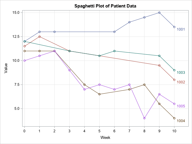
As usual, it is difficult to visualize missing data. The locations of the missing appointments are not easy to see in this line plot. You have to look for line segments that span multiple weeks and do not have markers for one or more weeks, as seen in the lines for PatientID=1001 and PatientID=1002. However, when two lines are near each other (for example, PatientID=1004 and PatientID=1005), it is more difficult to see the missing markers.
Now imagine a study that has 20 or 50 patients. Many lines will overlap, and the missed appointments will be very difficult to see. Although the spaghetti plot is a good way to visualize nonmissing data, it is not good at showing patterns of missing values.
The lasagna plot is an alternative way to visualize longitudinal data. A lasagna plot is a heat map. Each subject is a row. Each time point is a column. Whereas spaghetti plots can be used for unevenly spaced time points, the lasagna plot is most useful when the measurements are taken at evenly spaced time intervals.
You can use the HEATMAPPARM statement in PROC SGPLOT to create a lasagna plot for these data. The following example creates the lasagna plot and uses a white-yellow-orange-red color map to visualize the measurements for each time point.
%let WhiteYeOrRed = (CXFFFFFF CXFFFFB2 CXFECC5C CXFD8D3C CXE31A1C); /* lasagna plot: https://blogs.sas.com/content/iml/2016/06/08/lasagna-plot-in-sas.html */ title "Lasagna Plot of Patient Data"; proc sgplot data=Have; heatmapparm x=Week y=PatientID colorresponse=Value / outline outlineattrs=(color=gray) colormodel=&WhiteYeOrRed; refline (1000.5 to 1005.5) / axis=Y lineattrs=(color=black thickness=2); xaxis integer values=(0 to 10) valueshint; run; |
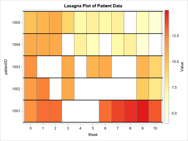
The lasagna plot does an excellent job of visualizing the data for each patient. You can see gaps for PatientID=1001 and PatientID=1002. These gaps are missing data.
However, there is a potential problem with this graph. I intentionally used white as one of the colors in the color model because I want to emphasize a problem that can occur when you create a heat map that has missing cells. In this graph, the color white is used for two different purposes! It is the color of the background, and it is the color for the lowest value of the measurement (Value=4.0). When a value is missing, the heat map does not display a cell, and the background color shows through as for PatientID=1001. On the other hand, PatientID=1005 does not have any missing values, but the patient does have a measurement (Week=8) for which Value=4.0. That cell is also white!
There are a few ways to handle this situation:
- Use a color model that does not include white.
- Change the color of the background to a color that is not in the color model.
- Add the missing values to the data and display cells that contain missing values in a different color.
The first option (change the color model) is the easiest but might not be possible if your boss or client insists on a color model that uses white. The subsequent sections explore the other two options.
Change the background color
The STYLEATTRS statement in PROC SGPLOT enables you to control the colors of various graphical elements. You can specify the background color by using the WALLCOLOR= option. The following call sets the background color to gray:
/* quick and easy way: change the background color of the "wall" in the plot */ title "Change Background Color to Gray"; proc sgplot data=Have; styleattrs wallcolor=Gray; heatmapparm x=Week y=PatientID colorresponse=Value / outline outlineattrs=(color=gray) colormodel=&WhiteYeOrRed; refline (1000.5 to 1005.5) / axis=Y lineattrs=(color=black thickness=2); xaxis integer values=(0 to 10) valueshint; run; |
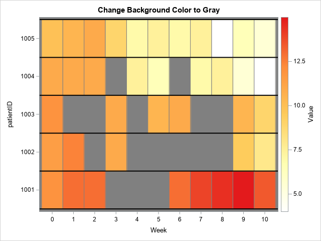
Now the gaps in the heat map are not white. The missing appointments are "visible" via the gray background. You can use the WALLCOLOR= option for all graphs. Notice, however, that the background color shows around the edges of the heat map. If you want to get rid of that edge effect, you can use the options OFFSETMIN=0 and OFFSETMAX=0 on the XAXIS and YAXIS statements. For example:
yaxis offsetmin=0 offsetmax=0; |
Display missing values as cells
The structure of the data makes it difficult to perform an analysis on the number and pattern of missed appointments. In its current form, the data set has 39 observations to represent the 39 visits from among the 55 scheduled appointments. If you want to analyze the missing values, it is better to restructure the data to include SAS missing values in the data.
An alternative structure for this data is for all patients to have 11 observations, but for the Value variable to be missing for any week in which the patient missed his appointment. The following DATA step creates a new data set for this alternative structure. First, a DATA step creates 11 weeks of missing values for each patient. The values of the PatientID variable are read by using a BY statement and the values of the FIRST.PatientID automatic variable. Then, this larger data set is merged with the observed data. Any observed values overwrite the missing values.
/* create sequence of missing values for each patient */ data AllMissing; set Have; by PatientID; /* assume sorted by PatientID */ if first.PatientID then do; do Week = 0 to 10; Value = .; output; end; end; run; /* merge with observed data */ data Want; merge AllMissing Have; by PatientID Week; run; |
If you create a heat map for the data in this new format, every cell will be plotted. The cells that contain missing values will be displayed by using the color for the GraphMissing style element in the current ODS style. For my ODS style (HTMLBlue), the color for missing cells is gray.
/* the color for missing cells is the GraphMissing color */ title "Missing Values Displayed in GraphMissing Color"; proc sgplot data=Want; heatmapparm x=Week y=PatientID colorresponse=Value / outline outlineattrs=(color=gray) colormodel=&WhiteYeOrRed; refline (1000.5 to 1005.5) / axis=Y lineattrs=(color=black thickness=2); xaxis integer values=(0 to 10) valueshint; legenditem type=fill name='missItem' / fillattrs=GraphMissing label="Missing Data"; keylegend 'missItem'; run; |
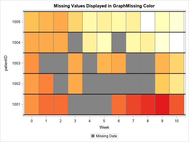
I like this graph because it uses SAS missing values to visualize the patterns of missed appointments. If you look carefully, you can see that there are 55 cells, one for each appointment. The gray cells represent the 16 missed appointments whereas the other colors represent the 39 clinical measurements. This visualization makes it easy to answer questions such as "which patients missed two or more consecutive appointments?"
Summary
This article discusses some ways to visualize missing values in longitudinal data. The traditional spaghetti plot does not do a good job of visualizing missing values. A heat map (sometimes called a lasagna plot) is a better choice. Depending on the structure of your data, you might need to add missing values data. By explicitly including missing values, the patterns of missing values can be visualized more easily.
This article also demonstrates how to use a trailing @ in a DATA step. This enables you to create multiple observations from a single line of input. Thanks to Warren Kuhfeld, who showed me how to read data by using this useful technique many years ago.
