For a linear regression model, a useful but underutilized diagnostic tool is the partial regression leverage plot. Also called the partial regression plot, this plot visualizes the parameter estimates table for the regression. For each effect in the model, you can visualize the following statistics:
- The estimate for each regression coefficient in the model.
- The hypothesis tests β0=0, β1=0, ..., where βi is the regression coefficient for the i_th effect in the model.
- Outliers and high-leverage points.
This article discusses partial regression plots, how to interpret them, and how to create them in SAS. If you are performing a regression that uses k effects and an intercept term, you will get k+1 partial regression plots.
Example data for partial regression leverage plots
The following SAS DATA step uses Fisher's iris data. To make it easier to discuss the roles of various variables, the DATA step renames the variables. The variable Y is the response, and the explanatory variables are x1, x2, and x3. (Explanatory variables are also called regressors.)
In SAS, you can create a panel of partial regression plots automatically in PROC REG. Make sure to enable ODS GRAPHICS. Then you can use the PARTIAL option on the MODEL statement PROC REG statement to create the panel. To reduce the number of graphs that are produced, the following call to PROC REG uses the PLOTS(ONLY)=(PARTIAL) option to display only the partial regression leverage plots.
data Have; set sashelp.iris(rename=(PetalLength = Y PetalWidth = x1 SepalLength = x2 SepalWidth = x3) where=(Species="Versicolor")); ID = _N_; label Y= x1= x2= x3=; run; ods graphics on; title "Basic Partial Regression Leverage Plots"; proc reg data=Have plots(only)=(PartialPlot); model Y = x1 x2 x3 / clb partial; ods select ParameterEstimates PartialPlot; quit; |
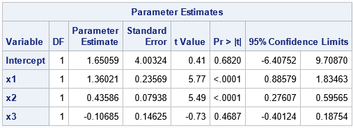
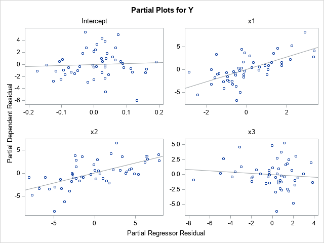
Let's call the parameter for the Intercept term the 0th coefficient, the parameter for x1 the 1st coefficient, and so on. Accordingly, we'll call the upper left plot the 0th plot, the upper right plot the 1st plot, and so on.
A partial regression leverage plot is a scatter plot that shows the residuals for a specific regressions model. In the i_th plot (i=0,1,2,3), the vertical axis plots the residuals for the regression model where Y is regressed onto the explanatory variables but omits the i_th variable. The horizontal axis plots the residuals for the regression model where the i_th variable is regressed onto the other explanatory variables. For example:
- The scatter plot with the "Intercept" title is the 0th plot. The vertical axis plots the residual values for the model that regresses Y onto the no-intercept model with regressors x1, x2, and x3. The horizontal axis plots the residual values for the model that regresses the Intercept column in the design matrix onto the regressors x1, x2, and x3. Thus, the regressors in this plot omit the Intercept variable.
- The scatter plot with the "x1" title is the 1st plot. The vertical axis plots the residual values for the model that regresses Y onto the model with regressors Intercept, x2, and x3. The horizontal axis plots the residual values for the model that regresses x1 onto the regressors Intercept, x2, and x3. Thus, the regressors in this plot omit the x1 variable.
These plots are called "partial" regression plots because each plot is based on a regression model that contains only part of the full set of regressors. The i_th plot omits the i_th variable from the set of regressors.
Interpretation of a partial regression leverage plot
Each partial regression plot includes a regression line. It is this line that makes the plot useful for visualizing the parameter estimates. The line passes through the point (0, 0) in each plot. The slope of the regression line in the i_th plot is the parameter estimate for the i_th regression coefficient (βi) in the full model. If the regression line is close to being horizontal, that is evidence for the null hypothesis βi=0.
To demonstrate these facts, look at the partial regression plot for the Intercept. The partial plot has a regression line that is very flat (almost horizontal). This is because the parameter estimate for the Intercept is 1.65 with a standard error of 4. The 95% confidence interval is [-6.4, 9.7]. Notice that this interval contains 0, which means that the flatness of the regression line in the partial regression plot supports "accepting" (failing to reject) the null hypothesis that the Intercept parameter is 0.
In a similar way, look at the partial regression plot for the x1 variable. The partial plot has a regression line that is not flat. This is because the parameter estimate for x1 is 1.36 with a standard error of 0.24. The 95% confidence interval is [0.89, 1.83], which does not contain 0. Consequently, the steepness of the slope of the regression line in the partial regression plot visualizes the fact that we would reject the null hypothesis that the x1 coefficient is 0.
The partial regression plots for the x2 and x3 variables are similar. The regression line in the x2 plot has a steep slope, so the confidence interval for the x2 parameter does not contain 0. The regression line for the x3 variable has a negative slope because the parameter estimate for x3 is negative. The line is very flat, which indicates that the confidence interval for the x3 parameter contains 0.
John Sall ("Leverage Plots for General Linear Hypotheses", TAS, 1990) showed that you could add a confidence band to the partial regression plot such that if the line segment for Y=0 is not completely inside the band, then you reject the null hypothesis that the regression coefficient is 0.
Identify outliers by using partial regression leverage plots
Here is a remarkable mathematical fact about the regression line in a partial regression plot: the residual for each observation in the scatter plot is identical to the residual for the same observation in the full regression model! Think about what this means. The full regression model in this example is a set of 50 points in four-dimensional space. The regression surface is a 3-D hyperplane over the {x1, x2, x3} variables. Each observation has a residual, which is obtained by subtracting the predicted value from the observed value of Y. The remarkable fact is that in each partial regression plot, the residuals between the regression lines and the 2-D scatter points are exactly the same as the residuals in the full regression model. Amazing!
One implication of this fact is that you can identify points where the residual value is very small or very large. The small residuals indicate that the model fits these points well; the large residuals are outliers for the model.
Let's identify some outliers for the full model and then locate those observations in each of the partial regression plots. If you run the full regression model and analyze the residual values, you can determine that the observations that have the largest (magnitude of) residuals are ID=15, ID=39, ID=41, and ID=44. Furthermore, the next section will look at high-leverage points, which are ID=2 and ID=3. Unfortunately, the PLOTS=PARTIALPLOT option does not support the LABEL suboption, so we need to output the partial regression data and create the plots manually. The following DATA step adds a label variable to the data and reruns the regression model. The PARTIALDATA option on the MODEL statement creates an ODS table (PartialPlotData) that you can write to a SAS data set by using the ODS OUTPUT statement. That data set contains the coordinates that you need to create all of the partial regression plots manually:
/* add indicator variable for outliers and high-leverage points */ data Have2; set Have; if ID in (2,3) then Special="Leverage"; else if ID in (15,39,41,44) then Special="Outlier "; else Special = "None "; if Special="None" then Label=.; else Label=ID; run; proc reg data=Have2 plots(only)=PartialPlot; model Y = x1 x2 x3 / clb partial partialdata; ID ID Special Label; ods exclude PartialPlotData; ods output PartialPlotData=PD; quit; |
You can use the PD data set to create the partial regression plot. The variables for the horizontal axis have names such as Part_Intercept, Part_x1, and so forth. The variables for the vertical axis have names such as Part_Y_Intercept, Part_Y_x1, and so forth. Therefore, it is easy to write a macro that creates the partial regression plot for any variable.
%macro MakePartialPlot(VarName); title "Partial Leverage Plot for &VarName"; proc sgplot data=PD ; styleattrs datasymbols=(CircleFilled X Plus); refline 0 / axis=y; scatter y=part_Y_&VarName x=part_&VarName / datalabel=Label group=Special; reg y=part_Y_&VarName x=part_&VarName / nomarkers; run; %mend; |
The following ODS GRAPHICS statement uses the PUSH and POP options to temporarily set the ATTRPRIORITY option to NONE so that the labeled points appear in different colors and symbols. The program then creates all four partial regression plots and restores the default options:
ods graphics / PUSH AttrPriority=None width=360px height=270px; %MakePartialPlot(Intercept); %MakePartialPlot(x1); %MakePartialPlot(x2); %MakePartialPlot(x3); ods graphics / POP; /* restore ODS GRAPHICS options */ |
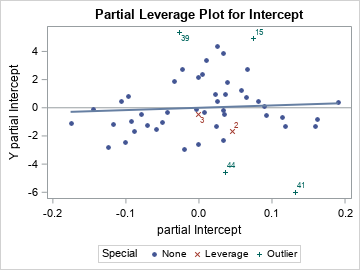
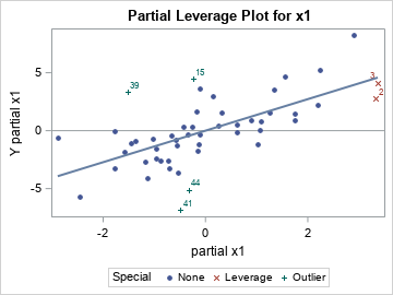
The first two plots are shown. The outliers (ID in (15,39,41,44)) will have large residuals in EVERY partial regression plot. In each scatter plot, you can see that the green markers with the "plus" (+) symbol are far from the regression line. Therefore, they are outliers in every scatter plot.
Identify high-leverage points by using partial regression leverage plots
In a similar way, the partial regression plots enable you to see whether a high-leverage point has extreme values in any partial coordinate. For this example, two high-leverage points are ID=2 and ID=3, and they are displayed as red X-shaped markers.
The previous section showed two partial regression plots. In the partial plot for the Intercept, the two influential observations do not look unusual. However, in the x1 partial plot, you can see that both observations have extreme values (both positive) for the "partial x1" variable.
Let's look at the other two partial regression plots:
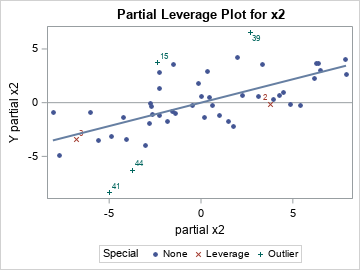
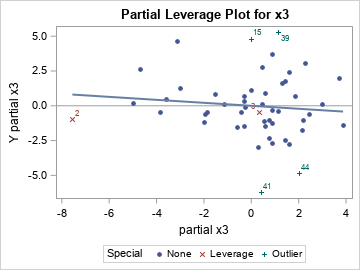
The partial regression plot for x2 shows that the "partial x2" coordinate is extreme (very negative) for ID=3. The partial regression plot for x3 shows that the "partial x3" coordinate is extreme (very negative) for ID=2. Remember that these extreme values are not the coordinates of the variables themselves, but of the residuals when you regress each variable onto the other regressors.
It is not easy to explain in a few sentences how the high-leverage points appear in the partial regression plots. I think the details are described in Belsley, Kuh, and Welsch (Regression Diagnostics, 1980), but I cannot check that book right now because I am working from home. But these extreme values are why the Wikipedia article about partial regression plots states, "the influences of individual data values on the estimation of a coefficient are easy to see in this plot."
Summary
In summary, the partial regression leverage plots provide a way to visualize several important features of a high-dimensional regression problem. The PROC REG documentation includes a brief description of how to create partial regression leverage plots in SAS. As shown in this article, the slope of a partial regression line equals the parameter estimate, and the relative flatness of the line enables you to visualize the null hypothesis βi=0.
This article describes how to interpret the plots to learn more about the regression model. For example, outliers in the full model are also outliers in every partial regression plot. Observations that have small residuals in the full model also have small residuals in every partial regression plot. The high-leverage points will often show up as extreme values in one or more partial regression plots. To examine outliers and high-leverage plots in SAS, you can use the PARTIALDATA option to write the partial regression coordinates to a data set, then add labels for the observations of interest.
Partial regression leverage plots are a useful tool for analyzing the fit of a regression model. They are most useful when the number of observations is not too big. I recommend them when the sample size is 500 or less.
