 Have you ever heard something referred to as the bee’s knees? Most likely the person uttering that expression meant that it was truly amazing and extraordinary. Maybe you stopped and pondered the origin of the phrase. Well wonder no more! In the 1920s in the United States, people were obsessed with rhyming and anthropomorphism (giving human traits or attributes to animals). This era saw the introduction of multiple animal-centric idioms: the ant’s pants, the cat’s pajamas, and (you guessed it) the bee’s knees. Most likely this idiom refers to the pollen basket on the lower section of a worker bee’s legs (where the tibia and the tarsi connect). When bees are out foraging, they carry all the pollen they find in the pollen baskets on their legs. If you ever see a bee with lots of pollen on her legs, you know she’s been working hard… one might even say she’s an amazing and extraordinary worker!
SAS Visual Analytics has a lot of features that you might call the bee’s knees, but one of the most amazing and extraordinary features is the AggregateTable operator. This operator, introduced in SAS Visual Analytics 8.3, enables you to perform aggregations on data crossings that are independent of (or changed from) the data in your objects. This means you can use this operator to compare aggregations for different groups of data in one single object.
To illustrate the AggregateTable operator in action (and to keep with the theme), let’s consider an example.
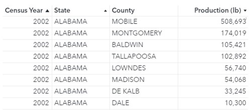
I’m a hobby beekeeper in Texas. This means that I own and maintain a few hives in my backyard from which I collect honey and wax to sell to family and friends. I’m interested in learning about honey production in the United States for different years. I’m pretty sure I’m not the biggest honey producer in my state (or even my county), but I want to look at different crossings of total production (by state and year, by county and year, and by state).
The United States Department of Agriculture’s National Agricultural Statistics Service has Census data on honey production (measured in pounds) for all counties in the United States for 2002, 2007, 2012, and 2017.
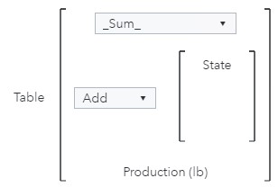
Type of Aggregation: Add
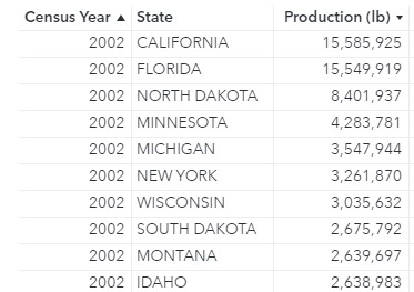
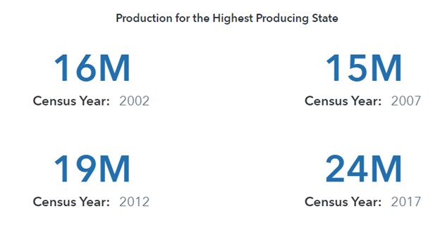
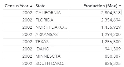
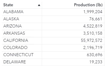
To start, I would like to calculate the total production for each state (Maximum by State) and display the total production for the state that produced the most honey in that year. For example, in 2002 California produced the most honey of any state (15,585,925 pounds) and in 2017 North Dakota produced the most honey of any state (24,296,437 pounds).
Because the table contains details by county and I’m interested in the total production by state, I will either need to create an aggregated data source that contains details by state, or I will need to use the AggregateTable operator. Since this post is about the wonders of the AggregateTable operator, let’s focus on that.
The AggregateTable operator requires five parameters:
| Parameter | Description |
| Aggregation- Aggregated | The aggregation applied to the aggregated item when it is used in an object that displays fewer group-by crossings than the table in the expression. |
| Aggregation- Measure | The aggregation applied to the measure in the inner table context. |
| Type of aggregation | The type of aggregation that is performed. Values are Fixed, Add, or Remove. |
| Categories | The list of categories used to alter the data crossing for the aggregation. |
| Measure | The measure that is aggregated. A Table operator can be added as the measure to perform a nested aggregation. |
It also has a nested operator, Table, that creates an intermediate table defined by the Type of aggregation, Categories, Measure, and Aggregation- Measure parameters.
For this example, I want to use a Key value object to see the total production values for the state that produced the most honey in each year. The object will contain one group-by crossing (or category): Year. The calculation, however, will need to use two group-by crossings to determine the highest producing state for each year: Year and State. Therefore, the Aggregation-Measure is _Sum_ (to calculate the total production by state), the Type of aggregation is Add (because I want to add a crossing for State to the calculation), Categories is set to State, and Measure is Production (lb).
The intermediate table will contain one row for each state and year and contain total production values.
Then, for each year, I want the highest production value (for 2002, 15,585,925 pounds). Therefore, the Aggregation- Aggregated parameter should be _Max_ to grab the maximum values for each year from the intermediate table.
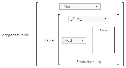
Then, I can display the Maximum by State with Year in a Key value object.
Note: Beginning in SAS Visual Analytics 2021.1.1 (May 2021), a new role is available for the Key value object, Lattice category. This enables you to display a key value object for each distinct value of a category data item (in this example, Year).
Now that I have a data item that contains the production amount for the highest producing state for each year, I can create some more complex calculations, like the percentage of total production for each year by the state that had the highest production. This will enable me to see if the highest producing state is doing all the heavy lifting or if all the states are producing a near-equal amount.

Type of Aggregation: Remove
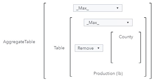
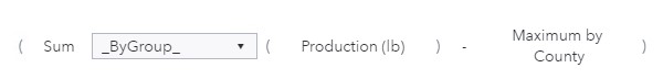
The Type of aggregation parameter also enables you to remove categories from the calculation. For this example, suppose I want to compare the production in each county to the production from the highest producing county in that state (Maximum by County). I want to use a list table to compare these values.
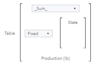
The object will contain three group-by crossings: Year, State, and County. The calculation, however, will only use two group-by crossings to determine the highest producing county in each state for each year: Year and State. Therefore, the Aggregation-Measure is _Max_ (to calculate the maximum production in each state), the Type of aggregation is Remove (because I want to remove a crossing for County from the calculation), Categories is set to County, and Measure is Production (lb).

The intermediate table will contain one row for each state and year and contain the production values for the county in that state with the highest production. Notice that for this table, the aggregation for Production was set to Maximum to show the maximum production for each state.
Because the number of groupings in the object (County, Year, and State) is not fewer than the number of groupings in the calculation (Year and State), the Aggregation-Aggregated parameter is not applied and can be set to any value.
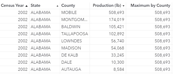
Then, I can display Maximum by County in a list table with total production by county to easily compare each county’s production with the production of the county in that state that had the highest production.
Now, I can calculate each county’s difference from the county with the highest production in that state for each year.
Type of Aggregation: Fixed
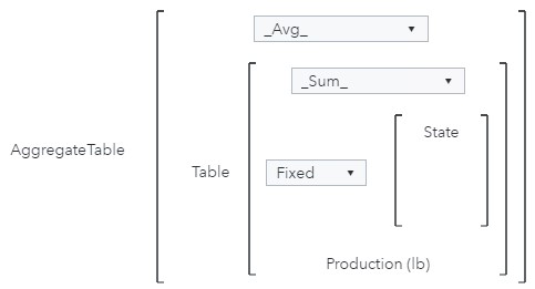
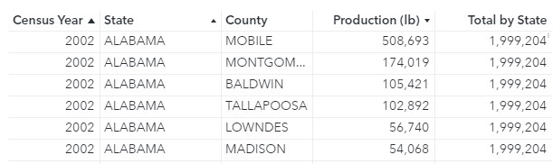
The Type of aggregation parameter also enables you to set a fixed category for the calculation. For this example, suppose I want to compare the production in each county to the total production across all years by state (Total by State). I want to use a list table to compare these values.
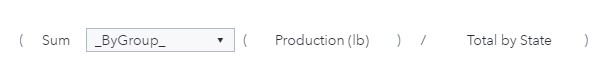
The object will contain three group-by crossings: Year, State, and County. The calculation, however, will only use one group-by crossing to determine the total production by state across all years: State. Therefore, the Aggregation-Measure is _Sum_ (to calculate the total production by state across all years), the Type of aggregation is Fixed (because I want to fix the crossing to State for the calculation), Categories is set to State and Measure is Production (lb).
The intermediate table will contain one row for each state and total production values across all years.
Because the number of groupings in the object (County, Year, and State) is not fewer than the number of groupings in the calculation (State), the Aggregation-Aggregated parameter is not applied and can be set to any value.
Then, I can display Total by State in a list table with total production by county to easily compare each county’s production with total production in the state across all years.
I can even compare total state values for each year with total production in that state across all years.

Then, I can calculate the share of total production produced each year.
For more information about how to create advanced data items and filters for your SAS Visual Analytics reports, including examples that use different types of operators, check out my book Interactive Reports in SAS Visual Analytics: Advanced Features and Customization.
Bees are important contributors in pollinating most of the food that you eat and are in desperate need of your help! There are many ways you can help the honeybee population thrive:
- Become a beekeeper
- Plant a garden for all pollinators (including bumblebees, butterflies, bats, and moths)
- Reduce or eliminate pesticide use
- Support your local beekeepers by buying local honey
- Contact a beekeeping group if you see a swarm
- Volunteer as a citizen data scientist by taking pictures and posting information on the iNaturalist app
- Create a bee bath for those hot summer days
- Build homes for native bees