Recently, I showed how to use a heat map to visualize measurements over time for a set of patients in a longitudinal study. The visualization is sometimes called a lasagna plot because it presents an alternative to the usual spaghetti plot. A reader asked whether a similar visualization can be created for subjects if the response is an ordinal variable, such as a count. Yes! And the heat map approach is a substantial improvement over a spaghetti plot in this situation.
This article pulls together several techniques from previous articles:
- Use a user-defined format to bin the counts into a known set of categories.
- Use a discrete attribute map to associate colors with the formatted values.
- Use PROC SGPLOT to create a heat map that visualizes the counts for each subject over time.
This article uses the following data, which represent the counts of malaria cases at five clinics over a 14-week time period:
data Clinical; input SiteID @; do Week = 1 to 14; input Count @; output; end; /* ID Wk1 Wk2 Wk3 Wk4 ... Wk14 */ datalines; 001 1 0 0 0 0 0 0 3 1 3 3 0 3 0 002 0 0 0 1 1 2 1 2 2 1 1 0 2 2 003 1 . . 1 0 1 0 3 . 1 0 3 2 1 004 1 1 . 1 0 1 2 2 3 2 1 0 . 0 005 1 1 1 . 0 0 0 1 0 1 2 4 5 1 ; title "Spaghetti Plot of Counts for Five Clinics"; proc sgplot data=Clinical; series x=Week y=Count / group=SiteID; xaxis integer values=(1 to 14) valueshint; run; |
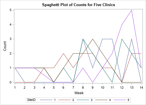
The line plot is not an effective way to visualize these data. In fact, it is almost useless. Because the counts are discrete integer values, and most counts are in the range [0, 3], the graph cannot clearly show the weekly values for any one clinic. The following sections develop a heat map that visualizes these data better.
Format the raw values
The following call to PROC FORMAT defines a format that associates character strings with values of the COUNT variable:
proc format; value CountFmt . = "Not Counted" 0 = "None" 1 = "1" 2 = "2" 3 = "3" 4 - high = "4+"; run; |
You can use this format to encode values and display them in a legend. Notice that you could also use a format to combine counts, such as using the word "Few" to describe 2 or 3 counts.
Associate colors to formatted values
A discrete attribute map ensures that the colors will not change if the data change. For ordinal data, it also ensures that the legend will be in ordinal order, as opposed to "data order" or alphabetical order.
You can use a discrete data map to associate graphical attributes with the formatted value of a variable. Examples of graphical attributes include marker colors, marker symbols, line colors, and line patterns. For a heat map, you want to associate the "fill color" of each cell with a formatted value. The following DATA step creates the mapping between values and colors. Notice that I use the PUTN function to apply the format to raw data values. This ensures that the mapping correctly associates formatted values with colors. The raw values are stored in an array (VAL) as are the colors (COLOR). This makes it easy to modify the map in the future or to adapt it to other situations.
data MyAttrs; length Value $11 FillColor $20; retain ID 'MalariaCount' /* name of map */ Show 'AttrMap'; /* always show all groups in legend */ /* output the formatted value and color for a missing value */ Value = putn(., "CountFmt."); /* formatted value */ FillColor = "LightCyan"; /* color for missing value */ output; /* output the formatted values and colors for nonmissing values */ array val[5] _temporary_ (0 1 2 3 4); array color[5] $20 _temporary_ ('White' 'CXFFFFB2' 'CXFECC5C' 'CXFD8D3C' 'CXE31A1C'); do i = 1 to dim(val); Value = putn(val[i], "CountFmt."); /* formatted value for this raw value */ FillColor = color[i]; /* color for this formatted value */ output; end; drop i; run; |
Create a discrete heat map
Now you can create a heat map that uses the format and discrete attribute map from the previous sections. To use the map, you must specify two pieces of information:- Use the DATTRPMAP= option on the PROC SGPLOT statement to specify the name of the data set that contains the map.
- Because a data set can contain multiple maps, use the ATTRID= option on the HEATMAPPARM statement to specify the value of the ID variable that contains the attributes for these data.
title "Heat Map of Malaria Data"; proc sgplot data=Clinical DATTRMAP=MyAttrs; /* <== the data set that contains attributes */ format Count CountFmt.; /* <== apply the format to bin data */ heatmapparm x=Week y=SiteID colorgroup=Count / outline outlineattrs=(color=gray) ATTRID=MalariaCount; /* <== the discrete attribute map for these data */ discretelegend; refline (1.5 to 5.5) / axis=Y lineattrs=(color=black thickness=2); xaxis integer values=(1 to 14) valueshint; run; |
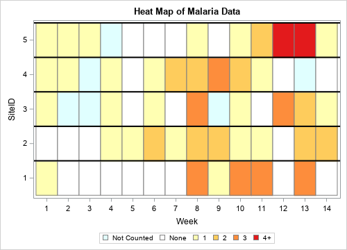
The heat map makes the data much clearer than the spaghetti map. For each clinic and each week, you can determine how many cases of malaria were seen. As mentioned earlier, you can use this same technique to classify counts into categories such as None, Few, Moderate, Many, and so forth.
Summary
You can use SAS formats to bin numerical data into ordinal categories. You can use a discrete attribute map to associate colors and other graphical attributes with categories. By combining these techniques, you can create a heat map that enables you to visualize ordinal responses for subjects over time. The heat map is much better at visualizing the data than a spaghetti plot is.
