Get the right information, with visual impact, to the people who need it
An NMF analysis of Scotch whiskies

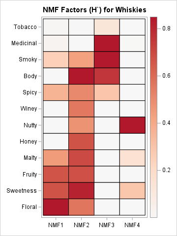
This is the last article in a series about the nonnegative matrix factorization (NMF). In this article, I run and visualize an NMF analysis of the Scotch whisky data and compare it to a principal component analysis (PCA). Previous articles in the series provide information about the whisky data, the