A profile plot is a compact way to visualize many variables for a set of subjects. It enables you to investigate which subjects are similar to or different from other subjects. Visually, a profile plot can take many forms. This article shows several profile plots: a line plot of the original data, a line plot of standardized data, and a heat map.
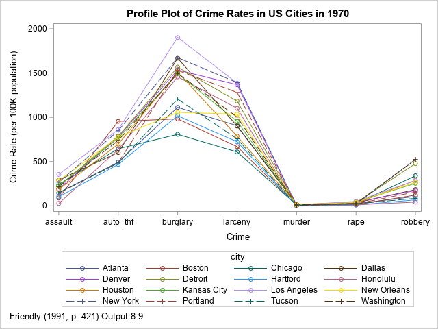
This article uses crime data to illustrate the various kinds of plots. The line plot at the right shows the incidence rate for seven types of crime in 16 US cities in 1970. The profile plot looks somewhat like a spaghetti plot, but a spaghetti plot typically features a continuous variable (often, time) along the vertical axis, whereas the horizontal axis in a profile plot features discrete categories. The vertical axis shows a response variable, which is often a count, a rate, or a proportion. The line segments enable you to trace the rates for each city. You can use the graph to discover which cities have high crime rates, which have low rates, and which are high for some crimes but low for others.
In the example, the subjects are cities; the variables are the seven crime rates. However, a profile plot is applicable to many fields. For example, in a clinical setting, the subjects could be patients and the variables could be the results of certain lab tests, such as blood levels of sugar, cholesterol, iron, and so forth. Be aware, however, that there are several different graphs that are known as "patient profile plots." Some are more complicated than the profile plots in this article.
A simple profile plot
For the city crime data, all variables are measured as rates per 100K people. Because all variables are measured on the same scale, you can plot the raw data. You could use a box plot if you want to show the distribution of rates for each crime. However, the purpose of a profile plot is to be able to trace each subject's relative rates across all variables. To do that, let's use a line plot.
The data are originally from the United States Statistical Abstracts (1970) and were analyzed by John Hartigan (1975) in his book Clustering Algorithms. The data were reanalyzed by Michael Friendly (SAS System for Statistical Graphics, 1991). This article follows Friendly's analysis for the line plots. The heat map in the last section is not considered in Friendly (1991).
The following SAS DATA step defines the data in the wide format (seven variables and 16 rows). However, to plot the data as a line plot in which colors identify the cities, it is useful to convert the data from wide to long format. For this example, I use PROC TRANSPOSE. You can then use the SERIES statement in PROC SGPLOT to visualize the rates for each crime and for each city.
/* Data from Hartigan (1975), reproduced in Friendly (SAS System for Statistical Graphics, 1991) http://friendly.apps01.yorku.ca/psy6140/examples/cluster/linpro2.sas */ data crime; input city &$16. murder rape robbery assault burglary larceny auto_thf; datalines; Atlanta 16.5 24.8 106 147 1112 905 494 Boston 4.2 13.3 122 90 982 669 954 Chicago 11.6 24.7 340 242 808 609 645 Dallas 18.1 34.2 184 293 1668 901 602 Denver 6.9 41.5 173 191 1534 1368 780 Detroit 13.0 35.7 477 220 1566 1183 788 Hartford 2.5 8.8 68 103 1017 724 468 Honolulu 3.6 12.7 42 28 1457 1102 637 Houston 16.8 26.6 289 186 1509 787 697 Kansas City 10.8 43.2 255 226 1494 955 765 Los Angeles 9.7 51.8 286 355 1902 1386 862 New Orleans 10.3 39.7 266 283 1056 1036 776 New York 9.4 19.4 522 267 1674 1392 848 Portland 5.0 23.0 157 144 1530 1281 488 Tucson 5.1 22.9 85 148 1206 757 483 Washington 12.5 27.6 524 217 1496 1003 739 ; /* convert to long format and use alphabetical ordering along X axis */ proc transpose data=crime out=crime2(rename=(col1=rate)) name=crime; by city; run; proc sort data=crime2; by crime; run; title "Profile Plot of Crime Rates in US Cities in 1970"; footnote J=L "Friendly (1991, p. 421) Output 8.9"; proc sgplot data=crime2; label rate="Crime Rate (per 100K population)" crime="Crime"; series x=crime y=rate / group=city markers; run; |
The graph is shown at the top of this article. It is not very useful. The graph does not enable you to trace the crime rate patterns for each city. To quote Friendly (1991, p. 422): "In plotting the raw data, the high-frequency crimes such as burglary completely dominate the display, and the low-frequency crimes (murder, rape) are compressed to the bottom of the plot. Because of this, the possibility that the cities may differ in their patterns is effectively hidden."
Whenever you are trying to graph data that are on different scales, it is useful to transform the scale of the data. You could do this globally (for example, a logarithmic transformation) or you can focus on relative aspects. Following Friendly (1991), the next section standardizes the data, thereby focusing the attention on which cities have relatively high or low crime rates for various crimes.
A profile plot for standardized data
The most common way to standardize data is to use an affine transformation for each variable so that the standardized variables have mean 0 and unit variance. You can use PROC STANDARD in SAS to standardize the variables. You can specify the name of variables by using the VAR statement, or you can use the keyword _NUMERIC_ to standardize all numeric variables in the data. The following statements standardize the original wide data and then convert the standardized data to long format for graphing.
proc standard data=crime mean=0 std=1 out=stdcrime; var _numeric_; run; /* convert to long format and ensure a consistent ordering along X axis */ proc transpose data=stdcrime out=stdcrime2(rename=(col1=rate)) name=crime; by city; run; proc sort data=stdcrime2; by crime; run; title "Profile Plot of Standardized Crime Rates in 1970"; footnote J=L "Friendly (1991, p. 423) Output 8.10"; proc sgplot data=stdcrime2; label rate="Crime Rate (standard score)" crime="Crime"; series x=crime y=rate / group=city markers; run; |
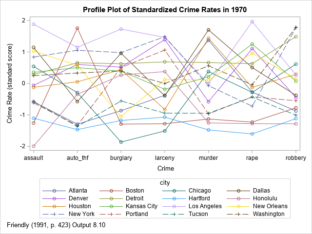
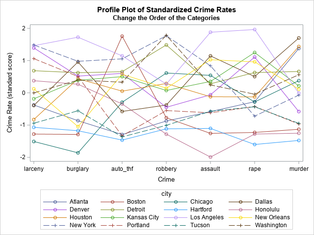
Unfortunately, for these data, this graph is not much better than the first profile plot. Friendly (1991, p. 423) calls the plot "dismal" because it is "hard to see any similarities among the cities in their patterns of crime." With a close inspection, you can (barely) make out the following facts:
- For most crimes, Los Angeles, Detroit, and New York have high rates.
- For most crimes, Tucson and Hartford have low rates.
- The crime rate in Boston is low except for auto theft.
This plot is similar to a parallel coordinates plot. There are three ways to improve the standardized profile plot:
- Rearrange the order of the categories along the X axis by putting similar categories next to each other. I created one possible re-ordering, in which property crimes are placed on the left and crimes against persons are placed on the right. The profile plot is slightly improved, but it is still hard to read.
- Change the affine transformation for the variables. Instead of always using mean 0 and unit variance, perhaps there is a better way to transform the response values? And perhaps using nonuniform spacing for the categories could make the profiles easier to read? These two ideas are implemented in the "optimal linear profile plot" (Hartigan, 1975; Friendly, 1991). I will show how to create the optimal linear profile plot in a subsequent article.
- Abandon the spaghetti-like line plot in favor of a lasagna plot, which uses a heat map instead of a line plot. This is shown in the next section.
A lasagna plot of profiles
The main advantage of a lasagna plot is that data are neatly displayed in rows and columns. For each subject, you can examine the distribution of the response variable across categories. Furthermore, a rectangular heat map is symmetric: for each category, you can examine the distribution of the response variable across subjects! For these data, the subjects are cities, the categories are crimes, and the response variable is either the raw crime rate or the standardized rate. The disadvantage of a heat map is that the response values are represented by colors, and it can be difficult to perceive changes in colors for some color ramps. On the other hand, you can always print the data in tabular form if you need to know the exact values of the response variables.
The following statements create a lasagna plot for the standardized data in this example. Like the line plot, the heat map uses the data in long form:
%let colormap = (CX0571B0 CX92C5DE CXF7F7F7 CXF4A582 CXCA0020); /* lasagna plot: https://blogs.sas.com/content/iml/2016/06/08/lasagna-plot-in-sas.html and https://blogs.sas.com/content/iml/2022/03/28/viz-missing-values-longitudinal.html */ title "Lasagna Plot of City Profiles"; title2 "Standardized Crime Rates in 1970"; proc sgplot data=stdcrime2; label city="City" crime="Crime" rate="Standardized Rate"; heatmapparm x=crime y=city colorresponse=rate / outline outlineattrs=(color=gray) colormodel=&colormap; run; |
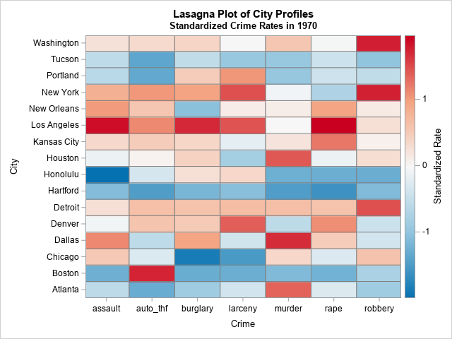
This is a better visualization of the crime profiles for each city. You can easily see the standardized rates and detect patterns among the cities. You can see that Detroit, Kansas City, Los Angeles, New York, and Washington (DC) have high relative rates. You can see that Atlanta, Boston, Hartford, Portland, and Tucson tend to have relatively low rates. You can see the crimes for which Atlanta, Boston, and Portland do not have low rates.
This display uses an alphabetical ordering of both the categories (crimes) and the subject (cities). However, you can sort the rows and columns of a lasagna plot to improve the visualization. For example, the following heat map sorts the cities by the average standardized crime rate across all categories. It also arranges the horizontal axis so that nonviolent crimes against property are on the left and violent crimes against people on the right:
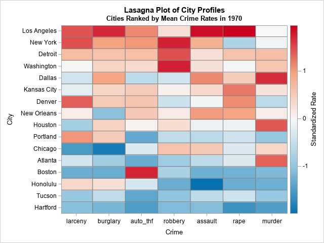
This arrangement makes it easier to see outliers such as the orange and red cells in the lower left of the graph. Both Portland and Honolulu have rates of property crime that are higher than you might suspect, given their overall low crime rates. Similarly, Boston has relatively high rates of auto theft compared to its otherwise low crime rates. In the same way, the relatively low rate of rapes in New York City is apparent.
Summary
This article shows three ways to create a profile plot in SAS. A profile plot enables you to visualize the values of many variables for a set of subjects. The simplest profile plot is a line plot of the raw values, where each line corresponds to a subject and the discrete horizontal axis displays the names of variables. However, if the variables are measured in different units or on different scales, it is useful to rescale the values of the variables. One way is to create a line plot of the standardized variables, which displays the relative values (high or low) of each variable. A third display is a heat map (sometimes called a lasagna plot), which uses color to display the high or low values of each variable.
In this article, the categories are uniformly spaced along the horizontal axis. In a subsequent article, I will show an alternative plot that uses nonuniform spacing.

1 Comment
Rick,
I think the better graph is using Medal Graph , which could use value to compare the difference in cities rather than color .
https://blogs.sas.com/content/graphicallyspeaking/2014/02/12/sochi-medal-graphs/
Also you could add a TOTAL column at the end to display which city has the top crime rate.
proc sql;
create table stdcrime3(drop=s) as
select *,sum(rate) as s
from stdcrime2
group by city
order by s desc;
quit;
title "Lasagna Plot of City Profiles";
title2 "Standardized Crime Rates in 1970";
proc sgpanel data=stdcrime3 noautolegend ;
panelby crime / layout=columnlattice onepanel sort=data novarname
uniscale=row proportional;
styleattrs datacontrastcolors=(navy green darkyellow orange red cyan black);
dot city / response=rate group=crime nostatlabel
markerattrs=(symbol=circlefilled size=10);
rowaxis discreteorder=data display=(nolabel) fitpolicy=none;
colaxis integer display=(nolabel);
run;