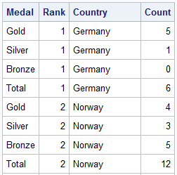
The attention of the world is now on Sochi and the Winter Games. Gold, Silver and Bronze medals are being earned by these amazing athletes, and everyone has an eye on the tally. Andre sent me a link to TRinker's R Blog, showing a graph of the current tally. Andre wanted to convey to SAS users this kind of a graph is easy to do in SAS, so he sent me the SAS data set of the latest tally. This data is in multi-column format, and I converted it to "Group" type structure as shown below.
A Lattice view of the graph as shown in TRinkers R Blog can be made using the SGPANEL procedure. Click on the graph for a high resolution view. I have intentionally ordered the countries by the number of GOLD medals, instead of Total. To keep the graph small, I only show countries with at least one Gold medal.
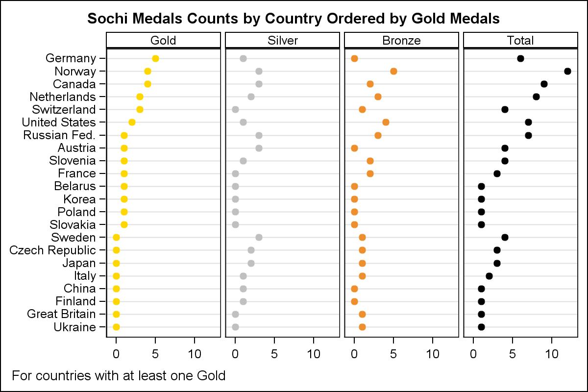
SGPANEL code:
proc sgpanel data=sochi_group noautolegend; title 'Sochi Medals Counts by Country Ordered by Gold Medals'; panelby medal / layout=panel columns=4 onepanel sort=data novarname spacing=5; styleattrs datacontrastcolors=(gold silver %rgbhex(236, 143, 44) black); dot country / response=count group=medal nostatlabel markerattrs=(symbol=circlefilled size=10); rowaxis discreteorder=data display=(nolabel) fitpolicy=none; colaxis integer display=(nolabel); run; |
While graphs like the one above are preferred by the statistical and analytical community, other users often want something spiffier. The nice thing about SG Procedures and GTL is that they can do both the analytical graphs and the spiffier graphs. Here is an example of what you can do with SAS 9.4 GTL. Click on the graph for a high resolution image.
SAS 9.4 GTL Graph of Sochi Medals:
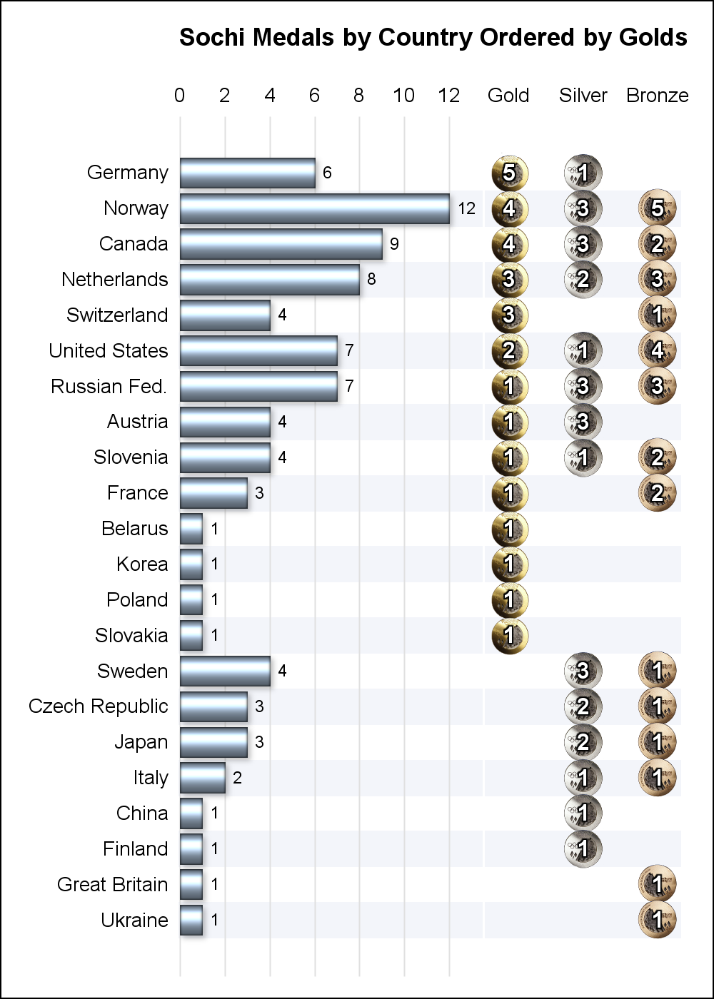
This graph uses the following new features included in SAS 9.4M1 GTL:
- A SymbolImage statement allows usage of any image as a marker symbol. Here I have used the three medals.
- Alternate horizontal color bands allows easier decoding of the data.
- Backlit (or shadowed) text is used on the medals so it shows clearly.
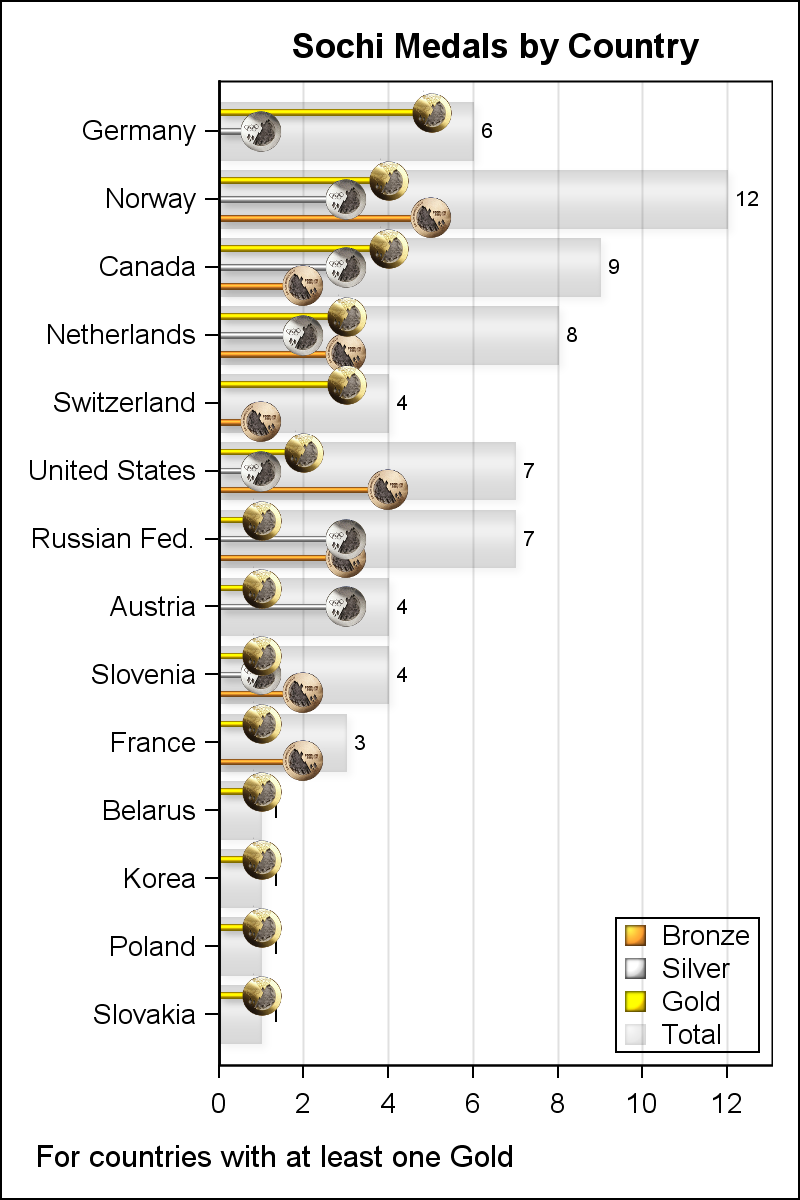
Other graph configurations are possible and are included in the attached program.
Full SAS Program: Sochi


3 Comments
Great article. Like the visualizations and how easy it is to produce these in SAS too!
Sanjay,
when i have tested the proc sgpanel under 9.3.2 it appears that some attributes or options
were not applying and causes errors as they are from 9.4.1 sas version level:
/* sort=data */ so the order is then alphabetic and not best
/* styleattrs instruction *: not recognized inducing better colors
/* fitpolicy=none */ the parameter that was only accepted in 9.3.2 is THIN
Beautiful graphs !
Andre
Thanks for the comment, Andre. Yes, I am using SAS 9.4M1, so I used some of the new features. If you have SAS 9.3, I suggest you can do the following.
- Reduce the Y axis tick value font size to fit all the names or increase the height of the graph.
- The default THIN policy will drop some country names, not so nice.
- To get the right colors, you will need to create your own style, or use DiscreteAttrMap.
- SORT on the PANELBY is new to keep the class variables in the same order as specified.
- To acheive this, you will have to use 1, 2, 3, 4 as the class values and then a user defined format to map it to the right values.
So, these are good "value add" features in SAS 9.4 !