This article is part three of the Empower your insights with SAS for Microsoft 365 blog series.
In this blog series' first article about Excel, you met Franco, who works with data in his role at the fictional retail company eCalico.
In the second article about Outlook, you met Sydney, who works at eCalico as a department head making smart, quick decisions using visual insights through her email.
Now, meet Jack Hero. Jack is the head of the US Sales division at eCalico, a retail company that, like many others in his industry, realized changes in customer shopping behavior from in-store to online purchases, because of the pandemic. This change in customer behavior has affected the number of returned merchandise that eCalico receives and he thinks this is an important information to share with the Sales Executives in their upcoming Sales meeting.
Jack meets with his sales team to discuss the importance of addressing online purchase returns in their sales presentation. They brainstorm ideas and strategies to highlight the company's efforts in providing seamless return experiences for online customers, and they pull numbers and trends from their Business Performance Analysis report develop in SAS Visual Analytics to support that discussion. This gives Jack data-based ammunition to set specific objectives for the upcoming fiscal year and for addressing online purchase returns. These objectives become the foundation of his presentation.
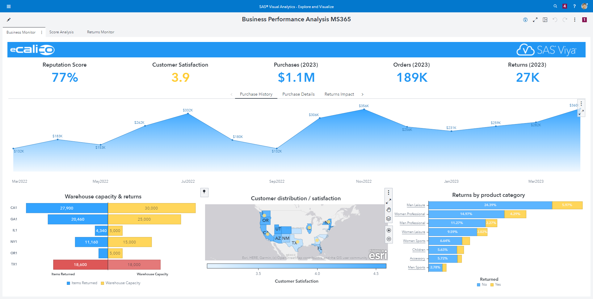
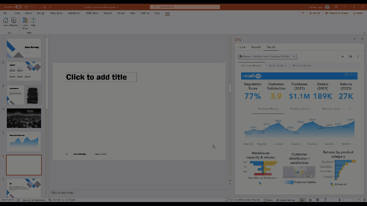
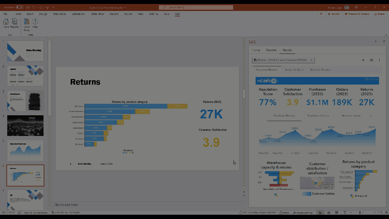
Jack works on the structure and content of the sales presentation in Microsoft PowerPoint 365. He determines the key messages to convey, including eCalico’s sales achievements, sales growth strategies, and efforts to improve the online purchase return process. Knowing his audience, Jack wants to add compelling visuals into his presentation, such as graphs, charts, and infographics, to showcase sales numbers and return statistics effectively. Fortunately, those visuals already exist in the SAS Visual Analytics report he used when meeting with his team earlier. From his PowerPoint deck, he uses the SAS menu, available through SAS for Microsoft 365, to access that same report. The report is live and interactive, as if he was accessing it from the browser, but at this time, it’s running inside PowerPoint. Jack adds a new slide from eCalico’s corporate template and then, from the SAS Visual Analytics report, he selects the bar chart containing returns by product and choose to insert it in the document. The bar chart immediately appears in the slide. He adds a title in the slide that reads “Returns”, resizes the bar chart as desired, and then updates the object in the document to redraw the bar chart according to his preferences.
Repeating the same steps, Jack adds two more visuals from the report into the same slide, one for returns in 2023 and one for customer satisfaction, creating an infographic. He continues the process and pull a couple of more visuals into his presentation to finalize the deck.
Jack knows that there might be questions that requires him to go deeper into the information provided, but he also knows that it will not be a problem, because with SAS for Microsoft 365 he can quickly access that report and others if needed during his presentation, and apply filters, drill down into the details, etc.
The presentation is ready, and Jack feels confident that, with a click of a button, he can refresh all the content sourced by SAS Visual Analytics reports in his deck, minutes before his presentation, and guarantee that he has the most updated information to share. Jack also feels relieved that all the effort he put when crafting the presentation, to deal with layout of mixed content coming from PowerPoint and SAS, are preserved when the visuals are updated. For busy Jack Hero, reusability is key.
You may not have Jack’s last name, but with SAS for Microsoft 365, you certainly have a superhero cape waiting for you to save the day.