This article is part one of the Empower your insights with SAS for Microsoft 365 blog series.
Meet Franco - Franco is a data analyst at retail company eCalico. As a data analyst, Franco collects, analyzes, interprets, and presents data to drive informed decision-making across many different departments. Franco’s role is an important one – he helps business users understand their data, identifying patterns and trends and uncovering insights that can lead to improved business outcomes.
He often collaborates with teams within marketing, finance, operations, and sales to understand their data needs, provide analytical support, and develop data-driven solutions to address specific business questions. Recently, the customer success team has enlisted Franco’s help in investigating a recent drop in satisfaction across their US-based customers.
Franco has many tools in his analytical toolbox to perform his job effectively. One application he uses frequently is Microsoft Excel, a powerful tool for data analysis. Many of the teams he works with use Excel daily and are comfortable digesting information using this familiar layout. Franco also uses SAS Viya when he finds himself needing more advanced analytical capabilities. Using SAS for Microsoft 365, Franco can enhance his Excel spreadsheets with additional insights from SAS Viya via one seamless integrated experience.
To get started with his investigation into customer satisfaction, Franco accesses a SAS Viya dashboard from within Excel that provides an overview of eCalico’s retail activity. He sees that this dashboard already includes an automated explanation of the customer satisfaction score in eCalico’s data – nice! Automated explanation is just one of SAS Viya’s built-in augmented analytics tools available to help you explore your data.
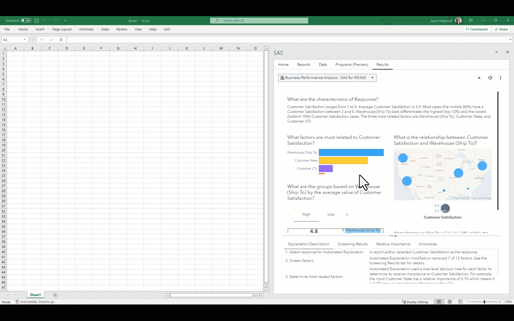
As a data analyst, Franco is responsible for presenting his findings in a clear and meaningful way. Impactful visualizations help stakeholders grasp complex information quickly and spur additional data-related questions. Including the visual insights from this SAS Viya dashboard in his report is a great way to begin exploring the factors that are most related to customer satisfaction. With SAS for Microsoft 365, Franco can embed several of the most relevant graphs from the dashboard directly into his Excel document with just a few clicks.
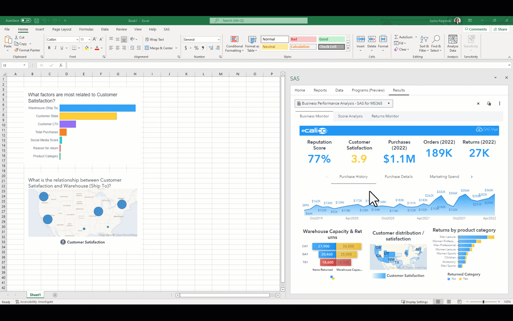
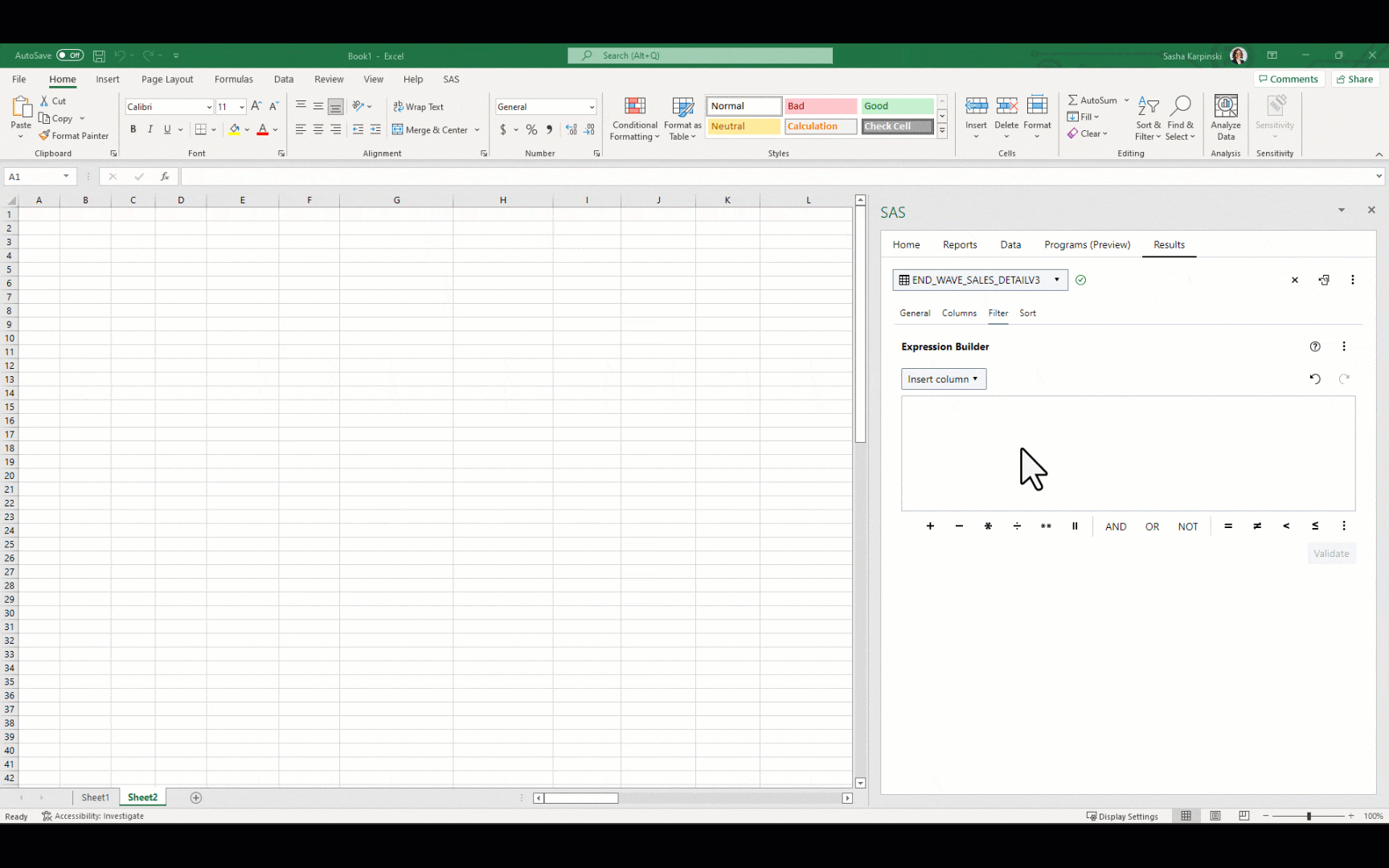
These visualizations suggest that customer satisfaction may be linked to customer distribution – where the customers live and the warehouses that their orders ship from. Now that he has a better idea of what affects customer satisfaction, Franco is ready to dive deeper into the data. Fortunately, SAS for Microsoft 365 also allows Franco to work directly with SAS data, inserting the detailed data of his choosing directly into Excel for further analysis. Franco navigates to the table used by the dashboard and sees that he can select a subset of columns to insert, apply a filter to the data, or create a sort on a data item prior to inserting the data into Excel. Since he is investigating low customer satisfaction rates in particular, he creates a filter expression to only include scores of 1 and 2. Then, he inserts the resulting rows of data into his spreadsheet to analyze.
With the SAS data now in Excel, Franco can apply native Excel capabilities onto the data, such as conditional formats like color scales or data bars. He can also use the SAS data to create new calculations using Excel formulas. Working with the detailed data gives Franco an even better understanding of the kinds of factors that may impact customer satisfaction – here, he realizes that customer satisfaction could also be linked to customers returning defective merchandise. If he takes a break and returns to his work at a later date, he can update the embedded content easily to make sure that he is always working with the latest data from SAS.
Franco might not be totally complete with his analysis, however, with SAS for Microsoft 365, he’s confident that he is well on his way to the right answers. He updates the customer success team that he has zeroed in on a few possible factors that contribute to lower customer satisfaction. By interpreting the analysis results, Franco will be able to provide insights and actionable recommendations to the customer success team. The integration between Excel and SAS facilitates collaboration with colleagues who primarily work in Excel, ensuring a smooth flow of data and insights from SAS across the organization. Once again, the combination of Excel and SAS proves to be a powerhouse when dealing with complex business questions.

1 Comment
Can this thing allow me to create Power Pivot on SAS data connection?