A profile plot is a way to display multivariate values for many subjects. The optimal linear profile plot was introduced by John Hartigan in his book Clustering Algorithms (1975). In Michael Friendly's book (SAS System for Statistical Graphics, 1991), Friendly shows how to construct an optimal linear profile by using the SAS/IML language. He displays the plot by using traditional SAS/GRAPH methods: the old GPLOT procedure and an annotation data set. If you do not have a copy of his book, you can download Friendly's %LINPRO macro from his GitHub site.
SAS graphics have changed a lot since 1991. It is now much easier to create the optimal linear profile plot by using modern graphics in SAS. This article reproduces Friendly's SAS/IML analysis to create the data for the plot but uses PROC SGPLOT to create the final graph. This approach does not require an annotate data set.
The optimal linear profile plot
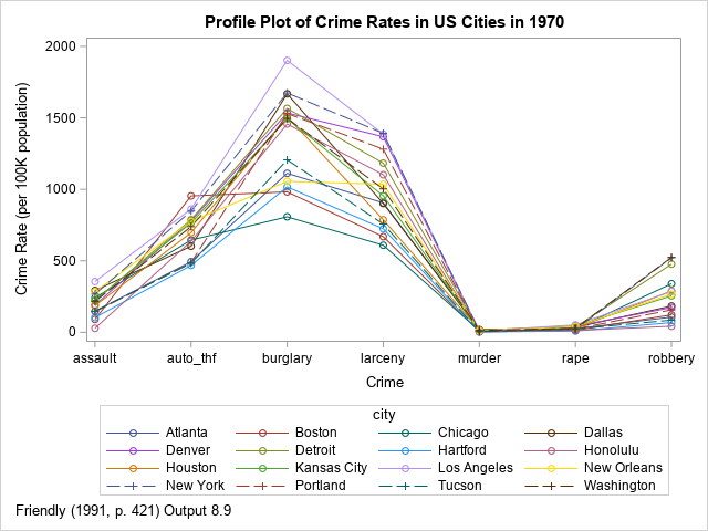
Friendly (1991) illustrates the optimal linear profile plot by using the incidence rate for seven types of crime in 16 US cities in 1970. I have previously shown how to visualize the crime data by using line plots and heat maps. A profile plot for the raw data is shown to the right.
The optimal linear profile plot modifies the profile plot in two ways. It computes an optimal ordering of the categories (crimes) and transforms the raw responses (rates) so that the transformed data are as close to linear as possible. Let's focus on the meaning of the words "linear" and "optimal":
- Linear: The goal of the linear profile plot is to show linear trends rather than exact data values. The method models the data to determine which cities tend to have relatively low rates of some crimes and relatively high rates of other crimes. Thus, the linear profile plot shows a linear model for the crime trends.
- Optimal: In creating the optimal linear profiles, you can choose any positions for the categories on the X axis. You can also (affinely) scale the data for each variable in many ways. The algorithm chooses positions and scales that make the transformed data as linear as possible.
The optimal linear profile is constructed by using the first two principal coordinates (PC) for the data (in wide form). The optimal positions are found as the ratio of the elements of the first two eigenvectors. The slopes and intercepts for the linear profiles are obtained by projecting the centered and scaled data onto the eigenspace, so they are related to the PC scores. See Friendly (1991) or the SAS/IML code for details.
The following DATA step creates the crime data in wide form. The SAS/IML program is taken from the %LINPRO macro and is similar to the code in Friendly (1991). It contains a lot of print statements, which you can comment out if you do not want to see the intermediate calculations. I made a few minor changes and three major changes:
- Friendly's code computed the covariance and standard deviations by using N (the sample size) as the denominator. My code uses the N-1 as the denominator so that the computations of the PCs agree with PROC PRINCOMP.
- Friendly's code writes a data set (LINFIT), which is used to create an annotate data set. This data set is no longer needed, but I have retained the statements that create it. I have added code that creates two macro variables (POSNAMES and POSVALUES) that you can use to specify the positions of the crime categories.
- The program uses PROC SGPLOT to create the optimal linear profile plot. The labels for the lines are displayed automatically by using the CURVELABEL option on the SERIES statement. The VALUES= and VALUESDISPPLAY= options are used to position the categories at their optimal positions.
/* Data from Hartigan (1975), reproduced in Friendly (SAS System for Statistical Graphics, 1991) http://friendly.apps01.yorku.ca/psy6140/examples/cluster/linpro2.sas */ data crime; input city $16. murder rape robbery assault burglary larceny auto_thf; datalines; Atlanta 16.5 24.8 106 147 1112 905 494 Boston 4.2 13.3 122 90 982 669 954 Chicago 11.6 24.7 340 242 808 609 645 Dallas 18.1 34.2 184 293 1668 901 602 Denver 6.9 41.5 173 191 1534 1368 780 Detroit 13.0 35.7 477 220 1566 1183 788 Hartford 2.5 8.8 68 103 1017 724 468 Honolulu 3.6 12.7 42 28 1457 1102 637 Houston 16.8 26.6 289 186 1509 787 697 Kansas City 10.8 43.2 255 226 1494 955 765 Los Angeles 9.7 51.8 286 355 1902 1386 862 New Orleans 10.3 39.7 266 283 1056 1036 776 New York 9.4 19.4 522 267 1674 1392 848 Portland 5.0 23.0 157 144 1530 1281 488 Tucson 5.1 22.9 85 148 1206 757 483 Washington 12.5 27.6 524 217 1496 1003 739 ; /* Program from Friendly (1991, p. 424-427) and slightly modified by Rick Wicklin (see comments). You can download the LINPRO MACRO from https://github.com/friendly/SAS-macros/blob/master/linpro.sas The program assumes the data are in wide form: There are k response variables. Each row is the response variables for one subject. The name of the subject is contained in an ID variable. The output for plotting is stored in the data set LINPLOT. Information about the linear regressions is stored in the data set LINFIT. */ %let data = crime; /* name of data set */ %let var = _NUM_; /* list of variable names or the _NUM_ keyword */ %let id = City; /* subject names */ proc iml; *--- Get input matrix and dimensions; use &data; if upcase("&var") = "_NUM_" then read all var _NUM_ into X[colname=vars]; else read all var {&var} into X[colname=vars]; n = nrow(X); p = ncol(X); m = mean(X); D = X - m; *- centered cols = deviations from means; if "&id" = " " then ID = T(1:nrow(X)); else read all var{&id} into ID; if type(ID)='N' then ID = compress(char(id)); close; *--- Compute covariance matrix of x; /* Modification by Wicklin: Friendly's COV and SD are different because he uses a divisor of n for the COV matrix instead of n-1 */ C = cov(X); sd = std(X); /* If you want to exactly reproduce Friendly's macro, use the following: c = d` * d / n; *- variance-covariance matrix; sd = sqrt( vecdiag( c))`; *- standard deviations; */ *--- Standardize if vars have sig diff scales; ratio = max(sd) / min(sd); if ratio > 3 then do; s = sd; * s is a scale factor; C = cov2corr(C); Clbl = "Correlation Matrix"; end; else do; s = j(1, p, 1); Clbl = "Covariance Matrix"; end; print C[colname=vars rowname=vars f=7.3 L=Clbl]; *--- Eigenvalues & vectors of C; call eigen(val, vec, C); *--- Optional: Display information about the eigenvectors; prop = val / val[+]; cum = cusum(prop); T = val || dif(val,-1) || prop || cum; cl = {'Eigenvalue' 'Difference' 'Proportion' 'Cumulative'}; lbl = "Eigenvalues of the " + Clbl; print T[colname=cl f=8.3 L=lbl]; *--- Scale values; e1 = vec[ , 1] # sign( vec[<> , 1]); e2 = vec[ , 2]; pos = e2 / e1; Ds = D; /* the raw difference matrix */ D = Ds / ( s # e1` ); /* a scaled difference matrix */ *--- For case i, fitted line is Y = F1(I) + F2(I) * X ; f1 = ( D * e1 ) / e1[##]; /* ssq(e1) = ssq(e2) = 1 */ f2 = ( D * e2 ) / e2[##]; f = f1 || f2; *--- Optionally display the results; scfac = sd` # e1; * NOTE: Friendly rounds this to the nearest 0.1 unit; table = m` || sd` || e1 || e2 || scfac || pos; ct = { 'Mean' 'Std_Dev' 'Eigvec1' 'Eigvec2' 'Scale' 'Position'}; print table [ rowname=vars colname=ct f=8.2]; *--- Rearrange columns; r = rank( pos); zz = table; table [r, ] = zz; zz = vars; vars [ ,r] = zz; zz = pos; pos [r, ] = zz; zz = scfac; scfac [r, ] = zz; zz = D; D [ ,r] = zz; *--- Optionally display the results; print table[rowname=vars colname=ct f=8.2 L="Variables reordered by position"]; lt = { 'Intercept' 'Slope'}; print f[rowname=&id colname=lt f=7.2 L="Case lines"]; *--- Fitted values, residuals; fit = f1 * j( 1 , p) + f2 * pos`; resid = D - fit; *--- Optionally display the results; print fit [ rowname=&id colname=vars format=7.3 L="Fitted values"]; print resid [ rowname=&id colname=vars format=7.3 L="Residuals"]; *--- Optionally display summary statistics for fit; sse = resid[##]; ssf = fit[##]; sst = D[##]; vaf = ssf / (sse+ssf); print sse ssf sst vaf; sse = (ds-fit)[##]; sst = ds[##]; vaf = ssf / (sse+ssf); print sse ssf sst vaf; *--- Construct output array for annotate data set - residuals bordered by fitted scale values; v1 = val[ 1 ] || {0}; v2 = {0} || val[ 2 ]; xout = ( resid || f ) // ( pos` || v1 ) // ( scfac` || v2 ); rl = colvec(ID) // {'Variable','Scale'}; cl = colvec(vars) // {'Intercept','Slope'}; create LINFIT from xout[ rowname=rl colname=cl ]; append from xout[ rowname= rl ]; close; free rl cl xout; *--- Output the array to be plotted; do col = 1 to p; rows = j(n,1,pos[col,]) || fit[,col] || resid[,col]; pout = pout // rows; rl = rl // shape(ID,1); end; cl = { 'Position' 'Fit' 'Residual'}; create LINPLOT from pout[ rowname=rl colname=cl ]; append from pout[ rowname=rl ]; close; /* Modification by Wicklin: create two macro variables for labeling the plotting positions. For example: POSNAME = 'larceny' 'burglary' 'auto_thf' 'rape' 'robbery' 'assault' 'murder' POSVALUES= -1.698 -1.014 -0.374 0.1389 0.5016 0.5805 2.1392 */ M1 = compress("'" + vars + "'"); M1 = rowcat(M1 + " "); M2 = rowcat(char(pos`,6) + " "); call symputx("posNames", M1); call symputx("posValues",M2); quit; %put &=posNames; %put &=posValues; /* Use the POSNAMES and POSVALUES macro variables to add custom tick labels and values. See https://blogs.sas.com/content/iml/2020/03/23/custom-tick-marks-sas-graph.html */ ods graphics / height=640px width=640px; title "Optimal Linear Profiles for City Crime Rates"; footnote J=L "Friendly (1991, p. 430) Output 8.11"; proc sgplot data=LINPLOT(rename=(RL=&ID)); label fit="Fitted Crime Index" position="Crime (Scaled Position)"; series x=position y=fit / group=city curvelabel curvelabelloc=outside; xaxis values = (&posValues) valuesdisplay=(&posNames) fitpolicy=stagger; run; footnote;title; |
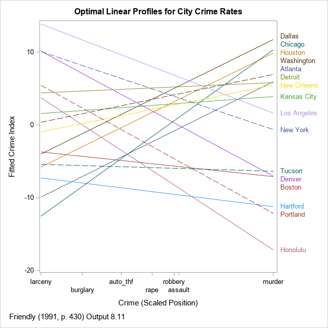
The optimal linear profile plot is shown for the crimes data. Unlike Friendly, I do not show the points along these lines. I think adding markers gives the false impression that the method has perfectly linearized the data.
The X axis shows the optimal positions of the crimes. They are roughly ordered so that crimes against property are on the left and violent crimes against persons are on the right. As is often the case, the PC interpretation does not perfectly agree with our intuitions. For these data, the analysis has placed rape to the left of robbery and assault. Notice that I use the VALUES= and VALUESDISPLAY= to specify the positions of the labels, and I use the FITPOLICY=STAGGER option to prevent the labels from colliding.
The cities can be classified according to their linear trends. For brevity, let's call larceny and burglary "property crimes," and let's call robbery, assault, and murder "violent crimes." Then you can observe the following classifications for the cities:
- The lines for some cities (Dallas, Chicago, Houston) have a large positive slope. This indicates that the crime rates for property crimes are low relative to the rates of violent crimes.
- The lines for other cities (Los Angeles, New York, Denver) have a large negative slope. This indicates that the crime rates for property crimes are high relative to the rates of violent crimes.
- The lines for other cities (Kansas City, Tucson, Hartford) are relatively flat. This indicates that the crime rates for property crimes are about the same as the rates of violent crimes.
- When the line for one city is above the line for another city, it means that the first city tends to have higher crime rates across the board than the second city. For example, the line for Los Angeles is above the line for New York. If you look at the raw data, you will see that the crime rates in LA is mostly higher, although NYC has higher rates for robbery and larceny. Similarly, the rates for Portland are generally higher than the rates for Honolulu, except for auto theft.
- The ordering of the city labels is based primarily on the violent crime rates.
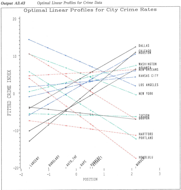
The following color image is copied from Friendly (1991, Appendix 3, p. 673) so that you can compare the SAS/GRAPH output to the newer output.
An alternative to the optimal linear profile plot
I'll be honest, I am not a big fan of the optimal linear profile plot. I think it can give a false impression about the data. It displays a linear model but does not provide diagnostic tools to assess issues such as outliers or deviations from the model. For example, the line for Boston shows no indication that auto theft in that city was extremely high in 1970. In general, there is no reason to think that one set of positions for the categories (crimes) leads to a linear profile for all subjects (cities).
If you want to show the data instead of a linear model, see my previous article, "Profile plots in SAS," and consider using the heat map near the end of the article. If you want to observe similarities and differences between the cities based on the multivariate data, I think performing a principal component analysis is a better choice. The following call to PROC PRINCOMP does a good job of showing similarities and differences between the categories and subjects. The analysis uses the correlation matrix, which is equivalent to saying that the crime rates have been standardized.
ods graphics/reset; proc princomp data=crime out=Scores N=2 plot(only)=(PatternProfile Pattern Score); var murder rape robbery assault burglary larceny auto_thf; id City; run; |
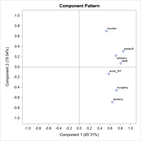
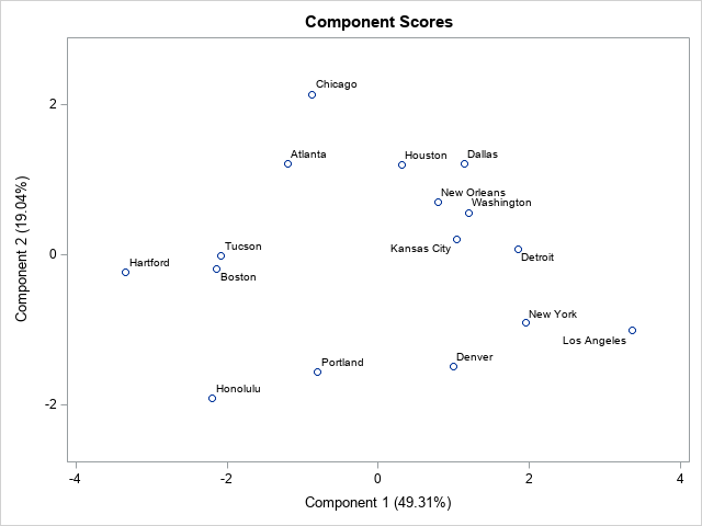
For this analysis, the "Pattern Profile Plot" (not shown) shows that the first PC can be interpreted as the total crime rate. The second PC is a contrast between property crimes and violent crimes. The component pattern plot shows that the position of the variables along the second PC is nearly the same as the positions computed by the optimal linear profile algorithm. You can see property crimes in the lower half of the plot and violent crimes in the upper half. The "Score Plot" enables you to see the following characteristics of cities:
- Cities to the right have high overall crime rates. Cities to the left have low overall crime rates.
- Cities near the top have higher rates of violent crime relative to property crimes. Cities near the bottom have higher rates of property crimes. Cities near the middle have crime rates that are roughly equal for crimes.
In my opinion, the score plot provides the same information as the optimal linear profile plot. However, interpreting the score plot requires knowledge of principal components, which is an advanced skill. The optimal linear profile plot tries to convey this information in a simpler display that is easier to explain to a nontechnical audience.
Summary
This article reproduces Friendly's (1991) implementation of Hartigan's optimal linear profile plot. Friendly distributes the %LINPRO macro, which uses SAS/IML to carry out the computations and uses SAS/GRAPH to construct the linear profile plot. This article reproduces the SAS/IML computations but replaces the SAS/GRAPH calls with a call to PROG SGPLOT.
This article also discusses the advantages and disadvantages of the optimal linear profile plot. In my opinion, there are better ways to explore the similarities between subjects across many variables, including heat maps and score plots in principal component analysis.

3 Comments
Rick,
"(Los Angeles, New York, Denver) have a large positive slope"
Should be
"a large negative slope"
?
Thank you! I can always count on you to read articles carefully.
Great information, congratulations for your great work!