Assigning observations into clusters can be challenging. One challenge is deciding how many clusters are in the data. Another is identifying which observations are potentially misclassified because they are on the boundary between two different clusters. Ralph Abbey's 2019 paper ("How to Evaluate Different Clustering Results") is a good way to learn about clustering methods and some associated statistics in SAS. One of the statistics that Abbey mentions (p. 5) is the silhouette statistic. This article discusses the silhouette statistic, the silhouette plot, and how the statistic can help you decide how many clusters are in the data and identify observations that are potentially misclassified. In a subsequent article, I will show how to compute the silhouette statistic in SAS and use it to create a silhouette plot.
The silhouette statistic
The silhouette statistic was introduced by Peter Rousseeuw (1987, "Silhouettes: A graphical aid to the interpretation and validation of cluster analysis") and is conceptually easy to understand because it is based on the geometry of clusters. The silhouette statistic is computed for each observation and measures how well the observation fits into its assigned cluster. Qualitatively, a silhouette statistic near 1 means that the observation is firmly located in the center of its assigned cluster. A statistic near 0 means that the observation is on the boundary between two clusters. A negative statistic means that the observation is located inside another cluster so is potentially misassigned. You can compute the silhouette measure for the entire data set by averaging the silhouette values over all observations. In this way, the silhouette measure enables you to assess individual observations and the overall quality of a clustering assignment.
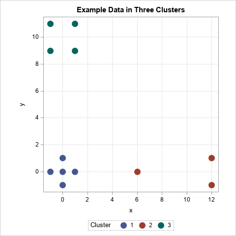
To illustrate the silhouette statistic, consider the 12 points in 2-D that are shown to the right. The points are assigned to three clusters: a five-point cluster near the origin, a four-point cluster near the coordinates (0, 10), and a three-point cluster near (10, 0). Intuitively, you might have confidence that the point (0, 0) is correctly assigned because it is in the center of its cluster and is not near any of the other clusters. In contrast, it is less clear whether the point (6, 0) belongs in the cluster with the points (±1, 12) or whether it belongs in the cluster near the origin. As we will see, the point (0, 0) has a large silhouette statistic (0.9) whereas the point (6, 0) has a silhouette statistic that is close to 0.
The silhouette statistic is a distance-based measure. If p is a point in the data set, you compute the silhouette value at p by doing the following:
- Define AvgDistIn(p) to be the average distance between p and other points in the same cluster. This is the average within-cluster distance.
- For each of the other clusters, find the average distance between p and points in the other cluster. If there are k clusters, this produces k-1 values. Define AvgDistOut(p) to be the MINIMUM of the values. This is the minimum of the average between-cluster distance.
- Define the silhouette statistic as s(p) = (AvgDistOut(p) - AvgDistIn(p)) / max(AvgDistOut(p), AvgDistIn(p)). This is a value in the interval [-1, 1].
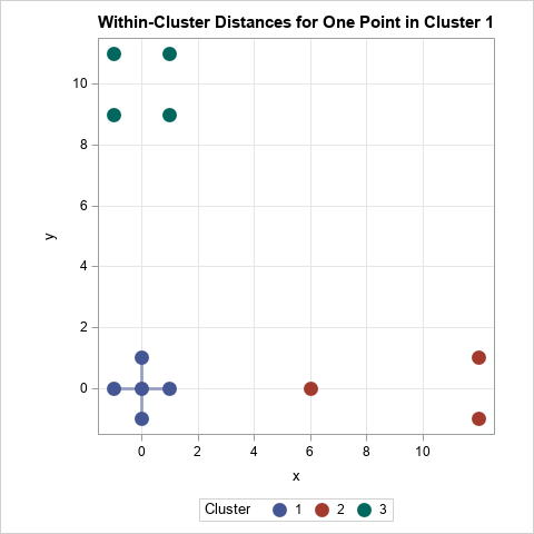
The first step is illustrated by the following graph for the point p=(0, 0). The lines show the distances between the other points in the cluster to which p is assigned. If there are N points in the cluster, the average within-cluster distance for p is sum(dist(p, x))/(N-1), where x ranges over all points in the cluster. (If N=1, the within-cluster distance is defined to be 0.) For this example, the distance from the origin to every other point in the cluster is 1, so AvgDistIn(p)=1 for p=(0, 0).
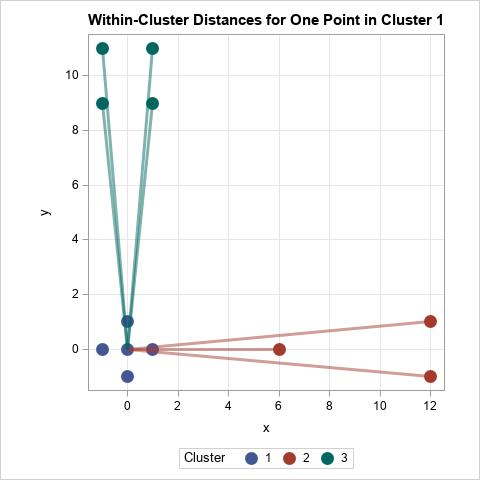
The second step for the point p=(0, 0) is illustrated by the following graph. The lines show the distances between points in the other clusters. For the cluster near (10, 0), the distances are {6, 12.04, 12.04}, so the average distance from p to that cluster is 10.03. For the cluster near (0, 10), the average of the four distances from p is 10.05. The "closest cluster" is therefore the cluster near (10, 0), so AvgDistOut(p) is the minimum of {10.03, 10.05}, which is 10.03.
The last step is merely applying the silhouette formula. For p=(0, 0), the silhouette statistic is s(p) = (10.03 - 1)/ 10.03 ≈ 0.90. You can repeat this process to get the silhouette statistic for the other points. The following graph shows the markers colored by the value of the silhouette statistic:
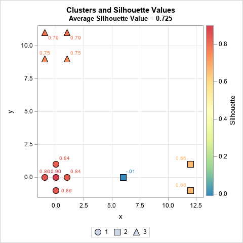
In this graph, the silhouette value is displayed next to each marker. You can notice three things:
- The five points in the first cluster (points near the origin) all have high silhouette statistics, which indicates that the points in this cluster are well-separated from the others. The average inter-cluster distance is small relative to the average distance to other clusters.
- The three points in the second cluster (points near the (10, 0)) are not well-separated. Although the points with x=12 have 0.66 for their silhouette values, the point at x=6 has the value -0.01. The fact that this value is near 0 indicates that this point could be assigned either to Cluster 1 or to Cluster 2. It is "on the boundary" between the two clusters.
- The four points in the third cluster (points near the (0, 10)) are mostly well-separated. The points with the lower Y coordinate have smaller silhouette values because they are closer to the first cluster.
For the example data, the overall silhouette measure is 0.725. This high value indicates that most clusters are well-separated from the others.
The silhouette plot
Creating a scatter plot is useful for visualizing the distribution of the silhouette statistic for small low-dimensional data sets. However, scatter plots are less useful for large or high-dimensional data sets. However, you can look at the distribution of the silhouette statistic within each cluster to get a feel for which clusters are well-separated and which are not. You can also average the silhouette statistics over all observations to obtain the silhouette measure for the entire data set.
Rousseeuw (1987) suggested using a panel of bar charts to visualize the statistic for each observation in the data set. He called this a silhouette plot. A bar chart is appropriate for small data sets. For larger data sets, you can use a panel of histograms. The following graph shows the silhouette plot for the example data set:
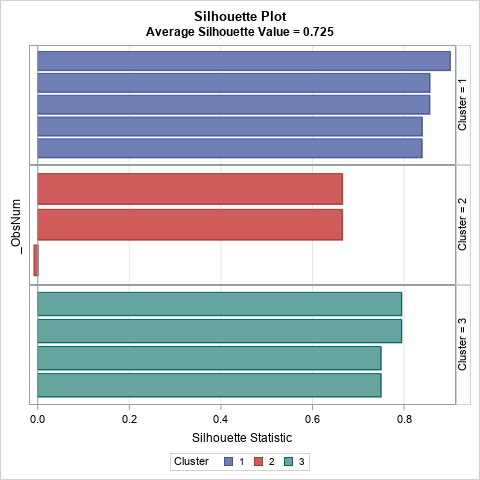
The plot shows the silhouette statistics for the observations as bars. The bars are grouped by cluster and sorted according to the silhouette value within the cluster. You can see that all observations in the first and third clusters have high silhouette values. In contrast, the second cluster has smaller silhouette values and has one observation whose silhouette value is slightly negative.
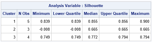
If you wish, you can display descriptive statistics that summarize the silhouette statistics within each cluster and overall:
Silhouette values for the Fisher iris data
Now that we have seen how the silhouette value is defined and have applied it to a small example, let's perform the same computations for Fisher's iris data. The data are 50 measurements for each of three species of iris flowers. For each flower, the data contains the width and length of the flower's sepal and petal, so the data are four dimensional. Two species are somewhat similar, so their clusters overlap, whereas the third species is well-separated from the other two. In this example, I use k-means clustering to form the clusters. The following graph shows a scatter plot of two variables where the shapes of the markers indicate the assigned cluster, and the colors indicate the silhouette statistic for each observation:
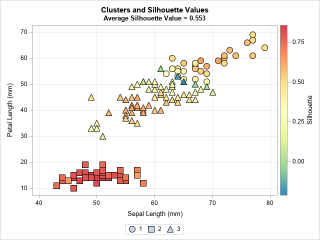
The actual clustering is done in four dimensions. The graph shows that Cluster 2 (squares) are well-separated from the other clusters in this 2-D projection. The colors indicate that the silhouette values are in the approximate range [0.65, 0.85]. In contrast, the first cluster (circles) and the third cluster (triangles) have smaller silhouette values. There are some observations that have values close to zero (green and blue colors)), and they are situated along the boundary between the clusters where the triangular and circular markers are next to each other. For the first and third clusters, only markers near the centers of the clusters have high silhouette values (red and orange colors).
The following graph shows the sorted silhouette values for each cluster:
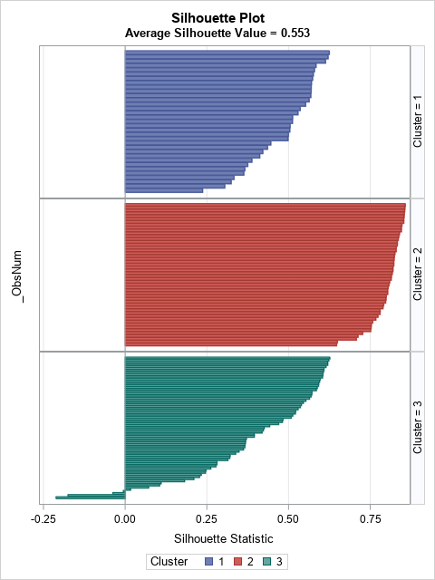
There is no uniform agreement on the definition of a "high" or "low" silhouette value, but for this article I will use "high" to mean greater than 0.5 and "low" to mean less than 0.3. Notice that Cluster 2 has all high values. Cluster 1 has a lot of high values but a few that are low. Cluster 3 is the worst: about half of the observations are low, and several are near zero or even negative, which indicates a possible misassignment of those observations.
The 150 observations in the iris data are about as many as I would visualize by using a bar chart. For larger data sets, you can use box plots or histograms to plot the distribution of the silhouette statistic for each cluster. For example, if you use a histogram, the visualization looks like the following panel:
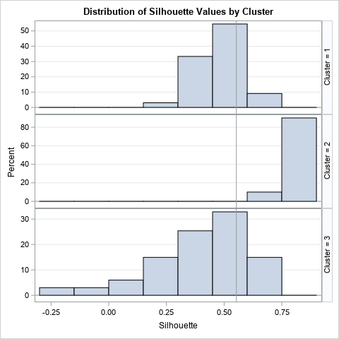
The vertical reference line is the overall silhouette measure, which is 0.553 for the iris data. You can see that Cluster 2 has higher-than-average statistics whereas Cluster 3 has many observations that are low or even negative.
How to use the silhouette statistic
Rousseeuw (1987) discusses several ways to use the silhouette statistic. We have already seen that values that are close to zero or negative can identify points that are potentially misclassified. You can also use the overall silhouette statistic as a tool for deciding how many clusters are in the data. If you use an algorithm such as k-means clustering, you must specify the number of clusters, k. Each value of k produces a different overall average silhouette measure. Rousseeuw says that "one way to choose k 'appropriately' is to select that value of k for which [the average measure]is a large as possible."
Summary
This article has described the geometry, computation, and visualization of the silhouette statistic, which is a tool for evaluating clustering assignments. The silhouette statistic measures how well each observation fits into its assigned cluster and can be used to assess the overall quality of a clustering solution. You can use the silhouette values to visualize the fit. SAS was used to create all the plots in this article. A second article shows how to compute the silhouette statistic in SAS.

4 Comments
Rick,
Another way to "Evaluate Different Clustering Results" is using ANOVA +Lesmans within PROC GLM .
I don't know what "Lesmans" is. Maybe you meant "least means"? Perhaps you are suggesting that you can test whether the means of the clusters are significantly different from each other?
Rick,
Yes. You got it.
And "Lesmans" is typo,should be "LSMEANS".
Awesome explanation. Thank you!