A previous article defines the silhouette statistic (Rousseeuw, 1987) and shows how to use it to identify observations in a cluster analysis that are potentially misclassified. The article provides many graphs, including the silhouette plot, which is a bar chart or histogram that displays the distribution of the silhouette statistic for each cluster.
This article shows how to compute the silhouette statistic in SAS. It also shows how to use PROC SGPLOT and PROC SGPANEL to construct visualizations of the silhouette statistic. The program uses SAS IML software to compute the average distance between each point and the clusters in the data set. You can download the SAS code that creates the silhouette statistic. You can also download the complete program that generates the graphs and tables in the previous article.
Compute the silhouette statistic in SAS
The silhouette statistic is a distance-based measure. It compares the average distance between a point and other points in the same cluster to the average distance from the point to points in other clusters. I will show how to compute the statistic by using the SAS IML matrix language. It is useful to first define two helper functions:
- The AvgDistSelf function takes an input matrix, Y, that represents N points in a cluster. It returns a vector with N elements. The i_th element is the average distance between the i_th row of Y and the other rows. (The average is computed by using N-1 as a divisor because we do not count the distance from the i_th row to itself, which is zero.)
- The AvgDistOther function takes two input matrices. The matrix Y represents N1 points in a cluster; the matrix Z represents N2 points in a different cluster. It returns a vector with N1 elements. The i_th element is the average distance between the i_th row of Y and the rows in Z.
If p is a point in the data set, you compute the silhouette value at p by performing the following computations:
- Define a(p) to be the average distance between p and other points in the same cluster. This is the average within-cluster distance. You can use the AvgDistSelf function for this computation.
- For each of the other clusters, find the average distance between p and points in the other cluster. If there are k clusters, this produces k-1 values. Define b(p) to be the MINIMUM of the values. This is the minimum of the average between-cluster distance. You can use the AvgDistOther function for this computation.
- Define the silhouette statistic as s(p) = (b(p) - a(p)) / max(b(p), a(p)). This is a value in the interval [-1, 1].
In the following program, this computation is implemented by the Silhouette function. The function takes two input arguments: A matrix of observations and a "ClusterID" variable, which identifies the cluster to which each point is assigned. Typically, the ClusterID variable has the values 1, 2, ..., k, where k is the number of clusters in the data.
For each cluster, the Silhouette function calls the AvgDistSelf function to compute the average inter-cluster distance, and it calls the AvgDistOther function to compute the average between-cluster distances to the other clusters. As it iterates over the clusters, it uses the elementwise-minimum operator to retain the smallest between-cluster distance that it has encountered. Finally, it computes the silhouette value. The computation is very efficient because it loops over clusters, not observations. For each cluster, you can use the DISTANCE function in SAS IML to compute the pairwise distances between points.
/* Implement the silhouette statistics for n points in k clusters. The silhouette statistic is defined in Peter Rousseeuw (1987) "Silhouettes: A graphical aid to the interpretation and validation of cluster analysis", https://doi.org/10.1016/0377-0427(87)90125-7 */ proc iml; /* AvgDistSelf: For each point, p, in a cluster this function returns the average distance between p and other points in the same cluster. */ start AvgDistSelf(Y); n = nrow(Y); if n=1 then return(0); /* convention */ D = distance(Y); /* D[i,j] is distance from Y[i,] to Y[j,] */ AvgDist = D[ ,+] / (n-1); /* exclude D[i,i] */ return AvgDist; finish; /* AvgDistOther: Let Y contains points in one cluster and Z contain points in a different cluster. For each point p in Y, this function returns the average distance between p and the points in Z. */ start AvgDistOther(Y, Z); D = distance(Y,Z); /* D[i,j] is distance from Y[i,] to Z[j,] */ return( D[ ,:] ); /* average of the D[i,j] */ finish; /* Silhouette: The main computational routine. For each point, p: 1. Define AvgDistIn = average distance between p and other points in the same cluster. Note: The divisor for this cluster is N-1, not N. 2. Find average distance between p and points in each of the other clusters. Define AvgDistOut to be the MINIMUM of the average distance. 3. Define s(p) = (AvgDistOut(p) - AvgDistIn(p)) / max(AvgDistOut(p), AvgDistIn(p)) Input: X is an (n x d) matrix of observations ClusterID is an (n x 1) vector that associates each point to a cluster. Typically, the values are in the range {1,2,...,k}, where k is the total number of clusters. Output: S is an (n x 1) vector that contains the silhouette statistic for each point in X. */ start Silhouette(X, ClusterID); n = nrow(X); AvgDistIn = j(n, 1, .); AvgDistOut = j(n, 1, .); /* Use the Unique-Loc technique to iterate over clusterID: https://blogs.sas.com/content/iml/2011/11/01/the-unique-loc-trick-a-real-treat.html */ uID = unique(ClusterID); k = ncol(uID); do i = 1 to k; idxIn = loc(ClusterID = uID[i]); Y = X[idxIn, ]; /* obs in the i_th cluster */ v = AvgDistSelf(Y); /* average inter-cluster distance */ AvgDistIn[idxIn,] = v; dMin = j(ncol(idxIn), 1, constant('BIG')); /* retain the min distances */ h = setdif(1:k, i); /* indices for the other clusters */ do j = 1 to ncol(h); /* loop over the other clusters */ jdx = loc(ClusterID = uID[h[j]]); Z = X[jdx, ]; /* obs in the j_th cluster, j ^= i */ v = AvgDistOther(Y, Z); /* average between cluster distances */ dMin = (dMin >< v); /* retain the elementwise minimum */ end; AvgDistOut[idxIn,] = dMin; /* min average distance to another cluster */ end; s = (AvgDistOut - AvgDistIn) / (AvgDistOut <> AvgDistIn); return s; finish; store module=(AvgDistSelf AvgDistOther Silhouette); QUIT; |
Compute the silhouette statistic on example data
In the previous article, I showed how to visualize the silhouette statistic on a small set example. The following DATA step defines the example data. The call to PROC FASTCLUS performs k-means clustering and creates an output data set that contains the Cluster variable, which assigns each point to one of three clusters:
data Have; input ID $ x y; datalines; A 0 0 A 0 1 A 1 0 A -1 0 A 0 -1 B 12 -1 B 6 0 B 12 1 C 1 11 C -1 11 C -1 9 C 1 9 ; /* k-means cluster analysis */ proc fastclus data=Have maxclusters=3 out=ClusOut noprint; var x y; run; /* compute vector of silhouette statistics */ proc iml; load module=(Silhouette); varNames = {'x' 'y'}; use ClusOut; read all var varNames into X; read all var "Cluster" into ClusterID; close; silhouette = Silhouette(X, ClusterID); print ClusterID X[c=varNames L=""] silhouette; m = mean(silhouette); print m[L="Silhouette Measure"]; /* write silhouette values to data set for graphing */ create S var "Silhouette"; append; close; QUIT; |
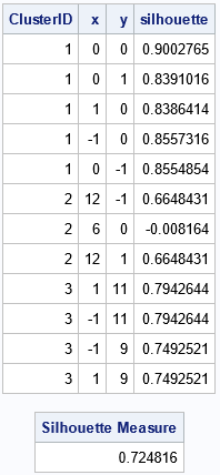
The output from PROC IML shows the ClusterID variable and the silhouette statistics for each point in the example data. You can see that most of the values are high (close to 1) except for the point (6,0) in Cluster 2, which has a silhouette value -0.008. This indicates that that point is located between two cluster and might be misclassified. The output also shows that the overall silhouette measure is 0.72, which indicates that most of the observations are assigned to clusters that are well separated from each other.
Visualize the silhouette statistics for example data
The IML program writes the silhouette statistics to a SAS data set. To visualize the statistics, I wrote a few SAS macros, which are defined in the appendix to this article. The macros are not necessary, but they reduce the amount of redundant code in this article. To make this article shorter, I will show how to use the macros, but not explain them. If you are trying to reproduce the analysis in this article, scroll down to the appendix and run the macros to define them.
To visualize the silhouette statistic, you can use the SilhouetteMergeSort macro to merge the original data and the silhouette statistics. You can then call the SilhouetteScatter macro to create a scatter plot of the observations, color-coded by the silhouette statistic:
/* merge data and create macro variable */ %SilhouetteMergeSort(ClusOut, S, Cluster, Silhouette, _All); %put &=Silh; /* scatter plot; markers colored by silhouette values */ title "Clusters and Silhouette Values"; title2 "Average Silhouette Value = &Silh"; %SilhouetteScatter(_All, x, y, Cluster, Silhouette); |
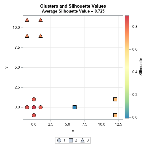
The scatter plot visualizes the table from the previous section. The graph shows the coordinates for each observation. Each marker is colored by the silhouette statistic. Most observations have a high silhouette value (red and orange colors), but one has a slightly negative value (blue color).
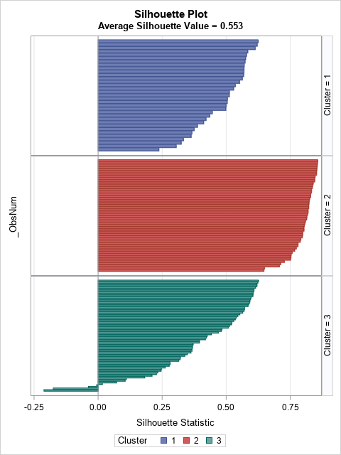
Rousseeuw (1987) proposes using a panel of bar charts to display the silhouette distribution for each cluster. In SAS, you can use PROC SGPANEL to create the bar charts:
/* silhouette plot (bar chart) */ title "Silhouette Plot"; title2 "Average Silhouette Value = &Silh"; %SilhouettePlot(_All, Cluster, Silhouette); |
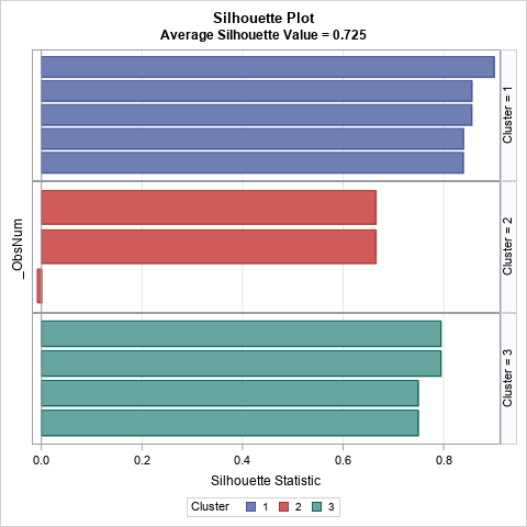
The bar chart contains the same information as the previous table, except that the observations within each cluster are sorted in descending order by the silhouette value.
Visualize the silhouette statistic for Fisher's iris data
Let's perform the same computation for Fisher's iris data, which is distributed as the Sashelp.iris data set in SAS. For brevity, I will show all the SAS code first, then discuss the output. The iris data contains four numerical variables, so the clustering is performed in four-dimensional space.
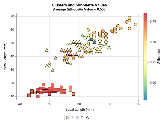
/* Create scatter and silhouette plots for the iris data */ /* k-means cluster analysis */ proc fastclus data=Sashelp.Iris maxclusters=3 out=ClusOut noprint; var SepalLength SepalWidth PetalLength PetalWidth; run; /* compute vector of silhouette statistics */ proc iml; load module=(Silhouette); varNames = {'SepalLength' 'SepalWidth' 'PetalLength' 'PetalWidth'}; use ClusOut; read all var varNames into X; read all var "Cluster" into ClusterID; close; silhouette = Silhouette(X, ClusterID); create S var "Silhouette"; append; close; /* write silhouette values to data set */ QUIT; /* merge data and create macro variable */ %SilhouetteMergeSort(ClusOut, S, Cluster, Silhouette, _All); %put &=Silh; /* scatter plot; markers colored by silhouette values */ title "Clusters and Silhouette Values"; title2 "Average Silhouette Value = &Silh"; %SilhouetteScatter(_All, SepalLength, PetalLength, Cluster, Silhouette); /* silhouette plot (bar chart) */ title "Silhouette Plot"; title2 "Average Silhouette Value = &Silh"; %SilhouettePlot(_All, Cluster, Silhouette); /* silhouette plot (histogram) */ title "Distribution of Silhouette Values by Cluster"; %SilhouetteHistogram(_All, Cluster, Silhouette, SilhRef=&Silh); |
The program calls PROC FASTCLUS to use k-means clustering to divide the iris data into three clusters. The output data set contains the Cluster variable, which assigns each point to a cluster. The IML program reads the data, computes the silhouette statistics, and writes the silhouette values to a SAS data set.
The SilhouetteScatter macro creates a scatter plot for two of the four input variables. The marker shapes reflect the cluster. The color of markers indicate the silhouette statistic. As discussed in the previous article, Cluster 2 is well-separated from the others and so the silhouette statistic is high. In contrast, Cluster 1 and Cluster 3 overlap, so some markers have small or negative silhouette values. You can see the blue and green markers along the boundary between the first and third clusters, as shown below:
The SilhouettePlot macro creates a panel of bar charts. The following graph shows that the second cluster has high silhouette values, whereas the first and third cluster contains small silhouette values.
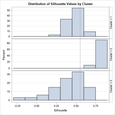
The Fisher iris data has 150 observations, which is about as many I would visualize by using a bar chart. For larger data sets, I suggest using the SilhouetteHistogram macro, which creates a panel of histograms. The following graph shows that distribution of the silhouette statistic for each cluster. Again, you can see that the Cluster 2 has high silhouette values, and that Cluster 3 has many values that are negative or near zero.
Summary
This article shows how to compute the silhouette statistic (Rousseeuw, 1987) in SAS. The silhouette statistic enables you to identify observations in a cluster analysis that are potentially misclassified and to assess the overall fit for the clustering assignments. The program uses SAS IML software to compute the average distance between each point and the clusters in the data set. It also shows how to use PROC SGPLOT and PROC SGPANEL to construct visualizations of the silhouette statistic. Rousseeuw suggested a visualization known as the silhouette plot, which displays a bar chart for each cluster. For large data sets, you can use a panel of histograms instead of bar charts to visualize the distribution of the silhouette statistic within each cluster.
You can download the SAS code that creates the silhouette statistic and use it in your own work. You can also download the complete program that generates the graphs and tables in the previous article.
Appendix: SAS utility macros to visualize the silhouette statistic
The following macros are used in this article. Feel free to use or modify as you see fit:
- SilhouetteMergeSort macro: This macro merges the original data and the silhouette statistics. It computes the overall average silhouette measure and stores it in &SILH macro variable. It sorts the data by cluster and (descending) by silhouette value. Lastly, it adds an _ObsNum variable for ease of plotting the silhouette values as a bar chart
- SilhouetteScatter macro: This macro creates a scatter plot of two variables in the cluster data and color-codes the markers by the silhouette statistic. The marker shapes indicate the cluster. Note: to run this macro, you must first run the SilhouetteMergeSort macro.
- SilhouettePlot macro: This macro creates a silhouette plot, which is a panel of bar charts of the silhouette values. Note: to run this macro, you must first run the SilhouetteMergeSort macro.
- SilhouetteHistogram macro: This macro creates a silhouette plot as a panel of histograms, not bar charts. Note: to run this macro, you must first run the SilhouetteMergeSort macro.
The following statements define the visualization macros:
/* The SilhouetteMergeSort macro 1. Merges the original data and the silhouette statistics 2. Computes the overall average silhouette measure and stores it in &SILH macro variable 3. Sorts data by cluster and (descending) by silhouette value 4. Adds an _ObsNum variable for ease of plotting the silhouette values as a bar chart Args: DSname = Original data SilhDSName = Output from PROC IML, containing silhouette values ClusName = Name of indicator variable for cluster membership SilhVarName = Name of variable that contains silhouette values OutName = Name of merged data set */ %macro SilhouetteMergeSort(DSname, SilhDSName, ClusName, SilhVarName, OutName); %GLOBAL Silh; data _temp; merge &DSName &SilhDSName end=EOF; _mean + &SilhVarName; if EOF then call symputx( "Silh", round(_mean/_N_, 0.001)); run; proc sort data=_temp; by &ClusName descending &SilhVarName; run; data &OutName / view=&OutName; set _temp; _ObsNum=_N_; label _ObsNum="Observation"; run; %mend; /* The SilhouetteScatter macro: To run this macro, you must first run the SilhouetteMergeSort macro! This macro creates a scatter plot of two variables in the cluster data and colors the markers by the silhouette statistic. The marker shapes indicate the cluster. Note: The macro hardcodes a spectral color ramp and uses only three shapes. Feel free to modify these attributes. Args: OutName = Name of merged data set xVarName, yVarName = Names of X and Y variables for scatter plot ClusName = Name of indicator variable for cluster membership SilhVarName = Name of variable that contains silhouette values */ %macro SilhouetteScatter(OutName, xVarName, yVarName, ClusName, SilhVarName); %let Spectral7 = (CX3288BD CX99D594 CXE6F598 CXFFFFBF CXFEE08B CXFC8D59 CXD53E4F ); ods graphics / PUSH attrpriority=none; proc sgplot data=&OutName; /* add more symbols if you have more than 3 clusters */ styleattrs datasymbols=(CircleFilled SquareFilled TriangleFilled); scatter x=&xVarname y=&yVarName / group=&ClusName name="scat" colormodel=&Spectral7 colorresponse=&SilhVarName filledoutlinedmarkers markerattrs=(size=14); xaxis grid; yaxis grid; keylegend "scat" / type=Marker; gradlegend "scat"; run; ods graphics / POP; %mend; /* The SilhouettePlot macro: To run this macro, you must first run the SilhouetteMergeSort macro! This macro creates a silhouette plot, which is a panel of bar charts of the silhouette values. Args: OutName = Name of merged data set ClusName = Name of indicator variable for cluster membership SilhVarName = Name of variable that contains silhouette values */ %macro SilhouettePlot(OutName, ClusName, SilhVarName); proc sgpanel data=&OutName; panelby &ClusName / layout=rowlattice onepanel spacing=0 rowheaderpos=right uniscale=column; hbar _ObsNum / response=&SilhVarName group=&ClusName; rowaxis display=(noticks novalues); colaxis grid label="Silhouette Statistic"; run; %mend; /* The SilhouetteHistogram macro: To run this macro, you must first run the SilhouetteMergeSort macro! This macro creates a silhouette plot as a panel of histograms. Args: OutName = Name of merged data set ClusName = Name of indicator variable for cluster membership SilhVarName = Name of variable that contains silhouette values SilhRef (optional) = Value of X variable at which to place a vertical reference line This is often the overall silhouette value for the data set. */ %macro SilhouetteHistogram(OutName, ClusName, SilhVarName, SilhRef=); proc sgpanel data=&OutName; panelby &ClusName / layout=rowlattice onepanel spacing=0 rowheaderpos=right uniscale=column; histogram &SilhVarName; %if %length(&SilhRef) %then %do; refline &SilhRef / axis=x; %end; rowaxis grid; run; %mend; |

1 Comment
Great post about computing silhouette statistic!
This can also be applied to HPCLUS in SAS 9.4 or KCLUS in SAS Viya, as those are both kmeans-based clustering methods, and give similar output.