In a previous article, I showed how to overlay a density estimate on a histogram by using the Graph Template Language (GTL). However, a SAS programmer asked how to overlay a curve on a histogram when the curve is not a density estimate. In this case, the vertical axis for the curve is different than the vertical axis for the histogram. You cannot overlay a histogram and a curve in PROC SGPLOT because they are not compatible plot types. However, you can overlay the components by using GTL.
A fundamental rule of consulting is to understand the needs of the client. The best solution to the problem might be one that the client did not originally envision. In this article, I solve the programmer's problem in three different ways:
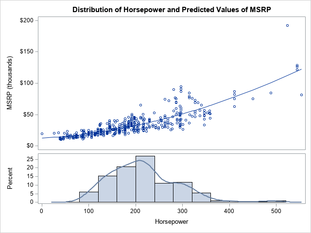
- Create a two-panel display in which the curve is in the upper panel, and the histogram is in the lower panel. This solution uses a lattice layout in GTL. An example is shown to the right. The programmer did not ask for this display, but I think it is the clearest way to visualize the data.
- Use GTL to overlay the curve and histogram in a one-panel graph. The vertical axis of the histogram is the YAXIS and the vertical axis of the curve is the Y2AXIS, which has a different scale. This solution requires GTL because a histogram and curve are not compatible plot types.
- Use PROC SGPLOT to overlay the curve and a pre-computed depiction of the histogram. To work around the issue of compatibility, you can pre-compute the bin locations and bin heights, then use a high-low plot to emulate the look of a histogram. Because a curve and a high-low plot are compatible plot types, the overlay can be accomplished in PROC SGPLOT. I learned this trick from KSharp on the SAS Support Communities.
The data for the graph
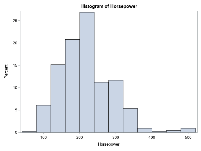
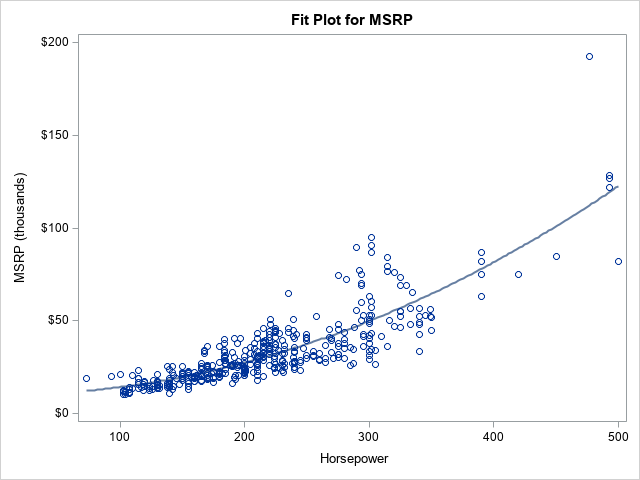
To illustrate the problem and solution, let's use data from the Sashelp.Cars data set. Let the Horsepower of the vehicles be the X variable. Let the manufacturer's suggested retail price (MSRP) be the Y variable. For the curve, use a nonlinear prediction of Y as a function of X. The following SAS DATA step extracts the data. A call to PROC SORT sorts the data according to X. A call to PROC SGPLOT creates the histogram of the X variable. You can use PROC GLM to graph the predicted Y values against X.
%let DSName = Have; %let XName = Horsepower; %let YName = MSRP; data &DSName; set Sashelp.cars; MSRP = MSRP / 1000; /* Manufacturer's suggested retail price, in thousands */ label MSRP = "MSRP (thousands)"; keep Model Make Horsepower MSRP; run; proc sort data=&DSName; by &XName; run; title "Histogram of &XName"; proc sgplot data=&DSName; histogram &XName / scale=percent; /* or use SCALE=COUNT */ run; /* fit the regression model and write Pred to data set */ proc glm data=&DSName plots=FitPlot(noclm nocli); model &YName = &XName &XName*&XName; output out=CurveOut(keep=&XName &YName Pred) predicted=Pred; quit; |
To goal of the subsequent sections is to combine the histogram and the predicted curve in a single graph that aligns the X axis.
Option 1: A two-cell graph that uses GTL
The person who requested the graph asked for an overlay of the curve and histogram. However, there might be a better way to display these data. The histogram shows the distribution of the X variable, so it is called a marginal histogram. It is common to display the marginal histogram above or below a scatter plot in a separate cell. (You can also display the marginal histogram of the Y variable by using a "sideways" histogram to the left or right of the scatter plot.)
The following GTL uses the LAYOUT LATTICE statement to specify two cells. The upper cell overlays a scatter plot and the curve of predicted values. The lower cell overlays a histogram and a kernel density estimate of the X variable. The call to PROC SGRENDER supplies the template with the data and the names of variable names that are required to render the graph.
proc template; define statgraph HistCurvePanel; dynamic _X _Y _CURVE _TITLE; begingraph / ; entrytitle halign=center _TITLE; /* a lattice that has two cells: Top is overlay of scatter/pred, botton is overlay of histogram and density */ layout lattice / rowdatarange=data columndatarange=data column2datarange=data rows=2 rowgutter=2 rowweights=(0.65 0.35); layout overlay / xaxisopts=( display=(LINE ) ); scatterplot x=_X y=_Y; seriesplot x=_X y=_CURVE / connectorder=xaxis; endlayout; layout overlay; histogram _X / binaxis=false; densityplot _X/ kernel(); endlayout; endlayout; endgraph; end; run; proc sgrender data=CurveOut template=HistCurvePanel; dynamic _X="&XName" _Y="&YName" _CURVE="Pred" _TITLE="Distribution of &XName and Predicted Values of &YName"; run; |
The graph is shown at the top of this article. This two-cell graph is a great way to visualize the data.
Option 2: A one-cell graph that uses GTL
If you want to overlay the two cells, you can do so, but it is probably wise to get rid of the scatter plot. You can remove the LAYOUT LATTICE statement to collapse the plot elements into a single cell. You then need to use the YAXIS=Y2 option to account for the different vertical scales of the histogram and curve. For clarity, I use a legend to identify the predicted curve. Lastly, I added a reference line at Y2=0, which is one way to set the minimum value of the Y2 axis to 0.
/* overlay the model and histogram in a single panel */ proc template; define statgraph HistCurveOverlay; dynamic _X _Y _CURVE _TITLE; begingraph / ; entrytitle halign=center _TITLE; layout overlay; histogram _X / binaxis=false; seriesplot x=_X y=_CURVE / yaxis=Y2 connectorder=xaxis name='curve' legendlabel="Predicted MSRP"; referenceline y=0.0 / yaxis=Y2 name='href'; discretelegend 'curve' / opaque=true border=true halign=right valign=top location=inside; endlayout; endgraph; end; run; proc sgrender data=CurveOut template=HistCurveOverlay; dynamic _X="&XName" _Y="&YName" _CURVE="Pred" _TITLE='Distribution and Predicted Values'; run; |
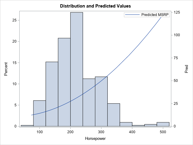
This is the graph that the programmer asked for. I prefer the two-panel graph because I try to avoid graphs that have two axes. I find them difficult to read. Nevertheless, the GTL is quite short, and the programmer seemed to like the graph.
Option 3: Emulate a histogram by using the high-low plot
Experienced SAS programmers know that you can use the HIGHLOW statement and the TYPE=BAR option to display bars in a graph. This enables you to produce complex graphs in which a bar-like chart is one feature. For example, the high-low chart is the standard way to create clinical graphs such as a swimmer plot or an adverse-event plot.
KSharp realized that this technique enables you to overlay a curve and bars. His additional insight was that you can use a SAS procedure to pre-compute the bin locations and the height of the bars, thus using the high-low plot to emulate a histogram.
Let's see how this works for our example data. I have previously shown that you can use the OUTHIST= option on the HISTOGRAM statement in PROC UNIVARIATE to create a data set that contains the bin locations and heights of a histogram. By default, the output data set contains the location of bin midpoints and the heights of each histogram bar on the count and percentage scale.
/* Summarize the histogram by using PROC UNIVARIATE: https://blogs.sas.com/content/iml/2018/12/05/histogram-table-of-counts.html */ proc univariate data=&DSName; var &XName; histogram &XName / outhistogram=UniOut; /* writes bin MIDPOINTS as _MIDPT_ */ ods select Histogram; run; proc print data=UniOut; run; |
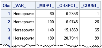
A portion of the output data set is displayed. You can see that the _MIDPTS_ variable provides the center of the bins. The height of the bins is provided by the _COUNT_ variable (bin counts) or the _OBSPCT_ variable (percentages), depending on your needs. If you need the width of the bins, it is deduced by the difference between adjacent midpoints.
It is worth mentioning that if you use the ENDPOINTS option on the HISTOGRAM statement in PROC UNIVARIATE, then the output data set will contain a variable named _MINPT_. That variable contains the left endpoint of each bin.
You can append the summarized histogram data and the data for the curve. The output from PROC UNIVARIATE specifies the top of each bar, but you must explicitly create a variable (ZERO=0) that contains the bottom of each bar. After combining the data sets, you can use the SGPLOT procedure to overlay the series and the "histogram." As before, the SERIES statement must use the Y2 axes to accommodate the different scales.
When you use the HIGHLOW statement to emulate a histogram, use the TYPE=BAR option to display the high-low plot as bars. You can use the BARWIDTH=1 option to eliminate gaps between adjacent bars. In essence, the HIGHLOW statement is emulating the "HISTOGRAMPARM" statement, which is not implemented in PROC SGPLOT.
/* combine data for series and data for "histogram". Rename X to t_X for histogram. */ data All; label Pred = "Predicted MSRP (thousands)" _ObsPct_="Percent" t_&XName="&XName"; set CurveOut UniOut(rename=(_MidPt_=t_&XName)); /* rename midpoint variable */ zero = 0; /* explicitly specify the bottom for highlow bars */ run; title "Use HIGHLOW Plot to Emulate Histogram"; title2 "Midpoints of Bins"; proc sgplot data=All; highlow x=t_&XName low=zero high=_ObsPct_ / type=bar barwidth=1; /* emulate histogramparm stmt */ series x=&XName y=Pred / curvelabel="Predicted/MSRP" splitchar="/" Y2AXIS; yaxis offsetmin=0; /* do not pad the Y axis at 0 */ y2axis min=0 offsetmin=0; run; |
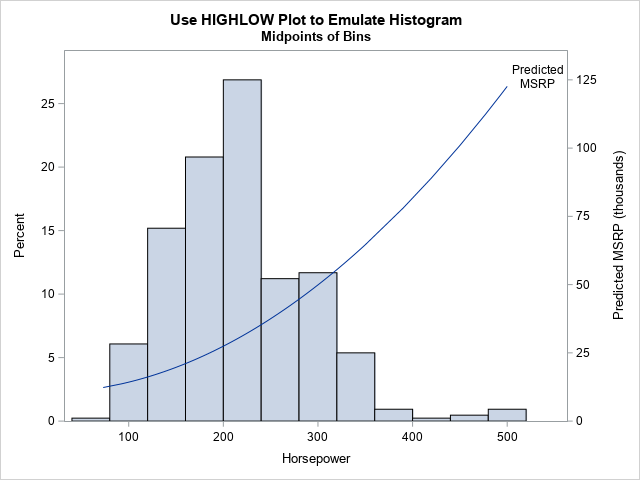
As shown from this example, the HIGHLOW statement is a powerful way to add bars to a graph that overlays several elements that have different plot types.
It is worth mentioning that if you use the ENDPOINTS option on the HISTOGRAM statement in PROC UNIVARIATE, then you need to shift the _MINPT_ values to the right by half of a bin width. The values in the X= variable are always the centers of the bars.
Summary
In a previous article, I showed how to overlay a density estimate on a histogram by using GTL. This article shows three ways to display an arbitrary curve and a histogram in the same graph when the components have different vertical scales:
- Create a two-panel display in which the curve is in one panel and the histogram is in the other. This is the clearest way to visualize the data.
- Use GTL to overlay the curve and histogram in a one-panel graph. Use the Y2 axis for the curve.
- Use the OUTHIST= option in PROC UNIVARIATE to compute the bin centers and heights. Use PROC SGPLOT to overlay the curve and an emulated histogram. You can use the HIGHLOW statement to emulate a histogram. Again, use the Y2 axis for the curve. Thanks to KSharp for this idea.
