At PharmaSUG 2014 in San Diego, I had the pleasure of attending "Swimmer Plot: Tell a Graphical Story of Your Time to Response Data Using PROC SGPLOT", by Stacey Phillips. In this paper, Stacey presented an interesting graph showing the effects of a study drug on patients' tumor size.
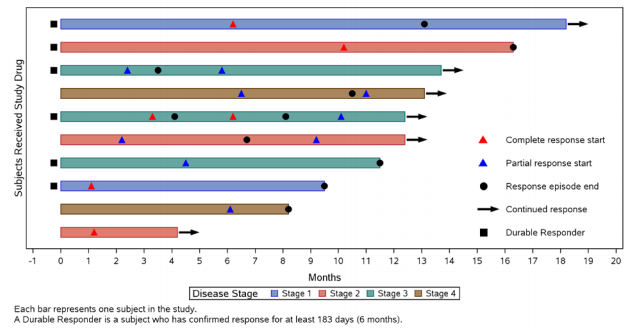 Stacey says in her paper that often "investigators prefer to dig deeper and look at an individual subject’s pattern of response. A swimmer plot is a graphical way of showing multiple pieces of a subject’s response 'story' in one glance." The final graph includes a bar showing the length of treatment duration for each patient, classified by the disease stage at baseline, one for each patient in the study. Graph also includes indicators for the start and end of each response episode, classified by complete or partial response, and an indicator showing whether the patient is a "Durable responder".
Stacey uses a combination of HBarParm, Scatter and annotations to create this graph. The annotation is used for adding the "Continued response" arrow, and for the display of the inner legend for decoding of the various symbols in the graph.
Along with many of the attendees of the presentation, I was impressed and intrigued by this visual. I was curious if its creation could be simplified using some of the new features released with SAS 9.3. In particular, I wanted to see if I could make this graph without any annotation.
 SAS 9.3 includes some versatile plot statements and features to create graphs. Two of these are the HIGHLOW plot and the Discrete Attributes Map for controlling the color of the group values.
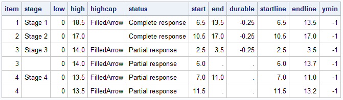
The data used to create the graph is is eyeballed from Stacey's graph and shown above. Updated graph is shown below. Click on the graph for a higher resolution image.
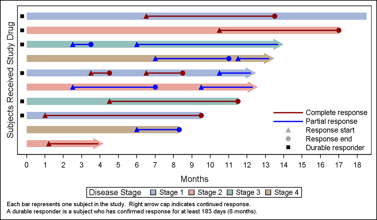 Here are the features of this graph:
- This graph uses the High Low plot to draw the bar representing the duration of the response for each subject.
- The bar has a arrow on the right side to indicate a continued response. This is explained in the 1st footnote.
- Each response episode is represented by start and end events joined by a line classified by the type of response - Complete or Partial. Connecting the start and end event and using a common classification color groups these together as one event, and is easier for the eye to consume. Continuing response does not have an end event on the right.
- All event lines and markers are included in the inner legend.
 It is also possible to place the indicator for continued event into the key legend using a "TriangleRightFilled" marker in the graph. This marker is drawn outside the plot region, but is included in the legend. Some items in the legend are shown in grey, to indicate the meaning of the shape since the actual marker will have different colors in the graph based on other criteria.
The graph on the right uses SAS 9.4 with a few aesthetic features for bar skins and filled, outlined markers. Note the shorter line segments in the legend.
Note, the marker for the right arrow in intentionally made bigger to match the right arrows of the HighCap of the HighLow plot.
SAS 9.3 Code:
footnote J=l h=0.8 'Each bar represents one subject in the study.'; footnote2 J=l h=0.8 'A durable responder is a subject who has confirmed response for at least 183 days (6 months).'; proc sgplot data= swimmer dattrmap=attrmap nocycleattrs; highlow y=item low=low high=high / highcap=highcap type=bar group=stage fill nooutline lineattrs=(color=black) name='stage' nomissinggroup transparency=0.3; highlow y=item low=startline high=endline / group=status lineattrs=(thickness=2 pattern=solid) name='status' nomissinggroup attrid=status; scatter y=item x=start / markerattrs=(symbol=trianglefilled size=8 color=darkgray) name='s' legendlabel='Response start'; scatter y=item x=end / markerattrs=(symbol=circlefilled size=8 color=darkgray) name='e' legendlabel='Response end'; scatter y=ymin x=low / markerattrs=(symbol=trianglerightfilled size=14 color=darkgray) name='x' legendlabel='Continued response '; scatter y=item x=durable / markerattrs=(symbol=squarefilled size=6 color=black) name='d' legendlabel='Durable responder'; scatter y=item x=start / markerattrs=(symbol=trianglefilled size=8) group=status attrid=status; scatter y=item x=end / markerattrs=(symbol=circlefilled size=8) group=status attrid=status; xaxis label='Months' values=(0 to 20 by 1) valueshint; yaxis reverse display=(noticks novalues noline) label='Subjects Received Study Drug' min=1; keylegend 'stage' / title='Disease Stage'; keylegend 'status' 'd' 's' 'e' 'x' / noborder location=inside position=bottomright across=1; run; |
The part that I believe makes this version easier to consume is the continuity of the response events. Joining the start and end events with a line segment, all having the same color as per the event classification allows the eye to see each event and its duration clearly.
The part I like best is the graph uses no annotation.
Full SAS 9.3 Code:Swimmer_93

17 Comments
Pingback: Swimmer Plots in Excel - Peltier Tech Blog
Pingback: CandleStick Chart - Graphically Speaking
Pingback: Clinical Graphs: Spider plot - Graphically Speaking
Is there a way to change the color of the swimmer lanes?
And is there a way to add a second title to the legend outside the graphs?
Pingback: Layers vs annotation - Graphically Speaking
Pingback: Mixing plots with different classification - Graphically Speaking
Hi Sanjay,
How to get Subject ID on each bar?
If Subject Id is available for each observation, you can create the plot with y=subjid which will be displayed on the y-axis. Or use a TEXT plot or YAxisTable to display the same somewhere in the graph aligned with the "Item' value.
Hi Sanjay,
how many bars (observations) can I add?
Best Wishes,
M. Simkovic
There is no limit. You can change the graph size to accommodate more observations.
While the HIGHLOW arrow caps look good visually, they are unreliable. From the SAS documentation: "If the length of the high-low element is smaller than the cap, then the cap is not drawn." When this happens there is no error or warning printed to the log, and indeed no way to know except for manually checking the output after each run, because the bar/arrow sizes will vary depending on how many bars are printing per page. This means that if there are any ongoing subjects with short on-study durations, this method could produce unreliable output.
I submitted this issue to the SASware Ballot Ideas exchange: https://communities.sas.com/t5/SASware-Ballot-Ideas/SGPLOT-HIGHLOW-HIGHCAP-Disappearing-bar-caps/idi-p/699633#M4261
I have number of subjects which is high hence subject numbers overlapping.
How can I split into multiple pages ?
I am using proc template with sgrender procedure.
hi,i want to know how to display while the number of subjects is more than 100?
One way to do that is to create an "index" column to break the number of subjects into groups of 10 (for example). Use this variable on a BY statement in SGPLOT. Also, specify "OPTIONS NOBYLINE;" to suppress the BY-line from appearing in the graph. Hope this helps!
Hi,
According to you, is it ok to plot the response and then the event (ending the reponse status). Exemple a complete remission until a relapse.
the aim would be to visualise time to event instead of duration of response.
Thanks.
Pingback: How to draw a swimmer plot in SAS Visual Analytics - SAS Users
Pingback: Overlay a curve on a histogram in SAS - The DO Loop