Recently I was on an email thread where someone asked how to do a swimmer plot in SAS Visual Analytics. People replied with other ways using SAS code. Though there is not a standard swimmer plot in VA, I thought it might be possible to create one with a custom graph. So I decided to give it a try.
I reviewed some related materials about the swimmer plot and discovered a useful blog post by my colleague Sanjay Matange. His post provides SAS code to generate the data used by the swimmer plot as well, making things simple. My next step was to create a swimmer plot template in SAS Graph Builder and draw the plot in SAS Visual Analytics.
Create swimmer plot template
This will be done in SAS Graph Builder, I will create a custom graph template named ‘Swimmer Plot’.
The composition of the swimmer plot template
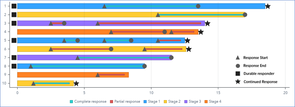
To make the Swimmer plot template, I use two schedule charts and four scatter plots, as shown below.
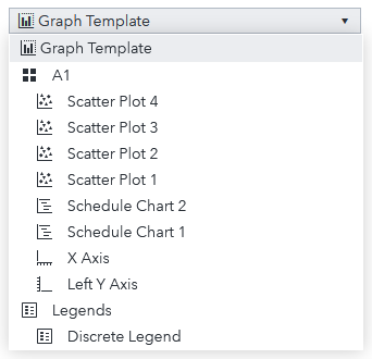
The template is made up with following charts:
a) Schedule Chart 1 will draw the High/Low bar representing the duration of each subject. It also needs to indicate the type of disease stage – Stage 1, 2, 3, 4.
b) Schedule Chart 2 will draw the Start/End line representing the duration of each response of each subject. It also needs to indicate the type of response - Complete or Partial.
c) Scatter Plot 1 will be used for the Start event, and Scatter Plot 2 for the End event.
d) Scatter Plot 3 will be used to indicate the Durable responder, and Scatter Plot 4 will show if the response is a Continued response.
Creating the swimmer plot template
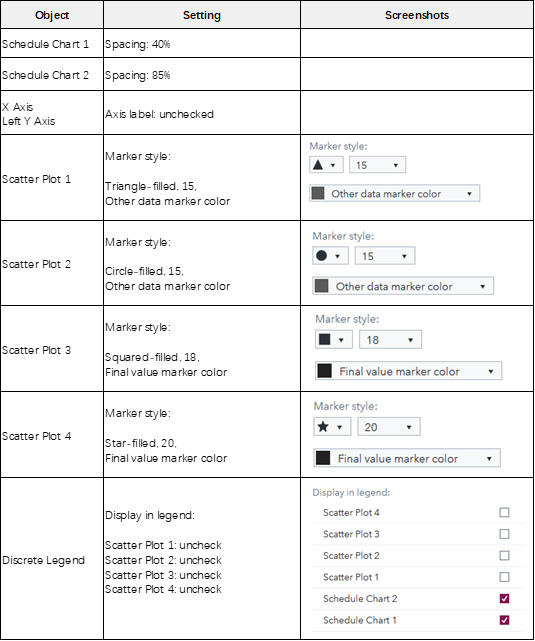
In SAS Graph Builder, drag the above plots one by one to the work area. And then perform the settings as listed for each object in the ‘Option’ pane.
Next, we need to define roles for these plots in the ‘Roles’ pane.
1 - In the ‘Shared Roles’ section, click the toolbox icon next to the role ‘Shared Role 1’. Edit the role to update the Role Name to ‘Item’ and click OK button.
2 - In the ‘Schedule Chart 1’ section:
a) Click the toolbox icon next to the role ‘Schedule Chart 1 Start’. Edit the role to update the Role Name to ‘Low’ and click OK button.
b) Click the toolbox icon next to the role ‘Schedule Chart 1 Finish’. Edit the role to update the Role Name to ‘High’ and click OK button.
c) Add role by clicking the ‘+ Add Role’ link, update the Role Name to ‘Stage’, leave the Role Type as ‘Group’, check the ‘Required’ checkbox, and click OK button.
3 - In the ‘Schedule Chart 2’ section:
a) Click the toolbox icon next to the role ‘Schedule Chart 2 Start’. Edit the role to update the Role Name to ‘Start’ and click OK button.
b) Click the toolbox icon next to the role ‘Schedule Chart 2 Finish’. Edit the role to update the Role Name to ‘Endline’ and click OK button.
c) Add role by clicking the ‘+ Add Role’ link, update the Role Name to ‘Status’, leave the Role Type as ‘Group’, check the ‘Required’ checkbox, and click OK button.
4 - In the ‘Scatter Plot 1’ section, click the toolbox icon next to ‘Scatter Plot 1 X’, and select ‘Create Shared Role with Another Role’ > ‘Start’. Update the Role Name to ‘Start’ and click OK button.
5 - In the ‘Scatter Plot 2’ section, click the toolbox icon next to ‘Scatter Plot 2 X’, and select ‘Edit Role’, update the Role Name to ‘End’, and click OK button.
6 - In the ‘Scatter Plot 3’ section, click the toolbox icon next to ‘Scatter Plot 3 X’, and select ‘Edit Role’, update the Role Name to ‘Durable’, and click OK button.
7 - In the ‘Scatter Plot 4’ section, click the toolbox icon next to ‘Scatter Plot 4 X’, and select ‘Edit Role’, update the Role Name to ‘Continued’, and click OK button.
Now I am done with the creating the template. Save it as ‘Swimmer Plot’ in ‘My Folder’.
Prepare the data for the swimmer plot
I generated the data set from the Swimmer plot codes by Sanjay and updated the missing values in the ‘Stage’ column. This will avoid the missing value shown in VA. I put the generated CSV file here. Next, I need to prepare the data so it can be directly used to draw the swimmer plot in VA.
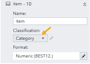
1 - Change the Classification of the ‘item’ column, from Measure to Category as shown below.
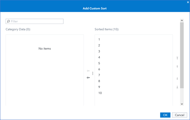
2 - Create a custom sort for the ‘item’ column. RMB the ‘item’ column in the ‘Data’ Pane and select ‘Custom sort…’ from the menu. In the ‘Add Custom Sort’ pop-up page, click the ‘Add all’ icon to have all the items sorted as below.
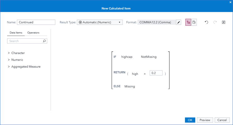
3 - Create a calculated item named ‘Continued’ as shown below, its expression is IF ( 'highcap'n NotMissing ) RETURN ( 'high'n + 0.2 ) ELSE ..
That’s all for the data preparation.
Create the swimmer plot in VA
We will first import the ‘Swimmer Plot’ template. In SAS Visual Analytics, go to the ‘Object’ pane, and click the toolbox icon. Select the ‘Import custom graph…’ from the pop-up menu and choose the ‘Swimmer Plot’ in the open dialog. Click OK button to import the graph template we just created. Now the ‘Swimmer Plot’ will be listed in the ‘Graph’ section in the ‘Object’ pane.
Next, drag the ‘Swimmer Plot’ object to canvas, and assign the corresponding data columns to the roles, SAS Visual Analytics will render the Swimmer Plot. To show more legends for the marks in the plot, I use an Image object. I put the ‘Swimmer Plot’ and the legend image in a Precision container. Now we see the chart as shown below.
Summary
With SAS Graph builder, we create the swimmer plot template using two schedule charts and four scatter plots. After importing the template in SAS Visual Analytics, we can create the swimmer plot easily by assigning corresponding data roles.

4 Comments
Thanks a lot Cindy! Why not creating a GitHub library for Custom Graphs like this one?
Thank you Maksym for the suggestion. I've put the report package for this swimmer plot at GitHub: https://github.com/sbjciw/VisualAnalytics/tree/master/CustomGraph/.
Awesome work Cindy!
Thank you Pritesh!