A HighLow plot is very popular in the financial industry, often used to track the periodic movement of a stock or some instrument or commodity. The CandleStick Chart is one specific type of high low plot, purportedly originating in Japan for tracking of financial instruments in the rice trade.
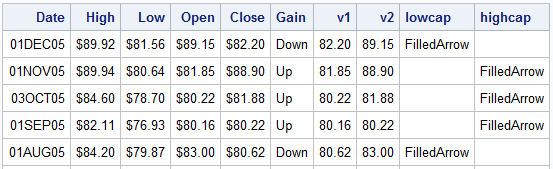
Creating a Candlestick Chart using SGPLOT procedure is very straightforward using the Highlow plot statement. In the data shown on the below, I have extracted the data for one stock, and set the group based on whether the stocked closed higher or lower than the open. Also based on the same criteria, I have set the Highcap or Lowcap variables to FilledArrow or missing. For example, if the stock closed higher than open, Gain='Up', Highcap='FilledArrow and LowCap is missing. V1 and V2 contain the low and high values for Open and Close variables.
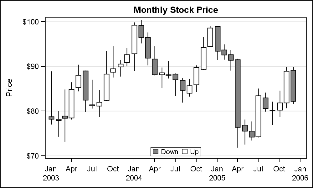 The graph on the right shows the classical Candlestick Chart. The Open and Close interval is displayed using a filled region. Line segments (shadows) are drawn to the High and Low values for each day. The fill color is white when Close > Open, and gray otherwise. Click on the graph for a higher resolution image
I have created this graph with the SGPLOT procedure using the HighLow plot statement. This statement comes in two Orientations and two Types. The syntax for the statement is as follows:
highlow X=var High=var Low=var / Type=LINE | BAR Highcap=var Lowcap=var; highlow Y=var High=var Low=var / Type=LINE | BAR Highcap=var Lowcap=var; |
Here we have used the "Vertical" orientation by setting X=Date. High and Low variable determine the vertical extents of the bar. Using Y=var sets the orientation to horizontal, and High and Low variables determine the horizontal extents of the bar. This is useful for a Adverse Event Timeline graph or my take on the Swimmer Plot. For more details on the plot statement and its uses, see the previous article HighLow Plot. In this graph I have used the following features:
- A HighLow plot of Type=LINE to draw the High-Low interval.
- A HighLow plot of Type=BAR to draw the filled region displaying the Open-Close interval.
- The second HighLow Low=V1 and High=V2 and Group=Gain to color the bar appropriately.
- I have used a discrete attributes map to define the colors for "Up" and "Down" values of gain.
SAS 9.4 Code for CandleStick Chart:
title 'Monthly Stock Price'; proc sgplot data=stock dattrmap=attrmap; highlow x=date low=low high=high / type=line; highlow x=date low=v1 high=v2 / type=bar group=gain lineattrs=(color=black) name='a' attrid=Mono; yaxis label='Price' grid; xaxis display=(nolabel); keylegend 'a' / location=inside position=bottom; run; |
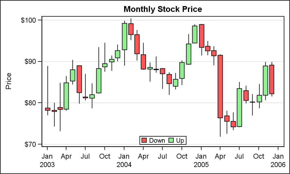 The graph on the right is a color version of the same graph, using a green shade for Gain='Up' and a red shade for Gain='Down'. The discrete attribute map is defined with two IDs, one for the monochrome graph, and one for the color graph. All I have to do is flip the attrid in the HighLow Bar statement. Legend is moved inside the graph area at the bottom since empty space exists.
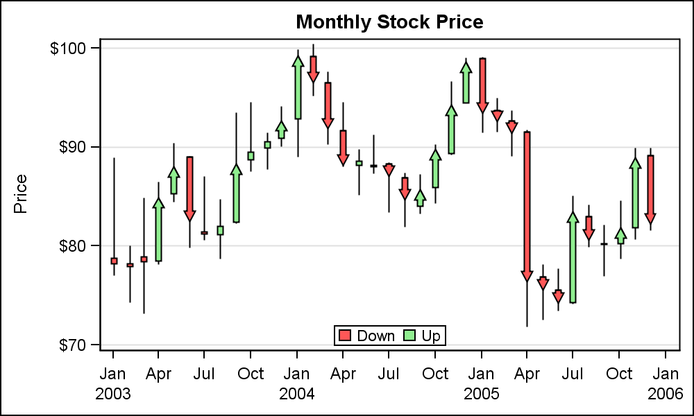 Note the data set also contains the HighCap and LowCap variables. Each has a value of "FilledArrow" or missing based on the gain. We have use these columns to make each bar have an arrow pointing up or down appropriately. Note, some intervals are too small to draw an arrow. In such cases the arrow is dropped. This is where we need your feedback. Would you like to see an option where an arrow is always drawn to indicate the direction regardless of the size of the interval?
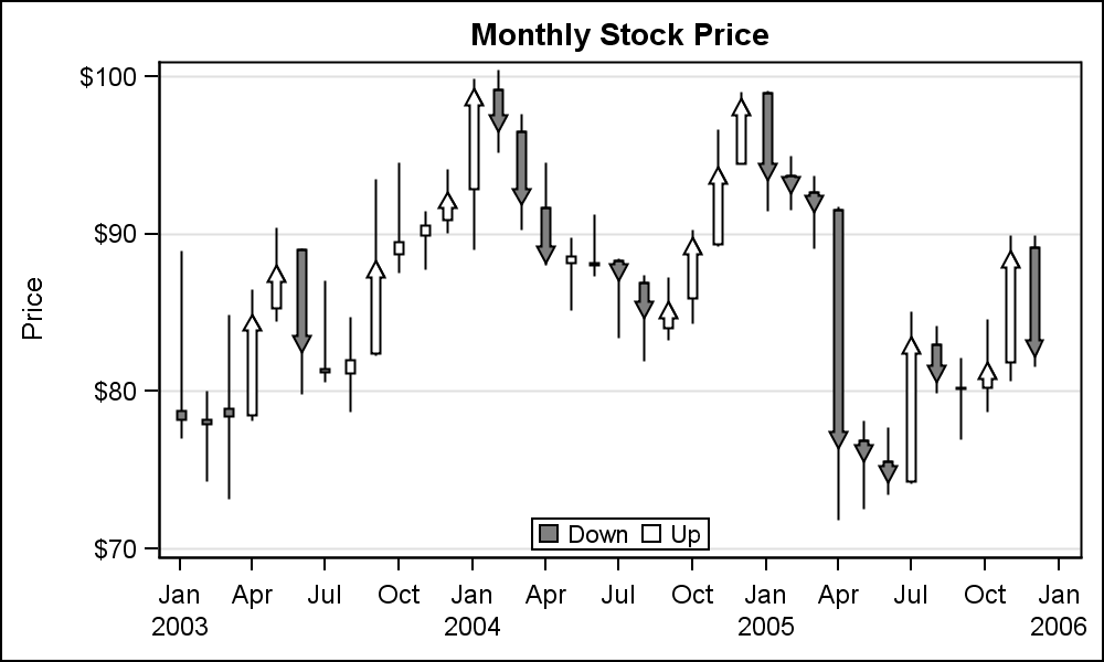 The traditional graph with directional arrows is shown to the right.
Full SAS Code: CandleStick2


3 Comments
To me, the directional arrows add nothing. The colorized bars provide the necessary directional information.
As for feedback regarding either drawing or not drawing the arrows, neither choice is satisfactory.
If the arrows are drawn when intervals are too small then, visually, the interval length is distorted. If the arrows are not drawn when intervals are too small then, visually, the direction is in error since an arrowless bar would suggest no change.
Pingback: Likert Graphs - Graphically Speaking
Pingback: CandleStick Chart with SAS 9.2 - Graphically Speaking