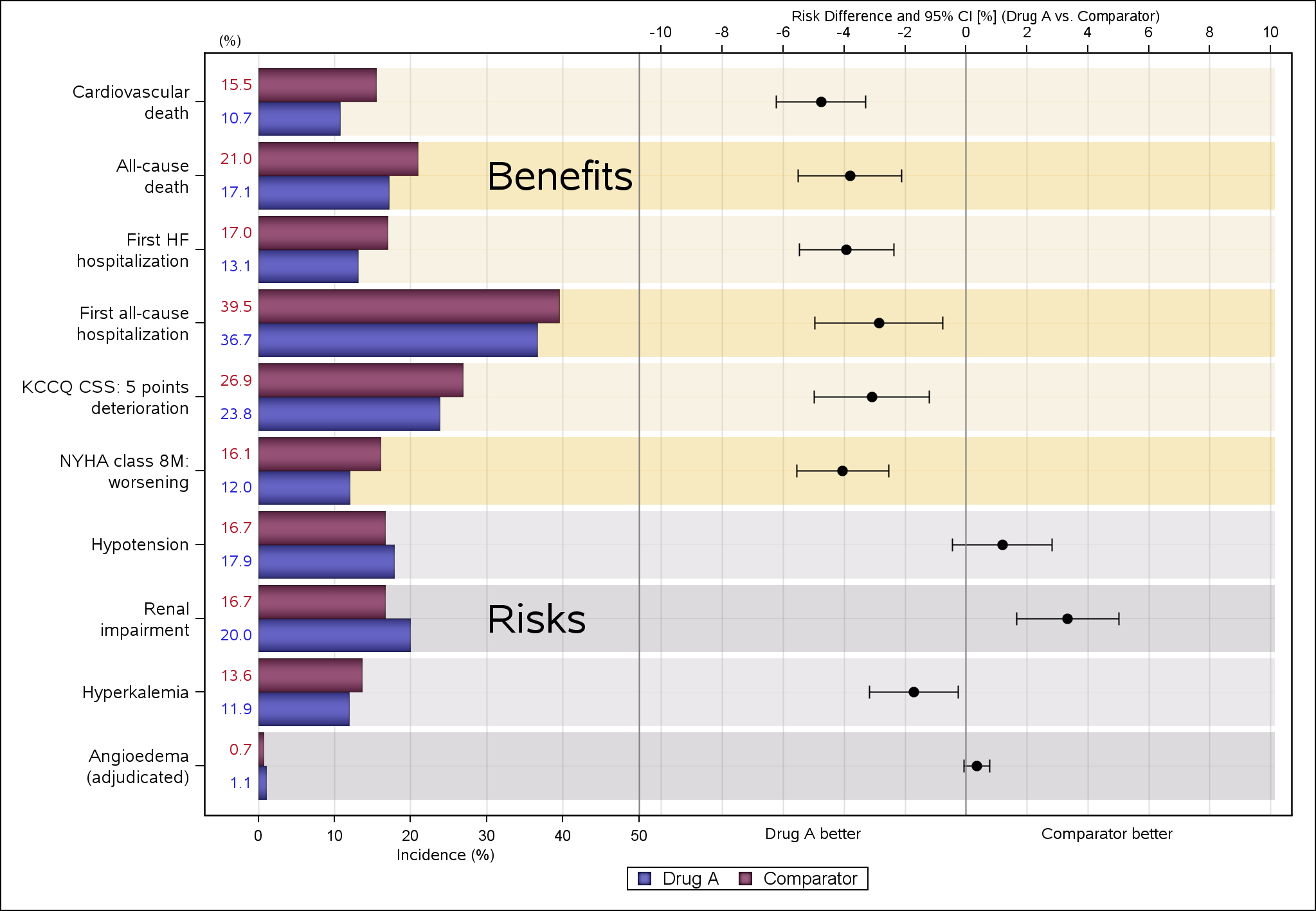
Tag: HighLow Plot

Data Visualization
Sanjay Matange 0
Stock Plots

This weekend I was reviewing my portfolio of stocks as usual.  Yes, I do have a small stock portfolio with a few stocks, and normally I use free stock charting software to review the stock plots.  These sites allow you to view the daily stock prices along with many technical

Data Visualization
Sanjay Matange 0
Polar Graph - Wind Rose

Last week I posted an article on displaying polar graph using SAS.  When the measured data (R, Theta) are in the polar coordinates as radius and angle, then this data can be easily transformed into the XY space using the simple transform shown below.     x=r*cos(theta * PI / 180);     y=r*sin(theta * PI

Data Visualization
Sanjay Matange 0
CandleStick Chart

A HighLow plot is very popular in the financial industry, often used to track the periodic movement of a stock or some instrument or commodity.  The CandleStick Chart is one specific type of high low plot, purportedly originating in Japan for tracking of financial instruments in the rice trade. Creating a

Data Visualization
Sanjay Matange 0
Swimmer plot

At PharmaSUG 2014 in San Diego, I had the pleasure of attending "Swimmer Plot: Tell a Graphical Story of Your Time to Response Data Using PROC SGPLOT", by Stacey Phillips.  In this paper, Stacey presented an interesting graph showing the effects of a study drug on patients' tumor size. Stacey

Data Visualization
Sanjay Matange 0
Grouped Timeline

Recently, a user posed a question on how to plot stacked frequencies on a time axis.  The data included frequencies of different viruses by week.  The data is modified to preserve confidentiality and is shown below. The user's first instinct was to use a bar chart with stacked groups.  This works for automatically computing frequencies

Data Visualization
Sanjay Matange 0
Schedule Chart

Last week Bruno asked about creating a Schedule Chart using SG Procedures.  To me, such projects are very interesting and challenging...How much mileage can we get out of the current set of SGPLOT procedure features to create a visual that was not part of the original requirements? The clear choice for

Data Visualization
Sanjay Matange 0
AE Timeline by Name

In my previous article on Adverse Event Timeline Graph, I wrote about how to create the AE timeline using SAS 9.2 code, using VECTOR plot and the MARKERCHAR option in SCATTER plot.  I  described a better way to place the labels at the lower end of the vectors. SAS 9.3 provides an easier way

Data Visualization
Sanjay Matange 0
Violin Plots

Over the past month or more, I have been in a conversation with SAS user James Marcus, on creation of some new displays for visual communication of uncertainty.  These include display of densities using a "Violin" plot, "Density Strips" and more.   With his permission, I can share some of the

Data Visualization
Sanjay Matange 0
Broken Y-Axis with SAS 9.2

In the previous post on Broken Y-Axis, I reviewed different ways to display data as a Bar Chart, where the response values for some categories are many orders of magnitude larger than the other values.  These tall bars force  the display of other values to be squeezed down thus making it harder to compare

Data Visualization
Sanjay Matange 0
Broken Y-Axis

Often we want to display data as a bar chart where a few observations have large values compared to the rest.  Comparison between the smaller values becomes hard as the small bars are squeezed by the tall bars.  Here is an example data, and a bar chart showing the data. The large values

Data Visualization
Sanjay Matange 0
Bar chart on interval axis

Recently, a user asked about creating a Bar Chart of Value by Date, where the dates are displayed on a scaled interval axis.   Consider this simulated data set of value by date and treatment shown below.  This data set only has one value for each date and treatment combination. We can use the VBAR statement