Here is the second installment of sample graphs from the SG Procedures book - The Adverse Event Timeline. This is a graph commonly used in patient profiles for clinical trials where we track the progress of a patient through a hospitalization event, tracking the dates and severity of the adverse events.
The data for this graph was originally in CDISC format, and was extracted and written to a data set for convenience. The data looks like this:
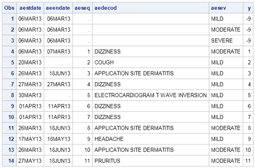
The first three observations have been added to ensure that all three severity levels are included in the graph and the legend. This data is then shaped into the format needed to create the graph, shown below. Incremental Y values is assigned to each event so we can use the Vector Plot to plot the events.
SAS 9.2 Version:
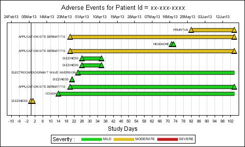
The important features of the graph are as follows:
- The data is shaped to start the Study Days from the earliest start date minus 10 days.
- The adverse event is plotted by day on the X (bottom) axis using a Vector plot.
- Markers for start and end event are plotted using Scatter plot.
- An equivalent date axis is plotted along the X2 (top) axis.
- Macro variables computed in the data step are used to correctly line up the X and X2 axes.
- The name of the adverse event is plotted on the left of the event, using a scatter plot with markerchar feature.
- The position of this label has to be computed based on graph width, length of string and font metrics (approx).
- Three dummy events are assigned Y=-9, so they fall below the range of the axis range.
SAS 9.2 SG Plot Code snippet:
title "Adverse Events for Patient Id = xx-xxx-xxxx"; proc sgplot data=ae1 noautolegend nocycleattrs; refline 0 / axis=x lineattrs=(thickness=1 color=black); /*--Draw the events--*/ vector x=endday y=y / xorigin=startday yorigin=y noarrowheads lineattrs=(thickness=9px); vector x=endday y=y / xorigin=startday yorigin=y noarrowheads lineattrs=(thickness=7px pattern=solid) transparency=0 group=aesev name='sev'; /*--Draw start and end events--*/ scatter x=aestdy y=y / markerattrs=(size=13px symbol=trianglefilled); scatter x=aestdy y=y / markerattrs=(size=9px symbol=trianglefilled) group=aesev; scatter x=aeendy y=y / markerattrs=(size=13px symbol=trianglefilled); scatter x=aeendy y=y / markerattrs=(size=9px symbol=trianglefilled) group=aesev; /*--Draw the event names--*/ scatter x=xc y=y / markerchar=aedecod; /*--Assign dummy plot to create independent X2 axis--*/ scatter x=aestdate y=y / markerattrs=(size=0) x2axis; /*--Assign axis properties data extents and offsets--*/ yaxis display=(nolabel noticks novalues) min=0; xaxis grid label='Study Days' offsetmin=0.02 offsetmax=0.02 values=(&minday10 to &maxday by 2); x2axis notimesplit display=(nolabel) offsetmin=0.02 offsetmax=0.02 values=(&mindate10 to &maxdate); /*--Draw the legend--*/ keylegend 'sev'/ title='Severity :'; run; |
Full SAS 9.2 Code: Full SAS Code_92
In the above graph, we have made use of the Vector Plot to draw the events. Also, we have to make an approximate computation for the location of the event name.
SAS 9.3 Version:
Some of the above machinations can be avoided when using the SAS 9.3, where we can use the new HighLow plot statement to display the event, along with end caps to indicate if the event continues past the duration. Also, the HighLow plot automatically draws the event label in the right location, saving us the kludged code. The coding is easier, and the resulting graph is nicer to boot.
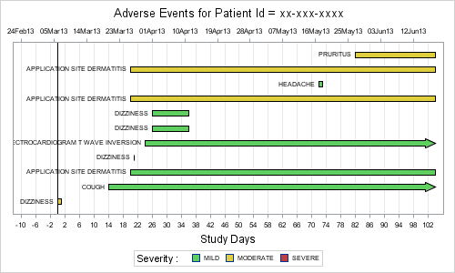
The important features of the graph are as follows:
- The data is shaped to start the Study Days from the earliest start date minus 10 days.
- The adverse event is plotted by day on the X (bottom) axis using a HighLow plot with end caps.
- An equivalent date axis is plotted along the X2 (top) axis.
- Macro variables computed in the data step are assused to correctly line up the X and X2 axes.
- The name of the adverse event is plotted on the left of the event, using the data label feature of HighLow plot
- Three dummy events are plotted outside the Y range, and attached to the legend.
SAS 9.3 SG Plot Code snippet:
title "Adverse Events for Patient Id = xx-xxx-xxxx"; proc sgplot data=ae2 noautolegend nocycleattrs; /*--Draw the events--*/ highlow y=aeseq low=stday high=enday / group=aesev lowlabel=aedecod type=bar barwidth=0.8 lineattrs=(color=black) lowcap=lcap highcap=hcap name='sev'; /*--Assign dummy plot to create independent X2 axis--*/ scatter x=aestdate y=aeseq / markerattrs=(size=0) x2axis; refline 0 / axis=x lineattrs=(thickness=1 color=black); /*--Assign axis properties data extents and offsets--*/ yaxis display=(nolabel noticks novalues) type=discrete; xaxis grid label='Study Days' offsetmin=0.02 offsetmax=0.02 values=(&minday10 to &maxday by 2); x2axis notimesplit display=(nolabel) offsetmin=0.02 offsetmax=0.02 values=(&mindate10 to &maxdate); /*--Draw the legend--*/ keylegend 'sev'/ title='Severity :'; run; |
Full SAS 9.2 Code: Full SAS Code_93
Adverse Event graphs are often used with graphs showing concomitant medications and vital signs of the patient on a uniform X axis.


10 Comments
Thanks so much for this post! I work in clinical trials and do many analysis of adverse events; this will be very useful for me!
Similarly, you can extract the medications or vital statistics data from CDISC and create a separate plot (with uniform axes), or possibly insert it into the same graph using the Y-axis split technique described earlier for the Survival Plot.
http://blogs.sas.com/content/graphicallyspeaking/2011/11/28/survival-plot-with-external-at-risk-table/
Do you have a good reference for what CDISC formatted datasets look like? Is it in your book? I can figure out how to make this type of plot with my current data, which isn't in CDISC format, but would be helpful for the future.
Thanks for your comments -- yep, I am definitely thinking of applications of this plot to other displays, especially concom meds!
There are quite a few papers on CDISC in many SGF presentations, but I am not sure I can give you any definative reference. I saw multiple separate data set, one each for adverse events, meds, vital signs, labs, all indexed by PatientId. It was relatively easy to extract the data and create the graphs. We had also carried over the adverse event reference lines into the other graphs to see the association between the event, meds and vital signs.
Thank you Sanjay for this interesting post, this blog is my go to resource for any graph related questions. Currently, I am working on a similar Adverse Events timeline graph in v9.2 and having issues with AE labels being cut off when the labels start before refline 0 (negative x axis). In your code you have started x-axis at -10, but what if the label go beyond that. After much trial and error I was not able to come up with a minday number that would work with all subjects. Is there a option that takes care of this or is the label position just an approximate number that may not necessarily work for all cases?
The -10 value comes from a user who wanted the timeline start from x=-10 days. I am not sure what the reason was for this setting however it is not set based on the length of the AE event name. In my example, it just seemed to work. When using the scatterplot with markercharacter, the text is centered on the data position. So, we need to compute this position based on AE name length, font size, graph width and data range. Some approximation comes in as the "plot" width is smaller than the graph width due to the axis offsets, etc. Clipping happens because we are setting OFFSETMIN. If you don't set the OFFSETMIN on the axes, the system will automatically create space, but it may add half the longest label length to both sides, thus shrinking the plot area.
With SAS 9.2, one option may be to put the AE names on the Y-axis labels if it is acceptable. Though I do understand it is preferable to put the names closer to the event. While no direct option comes to mind, we could try some other possibilites. One is use the scatter plot datalabel option (instead of markerchar), and disable the collision avoidance (set ods graphics / labelmax=1). This still draws the labels, but turns off the collision avoidance, thus labeling each marker at top right, near the marker. If it is acceptable to have the label offset a bit to upper right, this may be an option.
Another option is to see if you can compute a good value for OFFSETMIN. Half the longest label length, approximately converted to a fraction of axis length would be a conservative start.
Actually, this exercise led us to realize we needed a better way to do this. 🙂 At SAS 9.3, you have easier ways to do this, including scatterplot data label that can be positioned to left / right of marker position (without collision avoidance), or even better, using the HighLow plot. Also, annotation is supported to provide even more flexibility. I am glad you find the blog aricles useful, and the above information helps some. Any chance you can move to SAS 9.3?.
Pingback: Adverse event timeline – revisited - Graphically Speaking
Pingback: URL
Pingback: A Better AE Timeline - Graphically Speaking
Thanks Sanjay for providing both SAS 9.2 and 9.3 examples! This is helpful. Sunil