Football has finally come home for the England women’s football team. Now we need a nation of lions and lionesses willing to roar the tones of the lightning seeds. Does anybody know the words?
It’s a shame Ella’s goal was not the winner as it was well worthy of winning any game. As she ‘dinked it’ over the keeper in her all-white England strip, I thought how there was no better time to put pen to paper on a data visualisation blog.

The data-to-ink ratio
I’ve never heard of anybody shortening the ‘data to ink ratio’ to simply ‘dink ratio’. In the absence of a TikTok account, it’s something I may use to prove I am still cool, having entered my thirties this year.
The data-to-ink ratio concept was created by Edward Tufte and encouraged those in the field to focus the graphic on showing the data points themselves in the cleanest way. Rather than the supplementary information which supports it. In his own words, “above all else, show the data”.
What has this got to do with ink?
Edward Tufte’s work predates the widescale adoption of the personal computer. When individuals were tasked with displaying data through pen and paper, they typically started with a white piece of paper. The pen would touch the page every time to add detail to the graph. This could be to draw the graph data points (bars, lines etc.), axis, legend, or titles. You can think of yourselves as artists, as Picasso’s blank canvas would also be white when creating a masterpiece.
Fast forward 40 years
More recently, we have access to tools enabling us to visualise data quickly. As standard, graphs are displayed with lots of ‘ink’. It isn’t required. Adding these to your data visualisation is a distraction from the data itself. We graphically present data so our brains can concisely interpret large amounts of data. Therefore, we should make it easy for our brains to process that information in the quickest possible way. We should provide a critical approach to assess which components are needed. Any components that can be easily discarded without losing much from the data's overall message can be termed ‘visual clutter’.
In practice
I made two quick graphics using a tool very accessible from my PC this morning. Both graphics display the same data, which is, in fact, based on whether my colleagues have paid a £10 deposit for our office Christmas party. It’s never too early to start planning.
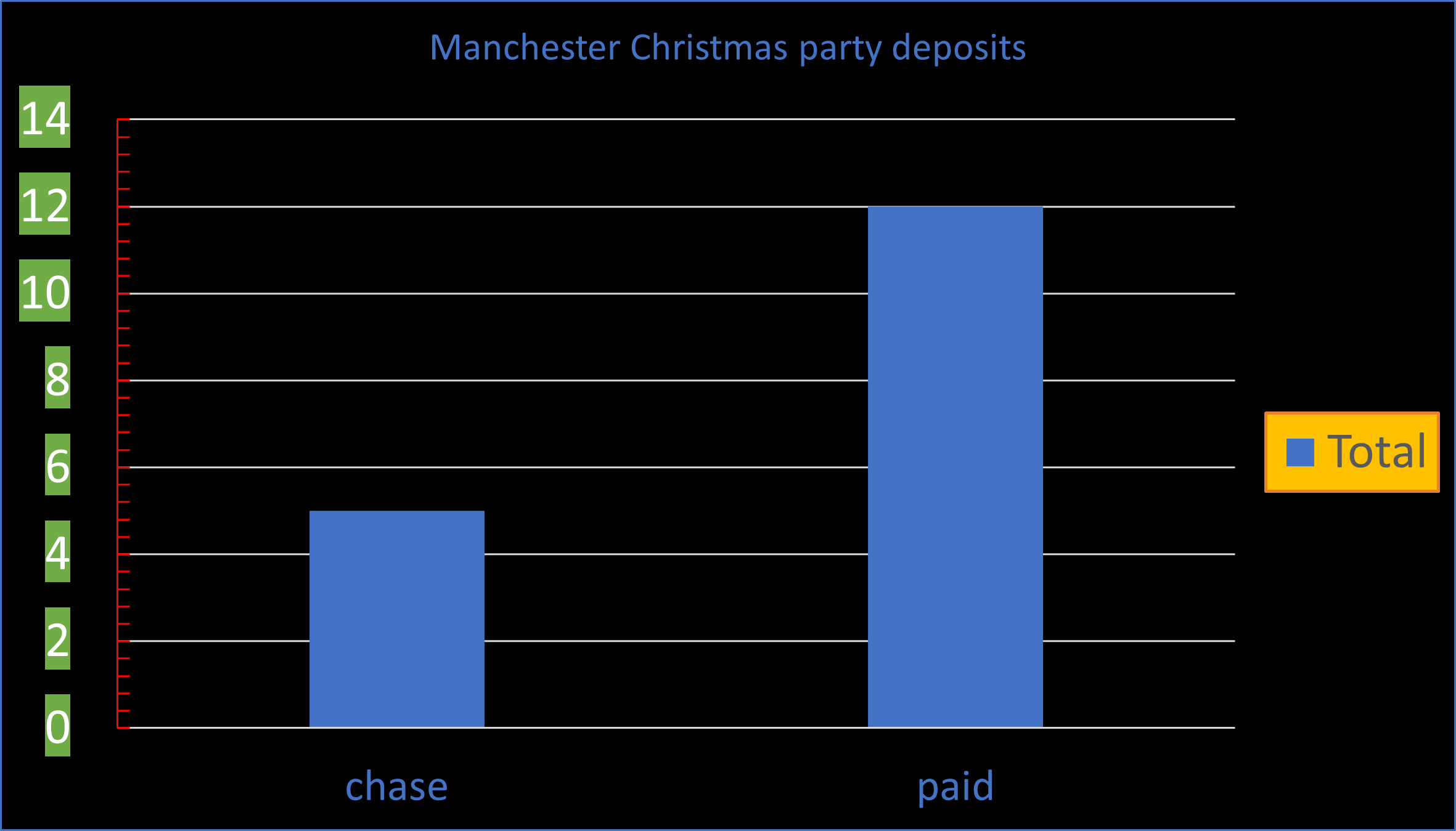
I have, of course, made this monstrosity to emphasise my point. How could I refine this to clarify the data (bars on the chart)? I may evaluate myself with some of the below questions.
- Where are my eyes drawn to when I see this for the first time?
- Is it the data?
- What is the black background adding?
- What would I assume the data label to be if the legend wasn't there?
- Do I need my Y axis to be labelled every two units?
- Does my Y axis require colour?
- What are my minor tickmarks on the inside adding?
- Do I need gridlines every two units?
- Do I need gridlines at all?
- Could the accompanying text be digested if it was smaller?
On reflection, I may choose to adjust some of these components to get to the answer quicker. As always, you should ask yourself; what is the question being answered with this data visualisation?
In my case – I need to know what proportion of people require chasing for their deposits to decide whether to make the booking while personally absorbing some of the risks.
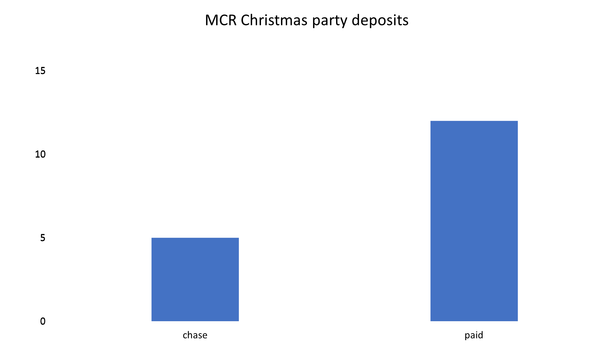
Quite clearly, I can see that I have five colleagues that I need to chase, but over ten have paid. This means that I’m waiting for under a third of the deposits. My eyes aren’t distracted from some of the visual clutter I have stripped out. Could I have gotten rid of the data labels? The Y-axis scale? The title? No, because they are required for context. I have been able to shorten my title in an abbreviation that I regard as acceptable and transparent. As all the text is smaller, a more significant proportion of the graphic displays the data.
Everybody works with or has worked with that colleague who takes an age to tell a story that can be summarised into one sentence. Perhaps you have also wasted time reading pages and pages on an email that would have been better with a few concise bullet points. By condensing this information efficiently, we can do more in a shorter space of time. Data visualisation should be thought of in the same way so that the data displayed can be interpreted without confusion.
So how do I bring it back to our triumphant Lionesses? Our ladies are the first England team to win a major tournament donning their white home strip. I hope you now appreciate that white is the best basis to build on for data visualisation. Only critical graphics can be layered on top, delivering high value towards its interpretation. Data visualisation? It’s coming home!
SAS Visual Analytics provides an intuitive interface, allowing you to create high impact reports to communicate your data effectively.


6 Comments
Greetings, I loved your blog!
Thank you Ander!
Incredible article! I congratulate you for this great work.
Many thanks Nicol!
If the goal of the chart is to know exactly how many have paid and not paid, I would recommend putting a label at the top of each bar showing that number.
Anybody using SAS for data visualization might be interested in the forthcoming book from Apress:
"Visual Data Insights Using SAS ODS Graphics: A Guide to Communication-Effective Data Visualization".
The author has written about communication-effective graphics for SAS users conferences since the early 1990's
Though the book provides how-to information for SAS ODS Graphics users,
the book's design guidelines apply to any graphic / data visualization tool,
whether it is SAS Visual Analytics, Excel, or Tableau.
The first two chapters are really software-independent:
Principles of Communication-Effective Graphic Design
Principles of Communication-Effective Use of Color