Real-world data often exhibits extreme skewness. It is not unusual to have data span many orders of magnitude. Classic examples are the distributions of incomes (impoverished and billionaires) and population sizes (small countries and populous nations). The readership of books and blog posts show a similar distribution, which is sometimes called the 80-20 rule or the Pareto principle. In these situations, a traditional histogram can be insufficient to visualize the distribution. For these examples, the X axis will be very long, and the tallest bars will be on the left side of the axis, as shown in the histogram to the right. In this histogram, the bars on the left side are so tall that you cannot even see the other bars.
What to do? Well, the usual advice to visualize data that extends over several order of magnitudes is to use a logarithmic transformation. This article shows three methods to visualize log-transformed values in a histogram in SAS:
- Use constant bins in X but log-scale the X axis. In this technique, the histogram bins appear to be nonuniform in width. Bins on the left side of the X axis appear wider than bins on the right side of the X axis.
- Manually log-transform the data, then construct a histogram of the transformed data. This produces a histogram that looks simple but can be hard to interpret. The bins are the same width for the scaled data but are not uniform on the scale of the original data. It can be useful to manually modify the tick values on the X axis if you want the reader to see the original (pre-transformed) data values.
- If the X axis is acceptable but you want to adjust the heights of the bars, you can log-transform the vertical axis (Frequency or Counts).
Example data that needs to be log-transformed
For this article, we will use simulated data from a mixture of three exponential distributions. This simulation generates data that looks similar to data for "views of articles on my blog" during a one-year period. The following SAS DATA step simulates the data, displays descriptive statistics, and displays a histogram of the data.
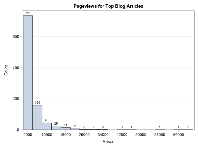
/* simulate data from a mixture of three exponential distributions */ data Counts; call streaminit(123); do i = 1 to 1100; if i < 800 then scale=2000; else if i < 1000 then scale = 5000; else scale = 14000; Views = int( rand("Expo", scale) ); if Views > 200 then output; end; drop i; run; proc means data=Counts; var Views; run; title "Pageviews for Top Blog Articles"; proc sgplot data=Counts; histogram Views / datalabel binwidth=4000 binstart=2000 scale=count; yaxis grid; run; |
The table shows that the least popular post got only 202 views. The most popular post got over 70,000 views. The histogram is shown at the top of this article. It shows the highly skewed distribution of views. The first bar shows that about 70% of the articles got between 0 and 4,000 annual views. There are 21 articles that got more than 20,000 views, but the bars on the right side of the histogram are basically invisible because the first bar is so tall. The following sections show three ways to modify the graph.
Log-scale X axis
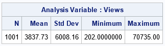
One option is to choose histograms bins to be a constant width on the data scale but display the X axis by using a log-scale transformation. on the log scale, the bins on the left side of the X axis appear wider than bins on the right side of the X axis.
If you do this, you must make sure that X=0 is to the left of all bars. Otherwise, PROC SGPLOT will issue the error, "NOTE: The log axis cannot support zero or negative values for the axis from plot data.... The axis type will be changed to LINEAR." In the following example, I use the BINWIDTH= and BINSTART= options to ensure that all bars are to the right of 0. (Recall that Views>200 for these data.) With that change, I can use the TYPE=LOG and LOGBASE=10 options to apply a LOG10 transformation to the horizontal values of the graph:
title "Constant Bin Widths on a Log Scale"; proc sgplot data=Counts; histogram Views / binwidth=2000 binstart=1100; xaxis type=log logbase=10 label="Views (log10 spacing)"; yaxis grid; run; |
I'm not fond of this graph. Even data visualization experts would find it unfamiliar, and trying to explain it to a nonexpert would be a challenge. I do not recommend this approach.
Log-transform the data
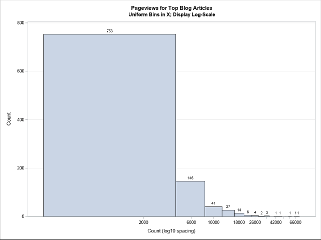
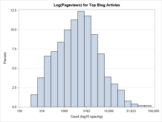
Instead of using uniform-width bins in the data coordinates, I prefer to manually log-transform the data and then create a histogram in the transformed coordinates. The following SAS DATA step computes the LOG10 value of the Views variable. Although all the Views in this example are positive, I include an IF-THEN statement that ensures that the program does not transform any nonpositive value. This is a good programming practice. A histogram then visualizes the distribution of the new variable:
/* Log-transform the X values and use non-constant bins */ data Pg / view=Pg; set Counts; if Views <= 0 then log10Count = .; else log10Count = log10(Views); run; title "Log(Pageviews) for Top Blog Articles"; proc sgplot data=Pg; histogram log10Count; xaxis label="log10(Count)" values=(2 to 5 by 0.5); yaxis grid; run; |
To be clear, not everyone would be able to interpret what this histogram reveals about the original data. Furthermore, some audiences might struggle to recall their high school math classes where they learned that log10(Views)=3 implies that Views=1,000, that log10(Views)=4 implies that Views=10,000, and so forth. One way to address the second issue is to create a set of custom tick marks for the X axis that show the scale of the original data, as follows:
/* Create custom tick values: https://blogs.sas.com/content/iml/2014/07/11/create-custom-tick-marks.html */ title "Log(Pageviews) for Top Blog Articles"; proc sgplot data=Pg; histogram log10Count; xaxis label="Count (log10 spacing)" values=(2 to 5 by 0.5) valuesdisplay=('100' '316' '1000' '3162' '10,000' '31,623' '100,000' ); yaxis grid; run; |
Log-transform the vertical axis (counts)
For some graphs, it is not the X variable that is the problem, it is the distribution of counts. If one or two bins contain most of the counts, then one option to visualize the data is to log-transform the Y axis. That is, display the log-counts for each bin. For some data, you can do this by using the TYPE=LOG option on the YAXIS statement in PROC SGPLOT.
Unfortunately, this simple modification is not possible for these data. To log-transform an axis, we must ensure that 0 is not included in the range of the axis. This example has bins that have zero counts. For data like these, you cannot transform the Y axis simply by using the TYPE=LOG option.
However, you can use a trick to overcome this issue. I have previously shown how you can use PROC UNIVARIATE to output the histogram bins and counts to a SAS data set. (See the section, "A trick to replace the histogram by a high-low plot" in a previous article.) You can then use a high-low plot (same reference) to emulate the histogram. This technique can be used here: for bins that have a nonzero count, apply the log-transformation; for bins that have zero count, set a missing value for the log-count. This is implemented in the following statements:
/* use high-low plot instead of histogram: See last section of https://blogs.sas.com/content/iml/2023/05/01/overlay-curve-histogram-sas.html */ proc univariate data=Counts; ods select histogram; histogram Views / vscale=count outhist=HistOut midpoints=(2000 to 72000 by 4000); run; data LogYScale; set HistOut; Zero = 0; /* explicitly specify the bottom for highlow bars */ if _Count_=0 then LogCount = .; else LogCount = log10(_Count_); run; title "Use HIGHLOW Plot to Emulate Histogram"; title2 "Midpoints of Bins"; proc sgplot data=LogYScale; highlow x=_MidPt_ low=zero high=LogCount / type=bar barwidth=1; /* emulate histogramparm stmt */ /* use same tick range as for midpoints= option in PROC UNIVARIATE */ xaxis values=(2000 to 72000 by 4000) valueshint; /* do not pad the Y axis at 0 */ yaxis offsetmin=0 grid label="Log10(Count)"; run; |
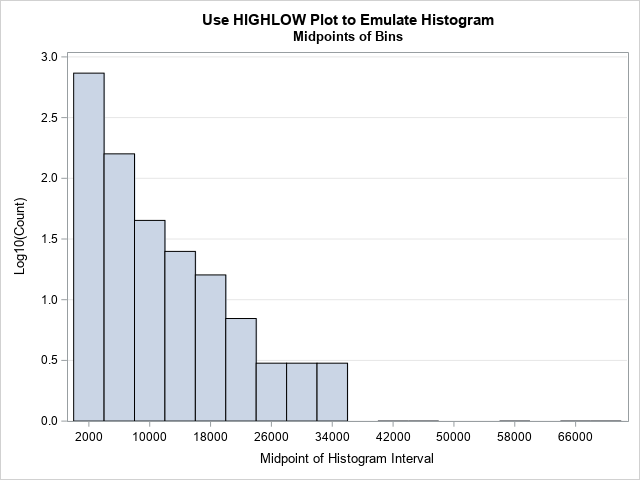
Notice the difference between this graph and the previous. In this graph, I have not transformed the X axis. The bins are all the same width on the data scale. What is different is the Y axis. This now shows the log(Count). As before, if your audience does not recall that log10(Count)=2 means that Count=100, you can replace the ticks on the Y axis with numbers like 10, 32, and 100.
Summary
When a data distribution is extremely skewed and has a long tail, you might want to use a log-transformation to visualize the distribution. There are two approaches: Use constant-width bins in the data scale or use constant-width bins in the log-transformed scale. The first results in a graph that appears to have non-uniform bins. The second results in a standard histogram for the log-transformed data. I prefer the second method.
A related issue is that sometimes the histogram is dominated by one or two extremely tall bars, which makes it impossible to see the distribution of the rest of the data values. One option is to log-transform the Y axis. If there are bins that have zero counts, you must use a little extra care to handle those bins.
Further reading
Several ideas in this article have been discussed previously. For more information about plotting data on a log-scale scale, see the following:
- How to construct scatter plots that have logarithmic axes.
- How to construct a bar chart where the response variable (Y axis) is displayed on a log scale.
- Sanjay's thoughts on how to construct a histogram of log-transformed data.
- In some cases, you can omit the log-scale and instead use a "broken axis" to show one or two extreme values.

1 Comment
Pingback: Blog posts from 2023 that deserve a second look - The DO Loop