In a previous article, I presented some of the most popular blog posts from 2023. The popular articles tend to discuss elementary topics that have broad appeal. However, I also wrote many technical articles about advanced topics. The following articles didn't make the Top 10 list, but they deserve a second look.
In the classic Christmas movie, Elf, Buddy the Elf explains that "elves try to stick to the four main food groups: candy, candy canes, candy corns and syrup." It's a funny line because, to a non-elf, these all seem like the same thing: sugar, and lots of it! Similarly, I have organized the blog posts into four main groups: statistics, statistical graphics, statistical programming, and SAS. If these groups seem like "computational statistics, and lots of it," I will not attempt to dissuade you.
Statistics (and probability)
Sometimes I read a journal article or book that is so interesting, I feel compelled to share the idea and show how to implement it in SAS.
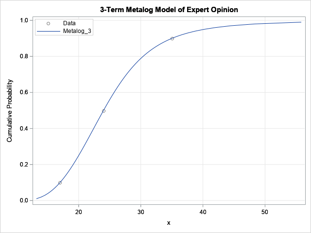
- The metalog distribution: The metalog distribution is a new family of flexible distributions that can fit a model to a wide range of empirical data distributions. Read an overview of the metalog distribution, then learn how to fit the metalog distribution in SAS. A useful application of the metalog distribution is to fit a distribution to an expert's estimate of quantiles.
- The Wald confidence interval for a binomial proportion: The Wald confidence interval (CI) is often used to estimate a CI for a binomial proportion. However, the documentation for PROC FREQ in SAS states "the Wilson interval has ... better performance than the Wald interval." This article discusses a TAS article by Andersson (2023) and demonstrates that the standard two-sided Wald interval is poor quality compared to Wilson's CI.
- The exact Wilcoxon test: Wilcoxon's signed rank test is a popular nonparametric alternative to a paired t test. Different software packages (such as SAS and R) use different test statistics. This article explains why the different Wilcoxon test statistics are equivalent. Furthermore, I show how to use the %SIGNEDRANK macro (Leuchs and Neuhäuser, 2010) to compute exact one-sided and two-sided Wilcoxon tests.
Statistical graphics
I have written many articles about statistical graphics and recently wrote an article about 10 tips for creating effective statistical graphics. In addition, the following articles on statistical graphics show how to create interesting graphs:
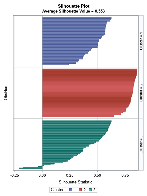
- Silhouette plots: The silhouette statistic (Rousseeuw, 1987) identifies observations in a cluster analysis that are potentially misclassified. The silhouette plot is a panel of bar charts (or histograms) that displays the distribution of the silhouette statistic for each cluster and enables you to assess the overall fit for the clustering method.
- Log-scale histogram: Histograms estimate the probability density for a variable. If the variable spans several orders of magnitudes, you can use a log-scale for the horizontal axis of a histogram. If the bin counts span several orders of magnitude, you can use a log-scale for the vertical axis. Both situations are potentially confusing and should be handled with care. This article discusses the advantages and potential pitfalls of a log-scale histogram.
- Prediction intervals in regression models: Although many SAS regression procedures create a confidence band for the predicted value of a regression model, if you use bootstrapping or another estimation method, you might need to manually create a graph that visualizes the prediction limits. This article shows how to visualize confidence limits for the predicted mean in a regression model.
Statistical programming
One of the goals of my blog is to show readers how to compute quantities or estimate statistics that are not directly obtainable by calling a SAS procedure. This requires writing programs. Although the SAS DATA step and PROC FCMP are powerful tools, for advanced programming, I use the SAS IML language, which enables high-level matrix-vector programming.
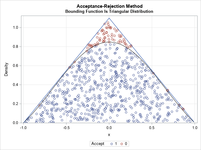
- The envelope method for acceptance-rejection sampling: The acceptance-rejection method (sometimes called rejection sampling) is a method that enables you to generate a random sample from an arbitrary distribution by using only the probability density function. If the acceptance rate is low, it can take a long time to generate a random sample. A well-chosen envelope function can greatly improve the efficiency of the acceptance-rejection method for simulating data.
- Standard error for a maximum likelihood estimate: Maximum likelihood estimation (MLE) is a general technique for fitting a model to data. The parameter estimates are obtained by using numerical optimization to maximize the log-likelihood function. To obtain the standard error of the estimates, you can use the Hessian at the MLE solution.
- Bivariate normal probabilities: Learn how to evaluate the standard bivariate cumulative normal distribution with correlation ρ over any rectangular region of the plane. This gives the probability that a random bivariate normal variate is observed in the region.
SAS
Almost every article I write includes some sort of SAS programming. Sometimes the task requires a bit of ingenuity to combine several techniques.
- Add an inset to a graph: In SAS, the term inset is used to describe a table that is displayed on a graph. This article shows four different ways to display a table of statistics on a graph in SAS.
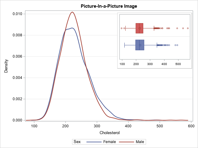
- A graph in a graph: Did you know that you can embed one graph inside another by using PROC SGPLOT in SAS? The trick is to save one graph as an image file, then use the SG annotation macros to insert the image into a second graph.
- Use Git to share SAS programs: I routinely use Git to share SAS programs. Although my main use is to share libraries of SAS IML functions, you can use them to share macros, templates, or any other snippets of SAS code.
Your turn
Did I omit one of your favorite blog posts from The DO Loop in 2023? If so, leave a comment and tell me what topic you found interesting or useful.
