A SAS programmer wanted to use PROC SGPLOT in SAS to visualize a regression model. The programmer wanted to visualize confidence limits for the predicted mean at certain values of the explanatory variable. This article shows two options for adding confidence limits to a scatter plot. You can use a SCATTER statement with the YERRORLOWER= and YERRORUPPER= options, or you can use a HIGHLOW statement. For the first option, you might need to modify default legend items. One way to modify a legend is to use the LEGENDITEM statement, which is a powerful statement that deserves to be known more widely among SAS programmers.
Visualizing confidence limits on a scatter plot
By using ODS graphics and the PLOTS= option, SAS regression procedures can automatically create graphical visualizations of regression models. In addition, you can use PROC PLM to create many regression graphics. So, if you want to visualize a regression model, you should check whether your regression procedure supports a built-in visualization. For example, the following simple linear regression model can be fit and visualized by using the PLOTS= option on the PROC REG statement:
/* create a small example data set */ data sample(keep=x y); set Sashelp.Class(rename=(Weight=Y Height=X)); /* rename to make roles easier to understand */ run; /* The PLOTS= option in PROC REG give one visualization of the CLM */ proc reg data=Sample plots=FitPlot(nocli); model Y = X; output out=RegOut Pred=Pred LCLM=LowerP UCLM=UpperP; /* save observation-wise statistics */ run; quit; |
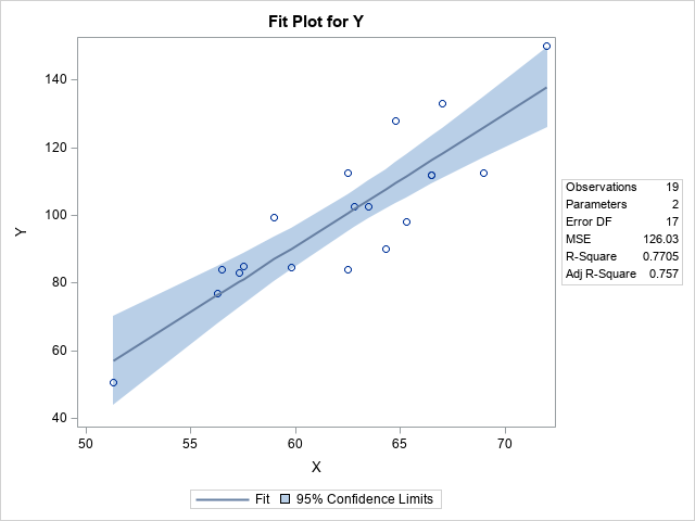
The graph overlays the original (x,y) data with a line that shows the predicted mean for each X value. The graph also shows a band that shows the 95% confidence intervals for the conditional mean of Y at every value of X. This band is computed by using a theoretical model that assumes the model is correctly specified and that the residual errors are independent, homogeneous, and normally distributed.
There are other ways to estimate confidence intervals, such as bootstrap intervals. If you compute alternative confidence intervals, you can display them by using PROC SGPLOT. You can visualize confidence intervals as "error bars" in two ways, which we describe in the following sections.
Plotting confidence intervals by using error bars
To keep the discussion focused on graphics (not statistics), let's see how to display the confidence limits that are created by PROC REG when you use the OUTPUT statement and the LCLM= and UCLM= options. For each X value in the data, you get the predicted value of the model and a 95% confidence interval (CI) for the conditional mean of Y|X. The following call to PROC SGPLOT uses a SERIES statement to plot the regression line and uses the SCATTER statement with the YERRORLOWER= and YERRORUPPER= options to display the confidence intervals at the measured values of X. When you use the SERIES statement, the data must be sorted by X.
/* Sort by X variable for plotting with the SERIES statement */ proc sort data=RegOut; by X; run; /* Plot the CLM at each value of X */ title "Prediction and CLM for Regression Model"; proc sgplot data=RegOut; scatter x=x y=y; /* (x,y) data values */ series x=x y=Pred; /* regression line */ scatter x=x y=Pred / yerrorlower=LowerP yerrorupper=UpperP; /* CLM */ run; |
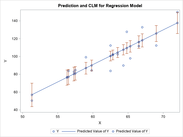
This graph displays confidence intervals for the predicted mean at each X location in the data. The interval is centered at the point (x, m(x)), where m(x) is the predicted mean at x.
If you study the graph, you will see that it can be improved in two ways. First, each CI has a marker at its center, which is on the regression line. The marker is dark green, but it is hard to distinguish the dark green markers from the blue markers used to represent the observed data. Consequently, the centers of the CIs look like they are additional data points. Second, the legend is confusing. The legend item for the confidence intervals displays a green marker and the label "Predicted Value of Y." I would rather see a reddish line segment and a more informative label.
You can fix both issues. You can use the SIZE=0 option to make the green markers invisible. You can use the LEGENDITEM statement to customize the legend so that it shows a line segment instead of a marker for the CIs. While we are improving the legend, let's also use the LEGENDLABEL= option to improve the other items in the legend, as follows:
/* use LEGENDITEM to improve legend; also set SIZE=0 for CI centers */ title2 "Use SCATTER Statement to Create Error Bars"; proc sgplot data=RegOut; scatter x=x y=y / name="Obs" legendlabel="Observed"; series x=x y=Pred / name="Pred" legendlabel="Predicted"; scatter x=x y=Pred / yerrorlower=LowerP yerrorupper=UpperP markerattrs=(size=0); legenditem type=line name="CLM" / label="CLM" lineattrs=GraphError; keylegend "Obs" "Pred" "CLM"; run; |
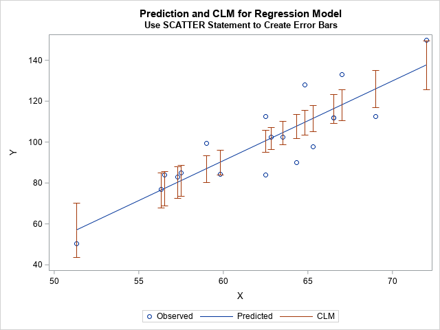
This visualization is much improved. The legend clearly labels the three elements in the plot. The CIs are represented as line segments in the graph and in the legend.
Plotting confidence intervals by using a high-low plot
In the previous graph, we had to use the SIZE=0 option to make remove markers from the CIs. If we do not want the markers, perhaps it is better not to use the SCATTER statement. An alternative is to use the HIGHLOW statement, which enables you to plot line segments. If you use the HIGHLOW statement, then you do not need to use the LEGENDITEM statement because the legend knows to display a line segment for the CIs:
/* Plot the CLM at each value of X */ title2 "Use HIGHLOW Statement to Create Error Bars"; proc sgplot data=RegOut; scatter x=x y=y / legendlabel="Observed"; series x=x y=Pred / legendlabel="Predicted"; highlow x=x low=LowerP high=UpperP / legendlabel="CLM" lowcap=serif highcap=serif lineattrs=GraphError; yaxis label="Y"; run; |
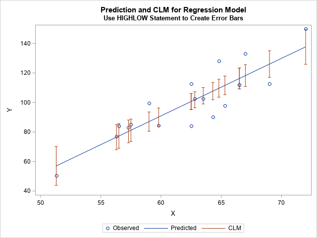
This graph looks like the previous graph, but it is easier to construct.
Summary
SAS regression procedures have built-in options to visualize regression models, including theoretical confidence bands for the predicted mean. In some situations, it is useful to display confidence intervals for the mean at certain values of the X variable. You can do this in two ways. The first uses a SCATTER statement and the YERRORLOWER= and YERRORUPPER= options. However, if you use the SCATTER statement, you need to modify the legend by using the LEGENDITEM statement. An alternative is to use a HIGHLOW statement. The HIGHLOW statement is easier to use, and you do not need to modify the resulting legend.
This article also shows how to use the LEGENDITEM statement, which is a powerful statement for customizing legends.

1 Comment
Pingback: Blog posts from 2023 that deserve a second look - The DO Loop