Often there are questions from users on creating histogram using a Log X axis. One such question came up this weekend, where a user wanted a histogram of her data using log axis. Before we get into her specific case, let us first clarify what we may want to see when we say "Histogram on Log Axis". This could mean one of these two cases:
1. Histogram of the linear values, displayed on a log x axis. This histogram has equal width bins in linear data space. When displayed on a log axis, the bins are drawn with varying pixel width.
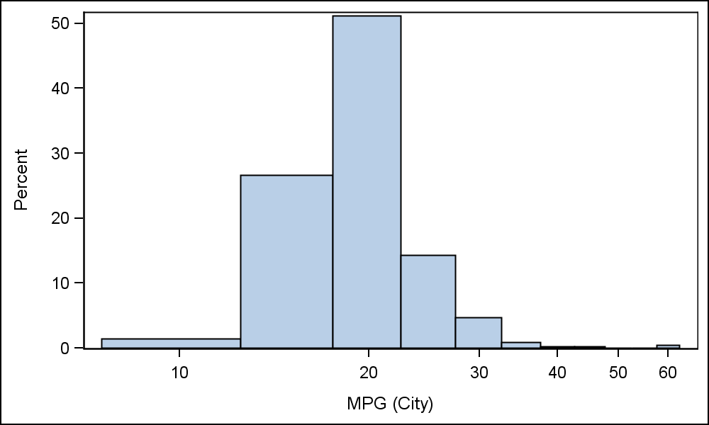 Using the sashelp.cars data set, the first case on the right shows a histogram of the original data in linear space, on a LOG x axis. Note, each bin represents the same amount of the data, but the widths of the bins in pixels are reducing as we go to the left due to the log axis.
proc sgplot data=sashelp.cars;
histogram mpg_city;
xaxis type=log;
run;
 2. Histogram of the transformed values. A transformed variable is used instead of the original variable. Now, each bin has equal pixel width, representing the transformed data.
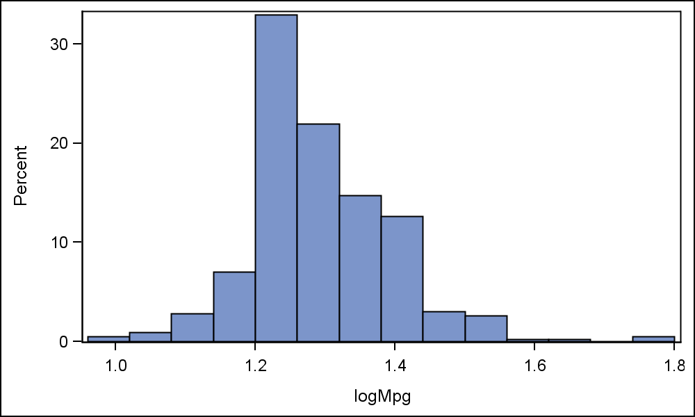
On the right is a graph of the log transformed data on a default axis. First, we create a new data column logMpg=Log10(mpg_city). Then use logMpg as the analysis variable for the histogram. This will create the graph shown here, where each bin is now has a constant pixel size. Note the x axis tick values and axis label.
data cars;
set sashelp.cars;
logMpg=log10(mpg_city);
run;
proc sgplot data=cars;
histogram logMpg / fillattrs=graphdata1
run;
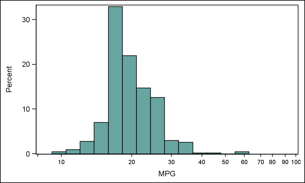 In the graph on the right we have replaced the x- axis values (log scale) with their respective untransformed linear values at equal spacing using the ValuesDisplay option. A tick value is displayed at each value provided in the Values option, but the actual text displayed is from the valuesDisplay option. Axis label is now "MPG".
proc sgplot data=cars;
histogram logMpg / fillattrs=graphdata1;
xaxis fitpolicy=none valueattrs=(size=7) values=(0.90 1 1.3 1.47 1.6 1.7 1.78 1.85 1.90 1.954 2)
valuesdisplay=(" " "10" "20" "30" "40" "50" "60" "70" "80" "90" "100") label='MPG';
run;
Discussing with experts here at SAS, the second and third graphs above have more practical uses instead for the first one. Often users wan to see if their data, or some transform, has a normal distribution. So, it is useful to view the histogram of the transformed data. Then, subsequent processing can be done on the transformed data. It turns out that the user who asked the original question about using the Log axis also really wants the last case shown above.
Now, let us talk about using TYPE=LOG on the x axis. Often, in this case when the data has a range of over 2 or 3 orders of magnitude, you may see a Note in the log saying:
NOTE: Log axis cannot support zero or negative values in the data range. The axis type will be changed to LINEAR.
This happens despite the fact at all the data is positive and is a bit confusing. What is going on is that the histogram is computing the BinStart and BinWidth values internally, and the default numbers can cause the lower edge of the first bin to have a negative x value. This is the reason for the warning if you then ask for TYPE=log. If you must set the TYPE=Log and get the graph like the first one above, make sure your BinStart and BinWidth combination satisfy the following criteria:
zero < BS-BW/2 < min value in data
Full SGPLOT program:
LogHistogram


6 Comments
I would like to be able to do what is shown in the 3rd version of the graph--use a log scale and be able to re-label the axis. However, I'm using SAS 9.3 and the valuesdisplay option does not seem to be available. Is that the case or am I missing something?
I have a dataset which is narrowly distributed around a central value. I would like to display the vertical (Y) axis using a log-scale. Is this possible with SAS 9.2?
You should be able to set the y-axis TYPE=LOG.
Sanjay, there is a missing ';' in:
proc sgplot data=cars;
histogram logMpg / fillattrs=graphdata1 {it goes here}
run;
Sanjay, thank you very much for posting this comment (' zero < BS-BW/2 < min value in data')! It would explain why SAS mysteriously acts like there are zero values in data when there are not.
Do you know of a work-around, which doesn't require manually setting bins and tick-marks?
Could you please explain how to plot histograms with a logarithmic Y axis?
I have tried getting the histogram data from PROC UNIVARIATE and then plotting it using VBAR from PROC SGPLOT but the results are really ugly...