A SAS programmer was trying to understand how PROC SGPLOT orders categories and segments in a stacked bar chart. As with all problems, it is often useful to start with a simpler version of the problem. After you understand the simpler situation, you can apply that understanding to the more complicated situation.
This article shows how PROC SGPLOT in SAS orders categories in a bar chart in three scenarios:
- Order the categories alphabetically. This is the default order.
- Order the categories by the height of the bars, which is called the frequency order. This is accomplished by using the CATEGORYORDER= option on the VBAR (or HBAR) statement.
- Order the categories in a user-specified manner. This is accomplished by using the VALUES= option on the XAXIS statement.
After you understand these three ways to order categories for a simple bar chart, you can investigate how these orderings work for a stacked bar chart.
Three ways to order bar charts
For data, let's use vehicles in the Sashelp.Cars data set and create bar charts that visualize the number of SUVs, sports cars, wagons, and trucks. This data also contains the Origin variable, which specifies the regions (Asia, USA, or Europe) that each vehicle was manufactured:
/* create example data */ data Have; set sashelp.cars; where Type in ('SUV' 'Sports' 'Truck' 'Wagon'); keep Type Origin; run; |
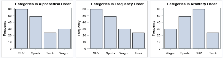
Let's visualize the number of SUVs, sports cars, wagons, and trucks. You can use PROC SGPLOT to order the categories of a bar charts in three ways: alphabetical order, ascending (or descending) order by frequency, and a user-specified order. Each bar chart shows the same data, but the order of the bars is different.
ods graphics / width=300px height=240px; /* three ways to order categories in a bar chart */ title "Categories in Alphabetical Order"; proc sgplot data=Have; vbar Type; xaxis display=(nolabel); run; title "Categories in Frequency Order"; proc sgplot data=Have; vbar Type / categoryorder=respdesc; xaxis display=(nolabel); run; title "Categories in Arbitrary Order"; proc sgplot data=Have; vbar Type; xaxis display=(nolabel) values=('Wagon' 'Sports' 'SUV' 'Truck' ); run; |
For these data, you can divide each category into subgroups by using the Origin variable. The next section shows how these plots change if you add a GROUP= variable to the VBAR statement.
Order of clustered and stacked bar charts
When you use the GROUP= option on the VBAR statement, you have an option to display the subgroups as a cluster of bars (GROUPDISPLAY=CLUSTER) or as a stacked bar chart (GROUPDISPLAY=STACK). The clustered option is easier to understand, so let's start with that. You can use the GROUP=Origin option to create clustered bar charts that display the number of cars for each category in each of three subsets: vehicles that were manufactured in 'Asia', 'USA', or 'Europe'.
When you introduce groups and different orderings of the data, you need to ensure that the colors of the groups are consistent across graphs. One way to do this is to create and use a discrete attribute map that associates each subgroup with a color: the bars for Origin='Asia' are red, the bars for Origin='USA' are blue, and the bars for Origin='Europe' are gold.
/* create a discrete attribute map to associate a color with values of the Origin variable */ data BarMap; length ID $10 value $6 linecolor $ 9 fillcolor $ 9; input ID $ value $ linecolor $ fillcolor $; datalines; BarAttr Asia DarkGray FireBrick BarAttr USA DarkGray DarkBlue BarAttr Europe DarkGray Gold ; |
You can now create bar charts that consistently use these colors regardless of the order of the bars. To make the output easy to see, the following program uses the ODS LAYOUT GRIDDED statement to arrange the output in one row that contains three graphs:
/* for GROUP=Origin, examine the three ways to order categories in a bar chart */ %let method = CLUSTER; /* use CLUSTER or STACK */ ODS LAYOUT GRIDDED columns=3 advance=table column_gutter=8px; title "Categories in Alphabetical Order"; title2 "GROUPDISPLAY = &method"; proc sgplot data=Have dattrmap=BarMap; vbar Type / attrid=BarAttr group=Origin groupdisplay=&method; xaxis display=(nolabel); run; title "Categories in Frequency Order"; title2 "GROUPDISPLAY = &method"; proc sgplot data=Have dattrmap=BarMap; vbar Type / attrid=BarAttr categoryorder=respdesc group=Origin groupdisplay=&method; xaxis display=(nolabel); run; title "Categories in Arbitrary Order"; title2 "GROUPDISPLAY = &method"; proc sgplot data=Have dattrmap=BarMap; vbar Type / attrid=BarAttr group=Origin groupdisplay=&method; xaxis display=(nolabel) values=('Wagon' 'Sports' 'SUV' 'Truck' ); run; ODS LAYOUT END; |
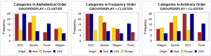
The graphs show that the ordering method (alphabetical or frequency) also extends to the subgroups. For example:
- In the first graph, the categories are in alphabetical order and so are the subgroups.
- In the second graph, the categories are in frequency order and so are the subgroups. The order of the subgroups changes depending on the relative frequencies within each category. For example, for the SUV category, the subgroups are ordered as 'Asia', 'USA', and 'Europe'. However, for the Sports category, the subgroups are ordered as 'Europe', 'Asia', and 'USA' because most of the sports cars are European.
- The third graph manually sets the order for the categories, but the subgroups are plotted in alphabetical order, which is the default. You can also choose reverse-alphabetical order by using the GROUPORDER=DESCENDING option, or you can use the ordering of the groups in the data set (GROUPORDER=DATA).
Ordering categories and groups in stacked bar charts
There is a simple way to understand the order of bars and bar segments in a stacked bar chart in PROC SGPLOT.
First, create a clustered bar chart, as shown in the previous section.
Then, change GROUPDISPLAY=CLUSTER to GROUPDISPLAY=STACK and rerun the program.
In the previous section, I wrote the code so that I only need to change one line:
%let method = STACK; /* use CLUSTER or STACK */
With that change, you can re-run the program to obtain the following graphs:
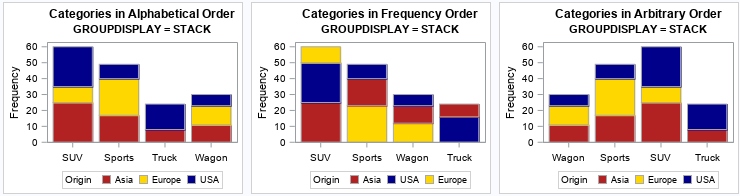
The graphs show that the order of segments in a stacked bar chart is the same as the order of bars in a clustered bar chart (from left to right). Specifically:
- In the first stacked bar chart, the subgroups are in alphabetical order from bottom to top.
- In the second stacked bar chart, the subgroups are in frequency order. For example, for the SUV category, the subgroups are ordered as 'Asia' (the bottom segment), 'USA' (the middle segment), and 'Europe' (the top segment). However, for the Sports category, the subgroups are ordered as 'Europe', 'Asia', and 'USA'. Be careful if you use the CATEGORYORDER=RESPDESC option: it can be confusing to view a graph in which the order of the segments differs between bars.
- The third stacked bar chart modifies the order for the categories, but the subgroups are plotted from bottom to top in alphabetical order. This provides a viewer with consistency across the bars.
Summary
This article shows how to understand how PROC SGPLOT in SAS orders bars in a bar chart. There are essentially three ways to order bars: alphabetically, by frequency, or by specifying the order manually. When you use the GROUP= option, you get either a clustered bar chart or a stacked bar chart. The order of the subgroups is best understood by looking at the clustered bar chart. The order of bars in the clusters (from left to right) is the same as the order of the segments in a stacked bar chart (from bottom to top). Be aware that the CATEGORYORDER= option also orders the subgroups. This can be confusing to the viewer because segments in the stacked bars might "move around" depending on their relative frequencies.

2 Comments
Dear Rick,
I appreciate your advice. How can I do to get "Percent" not "Frequency" (you code works nicely for my data).
Thank you
%let method = CLUSTER;
ODS LAYOUT GRIDDED columns=3 advance=table column_gutter=8px;
title "Categories in Alphabetical Order";
title2 "GROUPDISPLAY = &method";
proc sgplot data=igc4_538modelling dattrmap=attrmap_UBN;
where t3ime=0;
vbar degree_ubn/ attrid=BarAttr group=degree_ubn groupdisplay=&method;
xaxis display=(nolabel);
run;
Look at the documentation of the VBAR statement, which shows you all the options. Search for "percent" on that page.