The SGPLOT procedure supports a wide variety of plot types that you can use directly or combine together to create more complex graphs. Even with this flexibility, there might be times you run across a graph that you cannot create using one of the standard plot types. An "area" bar chart is one such plot. In this post, I will demonstrate how you can create this plot using SGPLOT's "Swiss Army knife" plot called the POLYGON plot.
The POLYGON plot is somewhere between annotation and a normal plot type. The plot statement has support for things like groups, color responses, and data tips. The plot also uses the standard plot axes and can be overlayed with other plot types. However, the X, Y and ID roles are used together to create ad hoc polygons, giving you the ability to create "non-standard" displays.
An area bar chart is a bar chart where both the X and Y axes represent continuous values, and each bar represents a category. The RESPONSE role is used for the height (or length), while the WIDTH role is used for the width of the bar. The CATEGORY role is used to identify each bar, much like a standard bar chart. I have created a set of macros to simplify the transformation of the input data to the data needed for the POLYGON plot. You can download these macros here.
The data set used for all of the examples is shown below. The macros take this data set as input and output the summarized and transformed data. The macros automatically perform a sum statistic on the RESPONSE and WIDTH variables, using the CATEGORY as the class variable. In the subgroup example later, the SUBGROUP is also added as a class variable. For the color response example, you will see that you can optionally specify an alternate statistic for the color, which is one of the statistics supported by the SUMMARY procedure.
data totals;
input Site $ Quarter Sales Salespersons;
format Sales dollar12.2;
datalines;
Lima 1  4043.97  4
NY   1  8225.26 12
Rome 1  3543.97  6
Lima 2  3723.44  5
NY   2  8595.07 18
Rome 2  5558.29 10
Lima 3  4437.96  8
NY   3  9847.91 24
Rome 3  6789.85 14
Lima 4  6065.57 10
NY   4 11388.51 26
Rome 4  8509.08 16
;
run;
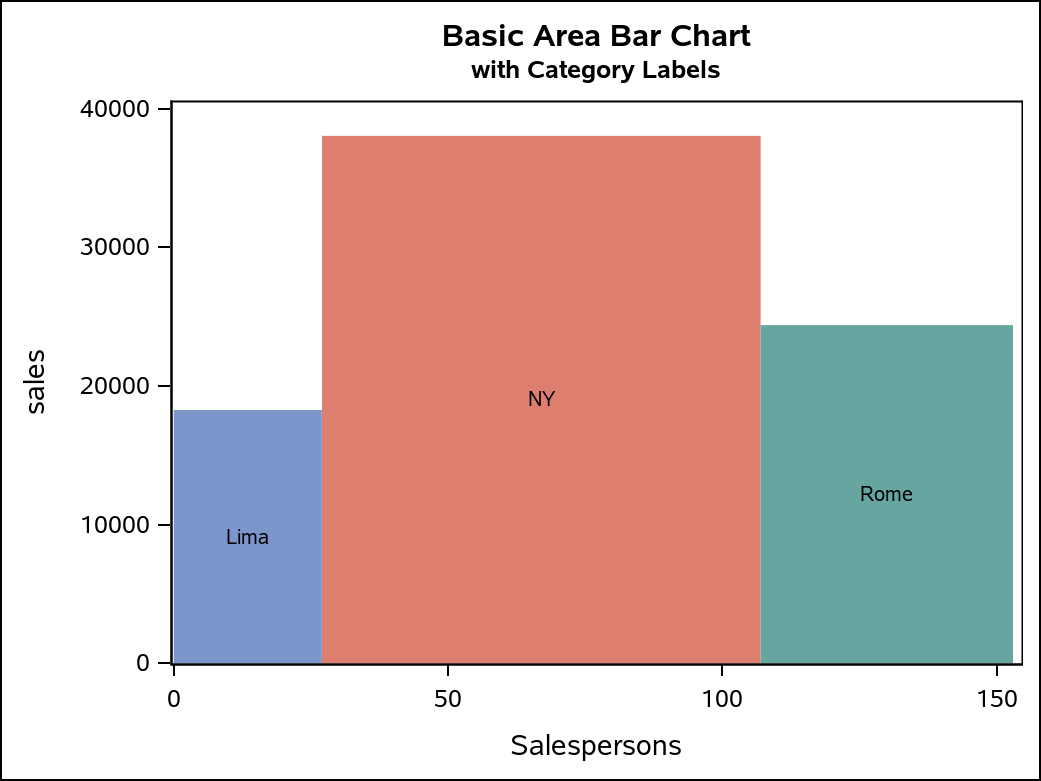
Basic Area Bar Chart
This first example is a basic area bar chart. The output dataset from the macro contains the X, Y, and ID columns needed to draw the bars. Each unique ID is used to draw a polygon. In this case, the CATEGORY values are used as the ID values. Because of that, I also used the ID column on the GROUP and LABEL options to color each bar differently and label them. By default, the polygons are not filled, so I added the FILL option. I also overrode the label attributes to make them stand out better. As an alternative to labeling, you can remove the NOAUTOLEGEND option and the LABEL option so that a legend is displayed instead of labeling the bars directly. The OFFSETMIN=0 option on the YAXIS statement forces the bars to the axis line. Without the option, a small amount of offset appears below the bars to account for the axis tick value text.
%genAreaBarDataBasic(totals, poly_data, Site, Sales, Salespersons);
title "Basic Area Bar Chart";
title2 h=9pt "with Category Labels";

proc sgplot data=poly_data noautolegend;
yaxis offsetmin=0;
polygon x=x y=y id=ID / group=ID label=ID fill labelattrs=GraphDataText;
run;
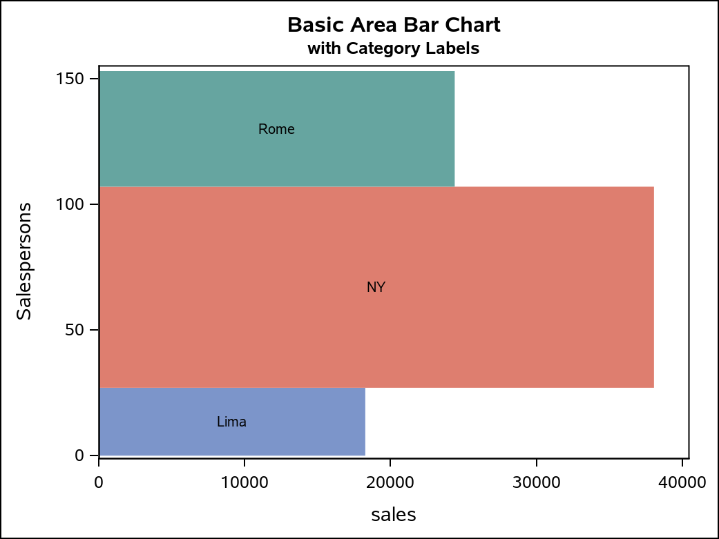
It is actually a simple operation to change the orientation of this chart. All that is required is to change the X and Y variable assignments, and change the YAXIS statement to be an XAXIS statement.
/* Horizontal */
ods graphics / imagename="BasicHorizontalAB";
proc sgplot data=poly_data noautolegend;
xaxis offsetmin=0;
polygon x=y y=x id=ID / group=ID label=ID fill labelattrs=GraphDataText;
run;
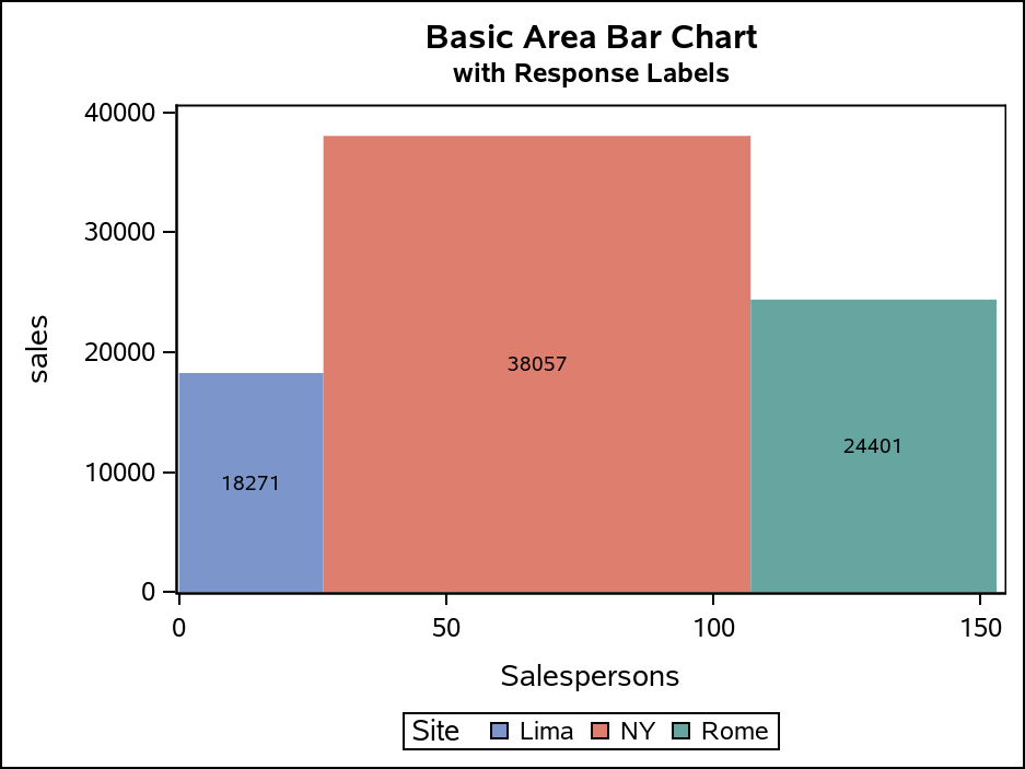
Another labeling alternative you can use is to remove the NOAUTOLEGEND option and reference either the RESPONSE or WIDTH column with the LABEL option to display the bar axis values. The legend will show the CATEGORY values.
title2 h=9pt "with Response Labels";
proc sgplot data=poly_data;
yaxis offsetmin=0;
polygon x=x y=y id=ID / group=ID label=response fill
                        labelattrs=GraphDataText;
run;
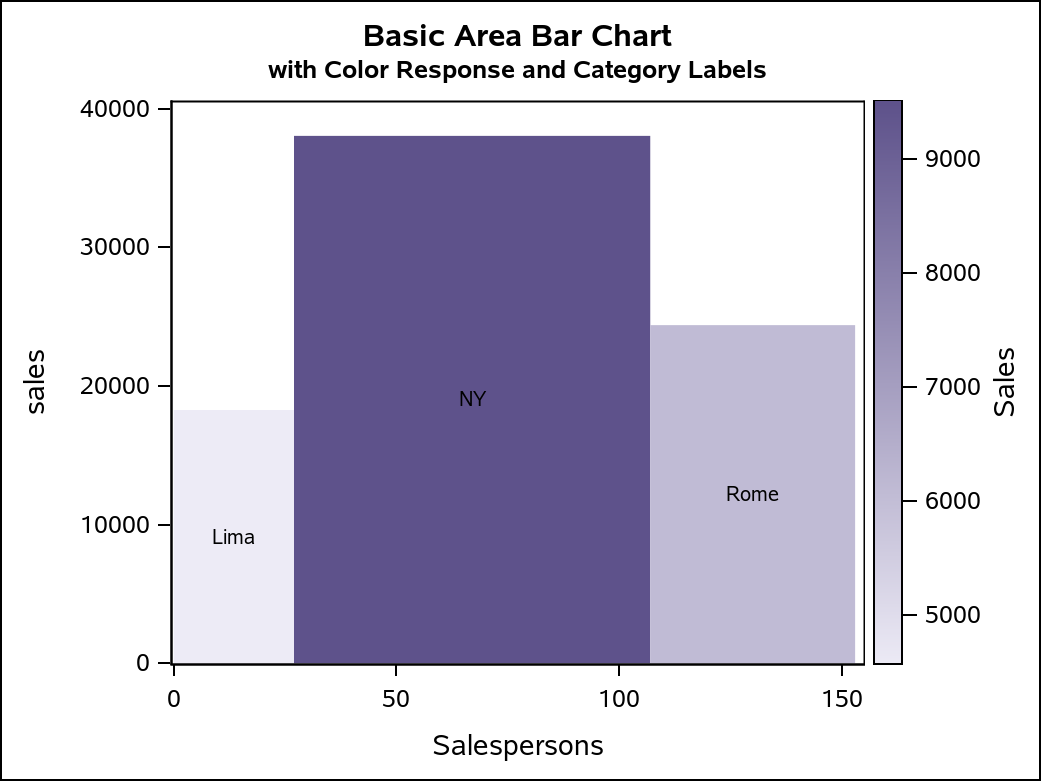
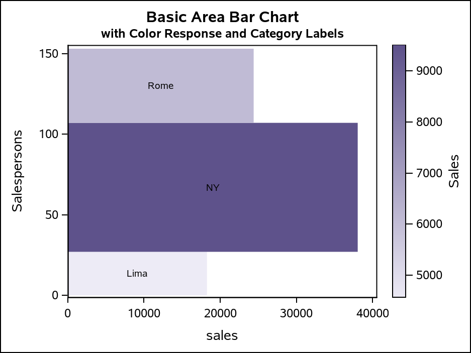
Area Bar Chart with Color Response
Another useful version of this chart is to incorporate yet another continuous variable as a COLORRESPONSE variable. For this case, you will call a different macro that has same options as before, but now with a required COLORRESPONSE option and an optional COLORSTAT option. The COLORSTAT option is a named parameter, with a default value of "sum". If you override the default, you must specify the COLORSTAT name in the parameter. In the example below, I used the same "Sales" variable for both the RESPONSE and the COLORRESPONSE. However, I set the COLORSTAT to be MEAN, so that the color represents the average sales per category value. The output data set will contain a "colorResponse" variable that you reference the COLORRESPONSE option on the POLYGON statement. The default COLORMODEL is a three-color ramp, so I changed it by referencing a two-color ramp to create a better appearance for this data. This example uses CATEGORY labeling, which would probably be typical with a COLORRESPONSE; however, the RESPONSE and WIDTH variables are also available for labeling.
%genAreaBarDataColorResponse(totals, poly_data, Site, sales, Salespersons, Sales, colorStat=mean);
title "Basic Area Bar Chart";
title2 h=9pt "with Color Response and Category Labels";

proc sgplot data=poly_data;
yaxis offsetmin=0;
polygon x=x y=y id=ID / colorResponse=colorResponse label=ID fill
                labelattrs=GraphDataText colormodel=twocolorramp;
run;
The orientation can be changed with this output, just as it can in the first example.
proc sgplot data=poly_data;
xaxis offsetmin=0;
polygon x=y y=x id=ID / colorResponse=colorResponse label=ID fill
                labelattrs=GraphDataText colormodel=twocolorramp;
run;
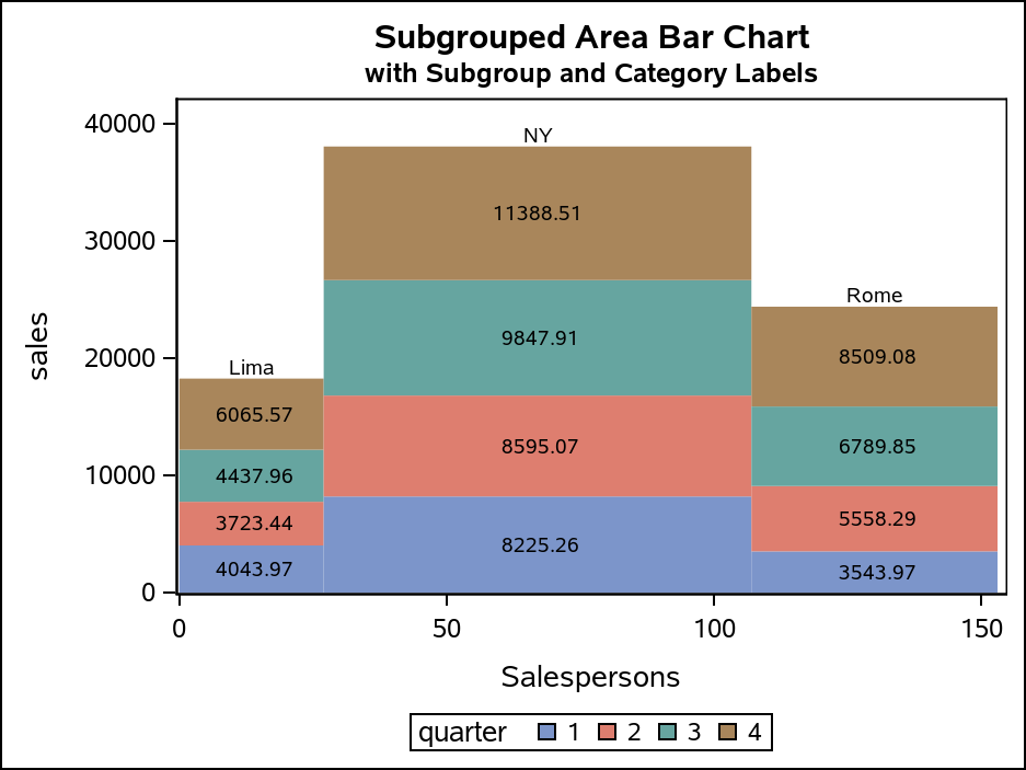
Area Bar Chart with Subgroups
Area bars can be further subdivided based on another classifier variable, much like "stacked" bars in a bar chart. For this chart, the ID column contains the SUBGROUP values instead of the CATEGORY values, yet you still need the CATEGORY information to properly summarize the data and identify each bar in the chart with a label. The macro for this case generates some additional labeling information in the output data that can be used by a TEXT plot to label the CATEGORY for each bar, as well as the RESPONSE value for each SUBGROUP.
%genAreaBarDataSubgroup(totals, poly_data, Site, sales, Salespersons, quarter);
title "Subgrouped Area Bar Chart";
title2 h=9pt "with Subgroup and Category Labels";

proc sgplot data=poly_data;
format sublabel f8.2;
yaxis offsetmin=0;
polygon x=x y=y id=ID / group=ID fill;
text x=subLabelX y=subLabelY text=subLabel / contributeoffsets=none;
text x=labelX y=labelY text=label / contributeoffsets=(ymax) position=top;
run;
The first TEXT statement uses the subLabelX, subLabelY, and subLabel columns to place the response values in each subgroup segment. If you do not want to show these values, simple remove that TEXT statement. The second TEXT statement labels the CATEGORY for bar using the labelX, labelY, and label columns. The SUBGROUP values appear in the legend because they are in the ID column, and the ID column is used by the GROUP on the POLYGON plot. The CONTRIBUTEOFFSET=(YMAX) option makes the TEXT plot contribute only to the axis offset calculation on the maximum side of the Y axis to prevent label clipping. The POSITION=TOP puts the label above the data point (which is the top of the bar).
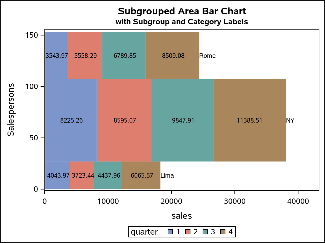
As in the previous examples, you can change the orientation of this chart; however, there are a few additional considerations. The X and Y columns of each TEXT plot must also be switched. The POSITION of the label TEXT plot must also be changed from TOP to RIGHT, so that the label is placed to the right of the data point. Finally. the CONTRIBUTEOFFSETS option must be changed from (YMAX) to (XMAX) so that the maximum side of the X axis takes the label size into account for the axis offset.
proc sgplot data=poly_data;
format sublabel f8.2;
xaxis offsetmin=0;
polygon x=y y=x id=ID / group=ID fill;
text x=subLabelY y=subLabelX text=subLabel / contributeoffsets=none;
text x=labelY y=labelX text=label / contributeoffsets=(xmax) position=right;
run;
Conclusion
Area bar charts can be generated in different ways with a variety of features. Hopefully, these macros and examples are flexible enough to give you the display you need. I encourage you to examine the macros and the output data sets, and experiment with your own enhancements. Understanding the structure of the data for the POLYGON plot can open the door for even more creative plot ideas.