Tag: bar chart

Data Visualization
Dan Heath 0
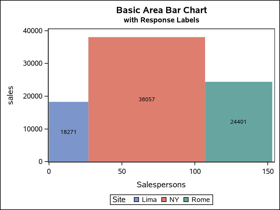
Area Bar Charts using SGPLOT

The SGPLOT procedure supports a wide variety of plot types that you can use directly or combine together to create more complex graphs. Even with this flexibility, there might be times you run across a graph that you cannot create using one of the standard plot types. An "area" bar

Data Visualization | Learn SAS | Programming Tips
Sanjay Matange 0
New Features in SAS 9.40M5 - Gradient fills

ODS Graphics procedures primarily strive towards the following goal:  "Make simple graphs easy and complex graphs possible".   SGPLOT procedure allows you create simple graphs with a single plot statement, and create complex graphs by layering together or combining multiple plot statements.  Generally, the appearance follows the guidelines set by industry

Data Visualization
Sanjay Matange 0
Naomi's Graph Makeover Contest

Naomi Robbins has posted a contest, part 1 of which is to submit alternative representations for the following graph: Clearly, usage of two pie charts to represent the share of the B2B and B2C referrals will invite many responses.  To create the graph, I took the data shown in the Pie Charts themselves, so we are using percent

Data Visualization
Sanjay Matange 0
Bar chart with response sort

A graph in a recent article in Fortune magazine caught my eye.  The graph shows the cost of hosting the Summer Olympics over the past eight events.  Here is what I termed the "Medal" graph. Now, practitioners of the art of Effective Graphics would likely find some shortcomings in the graph.  Clearly

Data Visualization
Sanjay Matange 0
Broken Y-Axis with SAS 9.2

In the previous post on Broken Y-Axis, I reviewed different ways to display data as a Bar Chart, where the response values for some categories are many orders of magnitude larger than the other values.  These tall bars force  the display of other values to be squeezed down thus making it harder to compare

Data Visualization
Sanjay Matange 0
Broken Y-Axis

Often we want to display data as a bar chart where a few observations have large values compared to the rest.  Comparison between the smaller values becomes hard as the small bars are squeezed by the tall bars.  Here is an example data, and a bar chart showing the data. The large values

Data Visualization
Sanjay Matange 0
Bar chart on interval axis

Recently, a user asked about creating a Bar Chart of Value by Date, where the dates are displayed on a scaled interval axis.   Consider this simulated data set of value by date and treatment shown below.  This data set only has one value for each date and treatment combination. We can use the VBAR statement

Data Visualization
Sanjay Matange 0
Cluster groups

The topic of cluster groups comes up often.  By cluster group I am referring to the feature in bar charts where the group values are displayed side by side. With SAS 9.3, SG Procedures support stack or cluster grouping for Bar Charts and overlay or cluster grouping for all other

Data Visualization
Sanjay Matange 0
Let them eat pie

ODS Graphics system was initially motivated by the need for high quality graphs for SAS Base, STAT, and other analytical procedures.  Use of SG Procedures, ODS Graphics Designer and GTL by users too has initially focused on analytical graphs.  But just like wheels on carryon bags that started for the specific needs of flight

Data Visualization
Sanjay Matange 0
Nested graphs

Here are a couple of bar charts showing the city mileage of cars by Type and Origin using the SGPLOT procedure from the sashelp.cars dataset. title 'Vehicle Mileage by Type'; proc sgplot data=cars; format mpg_city 4.1; vbar type / response=mpg_city stat=mean datalabel; xaxis display=(nolabel); run; title 'Counts by Country'; proc sgplot