I bet a lot of SAS users know where the phrase "Live Long and Prosper" comes from ... but can we use SAS software to also help analyze 'how long'? This blog posting shows several different kinds of SAS graphs that can help answer such a question!
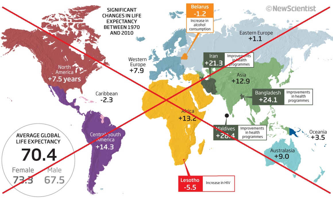
Let's start with a map. I recently found an interesting map in an article about overeating. The map showed changes in life expectancy, by geographical region. Here's a screen-capture:
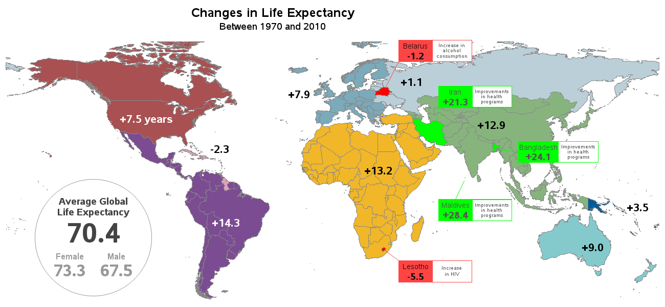
When I set about creating my own version of the map, with a few changes (hopefully improvements!). In the original map/article, I saw a lot of comments complaining about the 'regional/area names' that were used, therefore I decided to just leave those names out (and let the coloring of the grouped areas suffice). I also used simpler (just red & green, for bad & good) colors for the selected countries with detailed labels. My version also has mouse-over text for the country names. Click the snapshot below to see my full-size map, with hover-text:
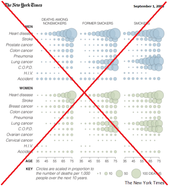
I found another visualization in a New York Times article that used a grid of bubbles to represent life expectancy data.
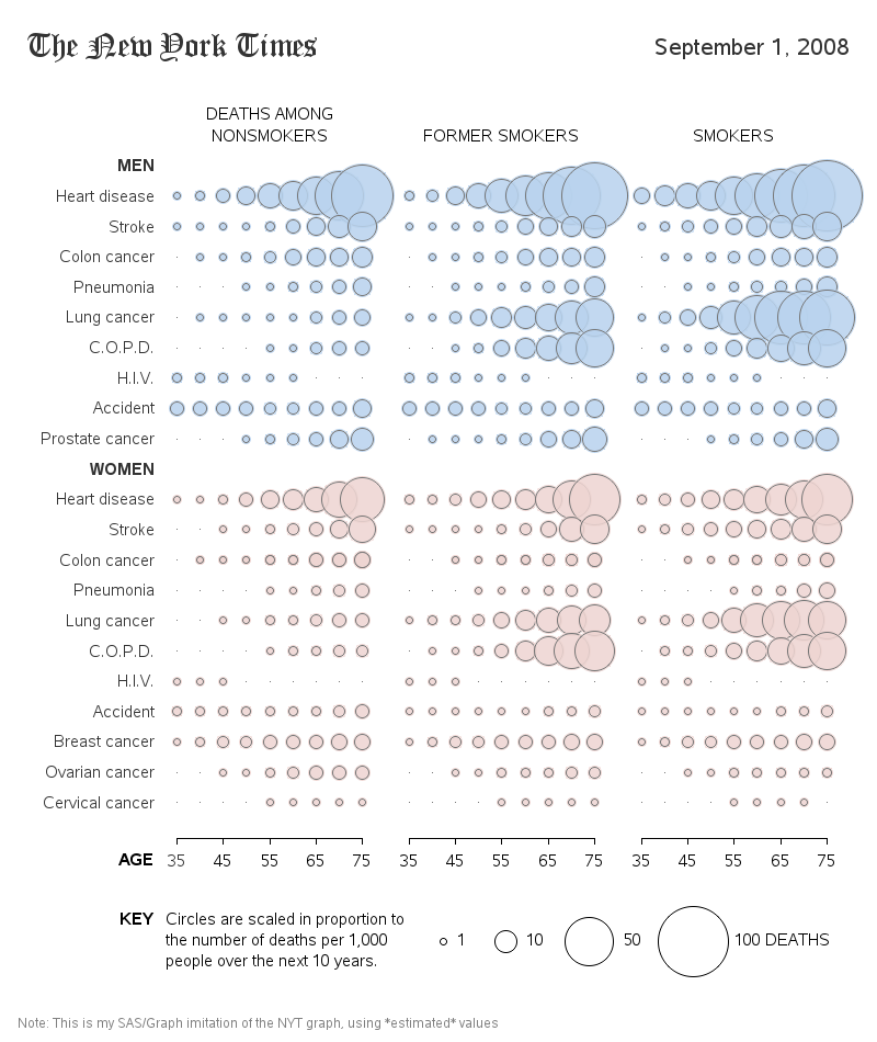
Now that we have added support for alpha-transparent colors in SAS, I was able to create my own version:
And last but not least, what about a bar chart? ...
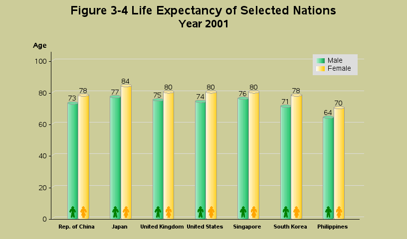
As you can see, there are many different ways of visually analyzing the same (or in this case similar) data. Each different type of chart, and even subtle variations of the same chart, can help give you more/different insight into your data, and thereby help you understand it better. When you're exploring your data, I encourage you to visualize it in several different ways. And when you want to answer a specific question, select the type of chart that best answers the question.


10 Comments
It doesn't work for me. All those negative x y coordinates "text" falls out the picture zone, won't be displayed. Again, I am thinking this is something default in EG? But our organization only uses program in EG. We don't have base SAS installed. I can't add lengend to my graph.
These might be good questions to post in the Enterprise Guide question/answer forum:
https://communities.sas.com/community/support-communities/sas_enterprise_guide
Hi, Rob,
I am trying to replicate your bubble graph here. But my SAS only allow me to put numeric value on vertical axis. How did you manage to put "classification" variable there?
Thanks
Ali
Which proc are you using, and which goptions device= are you using? I used Proc Gplot and device=png for mine. Here's the exact SAS code I used ... http://robslink.com/SAS/democd33/death_odds.sas
Thanks Rob! In my program, I am using proc gplot, type = bubble. In your code, actually you are "mannully" drawing those bubbles! It is the difference between advanced programmer and beginner:(
Thanks for sharing the code. I will try to follow your code structure and see what can I get.
Although I used more complex tricks in this particular example, you should be able to use character variables in the vertical axis of a gplot bubble chart. Here is an example...
goptions device=png;
proc gplot data=sashelp.class;
bubble name*height=weight;
run;
I can run your code fine. But when I change to my own, Enterprise Guide gives me error, and force me to exit it.
In EG memu, if you click task->graph->bubble plot, it will have a window ask to choose "task roles". In there, both "vertical" and "vertical right" are limited to numeric values. (please take a look at yours and let me know if it is the same, thanks)
Now I have found an "work around" for this. I created another numeric variable, assigning value from 1 to 10, corresponding to the classification variable. For example, class A has a value of 1, class B has a value of 2. etc.
Next step, I create a "SAS format" for the value 1, 2, 3 to be A, B, C. Using this format in proc gplot, it gives me the graph I wanted.
thanks for your help, Rob!
I don't use EG, so I can't give a 100% definitive explanation on that ... but my best guess would be that EG defaults to using device=activex, and the SAS activex implementation of gplot does not allow character values on the vertical axis (if I recall correctly). Either that, and/or the EG interface might be making the assumption that the vertical axis cannot be character(?) Since EG allows you to write your own code, I would suggest doing that in this particular case, since it seems to be off of the EG "happy path" (ie, it's not the way EG wants things to be). :)
Hi, Rob,
I changed device to png then it worked. EG defaults to use device activex.
Another question---when I run your code, I got this error:
NOTE: ERROR DETECTED IN ANNOTATE= DATASET WORK.ANNO_LABELS.
NOTE: PROBLEM IN OBSERVATION 3 -
A PERCENTAGE VALUE LIES OUTSIDE 0 TO 100 BOUNDARIES Y
This error appears for every y value exceeds (0,100) boundaries. I changed ysys="2", it still doesn't work. Then I found this site for the explanation:
https://support.sas.com/documentation/cdl/en/graphref/63022/HTML/default/viewer.htm#annodata-creating-grelem.htm
seems the range of y coordinates should be greater than 0.
How did you manage to use negative coodinates in your program?
Thanks
Are you saying it doesn't work, or just that it produces an 'error' message in the SAS log? When I annotate, I often use the '1' coordinate system (% of the data area), and use values outside the usual 0-100% range to place labels slightly outside of the graph axes. Even though an 'error' gets written to the SAS log, it still works ... so I just ignore those messages in the log :)