This post is a result of an intriguing question posed by a user on the SAS communities' page. How to create a bar chart where the category is a combination of two variables var_1 and var_2 (each with values of '+' and '-'), and get a X axis that shows each variable individually?
The data looks like this:
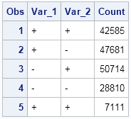
And the resulting graph looks like this:
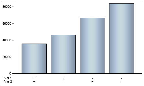
Note the x-axis. The graph has a bar for each possible combination of var_1 and var_2, but the x-axis label is split up to show each value of the two variables, and also the variable names on the left.
Yes, this graph is actual output from SAS 9.2 using GTL. How did I create this graph? Here are the steps, and the full SAS 9.2 program is attached below.
- Create a new variable 'var' that is a concatenation of var_1 and var_2.
- Add 4 extra observations at the end each having Var_1 and Var_2 values and labels.
- Use a GTL template with a Layout Lattice of two rows, upper row is 90%.
- Add bar chart of count x var and stat=mean in the upper cell.
- Add a scatter plot each of label1 x var and label2 x var with markercharacter in lower cell.
- Make the axes uniform and suppress the x-axes.
This is a good example of creative usage of GTL statements to achieve the results we want. Here is the full SAS 9.2 code: SAS92
Now, here is a sneak preview of how easy this is with SAS 9.4 code. We have added a new feature to the DiscreteOpts TickValueFitPolicy called "SplitAlways". Using a blank as the split character (default) the new var values can be split into multiple lines on the axis to show each value separately, and the variable labels can be added using the DrawText statement. Only a simple Layout Overlay is needed:
Preview of actual SAS 9.4 graph:
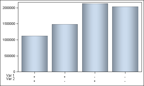
proc template; define statgraph two_var; begingraph; layout overlay / xaxisopts=(display=(ticks tickvalues) discreteopts=(tickvaluefitpolicy=splitalways)) yaxisopts=(display=(ticks tickvalues)); barchart x=var y=count / dataskin=pressed; drawtext "Var 1" / drawspace=wallpercent x=-2 y=-5 anchor=right; drawtext "Var 2" / drawspace=wallpercent x=-2 y=-10 anchor=right; endlayout; endgraph; end; run; ods listing gpath=&gpath; ods graphics / reset width=5in height=3in imagename='Two_Var_94'; proc sgrender data=two_var3 template=two_var; run; |
This time, we only need to concatenate the var_1 and var_2 with a blank as delimiter using the CATX() function. No additional data is needed.


