Naomi Robbins has posted a contest, part 1 of which is to submit alternative representations for the following graph:
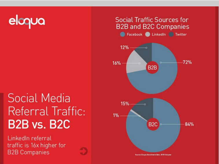
Clearly, usage of two pie charts to represent the share of the B2B and B2C referrals will invite many responses. To create the graph, I took the data shown in the Pie Charts themselves, so we are using percent numbers already summarized by type (B2B and B2C).
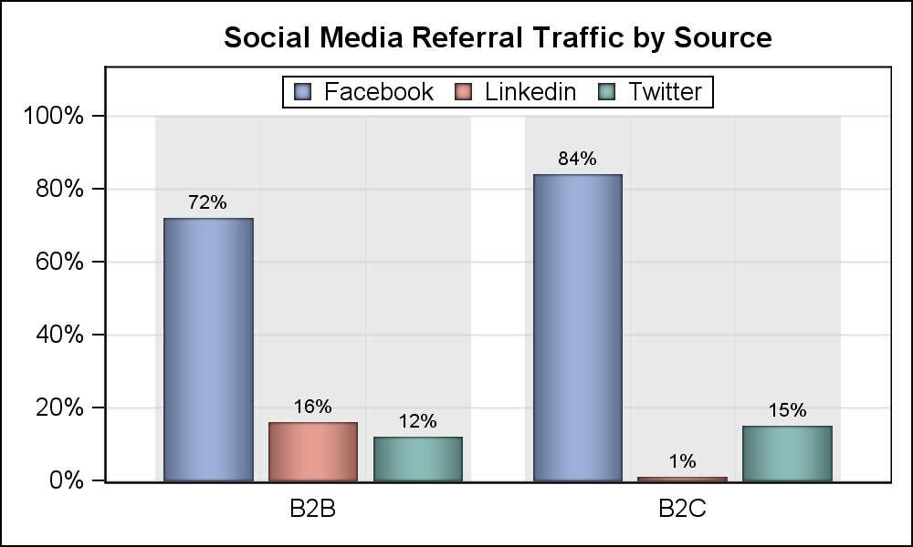
Here is my suggestion, using the ubiquitous Bar Chart. Click on the chart to view the full resolution graph.

SAS 9.3 SGPLOT code:
title 'Social Media Referral Traffic by Source'; proc sgplot data=traffic nocycleattrs; vbar type / response=total group=source groupdisplay=cluster fillattrs=graphdatadefault(color=lightgray) transparency=0.5 nostatlabel nooutline; vbar type / response=traffic group=source groupdisplay=cluster datalabel dataskin=pressed barwidth=0.85 name='a' nostatlabel; keylegend 'a'; yaxis offsetmax=0.1 grid display=(nolabel); xaxis display=(nolabel noticks); run; |
My intention is to bring the strengths of both the Pie Chart and Bar Chart in to one visual. Typically, the Bar Chart is well suited for magnitude comparisons between categories, while the Pie Chart allows easier part-to-whole comparisons. The Bar Chart also makes labeling of various parts easier.
To facilitate better part-to-whole comparison with a Bar Chart, I added a "ghost" chart behind the actual bar chart showing the summarized (100%) bars. This allows easier comparison of traffic for each source to the total traffic.
Since the main comparison is between the three sources for each type separately, it is best to bring those bars close to each other for easier comparisons. Also, having the B2B and B2C categories side by side also provides a feel for how the numbers compare across the categories, though that comparison is not accurate as the data is pre-summarized separately for B2B and B2C.
Alternate view:
Full SAS 9.3 Code: NaomiContest-1


