I peruse many different websites to get my news, and I always keep an eye out for good (or bad) presentations of data. I recently saw a posting on reddit claiming "U.S. GDP is greater than the total of all others combined." This news seemed too good to be true (for the US), so I decided to do some data sleuthing and try to verify whether or not it was true. Did I find what I was looking for, or as my buddy John says, did I take a journey down the rabbit hole? Read along and find out!
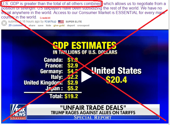
Here's the original headline, and chart, I saw on reddit:
Since it has a 'play' button, it appears to be a screen-capture of a video. I right-clicked on the image in my Google Chrome browser, and tried "Search Google for image". I got several matches, of various different sizes of this image.
The larger size images are usually more likely to be closer to the original, so I looked through them first. I found that the arabiangazette story had a link to the original Fox news story. The screen-capture comes from 2:27 in the Fox video. After skimming the article and the video, I found that the data is comparing the US to the other countries in the G7 - not comparing the US to all the other countries in the world. So it appears the comment in the reddit posting was a bit misleading (perhaps intentional, or perhaps they just forgot to provide the proper context for the comment?)
Now for my new/modified question. Does the US really have a larger GDP than the other 6 countries of the G7 combined? Where did they get this data? The article is dated June 9 (no year), and the URL of the article indicates it is June 9, 2018 ... and since the title of the table says "GDP Estimates" I assume it must be talking about 2018. But I would need to see the actual data to know for sure. And unfortunately the Fox article did not list the data source.

So I went on a data-quest ... I did a few Google searches, and ended up on one of the Wikipedia pages for GDP. I then went to the External links section at the bottom, and followed the link to the International Monetary Fund (IMF) World Economic Outlook (WEO) weodata index page, where I found a link to their Entire Dataset download page. I downloaded that data, but it didn't match the values in the Fox News table. Upon further investigation, it appeared to be the 2017 data. I then changed the 2017 to 2018 in the URL, and found the download page for the April 2018 data, which did match the Fox News table.
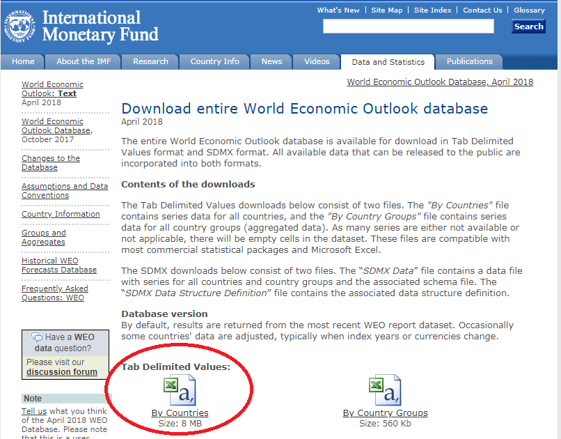
I downloaded the tab-delimited text file, opened it in Excel, and then saved it as an xlsx spreadsheet (my SAS software could have read the text file directly, but I found it convenient to look at the data in the spreadsheet, and while I was doing that I went ahead and saved it in Excel format). Here's the SAS code I used to import the spreadsheet, and subset the data:
proc import out=my_data datafile="WEOApr2018all.xlsx" dbms=xlsx replace;
getnames=yes;
run;
data g7; set my_data (where=(
WEO_Subject_Code='NGDPD' and country in
('United States' 'Canada' 'France' 'Germany' 'Italy' 'United Kingdom' 'Japan'))
keep = WEO_Country_Code ISO WEO_Subject_Code Country Subject_Descriptor
Subject_Notes Units Scale Country_Series_specific_Notes _2018);
_2018_trillions=.; _2018_trillions=_2018/1000;
length group $50;
if country='United States' then group='US';
else group='Other G7 Countries';
run;
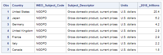
After subsetting the data, I spot-checked the GDP values and confirmed that these values are indeed the same as the ones in the Fox News table.
But of course I started thinking that there must to be a better way of viewing this data. The Fox table was not even in alphabetic order by country name, or numeric GDP order, so my table sorted by GDP was already an improvement. But these values were just begging to be plotted! So I came up with the following bar chart visualization:
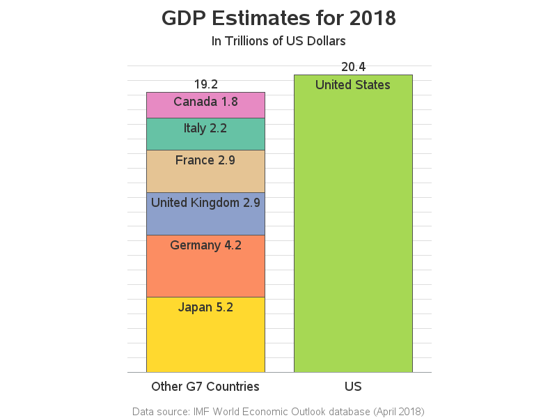
My graph has the country names, the country GDP, and the combined total GDP, similar to the Fox News table. But my graph has a few extra benefits to help you quickly grasp the data:
- The height of the two bars lets you visually compare the US and the other 6 countries, in an intuitive way.
- I controlled the stacking order of the 6 other countries based on their GDP.
- I added a title showing that these were GDP Estimates, for the year 2018.
- I labeled the bars so you can tell that this chart is talking about G7 countries (not the whole world).
- I added a footnote indicating where the data came from.
Now that you know where this GDP data lives, and how to import it into SAS, perhaps you can determine whether the US has the largest GDP in the world, or where we stand in that ranking? (Hahaha! - I bet you didn't know I'd be giving you a homework assignment!)
Since you made it through all that technical stuff, I'll reward you with something fun - here's a picture from my friend Joy, who has done a bit of traveling. Which of the G7 countries was this picture taken in? (feel free to leave your guess in a comment)


10 Comments
OK I looked at the data and sorted accordingly and a major player is missing...where is China with it's "14,092.51" GDP? That kinda...throws that statement out right?
That was awesome! Do you have code for your graph?
Thanks! ... Here's the code: http://robslink.com/SAS/democd99/gdp_info.htm
Very insightful. What if you add another chart that takes into account country population (GDP per capita). Should be telling?
Thanks Robert
Yes, that would be possible (and interesting). The spreadsheet has several variations of GDP per capita.
I think I see the flag of Nova Scotia flying from the gray building at position=(middle right) so I guess Canada. (I figured this out before I looked at the comments.)
Sharp eye!
Canada? In fact, it looks like Peggy's Cove, Nova Scotia.
You are correct! (and impressively so!) :-)
Little bit of a rabbit hole, I'd say!
If we expanded to include China and India, say, top 10 countries by GDP, it's not quite the runaway.
Nice visuals! Easy to compare.