Often we want to display data as a bar chart where a few observations have large values compared to the rest. Comparison between the smaller values becomes hard as the small bars are squeezed by the tall bars. Here is an example data, and a bar chart showing the data.
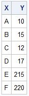
The large values for categories E and F take up most of the data range on the Y axis, making it harder to view the rest of the data. There is plenty of discussion about this on the Web. Peltier Tech Blog and Chandoo provide some examples and recommendations.
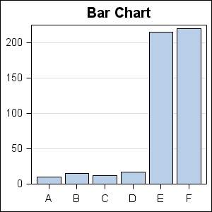
One option (frowned upon by many experts for Bar Chart) is to use a log Y axis. I wrote an article on How to use log axes with ODS Graphics bar charts which generated many good comments. Notwithstanding that, here is what this data would look like with a log Y-Axis.
Here I have used a log base 2 axis, with a baseline of 0.5. There are some problems here including the following:
- For bar charts, the magnitudes are decoded by their linear association with the lengths of each bar. Using a log transform breaks that association.
- To apply a log transformation, the Y axis must have all positive values (> 0). So, I have to set the baseline to a value greater than zero. This also breaks the association between magnitude and length. Also, the choice of baseline intercept value is arbitrary.
- However, some feel this is OK in special cases when a users is specifically aware of the use of log axes.
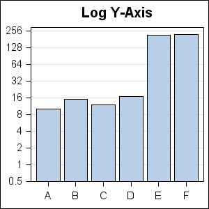
Another recommended way is to use a broken Y-Axis. In this case, a break is inserted into the continuous range of the Y axis, and the break is indicated by icons on the graph. "Full Panel Breaks" have been recommended, and here is what that would look like using GTL:
For the above graph, I have used the following process using SAS 9.2 GTL:
- Use a Layout Lattice container with two stacked cells.
- Draw a same bar chart in each cell.
- Use ColumnDataRange=Union to ensure all the x values are aligned.
- Use appropriate axis ranges (ViewMin / Viewmax) to set the data ranges.
- The lower cell only shows the data for the shorter bars. The taller bars flow out of the cell.
- The upper cell shows only the top ends of the data, so only the tallest bars show there.
- Cell heights and tick values are adjusted to provide even tick interval in both cells.
- With SAS 9.2, there is no easy way to add a "squiggle" or break icon in the axis, but it can be done using SAS 9.3.
In the above graph it is easier to compare the shorter bars, but now one has lost the perspective on how they compare with the tall bars.
Jon Peltier favors drawing a panel of two bar charts, one with the full Y data range, and the other with a range that grows the smaller bars allowing the taller ones to get clipped. He also adds a "fade the tall bars into the clouds" effect to the top ends of the tall bars. See last example in the Peltier Tech blog.
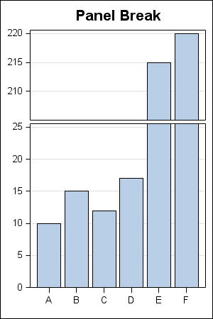
With SAS 9.3, we have another neat option shown below:
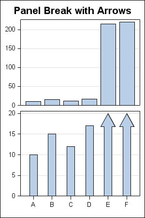
Here, we have drawn the full y-axis in the top cell, and the magnified y-axis in the lower cell. We have also added arrow caps to the bars that are now extending beyond the cell. This has some benefits.
- Comparison of all the bars can be done in the upper cell.
- Comparison of the smaller bars is easier in the lower cell due to magnification.
- Height of the taller bars will not be mistaken to be only their clipped heights.
- The end caps make it very clear that these taller bars are clipped.
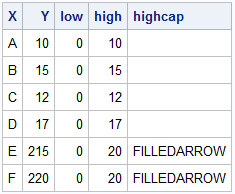
The data to make this graph is shown below. We have created a couple of extra columns to control the HighLow plot by clipping the data at "20", and another column to add caps when the bars are clipped.
Full SAS code : SAS93_Code


4 Comments
I disagree that the log axis is "frowned upon by many experts." It is true that a log transformation is hard for a non-technical person to interpret, and therefore it should be discouraged for graphics that appear in business reports. However, remember that "SG" stands for "Statistical Graphics." For graphs that are intended to show statistical content and are intended for scientific purposes, the log axis (especially Log10 and natural log) should be the PRIMARY way to solve this problem. None of the other approaches are nearly as useful. Furthermore, in scientific journals and books, you will rarely see a broken Y-axis or a graph with arrows. Those techniques are suitable for USA Today, but not for technical reports, papers, and journal articles.
I was specifically referring to use of log axis with Bar Charts. For other graph types like Dot Plots, log axes are often used.
Pingback: Broken Y-Axis with SAS 9.2 - Graphically Speaking
Pingback: Axis Break Appearance Macro - Graphically Speaking