Have you noticed a lot of graphs popping up lately, about politicians, voters, and elections? ... Well of course - it's an election year!
If you follow my blog posts, then you're probably a bit "smarter than the average bear" when it comes to scrutinizing graphs. And election graphs election graphs probably need more scrutiny than your average graph. Here's an example I recently came across in /r/dataisbeautiful on Reddit that shows the average age of the US Congressional Delegates, by state.

The graph might have appeared to be beautiful at first glance (simple, and an interesting topic) ... but when I looked closer, several problems jumped out at me:
- The age axis did not start at zero! This is a cardinal sin for bar charts - if the axis does not start at zero, then you're not visually comparing the % difference in the values. (For example, how short would Indiana's bar look, if they decided to arbitrarily chop off the age axis at 40 or 50?)
- The graph does not specify whether this is the current Congress, or the average of all the politicians that have been members of Congress throughout history.
- The graph also does not mention that it is the US Congress.
- And, there is no mention of the data source in the graph.
I found the data source listed in one of the Reddit comments, and located the data page on Github, and downloaded the csv data file. I imported the data into SAS using Proc Import, calculated the ages as of the 'snapshot' date using the following equation age = put(yrdif(birthday, "&snapshot"d, 'age'), comma5.1), used Proc SQL to calculate the average age per state, and then created my own version of the bar chart (fixing the deficiencies of the original chart). Here's a link to my SAS code. Can you spot all the differences in my version of the chart, below?
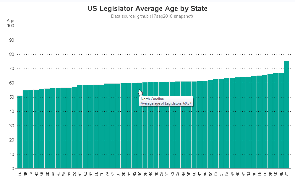
Here are the corrections & enhancements in my version of the bar chart:
- I start the age axis at zero, as is the customary "best practice" for bar charts (Now Indiana doesn't look so much younger than the other states, for example.)
- I also allow the age axis to extend out to 100, rather than chopping it off at around 80. Many members of the US Congress are in their 80s, and several have served into their 90s in the past ... therefore I felt obliged to let the age axis include the plausible range values of age.
- I used the term "US Legislator" in the title because that's the term the data source used, rather than "Congressional Delegations" (they both mean the same thing - US Congress and Senate).
- I added the data source and a timestamp for the graph, so there's no uncertainty.
- And I added HTML mouse-over text, so you can easily see what the actual values are, rather than having to visually estimate based on the axis (click the image above to see the interactive version).
The new bar chart is interesting, but I wonder if the average age tells the whole story. The data contains the individual age of each legislator, therefore let's plot those values and see how they look!
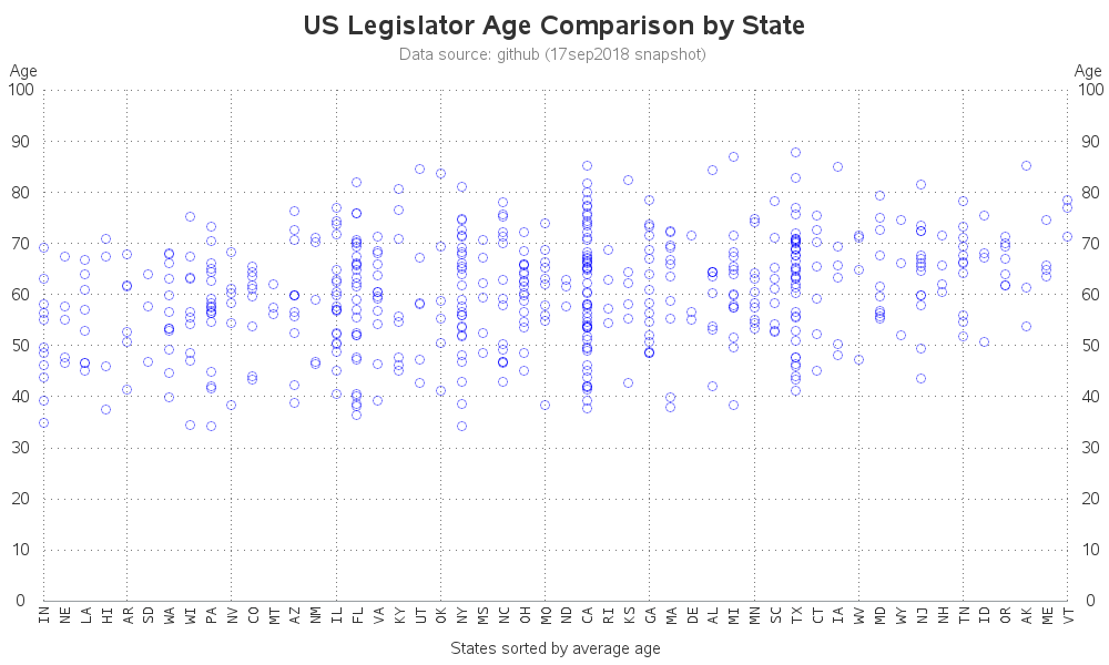
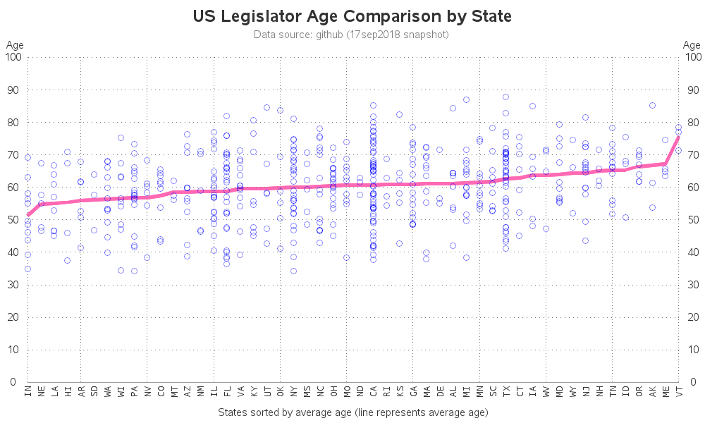
I sorted the states by average age, so we can more easily compare this scatter plot to the bar chart, but it's not immediately visually evident. Therefore I decided to add a line for the average age:
Sometimes the average (or mean) doesn't tell the whole story, and I wondered how it compared to the median age? An easy way to add the median age is to overlay a boxplot (which shows the median as the middle line in the box).
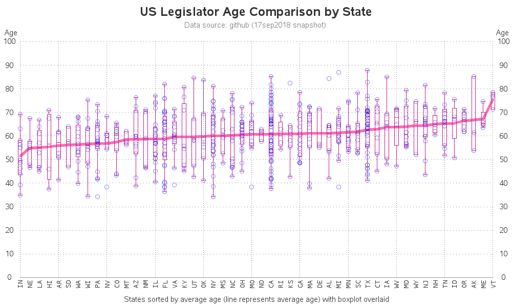
Which graph do you like best? I think I prefer the scatter plot with the line, better than the one with the boxplot.
Now for a quick quiz to test your political prowess! ... Can you name the current oldest members of the US congress & senate? How about the oldest ones that have served in the past? Leave your guesses in the comments. (No cheating & using Google!) And do you think the average age will increase, or decrease, after the upcoming election?


4 Comments
While I agree that normally on this type of graph the axis should start at zero couldn't this be regarded as a special case because, as I understand it, you have to be at least 25 to stand for election to the US congress and therefore values less than 25 aren't possible?
Hmm ... if the goal of the graph is for the bar height to represent "years over 25", they need to make that really clear (which it's not clear in the original graph).
Also, I believe US Senators have to be 30 or over (whereas Congress has the minimum age limit of 25), based on a Google search "In the United States, a person must be aged 35 or over to be President or Vice President, 30 or over to be a Senator, and 25 or over to be a Representative, as specified in the U.S. Constitution."
Great analysis Rob. And even better graphical displays.
Yay! - Snagged a comment from one of the SAS experts! Means a lot to me! :)