To stack the deck means to cheat or to fix something so a desired outcome is achieved. This term originated in card games, but can also be applied to other things. And here, I apply it (both metaphorically and literally) to creating a better graph!
I recently saw the following graph created by NPR. It was an interesting topic, and a nice clean-looking simple graph, which made me like it. The title indicated that the graph showed "the decline of farming jobs, and the rise of everything else," and when I looked at the graph, the white collar, blue collar, and services jobs did indeed appear to be increasing (look at the 'slope' of their areas in the graph - they all point dramatically towards the top/right corner).
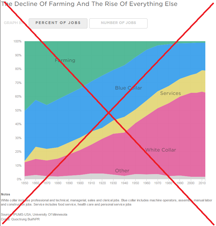
But upon closer examination, I noticed a problem. The percent of blue collar jobs had actually been decreasing quite a bit in the last few decades, rather than increasing. And that fact was disguised by the way NPR's graph was laid out - it sort of creates the illusion that blue collar jobs (the blue area) was increasing. I decided to try my hand (no pun intended!) at creating a better graph, using SAS software!
When it comes to stacked graphs, the stacking order can be very important (this is where the 'stacking the deck' analogy comes in). Just like stacking a deck of cards, you can cleverly arrange your stacked bar chart to help guarantee it will achieve the desired outcome.
By default, SAS stacks the bar segments alphabetically, but with a little bit of programming you can take complete control over the stacking order. I like to arrange the stacking order such that the things that hold constant over time have basically horizontal color bands, and the things that are changing over time have a slope to them. This takes quite a bit of trial-and-error (and studying your data) to determine the best stacking order so that "the desired outcome is achieved" when users look at your graph. Here's the layout I finally came up with:
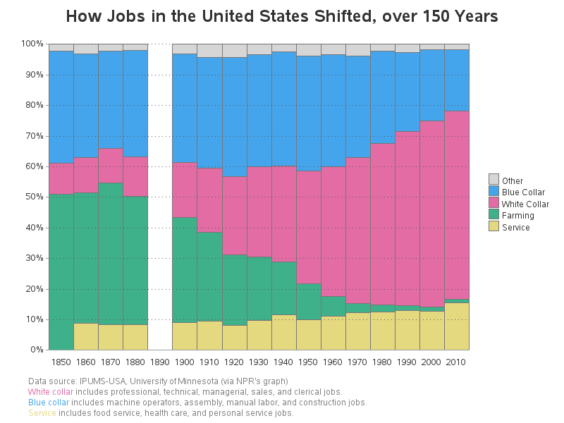
Here are a few of the changes/improvements over the original graph:
- You can more easily tell that blue collar jobs decreased over time, rather than increase.
- Breaking the footnote items into separate lines, and color-coding them to match the graph, make them easier to read.
- The horizontal reference lines make it easier to detect smaller changes over time.
- The 'missing' data for 1890 is more obvious.
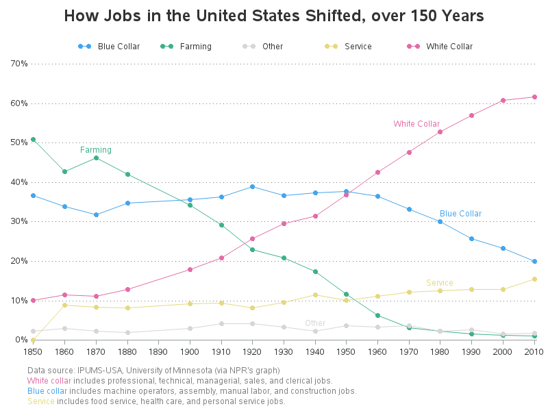
A stacked bar chart is fine for showing the shifts in jobs over the decades, but I also wanted an easy way to compare them. For example, where there more blue collar, or service jobs, in 2010? Using overlaid lines (rather than a stacked chart) would make that much easier. Therefore I created the following:
Perhaps you can create an even better graphical layout for this data? If you'd like to try, here is a link to my SAS code and data. And the astute reader will notice that I used the legacy 'cards' statement, rather than the newer 'datalines' statement ... this is yet another nod to my 'stacking the deck' analogy! ;-)

1 Comment
Hi. Really like the lines rather than the stacked bars. Since every JOB other than SERVICE has a shifting location of the baseline, it's sometimes difficult to see the change in the percentage of JOBS over time (not so with the lines). Both shown here are better than the NPR chart that seems to be paying more attention to aesthetics rather than the presentation of information.
There's another nice comparison of info in a stacked bar chart versus lines (car sales by brand over time) at ...
When to Use Stacked Barcharts?
https://solomonmessing.wordpress.com/2014/10/11/when-to-use-stacked-barcharts/
Once again, the line chart (I think) wins.