The Wall Street Journal recently published a study of the top 17 medical areas (or body parts) that venture capitalist investments are likely to benefit. They used graphs to summarize the results, but "the graph guy" in me just couldn't resist trying to improve them. Did my improvements help? - You be the judge!
Before we get started in the data analysis, I want to take a minute to point out how fortunate we are to live at a time when medical technology is so advanced. For example, the first successful long-term lung transplants took place in the 1980s ... and today we have a member on our dragonboat racing team who has had both lungs replaced. Can you tell which team member it is?

And now, on with the graph makeover! ...
In the WSJ article, they had a main graph showing the amount of $ invested in each body-part area from 1999 through the first half of 2015. Here's a screen-capture of their graph:
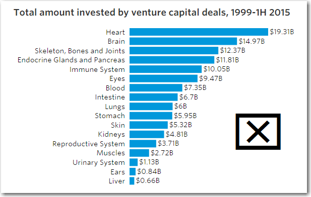
The horizontal bar chart was a good choice (especially with the long bar labels), but I found the graph a little cluttered with all the numbers at the end of the bars - and each number had a '$' and 'B' added to them, which seemed a bit redundant. Also, a bit more subtle, they don't show the same number of decimal places on the numbers, therefore they are difficult to quickly compare (such as 5.95, 6, and 6.7).
Here's my version, where I try to make it less cluttered and easier to read. Click the image below to see the full-size graph, with hover-text and drilldowns for each bar.
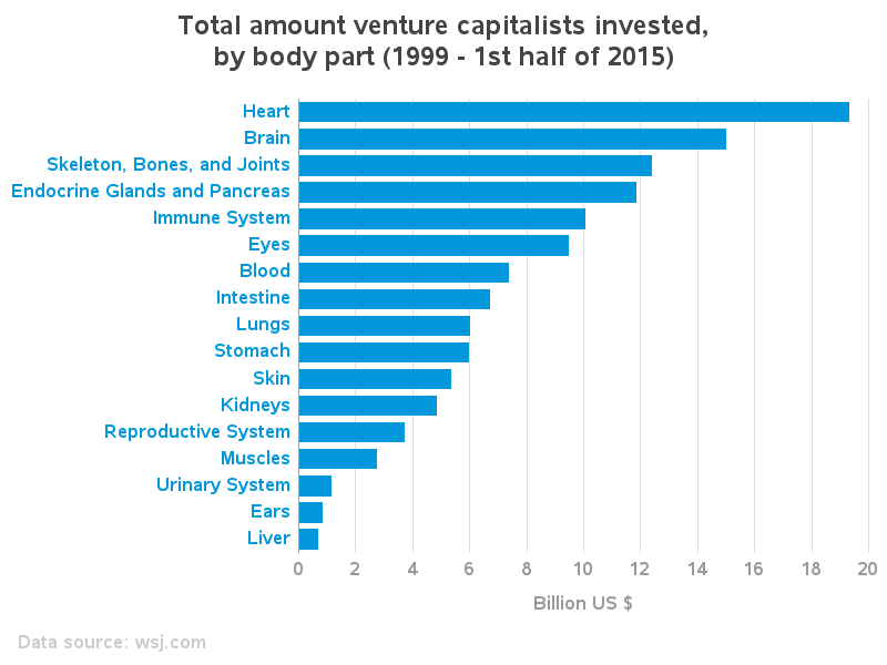
The WSJ graph had hover-text and drilldowns for each bar in the main graph, and I liked that functionality a lot. Therefore I mimicked it, using the SAS bar chart's html= option, and encoding html hover-text using the html title tag, and drilldowns using the href tag. To keep things compact and easy to manage, I placed all the drilldown graphs on the same page, and added html anchor tags which allows me to drilldown to that specific spot on the page.
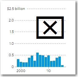
But there were a few details about the WSJ drilldown graphs that I didn't like. For example, they plotted them all to the same scale, which made all the bars in some of the graphs very short (and almost unreadable). In my opinion, if you want to compare all the body part $s you would use the main graph, and when you drilldown on a certain body part you want to compare the yearly values of the selected body part. Also, they included the 2015 "half year" in the graph, which I think is visually deceptive. Here's a screen-capture of the 'lungs' drilldown from the WSJ article:
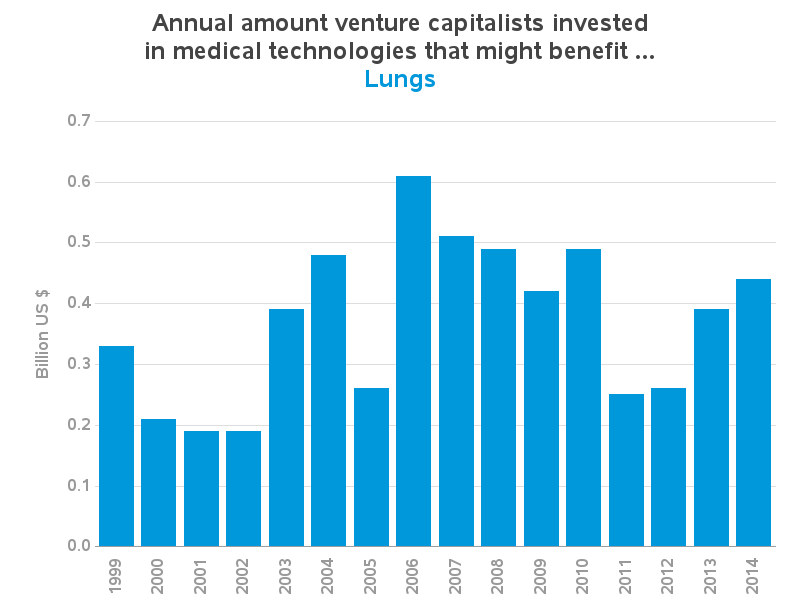
By comparison, I let my drilldown graphs auto-scale, and I leave off the 2015 partial-year bar. Also, the hover-text seems to be offset to the left in the WSJ graphs, which makes it difficult to know exactly which bar you're hovering over. And the WSJ hover-text has transparent background, which makes it difficult to read. My hover-text doesn't have those problems. Click the image below to see the interactive version of my graph:
And now, about that lung transplant ... Have you guessed which of my teammates it is?!? :)


3 Comments
Much better visualization via simplification. As I have big ears it's good to see an apparent increase in that area.
I'll give you a hint to narrow it down a bit ... it's one of the girls! :)
But you couldn't guess, eh!?! :) ... It's Jess, in the red shorts!