In the previous post on Broken Y-Axis, I reviewed different ways to display data as a Bar Chart, where the response values for some categories are many orders of magnitude larger than the other values. These tall bars force the display of other values to be squeezed down thus making it harder to compare the smaller values among themselves.
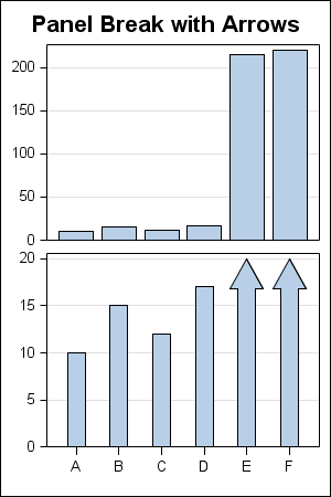
The final visual in the above article was a graph made using SAS 9.3 High Low plot shown below:
SAS 9.3 GTl Code:
proc template; define statgraph High_Low; begingraph; entrytitle 'Panel Break with Arrows'; layout lattice / rows=2 columndatarange=union rowweights=(0.5 0.5) rowgutter=2; columnaxes; columnaxis / tickvalueattrs=(size=7) display=(ticks tickvalues); endcolumnaxes; layout overlay / yaxisopts=(display=(ticks tickvalues) offsetmin=0 griddisplay=on tickvalueattrs=(size=7) ); barchart x=x y=y / barwidth=0.8; endlayout; layout overlay / yaxisopts=(display=(ticks tickvalues) offsetmin=0 griddisplay=on tickvalueattrs=(size=7)) ; highlowplot x=x low=low high=high / type=bar highcap=highcap barwidth=0.8; endlayout; endlayout; endgraph; end; run; |
On further investigation, I discovered a way to create a similar graph using SAS 9.2 GTL code. While the code is not as robust and scalable as the one using the High Low plot, you can create something close using SAS 9.2 GTL. The data, the graph and the GTL code are shown below.
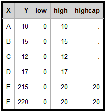
The Data:
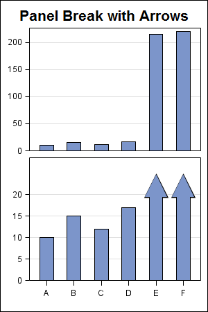
The Graph using SAS 9.2 GTL:
SAS 9.2 GTL Code:
proc template; define statgraph High_Low; begingraph; entrytitle 'Panel Break with Arrows'; layout lattice / rows=2 columndatarange=union rowweights=(0.5 0.5) rowgutter=2; columnaxes; columnaxis / tickvalueattrs=(size=7) display=(ticks tickvalues) offsetmin=0.1 offsetmax=0.1; endcolumnaxes; layout overlay / yaxisopts=(display=(ticks tickvalues) offsetmin=0 griddisplay=on tickvalueattrs=(size=7) ); barchart x=x y=y / fillattrs=graphdata1 barwidth=0.5; endlayout; layout overlay / yaxisopts=(display=(ticks tickvalues) offsetmin=0 griddisplay=on tickvalueattrs=(size=7)) ; scatterplot x=x y=eval(highcap+2) / markerattrs=(symbol=trianglefilled color=black size=31); barchart x=x y=high / fillattrs=graphdata1 barwidth=0.5; scatterplot x=x y=eval(highcap+2) / markerattrs=(symbol=trianglefilled color=graphdata1:color size=29); endlayout; endlayout; endgraph; end; run; |
Here we have used an overlay of two scatter plots and a bar chart to create the arrow heads. If the plot statements are ordered carefully, the appearance of bars with arrows can be created. The scatter plot markers used as arrow heads are manually sized for this specific use case, and hence this simple program will not scale (as is) to different data. However, something close could be attained using some creative programming.
Full SAS 9.2 Program: SAS92_Code


