A SAS programmer asked how to display long labels at irregular locations along the horizontal axis of scatter plot. The labels indicate various phases of a clinical study. This article discusses the problem and shows how to use the FITPOLICY=STAGGER option on the XAXIS or X2AXIS statement to avoid collisions of the tick labels. As a bonus, the Appendix shows how to solve the problem when the locations of the labels are stored in a SAS data set.
The challenge of non-overlapping labels
One of the challenges in statistical graphics is that long labels in plots can overlap, which makes the labels difficult to read. There are a few standard tricks for dealing with long or densely packed labels in graphs:
- For scatter plots with labeled markers, PROC SGPLOT in SAS uses a collision-avoidance algorithm that chooses positions for the labels so that the labels overlap as little as possible. You can also use the POSITION= option on the TEXT statement to manually place labels.
- For bar charts that display long category names, a useful trick is to use a horizontal bar chart (HBAR) instead of a vertical bar chart (VBAR). This enables you to plot long labels and many categories without having the tick labels overlap.
This article demonstrates a new technique for your graphical toolbox: How to use the FITPOLICY= option on the XAXIS or X2AXIS statements to prevent tick labels from overlapping. Specifically, this article shows the FITPOLICY=STAGGER option.
Illustrate the problem
To understand the problem, let's construct some hypothetical data about a weight-loss study. The analyst wants to display the weekly mean weight loss of the participants in the program along with reference lines and labels that visualize various phases and events in the study. The following program uses the REFLINE statement in PROC SGPLOT to specify the location of the events. By default, the labels for the events are displayed at the top of the scatter plot:
data Have; label MeanValue = "Mean Weight Loss (kg)"; input Day MeanValue @@; datalines; 0 0 7 1 14 2.2 21 2.7 28 3.1 35 3.3 42 3.6 49 4.1 56 5.0 63 5.6 70 5.9 77 6.3 84 6.5 ; title "Mean Weight Loss in Program"; title2 "First Attempt"; proc sgplot data=Have noautolegend; scatter x=Day y=MeanValue; refline (0 21 25 42 60 84) / axis=x label=('Phase 1' 'Phase 2' 'Adjustment' 'Phase 3' 'End Treatment' 'End Study'); run; |
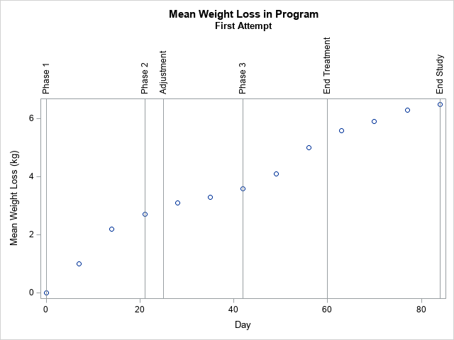
For this set of labels and for the default size of the plot, the REFLINE statement decided to plot the labels vertically because the 'Phase 2' and the 'Adjustment' labels are close to each other and would overlap if the labels are displayed horizontally. The plot isn't terrible looking, but we can do better. I would prefer for the labels to appear horizontally rather than to be rotated by 90 degrees.
Sometimes, you can handle long labels on a horizontal axis by simply making the graph wider.
For example, you might try to use
ODS GRAPHICS / width=800px height=400px;
to see whether a wider plot enables the reference labels to display side-by-side without overlapping. For these data, the distance between the 'Phase 2' event (Day=21) and the 'Adjustment' event (Day=25) is very close, so making the plot longer does not fix the problem.
Similarly, you can try to use the LABELATTRS= option to decrease the font size of the labels. The SIZE=6 option is the smallest font size that I can read. However, adding the LABELATTRS=(Size=6) option to the REFLINE statement does not fix the problem for these data.
The problem is that the REFLINE statement has limited support for displaying the labels. It checks to see if they can be displayed horizontally without colliding, and, if not, it rotates the labels 90 degrees. In contrast, PROC SGPLOT provides more support for the tick label on an axis. The XAXIS and X2AXIS statements support the FITPOLICY= option, which provides more options for controlling how to handle overlapping labels. The next section removes the REFLINE statement and uses two X axes: one to show the days and another to show the events.
The FITPOLICY=STAGGER option
As mentioned, the XAXIS and X2AXIS statements support the FITPOLICY= option, which supports more than a dozen ways to control the display of the ticks labels. For these data, I will use FITPOLICY=STAGGER, which alternates the placement of the labels in a two-row display. See the documentation for other useful options.
To visualize both the Day values and the events, you can use two axes, one below the scatter plot and one above the plot. In the following graph, the upper axis displays the events, and the lower axis displays the Day. (You could easily make the opposite choice.) The following techniques are used to create the plot:
- To create the X2 axis, you must create a plot that uses the X2 axis. In this case, I create an invisible scatter plot. It is invisible because the SIZE=0 option tells the plot that the markers have no width. The invisible plot ensures that the X and X2 axes have the same range.
- You can use the VALUES= option to specify the locations of the tick marks.
- You can use the VALUESDISPLAY= option to specify the strings that are associated with the tick marks.
- By adding the GRID option to the X2AXIS statement, you get a vertical line at each tick mark.
title2 "Uses FITPOLICY=STAGGER to Stagger Labels"; proc sgplot data=Have noautolegend; scatter x=Day y=MeanValue; /* add an invisible scatter plot to the X2 axis (set SIZE=0) */ scatter x=Day y=MeanValue / x2axis markerattrs=(size=0); x2axis display=(nolabel) grid FITPOLICY=stagger values = (0 21 28 42 60 84) valuesdisplay = ('Phase 1' 'Phase 2' 'Adjustment' 'Phase 3' 'End Treatment' 'End Study'); run; |
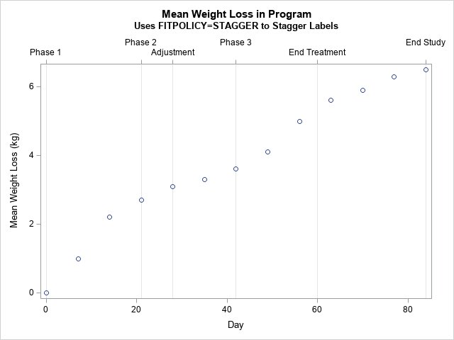
The SAS analyst was very happy to see this graph. Both the days and the events in the study are apparent. None of the tick labels overlap. The text is displayed horizontally.
Summary
This example shows how to use the FITPOLICY=STAGGER option to avoid overlap when you display long tick labels on an axis. The example uses two X axes: one to display the data and another to display related events. To use a second axis (called the X2 axis), you must create a plot that uses the second axis. This article creates an invisible scatter plot, which ensures that the X and X2 axes have the same scale.
In this article, I have hard-coded the locations of the ticks and the labels for each tick mark. However, if this information is in a SAS data set, you can read the data into macro variables and plot the events automatically. This trick is shown in the Appendix.
Appendix
Sometimes the location and labels for the events are stored in a SAS data set. If so, you can read that information into a SAS macro variable and use the macro as the value for the VALUES= and VALUESDISPLAY= options on the XAXIS or X2AXIS statements. You can use PROC SQL and the SELECT INTO (COLON) statement to create a macro variable that contains the data. There is one trick to learn: The values in the VALUESDISPLAY= option must be strings, so when you read the data you should add quotation marks around the strings, as follows:
data Ticks; length Label $15; input value Label 5-18; Label = "'" || trim(Label) || "'"; /* add single quotes to both sides of each string */ datalines; 0 Phase 1 21 Phase 2 25 Adjustment 42 Phase 3 60 End Treatment 84 End Study ; /* put the list of values into macro variables */ proc sql noprint; select value into :TickList separated by ' ' from Ticks; select Label into :LabelList separated by ' ' from Ticks; quit; %put &=TickList; %put &=LabelList; /* use the macro variables in the VALUES= and VALUESDISPLAY= options */ proc sgplot data=Have noautolegend; scatter x=Day y=MeanValue; scatter x=Day y=MeanValue / x2axis markerattrs=(size=0);/* invisible */ x2axis display=(nolabel) grid FITPOLICY=stagger values = (&tickList) valuesdisplay = (&LabelList); run; |
The graph is the same as the previous example, which hard-coded the tick values and strings.
