Sanjay recently posted about the new POSITION= option in the TEXT statement: Little things go a long way. This option enables you to precisely control where a label goes relative to a point by specifying any of the following positions: Bottom, Center, Top, BottomLeft, Left, TopLeft, BottomRight, Right, and TopRight. You can specify a custom value for every point. In Sanjay's example, labeling points on a curve, he could apply the same rule to various regions of the curve. I wondered if you could also use this option in scatter plots to tweak a few label positions. That is, I wanted to let the label collision avoidance algorithm place most of the labels but manually reposition a few.
Labeling points in a scatter plot has been near and dear to my heart for over 30 years. My first SUGI paper in 1984 was on this topic as was my first journal publication. One of my favorite data sets for evaluating label placement algorithms contains scores on the first two principal components of the mammals' teeth data. The code for creating the data set is given in the link at the end of this post. These data are interesting because there are several pairs of coincident points and several clusters of points. All must be labeled correctly.
The default label-placement algorithm works great for these data! Notice too that by specifying consistent minima and maxima on the axes and an aspect ratio of one, the geometry of the principal component analysis is properly portrayed--the axes are equated.
ods graphics on / height=6in width=6in; proc sgplot data=scores aspect=1; scatter y=prin2 x=prin1 / datalabel=mammal; xaxis min=-4.5 max=3; yaxis min=-4.5 max=3; label prin1 = 'Component 1' prin2 = 'Component 2'; run; |
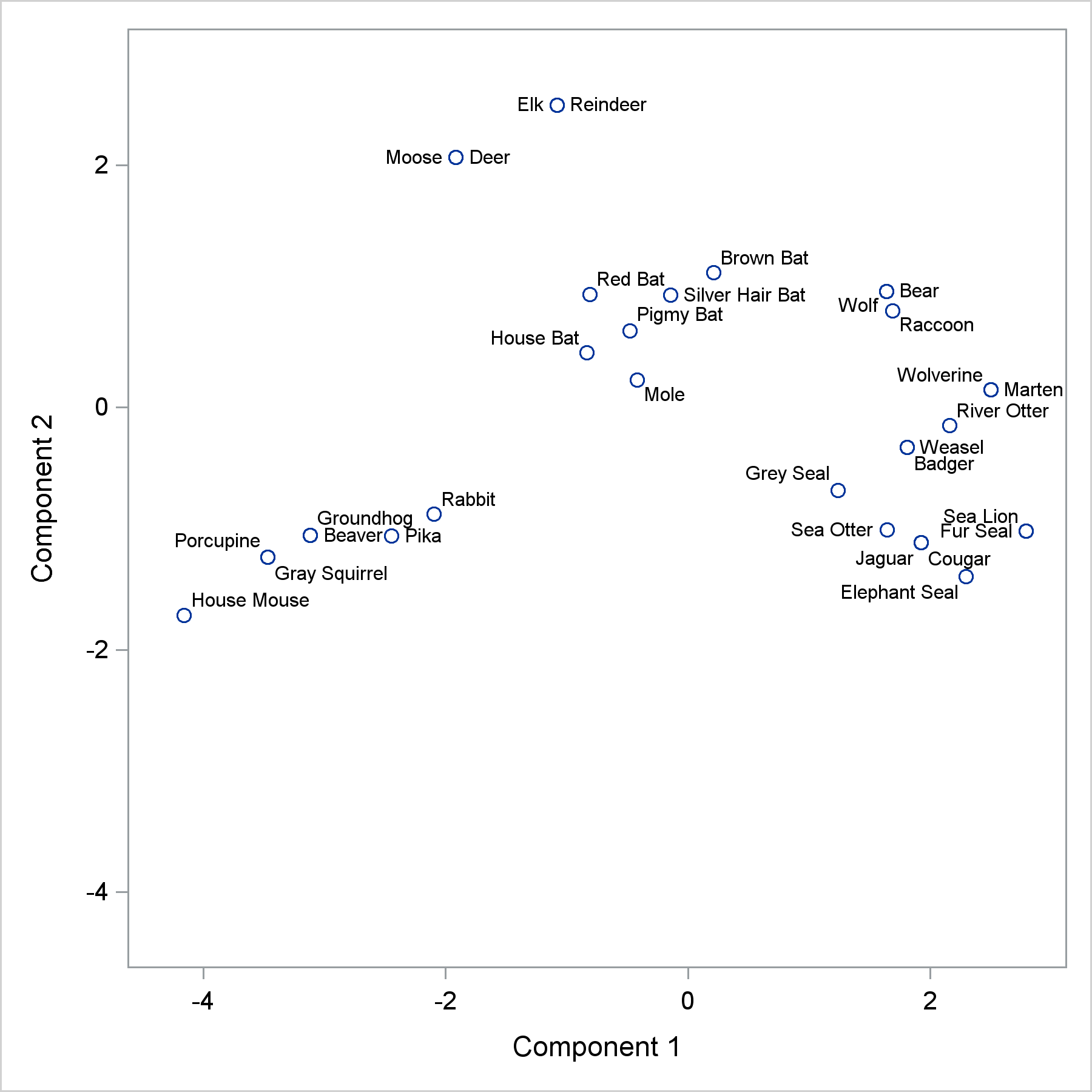
Every label appears in a reasonable place, and there are no collisions. Given a little bit of experience with how label placement in ODS Graphics works, you can immediately see that Wolf and Bear are coincident (not Wolf and Raccoon or Bear and Raccoon). Similarly, you can see that it is Jaguar and Cougar that are coincident and not Cougar and Elephant Seal. Still, a computerized algorithm has no sense of aesthetics. I know that the larger space before Beaver versus the smaller space after it suggests that Beaver and Groundhog are coincident and the Beaver label is labeling the point that comes before it and not after it. This might not be as obvious to others. It would be nice if we could better position the labels for Beaver and Groundhog. Before I show you how to do that, let's double check and make sure that I am right about Beaver and Groundhog being coincident. Instead of using labels, you can plot the mammal names as markers. Markers are not restricted to single characters. The following plot, while not suitable for publication, can be helpful when you want to be sure you understand the associations in a plot of labeled points.
proc sgplot data=scores aspect=1 nocycleattrs; scatter y=prin2 x=prin1 / markerchar=mammal; xaxis min=-4.5 max=3; yaxis min=-4.5 max=3; label prin1 = 'Component 1' prin2 = 'Component 2'; run; |
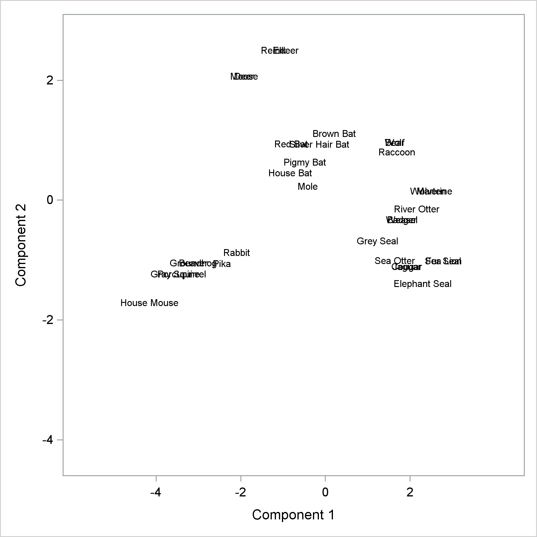
Indeed, the markers for Groundhog and Beaver are centered at the same location. Next, we can create some new variables. The point is to remove the Beaver and Groundhog labels from the SCATTER statement and place them precisely where we want them to be by using a TEXT statement. The variable AltMammal contains the mammal name only when we want to move it from its default location. Alternative coordinates (ay and ax) slightly move the location, and the Pos variable provides the position. Note that we are not changing the location of the marker; we are just moving the label.
data scores2;
   set scores;
   if mammal =: 'Beav' then do;
      altmammal = mammal;
      mammal = ' ';
      ay  = prin2 - .07;
      ax  = prin1;
      pos = 'bottomright';
   end;
   if mammal =: 'Grou' then do;
      altmammal = mammal;
      mammal = ' ';
      ay  = prin2 + .07;
      ax  = prin1 - .2;
      pos = 'top';
   end;
run; |
Now a TEXT statement positions just those two labels while the SCATTER statement positions the rest. This example also adds jittering options. Coincident points are slightly jittered or moved so that it is clear that two points map to the same point in the graph. The JITTERWIDTH=10 option controls the amount of jittering. It might take some trial and error to find a suitable value.
title "Mammals' Teeth"; proc sgplot data=scores2 aspect=1 nocycleattrs noautolegend; text y=ay x=ax text=altmammal / position=pos; scatter y=prin2 x=prin1 / datalabel=mammal jitter jitterwidth=10; xaxis min=-4.5 max=3; yaxis min=-4.5 max=3; label prin1 = 'Component 1' prin2 = 'Component 2'; run; |
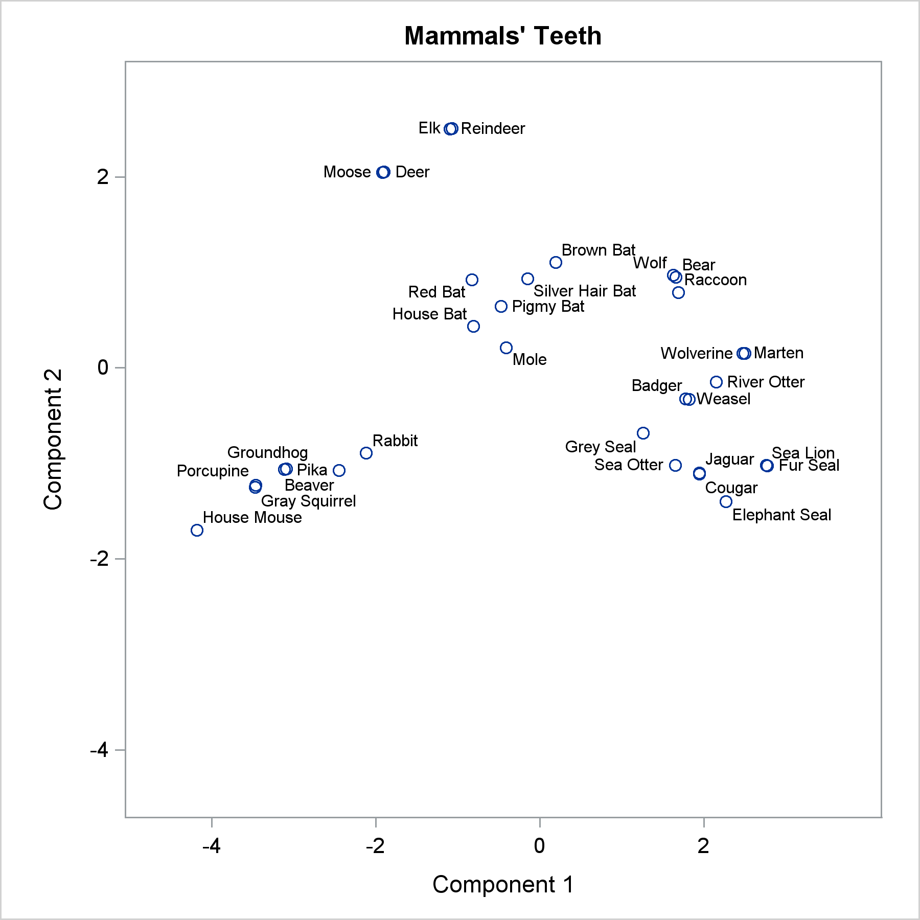
With Beaver moved from its default location, Pika jumps to the Beaver label's previous spot. This is fine since Beaver is nicely positioned elsewhere. You can apply this same logic to any number of points, but be aware that when you remove one point, the others in the vicinity might shift.
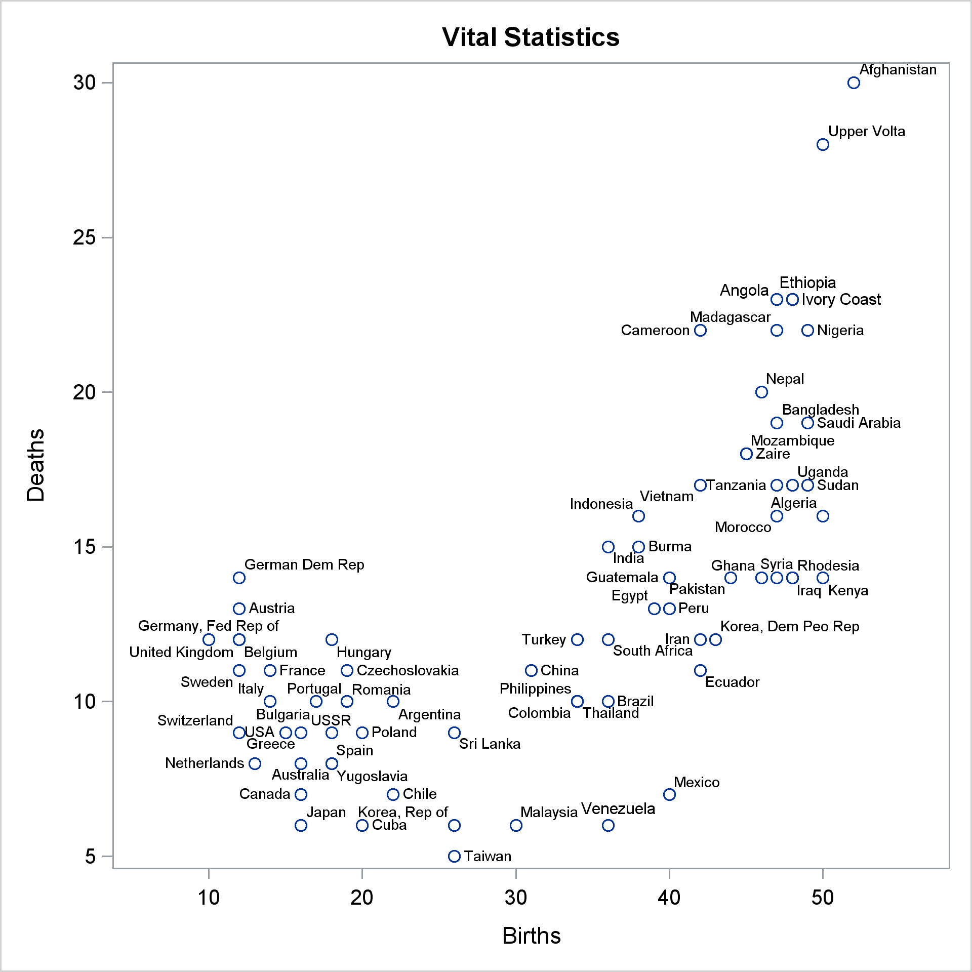
My second favorite data set for label placement is the vital statistics data set. It is also provided in the link at the end of this post.
ods graphics on / height=6.4in width=6.4in; proc sgplot data=vital noautolegend; scatter y=deaths x=births / datalabel=country; run; |
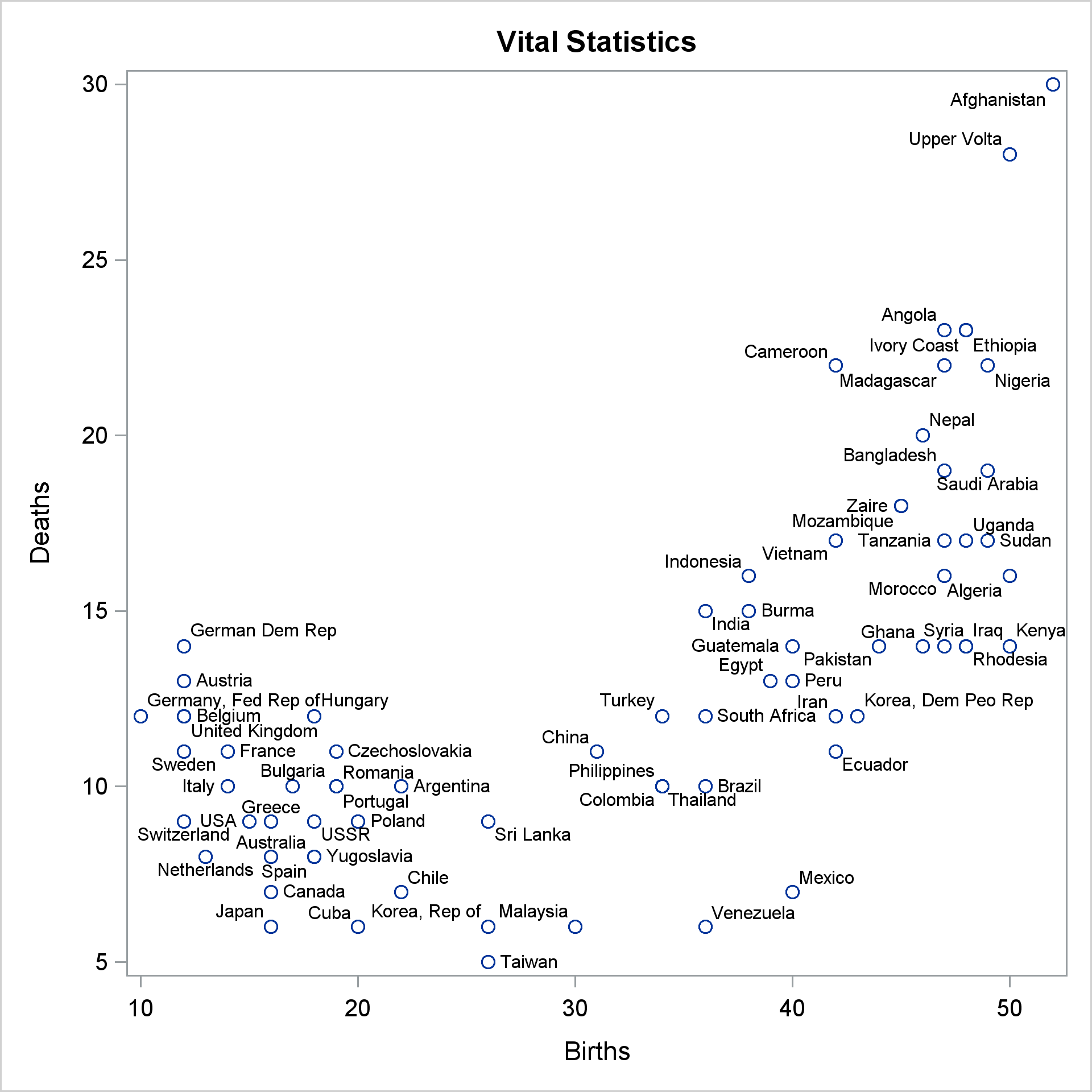
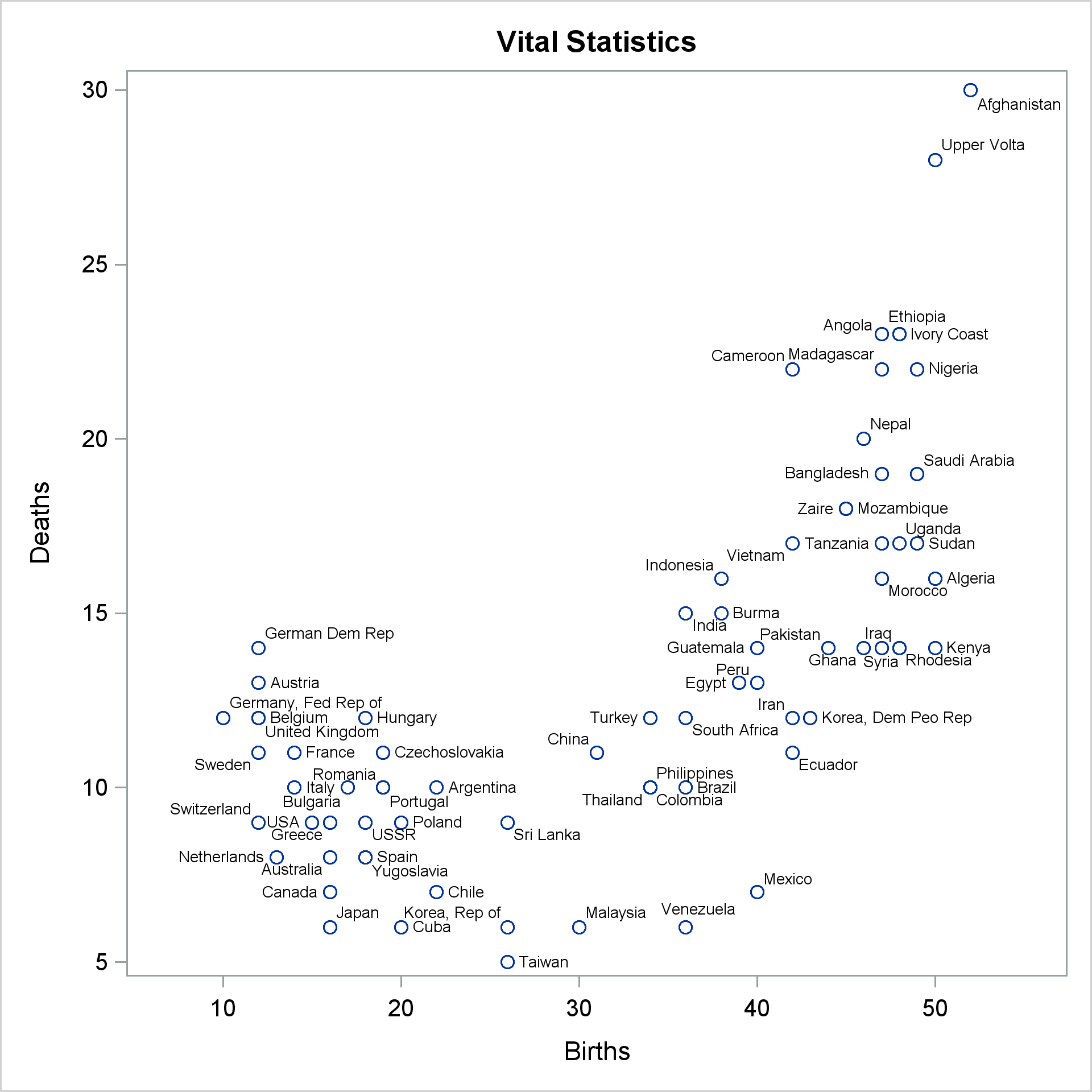
This is a tough data set for label placement software. The default algorithm nicely avoids collisions, but it can be hard to sort out which labels correspond to which points. I show ways of dealing with this data set in my advanced book. We will not go into that level of detail here, but we will tweak a few of the labels. Let's start with an easy one. Venezuela is clearly not coincident with Mexico, but still, it would be nice if it were moved a bit to the left. It would also be nice to move Ivory Coast over closer to Ethiopia, but that leaves room for Angola's label to change. We can change the position of all four and use a macro to make it easier.
data vital2;
   set vital;
   %macro p(pos, x=0, y=0);
      then do;
         altcountry = country;
         country    = ' ';
         pos        = "&pos" || '            ';
         altbirths  = births + &x;
         altdeaths  = deaths + &y;
      end;
   %mend;
   if country eq 'Venezuela' %p(top, x=.7, y=0.25)
   if country eq 'Ethiopia'  %p(top, y=0.25, x=1)
   if country =: 'Ivory'     %p(right, x=0.6)
   if country eq 'Angola'    %p(topleft, x=-0.5)
run; |
The macro provides a convenient way to change the position and optionally change the coordinates. The concatenation is used to ensure that the position is always at least 15 characters long to avoid truncation when a longer position is provided later. As a firm believer in not specifying superfluous semicolons and RUN statements, I do not end the macro calls with unnecessary semicolons.
proc sgplot data=vital2 noautolegend; scatter y=deaths x=births / datalabel=country; text y=altdeaths x=altbirths text=altcountry / position=pos; run; |
That does not quite work. All the labels are positioned in the right place, but the ones we repositioned are too big. You might have to click the graph and zoom in to see that. The label placement routine in ODS Graphics does many things to avoid collisions including shrinking the fonts when label placement gets tight. The TEXT statement does not do that. We can avoid this inconsistency by specifying a smaller font than the default and using it in both the SCATTER and TEXT statements. This might require some trial and error. I specified it in a macro variable so that I can change it once and affect both statements. For this graph, we need to use a 6 point font.
%let f = attrs=graphdatatext(size=6pt); proc sgplot data=vital2 noautolegend; scatter y=deaths x=births / datalabel=country datalabel&f; text y=altdeaths x=altbirths text=altcountry / position=pos text&f; run; |
The final example again uses the vital statistics data set. It repositions several labels and it uses jittering, the default jitter width, and smaller markers and fonts. With these changes, the associations between every label and every marker is clear. (Now it might not be clear which jittered marker goes with which label, but that is irrelevant since jittering is only a tool to show how many markers go to the same place.) Some of the labels are repositioned to make the mapping clearer. Some are simply for aesthetics. I think it is nicer if the labels repel each other as much as they can--if a label can go to two positions without colliding with other labels, I prefer the one that is farther from other labels. In some cases, I moved one label so it would open room for other labels to move away from each other. As you play with this technique, you will quickly become good at figuring out such strategies.
data vital3;
   set vital;
   %macro p(pos, x=0, y=0);
      then do;
         altcountry = country;
         country    = ' ';
         pos        = "&pos" || repeat(' ', 12);
         altbirths  = births + &x;
         altdeaths  = deaths + &y;
      end;
   %mend;
   if country =: 'Tai' %p(right, x=.3)
   if country =: 'Ban' %p(topleft)
   if country =: 'Mal' %p(top, y=.25)
   if country =: 'Hun' %p(right, x=.4, y=.1)
   if country =: 'Bel' %p(right, x=.4)
   if country =: 'Tan' %p(bottomleft)
   if country =: 'Vie' or country =: 'Gha' or country =: 'Gua' %p(topleft, y=.1)
   if country =: 'Uga' %p(top,y=.1, x=.5)
   if country =: 'Sud' %p(right, x=.4)
   if country =: 'Fra' %p(topright, x=.4)
   if country =: 'Swe' or country =: 'Pak' %p(bottomleft)
   if country =: 'Mad' %p(bottom, y=-.1)
   if country =  'Australia' %p(top, y=.1, x=-.65)
   if country =  'Korea, Rep of' %p(bottom, y=-.15)
run;

%let f = attrs=graphdatatext(size=5.5pt);
proc sgplot data=vital3 noautolegend;
   scatter y=deaths x=births / datalabel=country jitter
                               datalabel&f markerattrs=(size=3pt);
   text    y=altdeaths x=altbirths  text=altcountry / position=pos text&f;
run; |
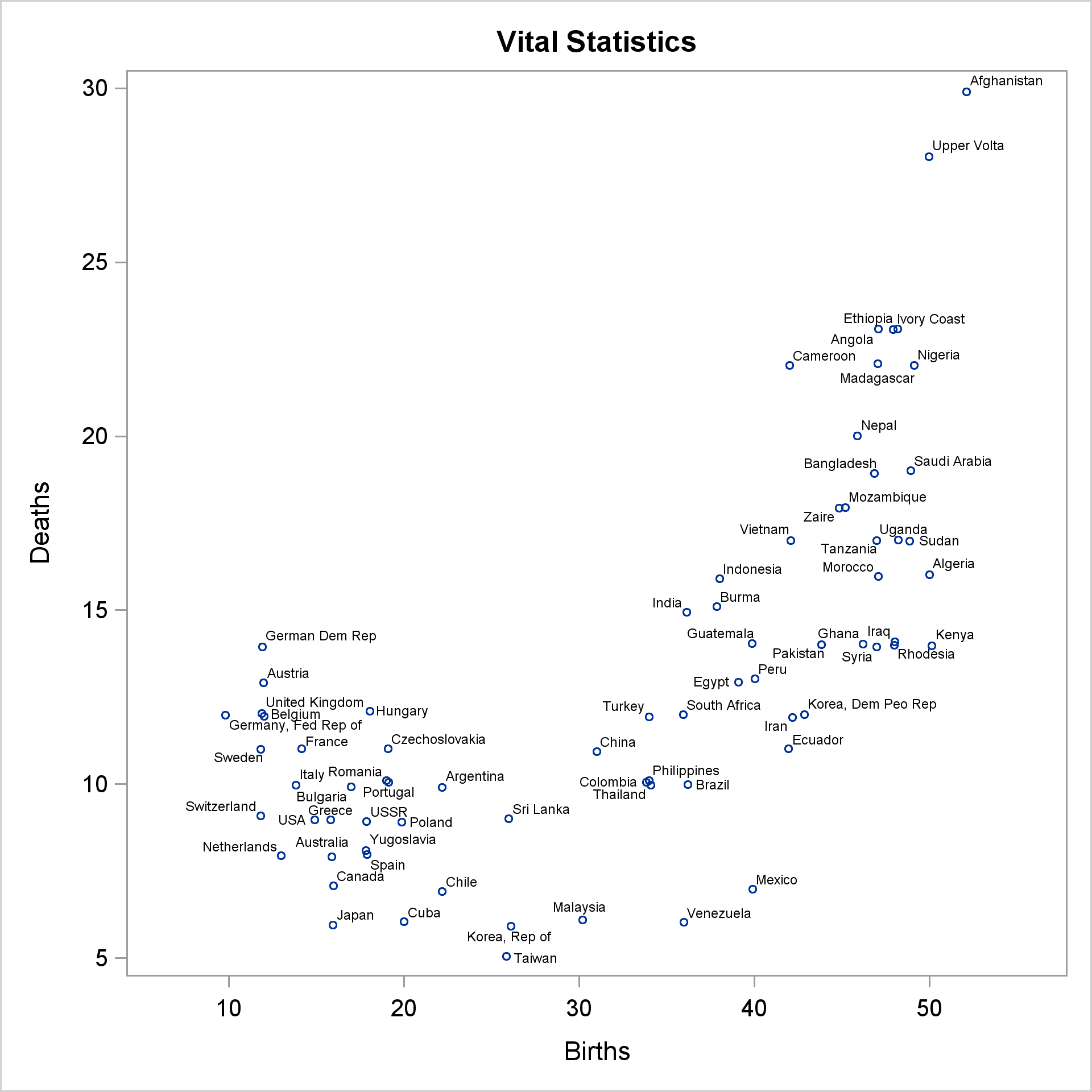
If you want to play with this example, you might start by moving Canada to the left, Netherlands down, and 'Germany, Fed Rep of' to the left. Be aware that these graphs are very much dependent on other options. They were all generated using the HTML destination, STYLE=HTMLBlue, IMAGE_DPI=300, and release 9.4M5. You will not get the same results if you use the default dots per inch.
In summary, if you want to reposition a few labels, you might be able to use this technique. However, if you are working in a really tight part of the plot, you might find that the other labels will reposition themselves too much, or you might find that you first need to think about how to move a few of the fringe labels out of the way. However you plan on placing labels, you should check out the TEXT statement and the POSITION= option. They give you a great deal of control over label placement. See Sanjay's post for a great example of using TEXT and POSITION= for placing all of the labels.

1 Comment
Pingback: How to stagger labels on an axis in PROC SGPLOT - The DO Loop