O Christmas tree,
O Christmas tree,
How lovely are your branches!

SAS programmers have a long history of creating yuletide-themed graphics. Christmas trees are a popular image because of their simplicity. I admit that I have indulged more than once in this holiday tradition:
- An old-school ASCII art image
- A math-nerd image based on Pascal's triangle and plotted by using a heat map
- A fractal tree based on an iterated function system
In 2023, KSharp posted an interesting Christmas tree graph on the SAS Support Communities. The graph was created by creating one graphical object that was translated, scaled, and overlaid on itself multiple times. KSharp's basic object looks like a volcano. When scaled and translated, the multiple "volcano" shapes create an image that vaguely resembles an evergreen fir tree.
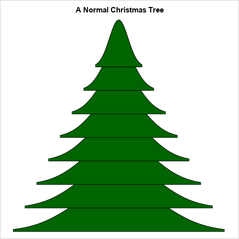
Today's post is inspired by KSharp's image, but I replace his "volcano" shape with the bell-shaped curve for the normal distribution. In other words, I start with a plot of the normal density curve. I use green to fill the area under the curve and then scale and shift the image curve several times. One possible image is shown to the right. The normal curve is scaled, translated, and overlaid eight times.
This image can be created by using Base SAS. The next sections explain the basic mathematical concepts. The article includes a SAS program that creates the image. You can modify the parameters of the algorithm to make the tree skinner or to add more "branches." Although this article is primarily for fun, it contains some important lessons about linear scaling, affine transformations, and how to shade the area under a probability density function.
The normal density curve
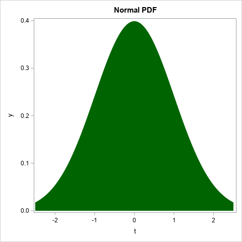
I have previously shown how to create a normal density curve and to use the BAND statement in PROC SGPLOT to shade the area under the curve and above the X axis. You can use this technique to create the standard normal density curve, which is also called the probability density function or the PDF. You can use a dark green color to fill the area under the curve. In the following DATA step, I do this in two steps. First, I compute the standard normal PDF and store the results in two temporary arrays, X and PHI. The X values are evenly spaced on the interval [-XMAX, XMAX] where XMAX=2.5. The second step is to output the values of X and PHI to a SAS data set. So that I can use the BAND statement to fill the area under the normal curve, I include the BASELINE variable in the output. For this example, the BASELINE variable has the constant value 0.
/* build it up in stages */ data Normal1; array x[101] _temporary_; array phi[101] _temporary_; xMax = 2.5; /* compute the standard normal PDF on [-xMax,xMax] */ dx = 2*xMax / (dim(x)-1); /* step size in interval */ do i = 1 to dim(x); x[i] = -xMax + (i-1)*dx; phi[i] = pdf("Normal", x[i]); end; do i = 1 to dim(x); t = x[i]; y = phi[i]; baseline = 0; output; end; keep i baseline t y; run; title "Normal PDF"; proc sgplot data=Normal1 noautolegend; band x=t upper=y lower=baseline / fill fillattrs=(color=DarkGreen); run; |

The X and Y axes are not to scale, but that's okay because I plan to rescale the shape. You might wonder why I used two steps to perform this computation. For this example, we don't need the temporary arrays. We could compute the standard normal PDF and then immediately scale it. However, in the next section, I implement a loop that scales and translates the normal curve multiple times. It is easier, clearer, and more efficient to store the curve in arrays and then transform the arrays in a loop.
Translating and scaling the normal curve
Linear transformations are one of the most important and most useful ideas in all of mathematics. An affine translation is a linear transformation (basically, a scaling) followed by a translation. You can use affine transformations to build a Christmas tree from the normal PDF.
Consider the linear function that maps the interval [a,b] into the interval [c,d].
Geometrically, the graph of this function passes through the point (a,c) and has slope m = (d-c)/(b-a).
From the point-slope formula, the algebraic form of the function is
y = m*(x-a) + c, where m = (d-c)/(b-a).
Establishing the geometry of a Christmas tree
I want my Christmas tree to resemble an isosceles triangle with base b and height h. I measured the tree in my living room and chose b=4 and h=6 as realistic values. I decided to represent the tree by using n=8 overlapping copies (appropriately scaled) of the normal curve. That means that each copy must have a height of h/n = 4/3. Thus, I need to vertically scale the PDF from its true height of φ(0) = 0.399 to its display height of h/n.
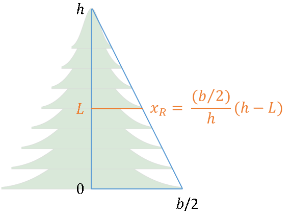
I will call each copy a "branch" of the tree. The horizontal width of each branch will depend on its height. For the lowest branch, I need to rescale the half-width of the shape (which is xMax) to b/2. For a branch at height L, the following geometry shows that the half-width of the branch is (b/2)/h * (h-L).

A SAS program to overlay normal density curves
Thus, by using high-school geometry and linear scaling, you can write the following SAS program to overlay n scaled copies of the normal curve at various heights:
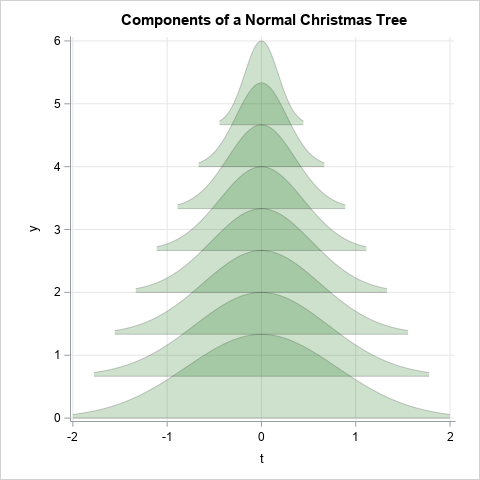
/* A normal Christmas tree: Each branch is a normal PDF (shaded) */ data NormalTree; array x[101]; /* for efficiency, store (x, phi(x)) values in an array */ array phi[101]; /* compute the standard normal PDF on [-xMax,xMax] */ xMax = 2.5; dx = 2*xMax / (dim(x)-1); /* step size for x */ do i = 1 to dim(x); x[i] = -xMax + (i-1)*dx; /* the i_th point in [-xMax,xMax] */ phi[i] = pdf("Normal", x[i]); /* phi(x) is normal PDF */ end; b = 4; /* width of the tree base; the interval is [-b/2, b/2] */ h = 6; /* height of tree; the interval is [0, h] */ nSegs = 8; /* number of normal curves to overlay to construct the tree */ /* linear transformation of Y from [0,maxPhi] to [0, 2*dy]. Use for ALL branches. */ maxPhi = pdf("Normal", 0); dy = h / (nSegs+1); /* height of each normal curve */ do i = 1 to dim(x); phi[i] = 2*dy / maxPhi * phi[i]; end; /* Translate curve and baseline up by k*dy units. Linearly transform X from [-xMax,xMax] to [-xR, xR]. If you slice the right triangle with base b/2 and height h at L=k*dy, the width of the slice is xR = (b/2)/h * (h-L) */ do k = 0 to nSegs-1; baseline = k*dy; xR = (b/2)/h * (h - baseline); do i = 1 to dim(x); t = xR / xMax * x[i]; /* t is the scaled version of X for k_th branch */ y = baseline + phi[i]; /* vertically translate Y values */ output; end; end; keep k i baseline t y; run; /* Fill/shade the PDF: https://blogs.sas.com/content/iml/2015/07/20/density-shaded-tails.html */ ods graphics / width=480px height=480px; title "Components of a Normal Christmas Tree"; proc sgplot data=NormalTree noautolegend aspect=1 noborder; band x=t upper=y lower=baseline / group=k transparency=0.8 fill fillattrs=(color=DarkGreen) outline lineattrs=(color=black); xaxis grid; yaxis grid; run; |
The graph shows the construction. I used the TRANSPARENCY= option to make each branch partially transparent. In this image you can see the coordinate system and how each branch is a normal PDF that is scaled in the horizontal direction and translated in the vertical direction.

The final image requires only minor modifications. The following call to PROC SGPLOT remove the transparency and the grid. It suppresses the labels, ticks, and values on the axes. The image is shown at the top of this article.
title "A Normal Christmas Tree"; proc sgplot data=NormalTree noautolegend aspect=1 noborder; band x=t upper=y lower=baseline / group=k fill fillattrs=(color=DarkGreen) outline lineattrs=(color=black); xaxis display=none; yaxis display=none; run; |
Summary
This article shows how to use the DATA step and PROC SGPLOT in SAS to create a Christmas tree image. Although this article is primarily for fun, it shows how to perform important operations in SAS such as linear scaling, affine transformations, and how to shade the area under a probability density function. Except for the definition of the normal density curve, the program uses only high-school level mathematics.
Lest you assume that translating and scaling the graph of a probability distribution has no practical value, I previously used this technique to visualize error distributions for generalized linear regression models.
O Christmas tree, how lovely are your branches! Especially when they are created by using the most important probability distribution in statistics, the normal distribution!

1 Comment
This is where we need @Nigel Law to step in with his 3D rotating Christmas tree he created for SAS/Insight.
Merry Christmas