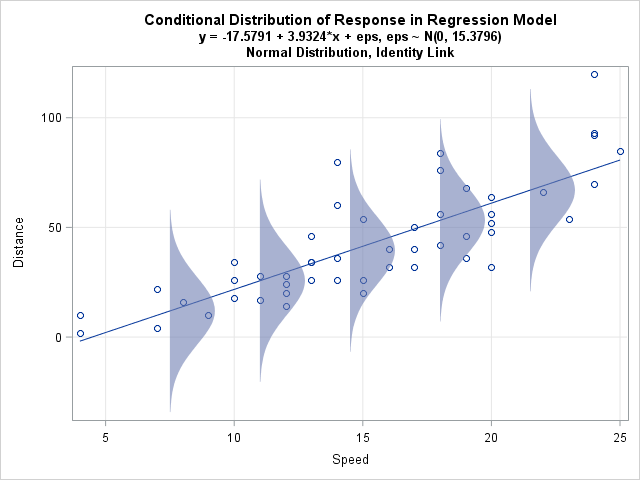
Last week I discussed ordinary least squares (OLS) regression models and showed how to illustrate the assumptions about the conditional distribution of the response variable. For a single continuous explanatory variable, the illustration is a scatter plot with a regression line and several normal probability distributions along the line.
The term "conditional distribution of the response" is a real mouthful. For brevity, I will say that the graph shows the assumed "error distributions."
A similar graph can illustrate regression models that involve a transformation of the response variable. A common transformation is to model the logarithm of the response variable, which means that the predicted curve is exponential.
There are two common ways to construct an exponential fit of a response variable, Y, with an explanatory variable, X. The two models are as follows:
- A generalized linear model of Y that uses LOG as a link function. In SAS you can construct this model with PROC GENMOD by setting DIST=NORMAL and LINK=LOG.
- An OLS model of log(Y), followed by exponentiation of the predicted values. In SAS you can construct this model with PROC GLM or REG, although for consistency I will use PROC GENMOD with an identity link function.
To illustrate the two models, I will use the same 'cars' data as last time. These data were used by Arthur Charpentier, whose blog post about GLMs inspired me to create my own graphs in SAS. Thanks to Randy Tobias and Stephen Mistler for commenting on an early draft of this post.
A generalized linear model with a log link
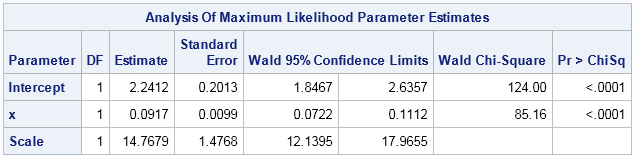
A generalized linear model of Y with a log link function assumes that the response is predicted by an exponential function of the form Y = exp(b0 + b1X) + ε and that the errors are normally distributed with a constant variance. In terms of the mean value of Y, it models the log of the mean: log(E(Y)) = b0 + b1X.
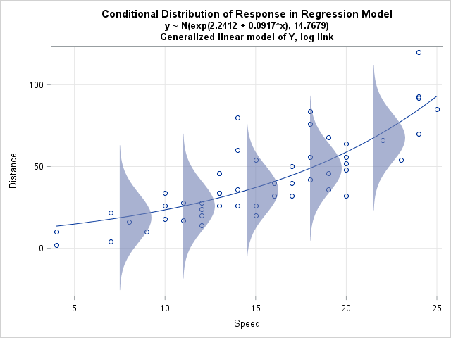
The graph to the left illustrates this model for the "cars" data used in my last post. The X variable is the speed of a car and the Y variable is the distance required to stop.
How can you create this graph in SAS? As shown in my last post, you can run a SAS procedure to get the parameter estimates, then obtain the predicted values by scoring the model on evenly spaced values of the explanatory variable. However, when you create the data for the probability distributions, be sure to apply the inverse link function, which in this case is the EXP function. This centers the error distributions on the prediction curve.
The call to PROC GENMOD is shown below. For the details of constructing the graph, download the SAS program used to create these graphs.
title "Generalized Linear Model of Y with log link"; proc genmod data=MyData; model y = x / dist=normal link=log; ods select ParameterEstimates; store work.GenYModel / label='Normal distribution for Y; log link'; run; proc plm restore=GenYModel noprint; score data=ScoreX out=Model pred=Fit / ILINK; /* apply inverse link to predictions */ run; |
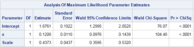
An OLS model of log(Y)
An alternative model is to fit an OLS model for log(Y). The data set already contains a variable called LogY = log(Y). The OLS model assumes that log(Y) is predicted by a model of the form b0 + b1X + ε. The model assumes that the errors are normally distributed and that the expected value of log(Y) is linear: E(log(Y)) = b0 + b1X. You can use PROC GLM to fit the model, but the following statement uses PROC GENMOD and PROC PLM to provide an "apples-to-apples" comparison:
title "Linear Model of log(Y)"; proc genmod data=MyData; model logY = x / dist=normal link=identity; ods select ParameterEstimates; store work.LogYModel / label='Normal distribution for log(Y); identity link'; run; proc plm restore=LogYModel noprint; score data=ScoreX out=Model pred=Fit; run; |
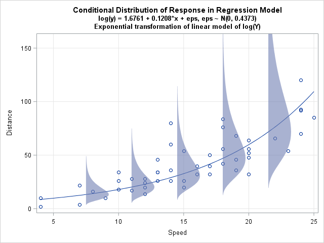
On the log scale, the regression line and the error distributions look like the graph in my previous post. However, transforming to the scale of the original data provides a better comparison with the generalized linear model from the previous section. When you exponentiate the log(Y) predictions and error distribution, you obtain the graph at the left.
Notice that the error distributions are NOT normal. In fact, by definition, the distributions are lognormal. Furthermore, on this scale the assumed error distribution is heteroscedastic, with smaller variances when X is small and larger variances when X is large. These are the consequences of exponentiating the OLS model.
Incidentally, you can obtain this same model by using the FMM procedure, which enables you to fit lognormal distributions directly.
A comparison of log-link versus log(Y) models
It is worth noting that the two models result in different predictions. The following graph displays both predicted curves. The first curve (the generalized linear model with log link) goes through the "middle" of the data points, which makes sense when you think about the assumed error distributions for that model. The second curve (the exponentiated OLS model of log(Y)) is higher for large values of X than you might expect, until you consider the assumed error distributions for that model.
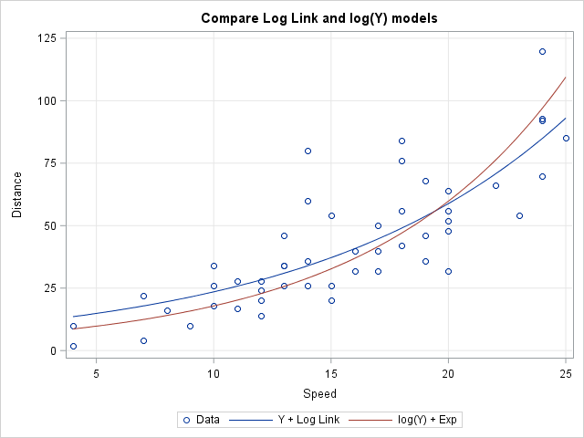
Both models assume that the effect of X on the mean value of Y is multiplicative, rather than additive. However, as one of my colleagues pointed out, the second model also assumes that the effect of errors is multiplicative, whereas in the generalized linear model the effect of the errors is additive. Researchers must use domain-specific knowledge to determine which model makes sense for the data. For applications such as exponential growth or decay, the second model seems more reasonable.
So, there you have it. The two exponential models make different assumptions and consequently lead to different predictions. I found the graphs in this article helpful to visualize the differences between the two models. I hope you did, too. If you want to see how the graphs were created, download the SAS program.

6 Comments
Rick,
To understand your
"the second model also assumes that the effect of errors is multiplicative, whereas in the generalized linear model the effect of the errors is additive. "
I just express it as Mathematic way, that is right ?
For the first model( GLM ):
Log(Y+eps)=X
it is additive.
For the seconde model( Log(Y) ):
Log(Y)+eps=X
==> Log(Y)+Log(eps)=X
==> Log(Y*eps)=X
it is multiplicative .
But Honestly, I like the first one better.
Xia Keshan
I think it is clearer if you use Y as the target. The first model (generalized) says that each observed Y value is of the form Y = exp(X`*beta) + epsilon. So clearly the "noise" affects the response in a linear fashion. The second model (OLS of log(Y)) says that each observed Y is of the form Y = exp(X`*beta + epsilon). If you define c = exp(epsilon), then Y = c*exp(X`*beta). Thus the (transformed) noise affects the response multiplicatively.
Pingback: Twelve posts from 2015 that deserve a second look - The DO Loop
I have following data about early neonatal deaths:
data early;
input ga alive mort total;
datalines;
22 23 19 42
23 522 214 736
24 1430 323 1753
25 1942 243 2185
26 2490 174 2664
27 3143 127 3270
28 4030 126 4156
29 4792 96 4888
30 6201 88 6289
31 7971 85 8056
32 5401 43 5444
;
run;
ga: gestational age in completed weeks
alive: newborns surviving the early neonatal period
mort: newborns not surviving the early neonatal period
total: alive + mort
I computed 95% CI on the proportions of mort/total as well.
Graphically this looks exponential.
How should I model these proportions, without loosing information regarding the numbers of observations?
Graphically
For questions about "how do I do this in SAS," post your questions to the SAS Support Community. This question is appropriate for the Statistical Procedures Community.
Very simple and very informative. Thank you very much for posting this great example. I am using different statistical software besides SAS, but the underlying theory is completely relevant.