In a previous article, I presented some of the most popular blog posts from The DO Loop in 2024. In general, popular articles deal with elementary topics that have broad appeal. However, I also write technical articles about advanced topics, which typically do not make it onto a Top 10 list. This post is an "Author's Choice" of some articles that I want to highlight. Some are useful. Some are surprising. Some explain essential concepts for practicing statisticians. Some are straightforward whereas others are challenging to read.
The following articles deserve a second look. I have grouped them into four categories: statistics, regression, simulation and bootstrapping, and statistical graphics.
Statistics and data analysis

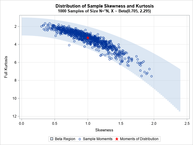
- Use the moment-ratio diagram to visualize the sampling distribution of skewness and kurtosis: The moment-ratio diagram is an indispensable tool for studying the sampling distribution of the skewness and kurtosis statistics.
- The distribution of p-values under the null hypothesis: P-values can be confusing. This article demonstrates that p-values are a transformation of the test statistic. If the distribution of the test statistic is known (which is a big assumption!), the p-values are uniformly distributed. But if your assumptions are not valid, watch out!
- On using flexible distributions to fit data: The Holy Grail of statistical modeling is to find a flexible distribution that can model any continuous univariate data. But when you use a system of flexible distributions (such as the Johnson system or Kellin's metalog distributions) to fit data that comes from a known distribution, do you always obtain the shape of the true distribution? No, and it is enlightening to see how these flexible systems misrepresent the true probability distribution.
Regression

- Poisson regression in SAS: Poisson regression is used to model a response that is a count or a rate. This article visualizes the Poisson regression model for rates and shows how to interpret it. A follow-up article shows how to simulate data from a Poisson regression model.
- Visualize a multivariate regression model: Visualizing the predicted values in a regression model with multiple explanatory variables is challenging, especially when incorporating spline effects. This article uses SAS tools and techniques to construct a "sliced fit" plot.
- Isotonic regression: Isotonic regression, also known as monotonic regression, assumes the response is a monotonic function of the explanatory variables. You can solve the isotonic regression problem in several ways: by optimizing a quadratic function, by using PROC TRANSREG, or by computing the convex hull of an associated geometric problem.
Simulation and bootstrapping

- The distribution of the R-square statistic: The R-squared statistic is commonly reported as a measure of goodness of fit in linear regression. This article discusses a formula for a confidence interval for the R-square parameter. A companion article shows how to obtain a bootstrap estimate of the sampling distribution for the R-square statistic.
- Simulate correlated continuous and discrete variables: It is not hard to simulate independent variables, but simulating multiple variables with a known correlation structure can be a challenge. The challenge is magnified if you want to simulate both continuous and categorical variables. This article uses ideas from polychoric correlation to generate both continuous and discrete correlated variables.
- Introducing PROC SIMSYSTEM: Not all SAS customers have upgraded from SAS 9 to SAS Viya. However, PROC SIMSYSTEM is a powerful tool in SAS Viya for running simulation studies in which you want to systematically vary the skewness and kurtosis of univariate distributions. It also makes beautiful moment-ratio diagrams!
Statistical graphics

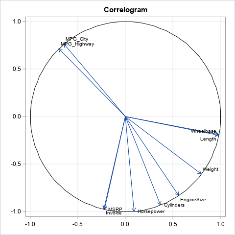
- The correlogram: Visualize correlations by fitting angles: The correlations between many variables are often visualized by using a heat map of a correlation matrix. However, the correlogram, offers an alternative visualization. The correlogram is similar to a loading plot, which is also a useful visualization of multiple correlations.
- Scale a density curve to match a histogram: A typical histogram shows counts or percentages. If you want to overlay a density curve, you must adjust the vertical scale of the curve. In SAS, this adjustment is performed automatically when you use the VSCALE= option on the HISTOGRAM statement in PROC UNIVARIATE. The article explains the formulas behind the adjustment.
- Create filled density plots: You can visualize density estimates by using a panel of shaded density plots, where the area under the curve is filled with a solid color.
Your turn
Did I omit one of your favorite blog posts from The DO Loop from last year? Maybe you liked my elliptical hearts post for Valentine's Day? Of maybe you enjoyed my Pi Day article about how to cut a pizza to derive the area of a circle? If so, leave a comment and tell me what topic you found interesting or useful.

1 Comment
I liked the "Word Game" blog: https://blogs.sas.com/content/iml/2024/03/04/number-word-game.html
You can't play it in Chinese (no alphabet) but I was very impressed to read about how to play the game in Spanish and Klingon!