Have you ever been curious about your monthly water consumption and how it compares to others in your community? Recently, I had this question and decided to get ahold of my family's water usage data for analysis. Harnessing the power of data visualization, I compared my family of four's monthly water consumption against the town of Cary, North Carolina's average.
Here is the final visualization:
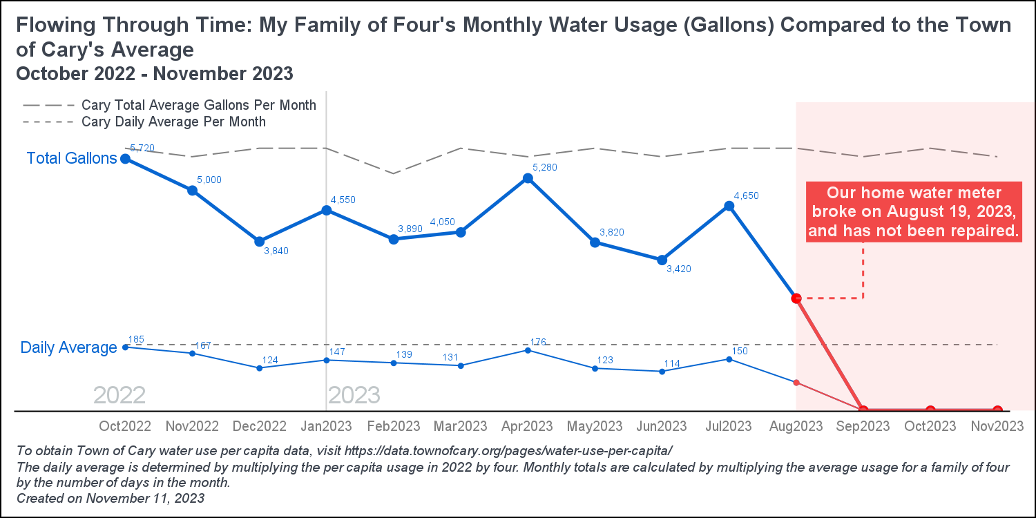
Looks like we use less water than the average household. Let's walk through the process of creating the graph.
Getting the Data
First, you need to get your data. Depending on your water company, there are various methods to access the data. I simply logged into my account and downloaded the hourly data, reaching as far back as my water company allowed, which, in this case, was 13 months. Saving the file in Microsoft Excel format (XLSX), I made it accessible online. Using SAS code, I downloaded the XLSX file, converted it into a SAS data set. Then, I previewed the initial 5 rows and examined the column metadata.
/* Reference the data online */ filename xlfile URL 'https://github.com/pestyld/data_projects/raw/master/water_usage_analysis/data/AMI_METER_READS-METER_INFO_HOURLY.xlsx'; /* Change column names to valid SAS values */ options validvarname=v7; /* Download and import the XLSX file as a SAS data set */ proc import datafile=xlfile dbms=xlsx out=work.water_usage replace; run; /* Preview the data */ proc print data=water_usage(obs=5); run; /* View column metadata */ ods select variables; proc contents data=water_usage; run; |
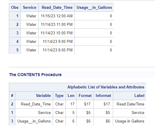
The results display the initial five rows and the column metadata. It's worth noting that the data preview shows the hourly data, while the column metadata indicates that all columns were read in as character data. That's an issue.
Prepare the Hourly Data
Next, I will prepare the hourly data by performing the following steps:
- Rename the Usage__in_Gallons character column to Usage_in_Gallons and convert it to a numeric value.
- Transform the Read_Date_Time character column into a valid SAS datetime value named Read_Date.
- Create new columns for Date, Time, Month, Year, and MonthYear.
- Format all columns appropriately.
- Add labels to the columns.
- Drop any unnecessary columns.
data water_clean; set water_usage (rename=(Usage__in_Gallons = Usage_in_Gallons_char)); /* Rename usage column to char to replace later */ /* Convert usage_in_gallons to numeric */ usage_in_gallons = input(Usage_in_Gallons_char, 8.); /* Convert read_date to a numeric date value */ read_date = input(Read_Date_Time, mdyampm23.); /* Create date columns */ Date = datepart(read_date); Time = timepart(read_date); Month = Date; Year = year(Date); MonthYear = Date; /* Format columns */ format read_date mdyampm23. Date date9. Time timeampm. Month monname. MonthYear monyy7. usage_in_gallons comma15.; /* Labels */ label read_date = 'Read Date' usage_in_gallons = 'Total Gallons'; /* Drop columns */ drop Service Read_Date_Time Usage_in_Gallons_char; run; /* Preview the new table */ proc print data=water_clean(obs=5); run; /* View column metadata */ ods select Position; proc contents data=water_clean varnum; run; |
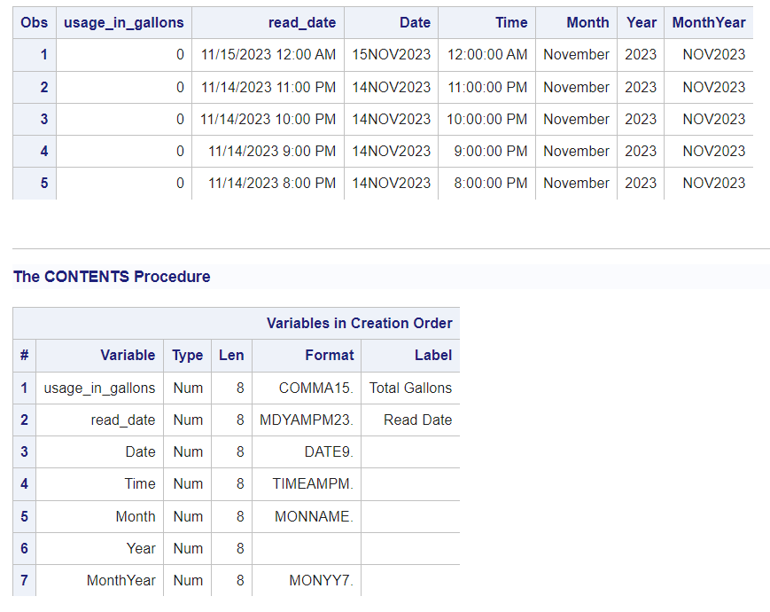
The results show the new columns were converted to numeric and created correctly.
Summarize the Hourly Data by Month
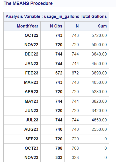
My goal is to condense the hourly data into a monthly summary for analysis of our water usage compared with the usage in the town of Cary. To begin, I will use the MEANS procedure to summarize the hourly data by month, creating a SAS table named monthly_summary.
/* Create MonthYear summary table */ ods output Summary=monthly_summary; proc means data=water_clean n sum; var usage_in_gallons; class MonthYear; run; |
Next, I will ready the summarized data for the visualization. To achieve my intended visualization, I'll create columns for the line plots of our monthly and daily average and total water usage. With our water usage data I want to separate the monthly usage by working and broken because our water meter broke in August (this started my investigation in this data) to visually show when the water meter broke. Additionally, I'll create two columns for the town of Cary's monthly daily average and total average, along with additional columns for data labels in my line plots. Below, you'll find the specifics of each column I created and its purpose.
- MeterStatus - Identifies when the water meter malfunctioned.
- num_days_in_month - Calculate the number of days in each month.
- avg_gallons_per_month - Computes the average daily water usage for my family by dividing number of days in the month by the total usage.
- total_water_usage_pp_day_cary - Multiplies the average water usage per person in Cary by the number of people in my family (4) to calculate town of Cary's daily usage.
- total_water_usage_pp_month_cary - Determines the total average monthly water usage for the town of Cary.
- usage_in_gallons_broken - Creates a column with values representing my family's total water usage per month when the meter is broken (red line in the visual).
- usage_in_gallons_avg_broken - Creates a column with values representing my family's average water usage per month when the meter is broken (red line in the visual).
- usage_in_gallons_sum_labels - Generates a column with total monthly usage values when the meter was working, intended for column labels in the visual.
- usage_in_gallons_avg_labels - Generates a column with average monthly usage values when the meter was working, intended for column labels in the visual.
/* Average gallons per person in Cary, NC in 2022 : https://data.townofcary.org/pages/water-use-per-capita/ */ %let total_family_members = 4; %let AVGPP_Cary_2022 = 48; data monthly_summary; length MeterStatus $7; set monthly_summary; /* Identify broken meter months */ if MonthYear < '01AUG2023'd then MeterStatus = 'Working'; else MeterStatus = 'Broken'; /* Avg water usage per day in a month */ num_days_in_month = day(intnx('month',MonthYear, 0,'end')); avg_gallons_per_month = round(usage_in_gallons_Sum / num_days_in_month); /* Avg and total water usage per month in Cary, NC */ total_water_usage_pp_day_cary = &total_family_members * &AVGPP_Cary_2022; total_water_usage_pp_month_cary = total_water_usage_pp_day_cary * num_days_in_month; /* Find number of days in the month */ if MeterStatus='Broken' then do; usage_in_gallons_broken = usage_in_gallons_Sum; usage_in_gallons_avg_broken = avg_gallons_per_month; end; else do; usage_in_gallons_sum_labels = usage_in_gallons_Sum; usage_in_gallons_avg_labels = avg_gallons_per_month; end; /* Format the columns */ format usage_in_gallons_Sum usage_in_gallons_sum_labels comma16. MonthYear monyy7.; /* Drop unnecessary columns */ drop usage_in_gallons_N NObs; run; proc print data=monthly_summary; run; |
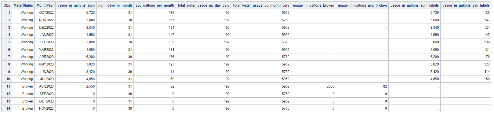
The results present the finalized monthly_summary data.
Data Visualization
Once the data is prepared, let's create the visualization, breaking it down into three steps:
- Create the macro variables for colors, font sizes, and axes positions.
- Generate the annotation data set to incorporate text, lines, and shading into the visualization.
- Utilize the SGPLOT procedure to make the visualization.
1. Create the macro variables
I prefer creating a set of macro variables for colors, font sizes, and any dynamic locations I require for the visualization. This approach simplifies adding values to the code for the visual or annotation data set. I've discovered that using macro variables for colors and fonts enables me to dynamically change those attributes within the visualization to view how it looks with different colors or fonts without having to modify the SGPLOT code directly.
Note: Change the path of the outpath macro variable to where you want to create the image file.
/* Set the path to your folder (REQUIRED) */ %let outpath = /*Add path where to create the final image*/; /* Set default visualization colors and setting */ %let textColor = CX3D444F; %let myBlue = CX0766D1; %let myRed = CXF24949; %let myLightRed = CXFF9999; %let lightGray = CXC1C7C9; %let labelSize = 12pt; %let curveLabelSize = 10pt; %let townCaryLinesColor = gray; /* Create the max y value for the graph by increasing the max value by %25 and rounding to the nearest 1,000 */ proc sql noprint; select round(max(usage_in_gallons_Sum) * 1.25, 1000) into :maxYValue trimmed from monthly_summary; quit; /* Create a macro for the position of water usage on Aug2023 for the annotation line */ proc sql noprint; select usage_in_gallons_Sum format=8. into :aug2023_total trimmed from monthly_summary where MonthYear='01Aug2023'd; quit; /* View macro variable values */ %put &=maxYValue; %put &=aug2023_total; /* and the log */ MAXYVALUE=7000 AUG2023_TOTAL=2550 |
The results display two dynamically calculated SAS macro variables: MAXYVALUE and AUG2023_TOTAL. MAXYVALUE is intended to set the maximum Y value on the Y-axis, while the AUG2023_TOTAL macro variable will be utilized to draw a line for the annotation text box.
2. Generate the annotation data set
Next, I created the annotation data set for my plot. Annotation data sets provide a way for adding shapes, images, text and other annotations to graph output. I'm using the DATA step with the SGANNO macros.
/* Import the annotation macro programs */ %SGANNO /* Create annotation data set for the graph */ data myAnno; /* 2022 and 2023 labels */ %sgtext(drawspace='datavalue',x1='01Oct2022'd, y1=2, label="2022", width = 10, justify="left", textcolor = "&lightGray", textSize=16, anchor='bottomleft', discreteoffset=-.5); %sgtext(drawspace='datavalue',x1='01Jan2023'd, y1=2, label="2023", width = 10, justify="left", textcolor = "&lightGray", textSize=16, anchor='bottomleft', discreteoffset=0); /* Bad water meter text and shading */ %sgline(drawspace="datavalue", linepattern='shortdash', lineColor="&myRed", x1='01Aug2023'd, x2='01Sep2023'd, y1=&aug2023_total, y2=&aug2023_total); %sgline(drawspace="datavalue", x1='01Sep2023'd, x2='01Sep2023'd, y1=&aug2023_total, y2=4000); %sgtext(drawspace='datavalue', x1='01Aug2023'd, y1=&maxYValue-1800, label="Our home water meter broke on August 19, 2023, and has not been repaired.", width = 25, justify="center", textcolor = "white", textSize=11, anchor='topleft', discreteoffset=+.15, fillColor="&myRed", textweight="bold", reset='all'); %sgrectangle(drawspace='datavalue', x1='01Aug2023'd , widthunit='data', width='01Oct2023'd, y1=0, heightunit='data', height=&maxYValue, display = 'fill', filltransparency=.9, fillcolor="&myRed", anchor='bottomleft',reset='all'); run; /* View the data */ proc print data=myAnno; run; |
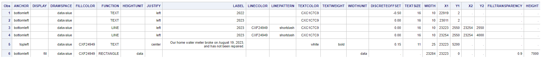
The results display the annotation table, showing various attributes for annotations. The specific type of annotation is shown in the FUNCTION column. For more detailed information on SG Annotation, you can refer to the SAS documentation.
3. Create the visualization
Lastly, I'll use the SGPLOT procedure to create the visualization. I did some unique data preparation to enable me to create two sets of lines (working blue lines vs broken meter red lines). I modified multiple SGPLOT options to achieve the visualization I wanted. I found it took a bit of time to get the my desired result.
/* Save the visual as a PNG file and set the size and DPI */ ods listing gpath = "&outpath" image_dpi = 150; ods graphics / imagename = "Water_Usage_MonthlyFinal" imagefmt = png width = 10in height = 5in; /* Add titles and footnotes */ title justify = left color = &textColor height=14pt "Flowing Through Time: My Family of Four's Monthly Water Usage (Gallons) Compared to the Town of Cary's Average"; title2 justify = left color = &textColor height=12pt "October 2022 - November 2023"; footnote1 justify = left color = &textColor height=8pt italic "To obtain Town of Cary water use per capita data, visit https://data.townofcary.org/pages/water-use-per-capita/"; footnote2 justify = left color = &textColor height=8pt italic "The daily average is determined by multiplying the per capita usage in 2022 by four. Monthly totals are calculated by multiplying the average usage for a family of four by the number of days in the month."; footnote3 justify = left color = &textColor height=8pt italic "Created on November 30, 2023"; /* Visualization */ proc sgplot data = monthly_summary sganno = myAnno noborder nocycleattrs nowall; /* 1. REFLINE FOR THE NEW YEAR */ refline 'Jan2023' / axis = x labelpos = min labelloc = inside lineattrs = (color = lightgray); /* 2. TOWN OF CARY TOTAL AND AVERAGE LINES */ vline MonthYear / name = 'Cary_Monthly_Total' response = total_water_usage_pp_month_cary lineattrs = (pattern = MediumDash color = &townCaryLinesColor); vline MonthYear / name = 'Cary_Daily_Average' response = total_water_usage_pp_day_cary y2axis lineattrs = (pattern = ShortDash color = &townCaryLinesColor); /* 3. TOTAL GALLONS LINE (working and broken) */ /* a. Working total line */ vline MonthYear / response=usage_in_gallons_Sum lineattrs = (thickness = 3 color = &myBlue) dataskin = none markers markerattrs = (symbol = CircleFilled size = 10 color = &myBlue) datalabel = usage_in_gallons_sum_labels datalabelattrs = (color = &myBlue) curvelabel = 'Total Gallons' curvelabelpos = min curvelabelattrs = (color = &myBlue size = &curveLabelSize); /* b. Broken total line */ vline MonthYear / response=usage_in_gallons_broken lineattrs = (thickness = 3 color = &myRed) markers markerattrs = (symbol = CircleFilled size = 10.5 color = red) dataskin = none; /* 4. AVG GALLONS A MONTH LINES (working and broken) */ /* a. Working average line */ vline MonthYear / response = avg_gallons_per_month y2axis lineattrs = (color = &myBlue) datalabel = usage_in_gallons_avg_labels datalabelattrs = (color = &myBlue) dataskin = none markers markerattrs = (color = &myBlue symbol = CircleFilled size = 6) curvelabel = 'Daily Average' curvelabelpos = min curvelabelattrs = (color = &myBlue size = &curveLabelSize); /* b. Broken average line */ vline MonthYear / response = usage_in_gallons_avg_broken y2axis lineattrs = (color = &myRed) dataskin = none markers markerattrs = (color = &myRed symbol = CircleFilled size = 6.5) ; /* 5. AXIS ATTRIBUTES */ xaxis display = (NOLABEL NOTICKS) valueattrs = (color = gray size = 9pt); yaxis display = NONE offsetmin = 0 max = &maxYValue; y2axis display = NONE offsetmin = 0 max = 900; /* 6. MODIFY THE LEGEND */ keylegend 'Cary_Monthly_Total' 'Cary_Daily_Average' / noborder location = inside position = topleft across = 1 valueattrs = (color = &textColor); label total_water_usage_pp_day_cary = 'Cary Daily Average Per Month' total_water_usage_pp_month_cary = 'Cary Total Average Gallons Per Month'; run; title; /* Clear all */ ods graphics / reset; title; footnote; |
The visualization compares my family's monthly daily and monthly water usage with the residents in the town of Cary. Looking at the visualization I can quickly see a few things:
- The first is the obvious broken water meter in August. I'm not sure what happened, but it broke!
- The second is our total monthly water usage is below the total monthly average for a family of four in the town of Cary.
- The third is our daily monthly average is also below the total daily average for a family of four in the town of Cary.
- Finally, I observed that the highest water usage occurred in October 2022 and April 2023. Curious by this, I examined our calendar for those months. I noticed that my mom visited during both of those months, and I know she prefers washing dishes by hand instead of using the dishwasher. This could be the reason behind the increased water consumption!


2 Comments
Greate work Peter visualizing your family's water consumption vis-a-vis that of the town! Your family seems to be doing well staying below the average consumption. Keep it up!
Thanks Partha!