A common task in statistics is to model data by using a parametric probability distribution, such as the normal, lognormal, beta, or gamma distributions. There are many ways to assess how well the model fits the data, including graphical methods such as a Q-Q plot and formal statistical tests such as the Kolmogorov-Smirnov test. Both methods are related to the cumulative distribution function (CDF), which tells you the probability that a random variable will be less than any specified value. Although statisticians spend a lot of time looking at the accuracy and precision of estimating parameters from data, Johnson and Kotz (1970, Continuous Univariate Distributions – Vol 1), point out that estimating parameters "is often not as important as estimation of probabilities — in particular, of cumulative distribution functions" (p. 122).
PROC UNIVARIATE in SAS produces a table, called the FitQuantiles table, which indicates how well the quantiles of the model distribution agree with the empirical distribution of the data. This article discusses the FitQuantiles, table, shows how to visualize it with a graph, and demonstrates how to create a larger version of the table, which provides further insight into how well the model's "estimation of probabilities" agrees with empirical evidence.
Quantiles of the fitted model
To illustrate the information in the FitQuantiles table, let's simulate some data from a three-parameter lognormal distribution and fit the data by using PROC UNIVARIATE. (You can read more about how to simulate lognormal data in SAS.) The following DATA step simulates 200 random observations from a lognormal distribution that has a non-zero threshold parameter.
/* Create example Lognormal(2, 0.5, theta) data of size N=200, where theta is a threshold parameter. https://blogs.sas.com/content/iml/2017/05/10/simulate-lognormal-data-sas.html */ %let N = 200; data LN; call streaminit(98765); sigma = 0.5; /* shape or log-scale parameter */ zeta = 2; /* scale or log-location parameter */ theta = 10; /* threshold parameter */ do i = 1 to &N; z = rand("Normal", zeta, sigma); /* z ~ N(zeta, sigma) */ x = theta + exp(z); /* x ~ LogN(zeta, sigma, theta) */ output; end; keep x; run; |
You can use PROC UNIVARIATE to create a histogram of the data and to overlay a lognormal density curve for the parameter estimates that are obtained by using maximum likelihood estimation (MLE). I include the parameter estimates and the FitQuantiles table as part of the output:
/* Fit data by using PROC UNIVARIATE */ proc univariate data=LN; histogram x / lognormal(theta=est); ods select Histogram ParameterEstimates FitQuantiles; ods output ParameterEstimates=PE /* to obtain the MLE parameter estimates */ FitQuantiles=FQ; /* to graph the FitQuantiles table */ run; |
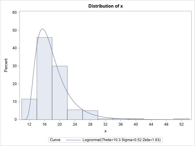
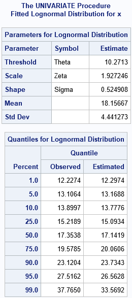
The histogram and overlaid density curve suggest a reasonable fit. The data are simulated from a distribution that has a threshold parameter equal to 10, a scale parameter equal to 2, and a shape parameter equal to 0.5. The corresponding estimates are 10.27, 1.927, and 0.525, respectively.
The FitQuantiles table compares the sample (observed) quantiles to the quantiles of the fitted lognormal distribution. For example, in the sample, 5% of the observations are less than 13.1064; in the fitted distribution, 13.1688 is the quantile for 0.05. Similarly, 17.3538 is the sample median (the 50th percentile), whereas 17.1419 is the median of the fitted distribution. Overall, the observed and fitted quantiles agree well. In general, when you look at this table, the quantiles in the center of the distribution (for example, the 25th, 50th, and 75th percentiles) tend to agree with the empirical quantiles better than the quantiles in the tails, which are more sensitive to sampling variation.
You can visualize this table. I call the resulting plot a quantile fit plot. It is similar to a quantile-quantile (Q-Q) plot, but it can be easier to interpret.
Visualize agreement between the observed and predicted quantiles
From the table, it's not easy to determine whether there are regions in which the predicted quantiles are systematically higher or lower than the sample quantiles. One way to see that information is to plot a scatter plot of the observed and fitted quantiles. If desired, you can display the percentile for each pair in the scatter plot. Notice that in the PROC UNIVARIATE call, I wrote the contents of the FitQuantiles table to the FQ data set. The following call to PROC SGPLOT visualizes the table by creating a quantile fit plot:
ods graphics / width=480px height=480px; title "Quantiles of Empirical vs. Model Distribution"; title2 "Thin Version from PROC UNIVARIATE Output"; proc sgplot data=FQ aspect=1 noautolegend; format Percent 2.0; series x=EstQuantile y=ObsQuantile / markers lineattrs=(pattern=dash) datalabel=Percent; lineparm slope=1 x=0 y=0 / lineattrs=(color=lightgray) clip; xaxis grid; yaxis grid; run; |
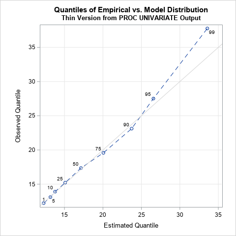
The quantile fit plot is similar to a quantile-quantile (Q-Q) plot. Whereas a Q-Q plot shows the empirical quantiles for all 200 observations in the data, this plot only contains estimates for nine quantiles. Furthermore, the horizontal axis of a Q-Q plot shows the quantiles for a standardized distribution, whereas the horizontal axis in this plot is on the data scale. The graph provides a visual summary of the FitQuantiles table. Namely, that the model fits the data well until the 75th percentile. For this sample, which is not too large, the predicted quantiles in the tails differ from the empirical quantiles.
Improving the quantile fit plot
The nine quantiles in the FitQuantiles table provide a small summary of the model fit. If, as Johnson and Kotz state, the estimation of probabilities is important, you can extend the table to encompass more quantiles. You can use PROC STDIZE to compute the empirical quantiles of the data, then use the QUANTILE function in a DATA step to obtain the predicted quantiles under the model, as follows:
/* empirical quantiles of x in long format https://blogs.sas.com/content/iml/2013/10/23/percentiles-in-a-tabular-format.html */ proc stdize data=LN PctlMtd=ORD_STAT PctlPts=(2.5 to 97.5 by 2.5) /* choose percentiles evenly spaced in [2.5, 97.5] */ outstat=EmpiricalQuantiles( where=(substr(_TYPE_,1,1)='P')); /* keep only percentile statistics */ var x; run; /* create macro variables with the MLE estimates */ data _null_; set PE; if Parameter='Threshold' then call symputx('MLE_thresh', Estimate); if Parameter='Scale' then call symputx('MLE_scale', Estimate); if Parameter='Shape' then call symputx('MLE_shape', Estimate); run; /* compute the predicted quantiles for the fitted model */ data Quantiles; retain pctlpts 0; set EmpiricalQuantiles; PctlPts + 2.5; /* create numerical variable for the percentiles in [2.5, 97.5] */ estX = &MLE_thresh + Quantile("Lognormal", PctlPts/100, &MLE_scale, &MLE_shape); mylabel = ifn( mod(PctlPts,10)=0, PctlPts, .); /* optional: label with deciles */ run; title2 "Version That Has More Percentiles"; proc sgplot data=Quantiles aspect=1 noautolegend; series x=estX y=x / markers lineattrs=(pattern=dash) datalabel=mylabel; lineparm slope=1 x=0 y=0 / lineattrs=(color=lightgray) clip; xaxis grid label="Estimated Quantile"; yaxis grid label="Observed Quantile"; run; |
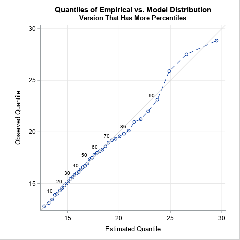
This new quantile fit plot compares the empirical and predicted quantiles for the model. The vertical axis shows sample estimates for selected percentiles. The horizontal axis shows predicted percentiles for the fitted model. This graph has finer "granularity" than the previous graph. You can now see that the quantiles agree until about the 70th percentile. In this example, the sample is small (n=200), which mean the quantiles in the tail of the data are determined by only a few observations. Thus, you shouldn't read too much into these differences. For example, you should not automatically reject the model if you see a graph like this where the extreme quantiles for the model do not match the corresponding sample estimates.
Summary
Johnson and Kotz (1970, p. 122) mention that the estimation of probabilities is often more important than the estimation of parameters. When you run PROC UNIVARIATE to fit a probability distribution to data, the procedure outputs a FitQuantiles table, which shows how well the empirical and predicted quantiles agree at a set of nine percentiles. You can use that table to create a quantile fit plot, which provides additional insight. Optionally, you can create a more detailed quantile fit plot by estimating a larger set of sample quantiles and model quantiles. The quantile fit plot enables you to visualize how well the model matches the empirical probabilities in the model.
The quantile fit plot has some advantages over the standard Q-Q plot. The Q-Q plot is often hard to read because it includes one marker for every observation. Also, the horizontal axis plots the quantiles of a standardized distribution. In contrast, the quantile fit plot summarizes the fit by using a small number of points, and both axes are on the scale of the data.
