A previous article shows how to use a scatter plot to visualize the average SAT scores for all high schools in North Carolina. The schools are grouped by school districts and ranked according to the median value of the schools in the district. For the school districts that have many schools, the markers might overlap, which makes it difficult to visualize the distribution of scores. This is a general problem with using dot plots. An alternative visualization is to plot a box plot for each school district, which is described in today's article.
Box plots are not for everyone
Box plots (also called box-and-whisker plots) are used by statisticians to provide a schematic visualization of the distribution of some quantity. The previous article was written for non-statisticians, so I did not include any box plots. To understand a box plot, the reader needs to know how to interpret the box and whiskers:
- The lower and upper portion of the box correspond to the 25th and 75th percentiles of the data, respectively
- The line in the middle of the box indicates the median score.
- A diamond marker indicates the mean score.
- The standard box plot extends the whiskers to observations that are within a distance D from the box, where D is 1.5 times the interquartile range. Other kinds of box plots are sometimes used. The SAS documentation explains the parts of a box plot.
Box plots require a certain level of comfort with statistical ideas. Nevertheless, for a statistical audience, box plots provide a compact way to compare dozens or hundreds of distributions.
The BOXPLOT procedure: An alternative way to display many box plots
I almost always use the SGPLOT procedure to create box plots, but today I'm going to demonstrate the BOXPLOT procedure. The BOXPLOT procedure is from the days before ODS graphics, but it has several nice features, including the following:
- When grouping box plots into categories, you can add headers, category dividers, and colors to help distinguish the categories. I demonstrated these so-called "nested box plots" in a previous blog post.
- When you want to display statistics about each box plot as a table inside the graph, the BOXPLOT procedure provides a simple syntax. You can use PROC SGPLOT to add a statistical table to a box plot, but you need to pre-compute the statistics and merge the statistics and the data.
- When you are plotting dozens or hundreds of box plots, the BOXPLOT procedure automatically splits the graph into a series of panels.
The second and third features are both useful for visualizing the SAT data for public high schools in NC.
Add a statistical table to a graph that contains many box plots
You can use the INSETGROUP statement in PROC BOXPLOT to specify statistics that you want to display under each box plot. For example, the following syntax displays the number of high schools in each district and the median of the schools' SAT scores. The WHERE clause filters the data so that the graph shows only the largest school districts (those with seven or more high schools).
ods graphics / width=700px height=480px; title "Average SAT Scores for Large NC School Districts"; proc boxplot data=SATSortMerge; where _FREQ_ >= 7; /* restrict to large school districts */ plot Total*DistrictAbbr / grid odstitle=title nohlabel boxstyle=schematicID vaxis=800 to 1450 by 50; insetgroup Q2 N; run; |
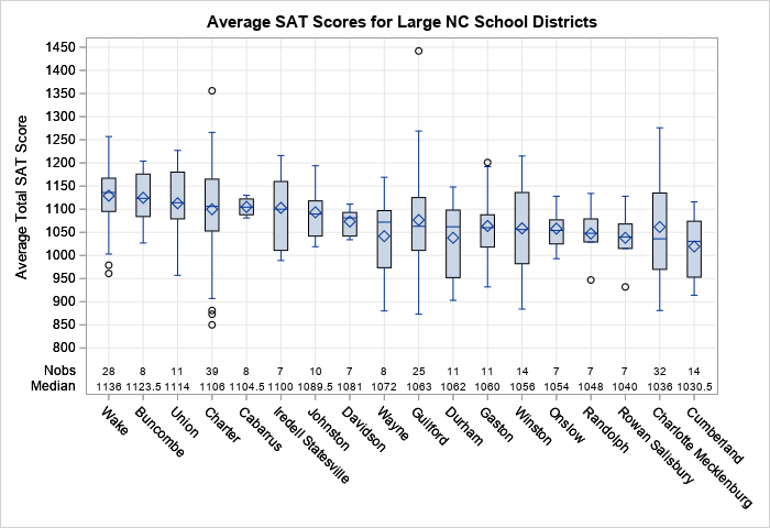
The graph shows schematic box plots for 18 large school districts. The districts are sorted according to the median value of the schools' SAT scores. The INSETGROUP statement creates a table inside the graph. The table shows the number of schools in each district and gives the median score for the district. The INSETGROUP statement can display many other statistics such as the mean, standard deviation, minimum value, and maximum value for each district.
Automatically create panels of box plots
One of the coolest features of PROC BOXPLOT is that it will automatically create a panel of box plots. It is difficult to visualize all 115 NC school districts in a single graph. The graph would be very wide (or tall) and the labels for the school districts would potentially collide. However, PROC BOXPLOT will split the display into a panel, which is extremely convenient if you plan to print the graphs on a piece of paper.
For example, the following call to PROC BOXPLOT results in box plots for 115 school districts. The procedure splits these box plots across a panel that contains five graphs and plots 23 box plots in each graph. Notice that I do not have to specify the number of graphs: the procedure uses the data to make an intelligent decision. To save space in this blog post, I omit three of the graphs and only show the first and last graphs:
ods graphics / width=640px height=400px; title "Average SAT Scores for NC School Districts"; proc boxplot data=SATSortMerge; plot Total*DistrictAbbr / grid odstitle=title nohlabel boxstyle=schematicID vaxis=800 to 1450 by 50; run; |
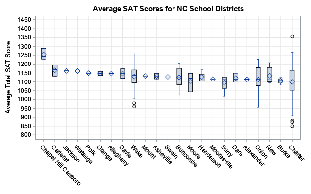
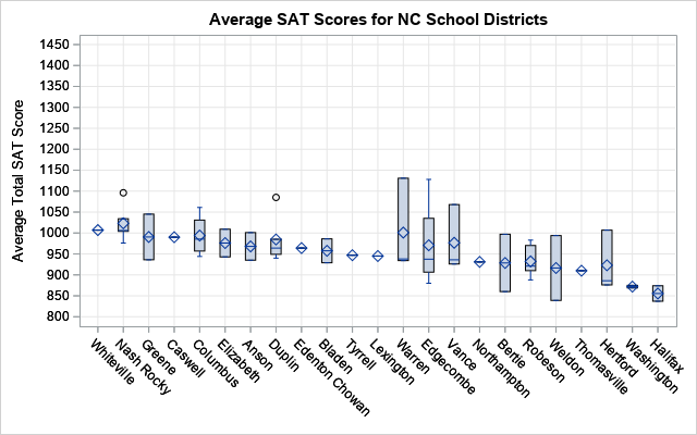
Because the districts are ordered by the median SAT score, the first plot shows the school districts with high SAT scores and the last plot shows districts with lower SAT scores. Districts that have only one school are shown as a diamond (the mean value) with a line through it (the median value). Districts that have two or three schools are shown as a box without whiskers. For larger school districts, the box plots show a schematic representation of the distribution of the schools' SAT scores.
Summary
In summary, PROC BOXPLOT has several useful features for plotting many box plots. This article shows that you can use the INSETGROUP statement to easily add a table of descriptive statistics to the graph. The procedure also automatically creates a panel of graphs so that you can more easily look at dozens or hundreds of box plots.
You can download the SAS program (NCSATBoxplots.sas) that creates the data and the graphs.

3 Comments
I'm having a problem getting PROC BOXPLOT to work with a blocking variable. I specify the blocking variable as per the example in the help file, but it's only producing the graph for one value of the blocking variable when there are three. And yes, there are observations in the dataset with each of the three values of the blocking variable. I've tried different approaches to sorting the data before passing it to BOXPLOT, but nothing seems to work. I'm trying to produce a boxplot that is similar to what is produced by univariate with bygroup processing. Based on what I've seen here and in the manual, BOXPLOT with a blocking variable should achieve what I'm after, but not if it will only read a single value of the blocking variable. Any ideas?
Yes. I suggest you post your data and code to the SAS Support Communities.
I kept digging and found the problem. My blocking variable was crossed with my grouping variable. I've changed it so that the group is nested within the blocking variable and it works as desired. Sorry to have troubled you. Thanks for the great blog on SAS Graph.