A Box Plot is very popular to view the distribution of an analysis variable with one or more classifiers. Also, everyone wants to customize the graph in different ways. One recent request was for creating a box plot by category and group along with the display of various statistics and overlaid markers using the SGPLOT procedure.
One of the key strengths of the SGPLOT procedure is its ability to layer multiple basic plots to create graphs with more information. However, previously the VBox statement could only be used with very few other statements with compatible roles. The good news is that with SAS 9.40M1, the VBox statement can now be layered with other basic plots and the new Axis Table statements to display more information in the graph. Let us see some examples
The GTL BoxPlot statement provides the DisplayStats option to display the numeric values for various computed statistics for each category in the plot such as Q1, Q3, STD and more. The SGPLOT VBOX statement does not support such an option. However, we use the Axis Table statement to include such statistics as shown below.
First we need to compute the statistics we want to show. Clearly, the above statistics like Q1, Q3 and STD are already being computed to draw the box plot anyway. So, we can use the SGPLOT program with the ODS OUTPUT statement to save out these statistics to a data set. Then, we can use the Axis Table to display the data.
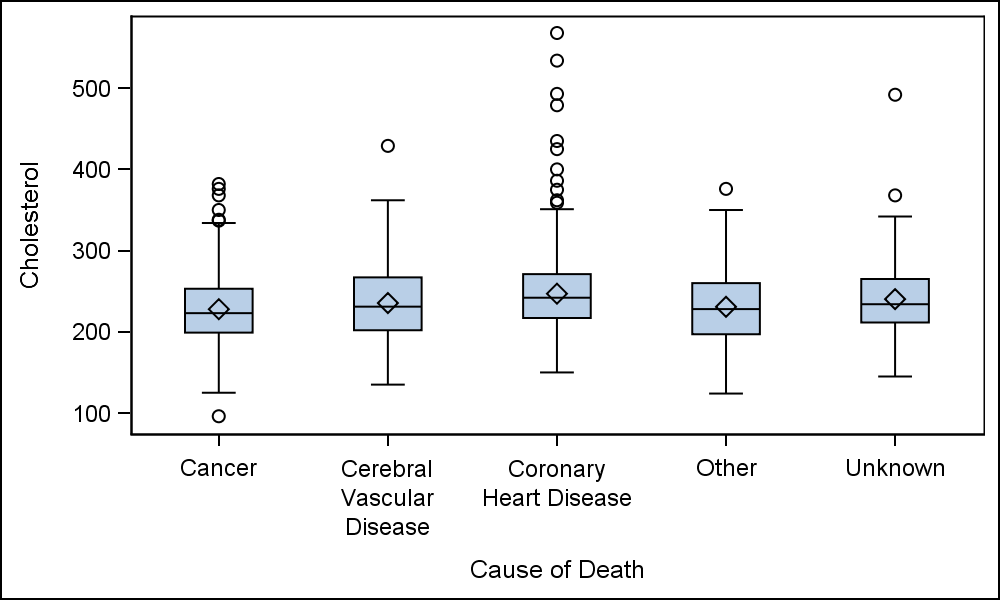
The first step is to create the basic box plot we want as shown on the right. The code for this is shown below, including the ODS Output statement that will save the generated data into the provided output data set.
ods output sgplot=sgplotdata;
proc sgplot data=sashelp.heart;
vbox cholesterol / category=deathcause;
run;
The SGPlot procedure computes the various statistics needed to draw the box plot, and these are saved into the SGPlotData data set. We can examine this data set and see that additional columns are created by Category (and Group) for each statistic and its value. Names like "BOX_CHOLESTEROL_X_DEATHCAUSE___Y" are used. I have renamed these variables to "Value", "Cat" and "Stat".
 Now, we keep only the statistics we wish to display (Q1, Q3 and STD), and merge this data with the original data.
data merged;
set sashelp.heart
sgplotdata(where=(value ne . and
stat in ('Q1' 'Q3' 'STD')));
run;
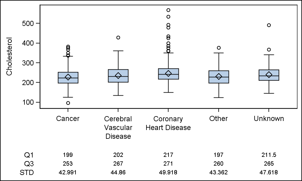
Now we use this merged data set to draw the box plot and the axis table of the statistic values.
proc sgplot data=merged;
vbox cholesterol / category=deathcause;
xaxistable value / x=cat class=stat;
xaxis display=(nolabel);
run;
 By default, the axis table is drawn below the X axis. However, the table can also be drawn above the X axis for better readability as shown on the right. The axis table displays the value of each statistic by the category. We use CLASS=Stat to stack each statistic as shown on the right. This is the default behavior for CLASSDISPLAY.
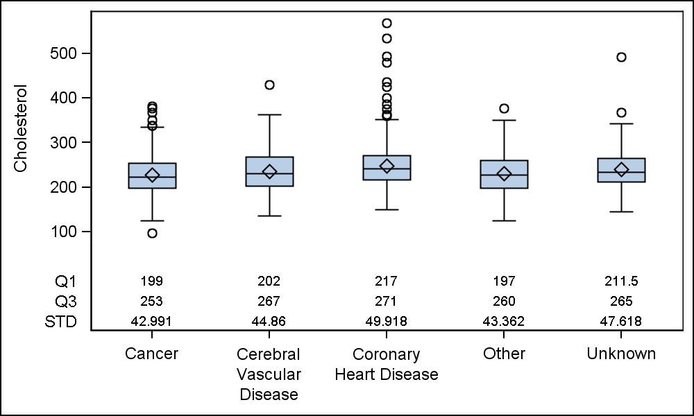
proc sgplot data=merged;
vbox cholesterol / category=deathcause;
xaxistable value / x=cat class=stat
location=inside;
xaxis display=(nolabel);
run;
As you can see from the code above, it is really very easy to add the display of any of the standard box plot statistics that are computed by the plot itself. These include MIN, Q1, MEDIAN, Q3, MAX, MEAN, STD, N, DATAMIN and DATAMAX.
 Often it is desirable to view the actual distribution of the data in addition to the box statistics. This can be done by layering a scatter plot on the box plot. This kind of overlay is now supported with SAS 9.40M1.
Note, we have assigned a filled symbol with high transparency value to overlay the scatter markers. We have also turned off the display of the outliers, and used a unfilled box.
proc sgplot data=merged;
vbox cholesterol / category=deathcause nooutliers nofill;
scatter x=deathcause y=cholesterol / jitter
markerattrs=(symbol=circlefilled size=5) transparency=0.95;
xaxistable value / x=cat class=stat location=inside;
xaxis display=(nolabel);
run;
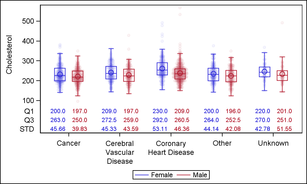
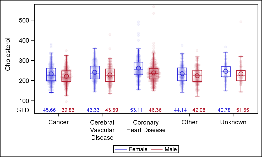 Finally, we would like to display this entire graph by a group variable 'Sex'. Now, the VBOX and the SCATTER use the GROUP role. The Axis Table uses 'Sex' as the class variable, and ClassDisplay=Cluster to place the values side by side per category.
Since the Axis table supports only one Class variable, we cannot display the data both by the Sex and Stat. In the example on the right, I have displayed only the data for "STD" by category and group. Note use of GroupOrder and CategoryOrder on all plots.
proc sgplot data=mergedGroup;
label value='STD';
format value 5.2;
vbox cholesterol / category=deathcause group=sex nooutliers
nofill grouporder=ascending name='a';
scatter x=deathcause y=cholesterol / group=sex groupdisplay=cluster
grouporder=ascending jitter markerattrs=(symbol=circlefilled size=5)
transparency=0.95 clusterwidth=0.7;
xaxistable value / x=cat class=grp classdisplay=cluster colorgroup=grp location=inside classorder=ascending;
xaxis display=(nolabel);
keylegend 'a' / linelength=24;
run;
 But, what if we do want to display multiple statistics by category and group. Yes, we can do that as shown on the right. Now, we have displayed the values for 'Q1', 'Q3' and 'STD' by category and group. To do this, we have to break up the data, so each statistic has a column of its own.
Now, we can use three separate Axis Table statements to display each statistic by category and group. Note also the use of ColorGroup=sex. This colors the statistic value by the group variable to match the box and the scatter.
proc sgplot data=mergedGroup2;
label value='STD';
format std 5.2 q1 q3 4.1;
vbox cholesterol / category=deathcause group=sex nooutliers
nofill grouporder=ascending name='a';
scatter x=deathcause y=cholesterol / group=sex groupdisplay=cluster
grouporder=ascending jitter
markerattrs=(symbol=circlefilled size=5)
transparency=0.95 clusterwidth=0.7;
xaxistable q1 / x=cat class=grp classdisplay=cluster colorgroup=grp location=inside classorder=ascending;
xaxistable q3 / x=cat class=grp classdisplay=cluster colorgroup=grp location=inside classorder=ascending;
xaxistable std / x=cat class=grp classdisplay=cluster colorgroup=grp location=inside classorder=ascending;
xaxis display=(nolabel);
keylegend 'a' / linelength=24;
run;
Full SAS 9.40M3 program: Box_Stat_Scatter


24 Comments
Great augmented box plots, Sanjay. I'll be trying this soon in SAS 9.40M2. Thanks!
I noticed I did not use ClassOrder on the AxisTable, causing the statistics to be mis aligned. Now fixed. ClassOrder is a SAS 9.4M3 feature. So, with SAS 9.4M2, I suggest you leave out the GroupOrder for VBox and Scatter. Sort the data by category and group if you want all the groups to be similarly ordered.
It took some effort to understand why/how this works, Sanjay, so in case it helps others ...
If I understand correctly, the AXISTABLE statement applies either a SUM or MEAN to a numeric value (such as these plot statistics). Otherwise, given a character variable, it simply displays the first value encountered for each plot point. In your final example, above, group and category define each "plot point".
So users have two options:
1 - As you've blogged: Use numeric results directly from SG. Concatenate these to the plot data; exactly 1 obs per "plot point", so AxisTable default (to SUM plot-point values) does not change results. Do *not* merge. Ensure these stats, one per plot point, appear in unique columns not otherwise used in the other plots. NB: for boxplot stats, do not mix up MIN and DATAMIN.
2 - Use formatted character results. These you have to merge onto the appropriate plot points, so that the first result SAS encounters is the intended display value, formatted as desired. For example, I can include an AxisTable class label as column headers for the stats -- to ensure that I haven't silently mis-align stats in SAS 9.4M2.
Having the choice gives flexibility: Use SG-calculated numeric values to reduce data manipulation (and related mix-ups). Or use character values to bring in non-SG, custom details.
This example demonstrates nicely the power and flexibility of ODS/SG/GTL! (And has been a great learning experience.)
Thanks for posting your comments. I believe the AxisTable statement is a very useful and flexible statement and can be used both for x-axis aligned tables (Survival Plot) and y-axis aligned tables (Forest Plot). Note use of Class, ClassDisplay and ClassOrder. ClassOrder must be same for all plots to avoid possible misalignment. We will make that an internal setting enforced by SG or GTL in next release to avoid potential for error.
If you do use a match merge, be sure to use the STAT=MEAN. Unfortunately, default STAT has been SUM all along back from the SAS/GRAPh days. Else, I would prefer a default STAT of Mean.
Is it possible to print out the number of points in each group? Even better would be to scale the width of the box according to the sample size. The BOXPLOT procedure has BOXWIDTHSCALE. This would be more useful to me and my readers than printing out the numbers the plot is showing. I use graphics to summarise.
is there a way to display the statistics table at bottom and out of the graph body?
Yes. Just remove LOCATION=INSIDE for the XAxisTable as in the second example.
Pingback: Scatter with box - Graphically Speaking
Thanks great read Sanjay! I had a strange warning though which was "WARNING: VAR=CAT is invalid. The option expects that the column not contain all missing values"
Would you have any ideas wh? I am using SAS 9.4M2... I ran your example code as well which worked fine and both my dataset and your dataset appeared to be the same structure...
Hello Sanjay
I'm trying to figure out how to use both category and group variable in a vbox, combined with that table statistics (in my case N P5 and P95).
How do you construct your grp variable?
When I try to follow your code, I only get empty spaces instead of the numbers.
Category are at the major tick marks on the axis with the category values. Groups are within a category, and do not have representation on the axis. I am not sure exactly what your question is. If you can send me the full example with data (sample) and code, and I can probably help.
Dear Sanjay,
these plots are very nice!
Do you have any suggestion how to allow for unequal spacing in the categorical variable? In my case the 'category' in fact represents different observation-time-points, which are not evenly spaced (0.5, 1,2,5) and it would be great to include this information into the graphic. I have seen proc boxplot to allow for a continuous variable - however, not so with ods-output. And of course, I would like to consider a grouping variable as in your example...
It should all work seamlessly with non discrete categories on the x-axis. Box, Scatter and AxisTable support interval variables too.
Hello Sanjay,
Thank you very much for the useful instructions! I am wondering can I ask you a question. In your very first example, I followed what you did to only select "Q1" and "Q3" in the dataset "Merged". I double-checked that the dataset "Merged" only has "Q1" and "Q3". However, the following sgplot statement gives me all of the stats (MIN, Q1, MEDIAN, Q3, MAX, MEAN, STD, N, DATAMIN, DATAMAX, FAROUTLIER, and OUTLIER). I am wondering do you possibly know why it is. Thanks!!
Yes, I am having the same issue. Although the "Merged" dataset is filtered to only provide the Q1/Q3/STD statistics, the sgplot command prints ALL statistics.
Great post (as always). It would be great if the AXISTABLE STAT option could be expanded to compute all of the statistics that are computed by PROC MEANS, just to avoid the need to calculate statistics separately and merge/concatenate the results. I almost always want to see the N displayed. Also would be helpful for it to have the REPEATEDVALUES=TRUE|FALSE option similar to GTL BLOCKPLOT. Could be useful when using AXISTABLE to display stats that are mostly constant (e.g. N or NMiss), also could be useful when using AXISTABLE as axis labels.
I have a problem when using this code:
I wanted to plot alcohol intake regarding age group, and subgroup is gender. I used the following code:
ods output sgplot=sgplotdata;
proc sgplot data=gesamt1;
format alterg alterg.;
VBOX u3talkkon/ category=alterg group=u3csex; /*alterg =age group; u3csex= gender*/
where einsame ne . ;run;
proc contents data=sgplotdata;run;
data sgplotdat; set sgplotdata;
rename BOX_U3TALKKON_X_ALTERG_GROUP__ST=stat BOX_U3TALKKON_X_ALTERG_GROUP___Y=value
BOX_U3TALKKON_X_ALTERG_GROUP___X=cat BOX_U3TALKKON_X_ALTERG_GROUP__GP=grp;
run;
data merged; set gesamt1 sgplotdat(where=(value ne . and stat in ('MEDIAN')));
label u3talkkon = 'Alcohol consumption (g/day)';run;
proc sgplot data=merged;
label value='MEDIAN';
format u3csex sex.;/*hier kann man die Labels der Subkategorien bzw. Stratifikationsfaktor definieren*/
vbox u3talkkon / category=alterg group=u3csex nooutliers
nofill grouporder=ascending name='a' ;
scatter x=alterg y=u3talkkon / group=u3csex groupdisplay=cluster
grouporder=ascending jitter markerattrs=(symbol=circlefilled size=5)
transparency=0.95 clusterwidth=0.7;
xaxistable value / x=cat class=grp classdisplay=cluster colorgroup=grp location=inside classorder=ascending;
xaxis label="Median alcohol consumption of different age groups";
keylegend 'a' / linelength=24;
run;
This code worked, and it gave me boxplots grouped by age group and each age group was separated by gender using different colors.
Now I want to flip the role of age and gender, meaning I want 'gender' to be category and 'age group' to be subcategories. So 'I tried out the following code:
ods output sgplot=sgplotdata1;
proc sgplot data=gesamt1;
format u3csex sex.; /* hier die Namen der Kategorien, die auf X-Achse gezeigt werden*/
VBOX u3talkkon/ category=u3csex group=alterg;
where einsame ne . ;run;
proc contents data=sgplotdata1;run;
data sgplotdat1; set sgplotdata1;
rename BOX_U3TALKKON_X_U3CSEX_GROUP__ST=stat BOX_U3TALKKON_X_U3CSEX_GROUP___Y=value
BOX_U3TALKKON_X_U3CSEX_GROUP___X=cat BOX_U3TALKKON_X_U3CSEX_GROUP__GP=grp;
run;
data merged; set gesamt1 sgplotdat1(where=(value ne . and stat in ('MEDIAN')));
label u3talkkon = 'Alcohol consumption (g/day)';
run;
proc sgplot data=merged;
label value='MEDIAN';
format alterg alterg.;/*hier kann man die Labels der Subkategorien bzw. Stratifikationsfaktor definieren*/
vbox u3talkkon / category=u3csex group=alterg nooutliers
nofill grouporder=ascending name='a' ;
scatter x=u3csex y=u3talkkon / group=alterg groupdisplay=cluster
grouporder=ascending jitter markerattrs=(symbol=circlefilled size=5)
transparency=0.95 clusterwidth=0.7;
xaxistable value / x=cat class=grp classdisplay=cluster colorgroup=grp location=inside classorder=ascending;
xaxis label="Median alcohol consumption of different age groups";
keylegend 'a' / linelength=24;
run;
However, this code only gave me a graph with the x-axis table, but without the boxplot. Would someone tell me, what is wrong?
Thank you so much!
Pingback: Use PROC BOXPLOT to display hundreds of box plots - The DO Loop
Pingback: Annotate features of a schematic box plot in SGPLOT - The DO Loop
I am having trouble running the code ion SAS studio 5.1. The SGPLOTDATA has a column whose name is: BOX(Cholesterol,X=DeathCause___Y,. and not BOX_CHOLESTEROL_X_DEATHCAUSE___Y. Is this a bug?
This might be happening because the default for SAS Studio is to set:
options VALIDVARNAME=any;
At the beginning of your program, set:
options VALIDVARNAME=v7;
and see if that works for you.
My goal is to simply display the sample size for each category below the box plot. I run your exact code and my box plot has ALL the statistics that are output into the sgplotdata even though my merged data set only has the Q1, Q3, and STD....any ideas? I copied and pasted your code directly.
The way the code is set up, the axis tables will display only the information in the input data set ("merged", in this case). Have you done a PROC PRINT of the merged data set to verify that it contains only the stats you want?
For anyone still having this issue, you have to rename the BOX_CHOLESTEROL_X_DEATHCAUSE___Y, BOX_CHOLESTEROL_X_DEATHCAUSE___X, and BOX_CHOLESTEROL_X_DEATHCAUSE__ST variables otherwise, SAS will extract the statistics from your second proc sgplot procedure!