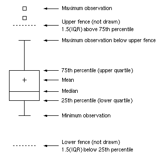
A SAS programmer asked an intriguing question on the SAS Support Communities: Can you use SAS to create a graph that shows how the elements in a box-and-whiskers plot relate to the data? The SAS documentation has several examples that explain how to read a box plot. One of the documentation images is shown to the right. The programmer wanted a program that creates the image.
In response to the question, a Communities member shared Graph Template Language (GTL) code that uses hard-coded values for the statistics (Q1, Median, Q3, etc) and overlays explanatory text and arrows onto a box plot. I wondered how hard it would be to dynamically position the explanatory text and lines based on a particular set of data? In other words, given any set of data, can you write a program that automatically positions the explanatory text next to the box plot for those data?
The answer is yes. While developing the program, I learned about axis tables and annotation in the SGPLOT procedure. This article shows how to use the YAXISTABLE statement to overlay a table of text on a box plot (or other plots). The article also shows how to use the SG annotation facility to overlay curves, arrows, and other features. You can use these ideas to augment and decorate your own SAS graphs. My primary goal is not to reproduce the graph in the documentation, but rather to demonstrate general techniques that are relevant in many situations.
The creation of the graph is divided into five steps:
- Plan the graph.
- Define the data.
- Compute values for the whiskers, outliers, and mean value.
- Compute values for quartiles and fences.
- Create an annotation data set for lines, arrows, and text.
Step 1: Plan the graph
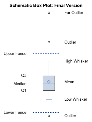
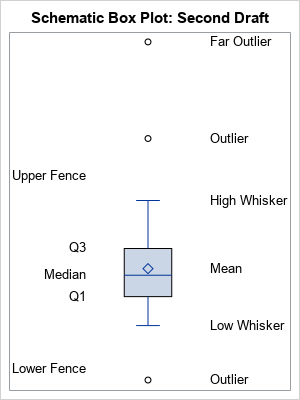
For graphs like this, it is always best to decide what SGPLOT statements you can use and how to arrange the underlying data object for the graph. There are eight statistics that are important for understanding a box plot. To reduce the likelihood of overlapping text, I decided to split them into two groups, one on the right and one on the left. The graph that I will eventually produce is shown to the right. I want to use three SGPLOT statements and an annotation data set:
- The box plot. For this, I need a variable, x, that contains the data. The VBOX statement will display the box plot.
- The features on the right are mostly related to observations. They include the high and low whiskers, and any outliers and "far outliers." Because the mean often is close to the median, I'll also plot the mean on the right. A YAXISTABLE statement will display these words on the right. The variables for this axis table will be called _TYPE_ and _VALUE_, for reasons that will become apparent.
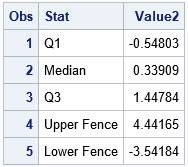
- The features on the left are related to quantiles. The Q1, median, and Q3 values are self-explanatory. The upper fence is value Q3 + 1.5*IQR, where IQR = Q3 - Q1 is the interquartile range. The lower fence is value Q1 - 1.5*IQR. A second YAXISTABLE statement will display these words on the left. The variables for this axis table will be called Stat and Value2. (You can also define the "upper far fence" by Q3 + 3*IQR and the "lower far fence" by Q1 - 3*IQR.)
- Annotation. To keep it simple, I will show how to draw dashed lines by using an annotation data set. You could also use annotation to display arrows and additional text.
Step 2: Define the data
Assume the data are in a variable named X in a data set named HAVE. Because PROC BOXPLOT (used in the next step) requires a Group variable, you need to add a constant variable named GROUP to the data. The following data simulates normally distributed data and adds three outliers:
/* Step 2. Create example data */ data Have(keep= Group x); call streaminit(1); Group=1; /* required for PROC BOXPLOT */ do i = 1 to 40; x = rand("Normal", 0, 1.5); /* normal data */ output; end; x = 6; output; /* upper outlier */ x = 10; output; /* far upper outliers */ x = -4; output; /* lower outlier */ run; |
Step 3: Compute whiskers and outliers
The easiest way to compute the whiskers and outliers is to use the OUTBOX= option in PROC BOXPLOT. It writes SAS data set that contains two variables, _TYPE_ and _VALUE_, that contains the values for many of the features and statistics that are displayed by the box plot.
/* Step 3: Compute values for box plot features: Mean, lower/upper whiskers, outliers */ proc boxplot data=Have; plot x*Group / boxstyle=schematic outbox=outbox; run; proc print data=outbox; where _Type_ in ('MIN', 'MAX' 'MEAN' 'HIGH' 'LOW' 'FARHIGH' 'FARLOW' 'HIWHISKR' 'LOWHISKR'); var _Type_ _Value_; run; |
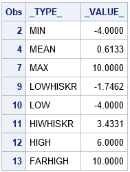
Unfortunately, the output from the OUTBOX= option does not always contain the value of the whiskers (although it does for this example). If the box plot does not contain a lower outlier, the _TYPE_='LOWHISKR' observation does not exist and you need to use the value of the 'MIN' observation instead. Similarly, if there is no upper outlier, the _TYPE_='HIHISKR' observation does not exist and you need to use the value of the 'MAX' observation instead. I have previously discussed how to handle this situation, and the full SAS code shows how to create a new data set (called Outbox2) that contains all the needed information.
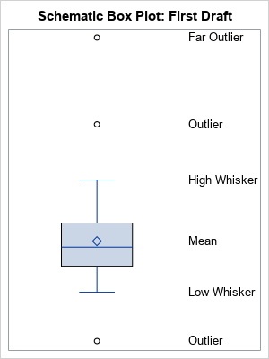
If you merge Outbox2 data with the original data, you can use the YAXISTABLE statement in PROC SGPLOT to overlay the box plot and a table of box plot features. The YAXISTABLE statement is great for aligning text with data values. (At first, I thought to use the TEXT statement to display the text, but the TEXT statement requires a coordinate system for the horizontal variable, which is not applicable for this graph.) The YAXISTABLE statement only requires vertical coordinates and places the text in the margins.
/* Step 3a. Solve a potential problem. See link to full code. */ data outBox2; set outBox(where=(_Type_ in ('MIN', 'MAX' 'MEAN' 'HIGH' 'LOW' 'FARHIGH' 'FARLOW' 'HIWHISKR' 'LOWHISKR'))) END=EOF; /* EOF is temporary indicator variable */ /* ...more... */ run; data Schematic1; merge outBox2 Have; run; /* OPTIONAL: How are we doing? Display box plot with axis table on right */ ods graphics/ width=300px height=400px; title "Schematic Box Plot"; proc sgplot data=Schematic1; vbox x; yaxistable _Type_ / y=_Value_ nolabel valueattrs=(size=12) location=inside; yaxis display=none; /* OPTIONAL: Suppress Y ticks and values */ xaxis offsetmin=0 offsetmax=0; run; |
Step 4: Compute quartiles, fences, and IQR
As explained previously, the upper and lower fences are computed by using the first and third quartiles and the interquartile range. The coordinates of the fences are not produced by PROC BOXPLOT. The following statements use PROC MEANS to compute the quartiles, then use a DATA step to compute the IQR and the locations of the fences. A call to PROC TRANSPOSE converts the data set from wide to long form so that it can be merged with the data set from the previous section. Lastly, a second YAXISTABLE statement is added to the PROC SGPLOT call to display the quartiles and fences on the left side of the graph.
/* Step 4: Use PROC MEANS and a DATA step to compute the quantile stats */ proc means data=Have Q1 Median Q3 noprint; var x; output out=Q Q1=Q1 Median=Median Q3=Q3; run; option validvarname=ANY; /* permit 'Upper Fence'n to be a var name */ data IQR; set Q; IQR = Q3 - Q1; 'Upper Fence'n = Q3 + 1.5*IQR; 'Lower Fence'n = Q1 - 1.5*IQR; drop _TYPE_ _FREQ_ IQR; run; proc transpose data=IQR out=IQR2(rename=(COL1=Value2)) name=Stat; run; data Schematic2; merge Schematic1 IQR2(keep=Stat Value2); run; /* OPTIONAL: How are we doing? Display box plot with two axis tables */ title "Schematic Box Plot: Second Draft"; proc print data=IQR2; run; proc sgplot data=Schematic2; vbox x; yaxistable _Type_ / y=_Value_ nolabel valueattrs=(size=10) location=inside; yaxistable Stat / y=Value2 nolabel valueattrs=(size=10) location=inside position=left valuejustify=right; yaxis display=none; /* OPTIONAL: Suppress Y ticks and values */ xaxis offsetmin=0 offsetmax=0; run; |
Step 5: Create an annotation data set
If you want to overlay additional curves, arrows, or text on the graph, use an SG annotation data set. For a gentle introduction to SG annotation, see Dan Heath's 2011 SAS Global Forum paper about SG annotation. For a more complete exposition, including many cut-and-paste examples, see Chapter 4 of Warren Kuhfeld's free e-book Advanced ODS Graphics Examples, which also contains an excellent chapter about axis tables.
To keep this article from becoming too long and complicated, I will use SG annotation merely to add two dashed horizontal lines that indicate the location of the lower and upper fences. When you use annotation, it is important to choose good coordinate systems. For this example, you can use the WallPercent coordinate system ([0, 100]) for the horizontal direction and use the DataValue coordinate system for the vertical direction. I used the interval [35, 65] to draw the horizontal lines. The vertical position of the lines come from the IQR2 data, which was created in the previous section.
/* Step 5: Create annotation data set */ data anno; retain Function 'Line' x1Space x2Space 'WallPercent ' y1Space y2Space 'DataValue ' LinePattern 2 /* short dashed line */ x1 35 x2 65 y1 y2 0; set IQR2(where=(upcase(Stat) contains 'FENCE')); y1 = Value2; y2 = Value2; run; title "Schematic Box Plot: Final Version"; proc sgplot data=Schematic2 sganno=anno; vbox x; yaxistable _Type_ / y=_Value_ nolabel valueattrs=(size=10) location=inside; yaxistable Stat / y=Value2 nolabel valueattrs=(size=10) location=inside position=left valuejustify=right; yaxis display=none; /* OPTIONAL: Suppress Y ticks and values */ xaxis offsetmin=0.2 offsetmax=0; run; |
The graph is complete! The final graph is shown in the "Plan the Graph" section. The challenge in creating this graph is not the SGPLOT syntax (which is simple) but is computing all the coordinate values and arranging them in a rectangular format.
Does the program handle other data sets?
My goal was to augment a box plot with text that explains the important statistical features of the plot and that is flexible enough to work for an arbitrary data set. Let's see how well the program works on other data that are not so symmetrical. The following data set defines the X variable as the MPG_City values for the vehicles in the Sashelp.Cars data set. These data are positively skewed.
data Have(keep=x Group); set Sashelp.Cars(rename=(MPG_City=x)); label x = "MPG_City"; Group = 1; run; |
If you run the program on this data, you obtain the following graph. I commented out the YAXIS statement in the SGPLOT call so that the Y axis ticks and values are displayed.
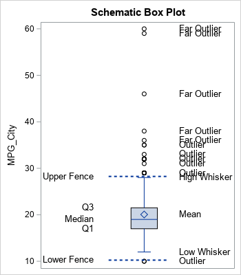
The graph is typical of skewed data. There are many outliers and the text for the outliers can overlap other text. Nevertheless, the program does a fair job of displaying the important statistical features of the box plot for these data.
In summary, this article shows how to use PROC BOXPLOT, PROC MEANS, and the DATA step to compute data-dependent quantities that represent the statistical features of a box plot. You can use the YAXISTABLE statement to display explanatory text at various data values. You can use SG annotation to display lines, arrows, and other decorations. For simplicity, I hard-coded some the data set name and the variable name in this program. It is straightforward to encapsulate the computations into a SAS macro that would create an annotated box plot for any numerical variable.
You can download the full SAS code in this article.

2 Comments
Very nice, Rick! I am a huge fan of the axis table. This is a nice application, and one that I would not have thought of. I would have probably thought of using annotation instead, but I like your axis table approach better. ODS Graphics provides so many elegant building blocks, and you provide a nice application of combining those blocks in creative ways.
Hi Prof Rick, I have read your book "Simulating Data with SAS". I recently have some questions about simulating survival data in a paper https://ascopubs.org/doi/10.1200/JCO.2006.09.6198.
I wnat to ask your help about the simulation. Can the data in paper simulated using SAS ?