Previously, I discussed ways to create a Box Plot with Stat Table and Markers in the linked article. One of the graphs showed a Box Plot of Cholesterol by Death cause along with the display of the actual observations. The main goal for that article was display of statistics with a Box Plot.
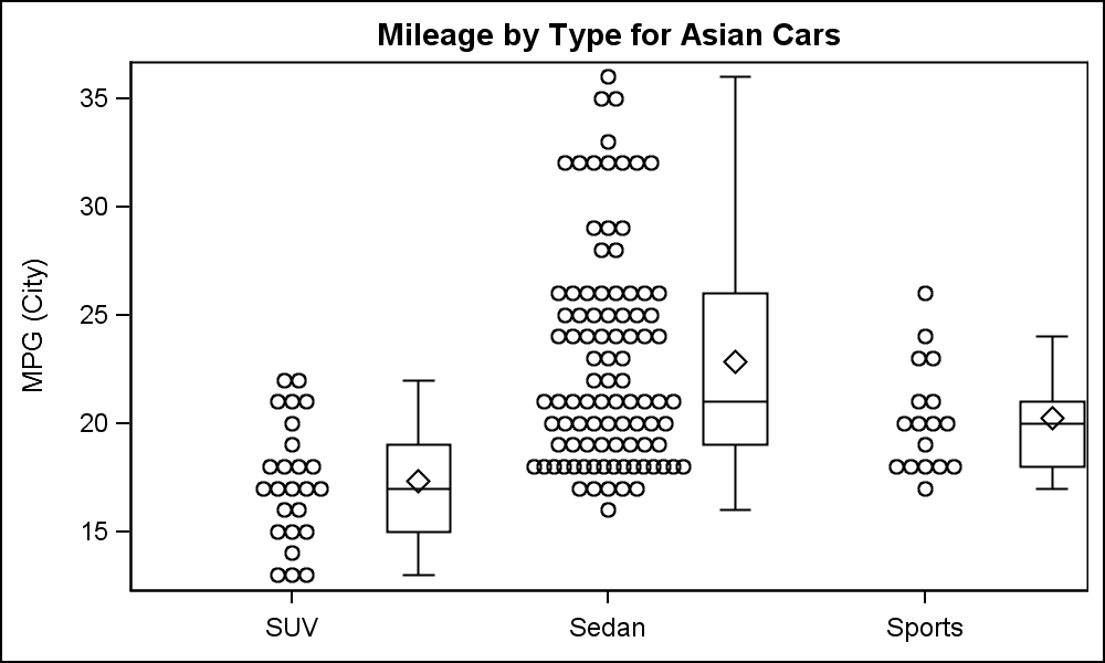 Often we want to view the data by a discrete variable along with its distribution. Starting with SAS 9.40M3, we can overlay a VBOX on the Scatter plot, as shown on the right. Here the box plot is offset to the right from the data. This is a small variation on the graphs shown in the link above, but may provide a cleaner view of the observations and the distribution.
Note, when we use a scatter plot with an x-axis with a discrete variable (in this case Type) and the "Jitter" option, the graph automatically places the categories equally spaced on the axis, with an offset of half the midpoint spacing at the ends like in a bar chart. We have overlaid a VBOX that is offset to the right, and reduced the box width to 0.2. Click on the graph for a higher resolution view. The code is shown below.
SAS 9.40M3 SGPLOT Code:
title 'Mileage by Type for Asian Cars';
proc sgplot data=cars noautolegend noborder;
scatter x=type y=mpg_city / jitter jitterwidth=0.5;
vbox mpg_city / category=type discreteoffset=0.4 boxwidth=0.2 nooutliers nofill;
xaxis display=(nolabel noline);
yaxis display=(noline noticks) grid gridattrs=(color=white);
run;
This is made possible with the DISCRETEOFFSET option available on all plot statements that support a discrete variable, including bar charts, box plots, scatter, series and more. In the example above, I have left the scatter centered on the midpoint, but to make room for the box, I have reduced the JITTERWIDTH so the markers are not spread over the entire available spacing.
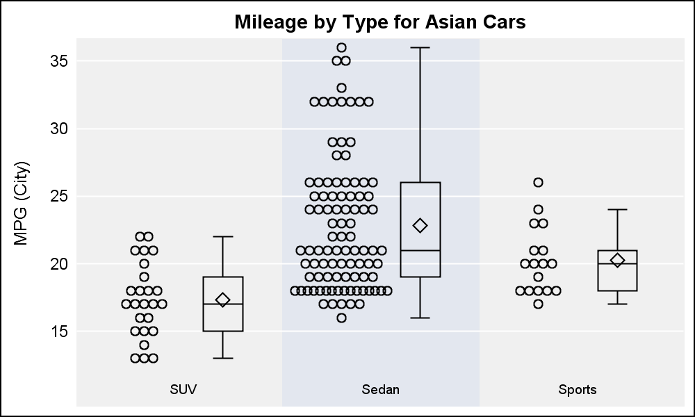 The graph on the right provides an alternative appearance, with a reverse color scheme for background and wall, and removal of the axis lines and borders. Note the following changes:
- Use of Styleattrs to set the wall color.
- Scatter and box are both offset, so tick value is in the middle of each cluster.
- Use of x-axis color bands to indicate the cluster.
- The x-axis tick values are now really an axis table so the color band can include the tick value.
- See link for full code.
SAS 9.40M3 SGPLOT Code: scatter_box


1 Comment
Pingback: Scatter with layer - Graphically Speaking