This article is motivated by a recent question on the Communities Web Site on creating a scatter plot with additional summary information. Recently, I described how to create a scatter plot with a box overlay. While such graphs have been discussed in earlier posts, this article provided a visual benefit of offsetting the box so both the scatter and box layers are clearly visible.
However, in this case, the user wanted to see the scatter markers by category along with a display of the mean value for each category. The first impulse is to create a scatter with box overlay and restrict the box display to show only the mean. However, it quickly became clear this was not possible as the VBOX statement does not allow hiding of the Q1-Q3 interval.
Also, this particular user was using SAS 9.3, where layering of scatter with vbox is not allowed.
The solution is to create a graph with a scatter plot along with another plot layer that will allow us to display the mean value by category. This can be done using the HIGHLOW plot, setting both the high and low value to the same value of mean.
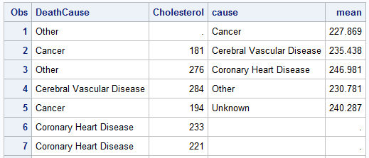 In this example, I used the sashelp.heart data set. I ran the MEANS procedure to compute the mean Cholesterol by DeathCause and saved it to a new data set called Heart_Mean. In this data set, I renamed DeathCause to Cause. Now, I do a simple merge of the means data with the detailed data to get this combined data set shown on the right.
proc means data=heart;
class deathcause;
var cholesterol;
output out=heart_mean(where=(_type_ > 0) rename=(deathcause=cause))
mean=mean;
run;
data combined;
merge heart heart_mean;
keep deathcause cholesterol cause mean;
run;
 Note, the data set has 1991 observations from the detailed data set and four columns. The first two columns are used for the scatter plot, and the next two columns are used for the display of the mean values as shown on the right.
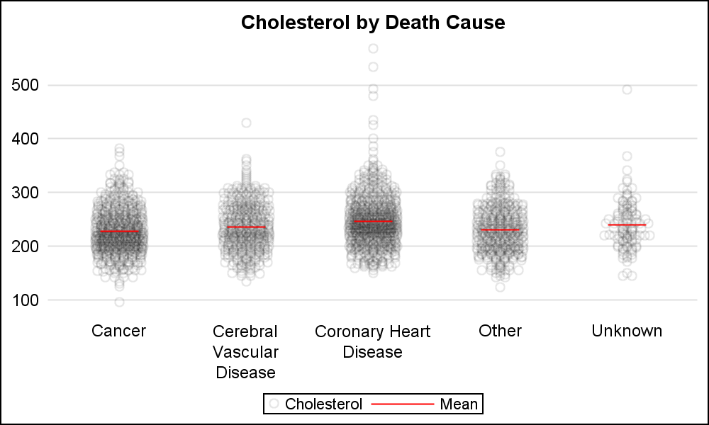
title 'Cholesterol by Death Cause';
proc sgplot data=combined nowall noborder;
scatter x=deathcause y=cholesterol / jitter
jitterwidth=0.4 transparency=0.9;
highlow x=cause low=mean high=mean / type=bar
nofill lineattrs=(color=red)
barwidth=0.3 legendlabel='Mean';
yaxis display=(noline noticks nolabel) grid;
xaxis display=(noline nolabel noticks);
run;
I have used the JITTER option in this case with JITTERWIDTH. Jitter options are not available with SAS 9.3. Width of the "Mean" line is controlled by setting the bar width on the HIGHLOW statement.
SAS 9.4 SGPLOT code: ScatterLayer


