Standardized tests like the SAT and ACT can cause stress for both high school students and their parents, but according to a Wall Street Journal article, the SAT and ACT "provide an invaluable measure of how students are likely to perform in college and beyond." Naturally, students wonder how their individual scores compare with others at their high school, their school district, or their state. I addressed some of those questions in a previous article that visualizes national ACT scores among college-bound students.
The average test scores at a school (or in a school system) are also scrutinized. Administrators and state legislators look at standardized scores to help assess the effectiveness of school districts, principals, and teachers. Parents might use scores to help them decide whether to send their child to the local public school, a charter school, or a private school.
A recent article in the Raleigh News and Observer links to a website of the NC Department of Public Instruction that contains the full set of SAT scores for all 496 public schools in NC. The table is great if you want to find the scores for a particular school, but is not very illuminating if you want an overview of how SAT scores vary at schools across the state. Thus, I decided to visualize the data for all NC schools by using SAS.
The data are only for public schools. You can download the data and the SAS program that I used to create the graphs in this article.
The distribution of total SAT scores
The SAT score contains two components, a score on a math test and a score on a reading and writing test (sometimes referred to as the "English" score). Colleges look at the component scores and the sum of the scores (the "total" score). The following histogram shows the distribution of the average total SAT score for schools in North Carolina:
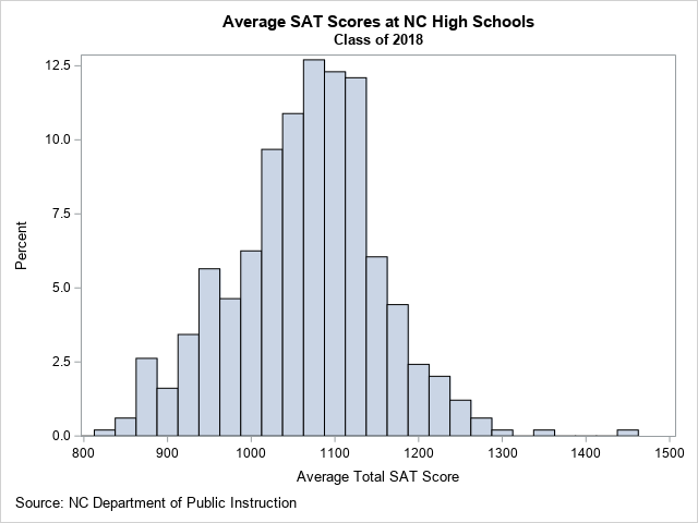
From this graph, you can determine several facts about the data:
- For most NC schools, the average SAT score is about 1100.
- About 73% of NC schools have an average SAT score between 1000 and 1200.
- There are a few schools that have much higher scores than the others. Those schools are Early College At Guilford (Total=1442), Raleigh Charter High School (Total=1356), and East Chapel Hill High (Total=1290).
Visualize the SAT math and English scores
If you want to compare the distributions of the math and English SAT scores, you can create a comparative histogram, as shown below:
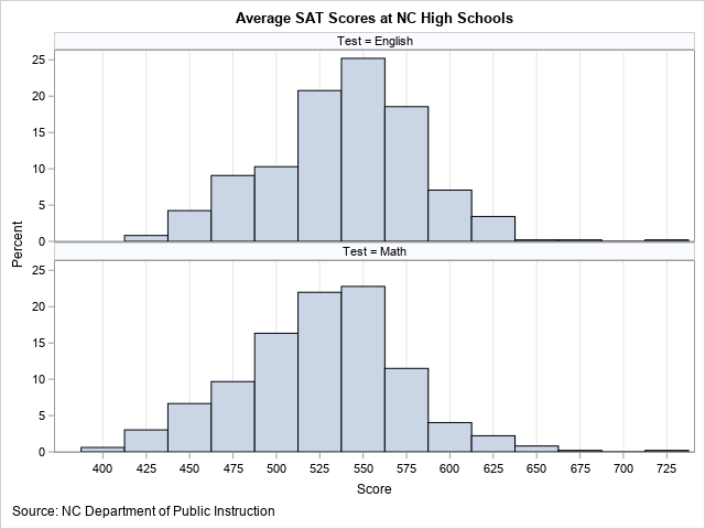
In the comparative histogram, the average English scores for schools are shown in the top row; the math scores are in the bottom row. The English scores are generally higher, with a median value of 543. The median math score is about 15 points lower, with a value of 528.
Of course, the measurements in these two histograms are not independent. In reality, the math and English scores are paired, since every student takes both the math and English tests. Therefore, it makes sense to plot the joint distribution of the scores in a scatter plot, as follows:
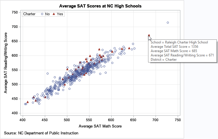
In this plot, each school is represented by a marker. The math and English scores determine the placement of the marker. You can see that the math and English scores are highly correlated and linearly related. Schools with high (respectively, low) English scores tend to have high (respectively, low) math scores.
I used SAS to add tool tips to the graph. When I hover the cursor over a marker, the graph display information about the school and the average test scores. That technique makes it easy to identify the outliers. For example, the image above shows the tool-tip information for the Raleigh Charter High School, which has exceptionally high SAT scores.
And speaking of charter schools, legislators and school boards sometimes discuss the merits and disadvantages of using public tax dollars to establish and run charter schools. I have used red triangles to indicate the 39 charter schools in NC, which represent about 8% of the total schools. Overall, the distribution of SAT scores among the charter schools appears to be similar to the non-charter schools. I also created a comparative histogram of the charter/non-charter schools (not shown), which shows that the overall distribution is similar.
SAT scores for all NC public high schools
The previous graphs show the distribution of SAT scores for all public NC high schools, but do not enable you to easily compare different school districts. One way to compare school districts is to rank them according to the median scores for the schools within the district. You can create a graph that shows the school scores for each district. Because there are 115 school districts in NC, this graph will be very tall or wide. Nevertheless, it can be useful to rank the school districts and simultaneously see the distribution of scores for each school. The following plot displays the top 75 school districts, which collectively contain 385 high schools:
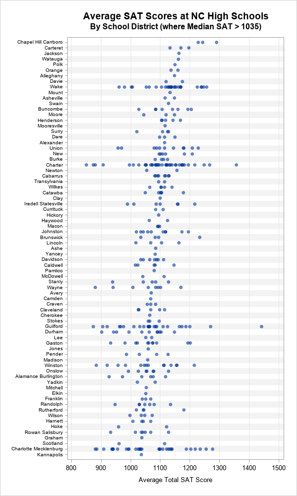
The top school district is Chapel-Hill/Carrboro, which contains three high-performing high schools. The next few school districts are also small, having three or fewer high schools. Wake County, the second-largest school district in the state, is ninth in terms of the median SAT scores, but you can see considerable variation among the schools in the district. Other large school districts (Charter schools, Guilford, and Charlotte/Mecklenburg), show similar variation in scores.
Summary
By using data visualization, you can better understand the distribution of SAT scores across public high schools in NC. The graphs in this article enable you to see that there are several high-performing schools, lots of schools in the middle, and a few low-performing schools. Similarly, you can compare the test scores by school districts. The school-district graph enables you to see the variation of scores of schools within a district. Lastly, when you create these graphs in SAS, you can add tool tips that help you identify the individual schools within each school district.
In my next article, I will describe an alternative visualization that displays a box plot for each school district.
Download the data and the SAS program (NCSAT.sas) for this article.

1 Comment
Pingback: Use PROC BOXPLOT to display hundreds of box plots - The DO Loop