The mosaic plot is a graphical visualization of a frequency table. In previous articles, I showed how to create a mosaic plot in SAS by using PROC FREQ and how to define a template in the Graph Template Language (GTL) by using the MOSAICPARM statement. This article shows how to display additional information on a mosaic plot. The two techniques in this article are
- For interactive displays, add tool tips (also called infotips or "data tips") to the mosaic plot. When you hover the mouse pointer over a cell, SAS displays information about cell counts and percentages.
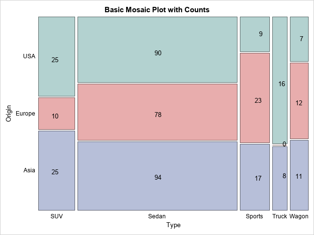
- For static displays, use the GTL annotation facility to overlay cell counts or percentages on a two-way mosaic plot. A result is shown to the right.
Add data tips to any SAS graph
When you analyze data in SAS, many SAS procedures can automatically create graphs that are appropriate for the analysis. Most of these graphs support data tips that provide information about the data when you hover a mouse pointer over a graph component. I like to use this feature for "area graphs" such as bar charts, histograms, and mosaic plots.
It is easy to turn on tool tips: you simply specify the IMAGEMAP=ON option on the ODS GRAPHICS statement. Because PROC FREQ can create a mosaic plot, the following statements draw a mosaic plot with tool tips for the Origin and Type variables in the Sashelp.Cars data set:
/* Use tool tips to see details of a mosaic plot */ ods graphics on / imagemap=ON; /* enable data tips */ proc freq data=Sashelp.Cars; where Type ^= 'Hybrid'; tables Origin * Type / plots=mosaic out=FreqOut(where=(Percent^=.)); /* output stats for next section */ run; |
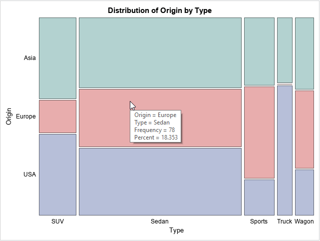
When you hover the mouse pointer over a cell, the graph displays a tool tip. The tip for the center cell shows that the cell represents Origin=Europe and Type=Sedan. The center cell represents 78 vehicles or 18.4% of the total number of vehicles in the data.
Create a mosaic plot from the output of PROC FREQ
Unfortunately, the mosaic plot is not supported by PROC SGPLOT in SAS 9.4M6, but the MOSAICPARM statement in the Graph Template Language (GTL) enables you to create a mosaic plot. The following statements display the PROC FREQ template in the SAS log:
/* view the template for the MosaicPlot in PROC FREQ */ proc template; source Base.Freq.Graphics.MosaicPlot; run; |
You can copy the basic structure of the Base.Freq.Graphics.MosaicPlot template to create your own template. You need to add an ANNOTATE statement if you want to support annotation, as follows:
proc template; define statgraph mosaicPlotParm; dynamic _VERTVAR _HORZVAR _FREQ _TITLE; begingraph; entrytitle _TITLE; layout region; /* REGION layout, so can't overlay text! */ MosaicPlotParm category=(_HORZVAR _VERTVAR) count=_FREQ / datatransparency=0.5 colorgroup=_VERTVAR name="mosaic"; endlayout; annotate; /* required for annotation */ endgraph; end; run; proc sgrender data=FreqOut template=mosaicPlotParm; dynamic _VERTVAR="Origin" _HORZVAR="Type" _FREQ="Count" _TITLE="Basic Mosaic Plot with No Labels"; run; |
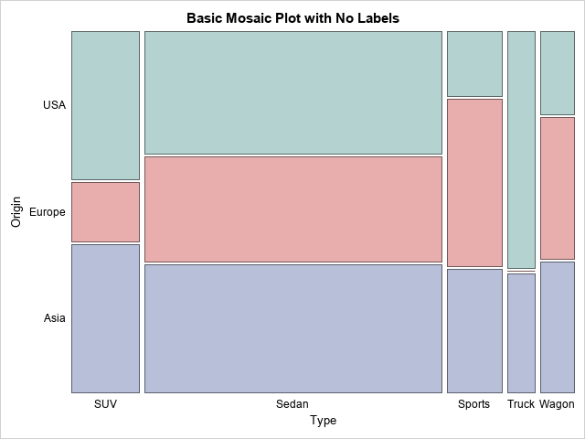
Notice that the FreqOut data (which I created by using the OUT= option on the TABLES statement in PROC FREQ) has the cell counts in a different order than the data object that the PLOTS=MOSAIC option uses. The mosaic plot I created has the vertical axis "pointing up" whereas the vertical axis in the PROC FREQ graph "points down" to match the frequency table that the procedure creates.
My initial idea was to overlay a text plot on the mosaic plot and use the text plot to show the cell counts or percentages. However, the MOSAICPLOTPARM statement must be part of a LAYOUT REGION block. A LAYOUT REGION block supports only one plot, a mosaic plot or a pie chart; you cannot overlay another plot such as a text plot or a scatter plot on a "region plot."
Therefore, the only choice for adding text to a mosaic plot is to use the GTL annotation facility. This is not as easy as I'd hoped because "region plots," which do not have axes, do not support data coordinates. This means that you cannot use the DATAVALUE or WALLPERCENT drawing areas, which are the most useful drawing areas for data-dependent annotations. The only choices for drawing areas are the GRAPHPERCENT and LAYOUTPERCENT areas. Of these, the LAYOUTPERCENT is better because annotations in the layout area do not shift around if you decide to add a title or footnote to your mosaic plot. The horizontal portion of the LAYOUTPERCENT drawing area goes from the vertical axis label to the right edge of the graph region. The vertical portion goes from the horizontal axis label to the top edge of the graph region.
Create an annotation for a mosaic plot
This section describes how to create an annotation data set for a region plot. For an introduction to GTL annotation, see the following articles:
- Dan Heath's blog post about SG annotation in PROC SGPLOT.
- Dan Heath's SAS Global Forum 2011 paper about SG annotation.
- Chapter 4 of Warren Kuhfeld's free e-book Advanced ODS Graphics Examples
The goal of this section is to annotate a mosaic plot, but the same ideas will work on a pie chart, which is also a "region plot." The following annotation uses the LAYOUTPERCENT drawing space. The annotation consists of a series of 'text' function calls. Each 'text' function must be supplied with the following information:
- The Label variable specifies the text to display.
- The x1 and y1 variables specify the coordinates of the label (in the LAYOUTPERCENT drawing space).
- The Width variable specifies the width of the label and the Anchor variable specifies how the text is anchored (left, right, centered,...) at the (x1, y1) location.
The following data set specifies the center of the text in LAYOUTPERCENT coordinates. In a follow-up article, I will show how to compute these values. For now, just assume that the coordinates are provided. In many annotation examples, coming up with the coordinate is an iterative process of guessing values, plotting them, and then revising the guess.
Regardless of how the coordinates are obtained, you can read the coordinates into an annotation data set and assign the special variable names that SG annotation looks for, such as x1, x2, Label, and Width:
data AnnoData; length Type $8 Origin $6; input Type Origin hCenter vCenter Freq Pct; datalines; SUV Asia 16.35 28.75 25 5.8824 Sedan Asia 50.45 26.15 94 22.1176 Sports Asia 83.38 25.61 17 4.0000 Truck Asia 91.11 25.00 8 1.8824 Wagon Asia 96.82 26.50 11 2.5882 SUV Europe 16.35 55.00 10 2.3529 Sedan Europe 50.45 55.69 78 18.3529 Sports Europe 83.38 62.35 23 5.4118 Truck Europe 91.11 40.00 0 0.0000 Wagon Europe 96.82 61.00 12 2.8235 SUV USA 16.35 81.25 25 5.8824 Sedan USA 50.45 84.54 90 21.1765 Sports USA 83.38 91.73 9 2.1176 Truck USA 91.11 70.00 16 3.7647 Wagon USA 96.82 89.50 7 1.6471 ; data anno; set AnnoData; length label $12; /* use RETAIN stmt to define values that are constant */ retain function 'text' y1space 'layoutpercent' x1space 'layoutpercent' width 4 /* text box width = 4% of layout range */ anchor 'center'; /* for the TEXT function, need (x1, y1) coords and Label */ x1 = hCenter; y1 = vCenter; label = put(Freq, 4.); /* use 4. format for count */ /* label = put(Pct/100, PERCENT7.1); width=7; */ run; proc sgrender data=FreqOut template=mosaicPlotParm sganno=anno; dynamic _VERTVAR="Origin" _HORZVAR="Type" _FREQ="Count" _TITLE="Basic Mosaic Plot with Labels"; run; |
The mosaic plot with annotation is shown at the top of this article. The DATA step that creates the annotation data set includes a comment that shows how you can display percentages instead of counts. Of course, if your counts are large (thousands), you should increase the Width value and the field width of the format in the PUT statement. You can also modify the program to omit labels for small cells. For example, you might not want to label cells that have fewer than 2% of the sample size.
The key to this example is that the mosaic plot is a region plot. You cannot overlay plots (such as a text plot) on a region plot. Therefore, you must use an annotation. Furthermore, you must use the LAYOUTPERCENT drawing area, which is somewhat inconvenient. How I wish I could use the WALLPERCENT drawing space with a range of [0, 100] in each direction!
In my next article, I will show how to obtain the locations of the annotation centers from the data.

3 Comments
Pingback: Find the center of each cell in a mosaic plot - The DO Loop
ERROR: Unable to restore 'mosaicPlot' from template store!
NOTE: The SAS System stopped processing this step because of errors.
You can post your code and ask programming questions at the SAS Support Communities. Be sure to include your version of SAS and how you are calling SAS (EG, SAS Studio, SAS On Demand,....)