
The Swiss army knife is known for its versatility, with a variety of tools and blades to help you complete the task at hand. When you are creating graphics, you sometimes have a special feature you want to add, but you can't seem to find the right syntax "tool" to get it done. In SAS 9.3, we added an annotation facility to the SG procedures that gives you the ability to add these features when it becomes too difficult or impossible to add them through the standard syntax.
Like the "classic" annotate facility in SAS/GRAPHⒸ, SG annotation uses a data set of reserved column names to define the type of annotation and its attributes. However, the similarities stop there. The data set definition has been redefined in a way that, hopefully, makes it easier to use, while taking advantage of features available in the ODS GRAPHICS system. For example, features such as drawing spaces and anchor positions are now defined using keywords instead of numbers to make the values easier to remember. The new definition contains 45 column names, but you will typically use only a few at a time.
The FUNCTION column defines the type of annotation to draw. For the SAS 9.3 release, the following are the available functions:
- Text - draw a text string
- TextCont - continue a text string from a previous TEXT or TEXTCONT. Used for rich text.
- Image - draw an image
- Line - draw a line
- Arrow - draw an arrow
- Rectangle - draw a rectangle or square
- Oval - draw a circle or oval
- Polygon - start a closed polygon
- Polyline - start an open polyline
- PolyCont - provides points for a POLYGON or POLYLINE
The following examples will give you some ideas on how these functions can be used.

In this example, I wanted to add the "less-than-or-equal-to" symbol to each of my axis values. There is currently not a a way to do this directly, so I took advantage of the TEXT functions ability to handle inline text functions, such as Unicode, superscript, and subscript. Many of the column values in this example can be held constant using the RETAIN statement. The only values that change are the X1 values (used to position the values along the X-axis) and the labels themselves.
data anno; retain function 'text' y1space 'graphpercent' x1space 'datavalue' y1 7 width 15; input x1 label $ 4-33; cards; 21 20 (*ESC*){unicode '2264'x} 30 31 30 (*ESC*){unicode '2264'x} 40 41 40 (*ESC*){unicode '2264'x} 50 51 50 (*ESC*){unicode '2264'x} 60 61 60 (*ESC*){unicode '2264'x} 70 run; |
The LABEL text contains the ODS ESCAPECHAR (which is (*ESC*) by default) to mark where the Unicode function is inserted. The new PAD option is used in PROC SGPLOT to reserve room along the bottom of the graph for the labels because annotations do not reserve space.
proc format; value agefmt 20-<30 = "20-30" 30-<40 = "30-40" 40-<50 = "40-50" 50-<60 = "50-60" 60-<70 = "60-70" ; run; Title1 "Cholesterol Level by Age Range"; proc sgplot data=sashelp.heart sganno=anno pad=(bottom=8%); format AgeAtStart agefmt.; xaxis display=(nolabel novalues); vbox cholesterol / category=AgeAtStart; run; |
Images are another feature that can easily be added using annotation. In the following example, images are used to label the curves instead of the typical text label. Also, a custom company logo is added to the bottom right corner.
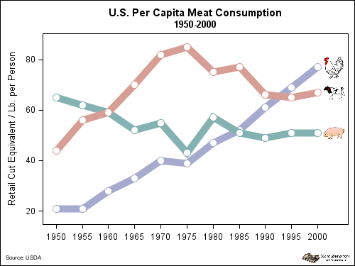
data anno; length x1space $ 13 y1space $ 13 anchor $ 11; set meat_consumption (where=(year='01jan2000'd)) end=_last_; retain anchor 'left' y1space 'datavalue' x1space 'datapercent' width 40 widthunit 'pixel' function 'image' x1 102; y1 = chicken; image = "chicken.jpg"; output; y1 = beef; image = "cow.jpg"; output; y1 = pork; image = "pig.jpg"; output; if (_last_) then do; x1space = "graphpercent"; y1space = "graphpercent"; anchor = "bottomright"; x1 = 99; y1 = 1; width=90; image = "Logo.png"; output; /* the image logo */ function = "text"; anchor = "bottomleft"; x1 = 1; width=150; textsize = 6; label = "Source: USDA"; output; /* the footnote */ end; run; |
Notice that only the image width is specified. In this system, if only the width or the height is specified for the image, the other attribute is automatically calculated based on the aspect of the image data. Specifying only one value is a great way to ensure that the image is never distorted.
For a final example, I created a bubble legend as an alternative to displaying the value on the bubble. That way, I could use the DATALABEL option to display the Y-axis value.
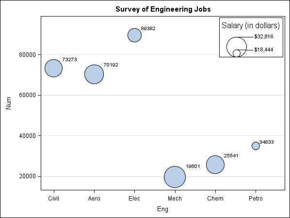
data anno; retain drawspace "wallpercent" widthunit "pixel" heightunit "pixel" linethickness 1 textsize 8; length function $ 9; input function $ x1 y1 width height x2 y2 textsize anchor $ label $ 48-66 display $ 68-70 fillcolor $ 72-76; cards; Rectangle 86 76.5 140 87 . . 12 bottom all white Oval 80 76.5 44 44 . . 12 bottom Oval 80 76.5 16 16 . . 12 bottom Line 80 87.9 . . 87 87.9 12 bottom Line 80 80.75 . . 87 80.5 12 bottom Text 86 98 140 . . . 12 top Salary (in dollars) Text 87 88.1 140 . . . 8 left $32,816 Text 87 80.4 140 . . . 8 left $18,444 ; run; |
These are but a few of the examples covered in my paper located here on the support site. There are also more details about using the SG annotation system in general. Please check out the paper and post here if you have any questions or comments.


10 Comments
In the box plot example, it is not clear which category a 30-year-old person is in. This is determined by the AgeAtStart format, which is not shown. The categories are half-open intervals, meaning that they are either (20, 30], (30, 40], etc, or are [20, 30), [30, 40), etc.
The purpose of the first example is to demonstrate unicode text in annotation, but can't you create this box plot by using PROC FORMAT to define the categories and labels, and skip annotation?
I updated the picture and code to make it clear where the data fell. I did find a mistake in my original format, which is why I updated the picture. As for PROC FORMAT, it is currently not possible to embed Unicode characters in the format label. That is why the annotation was needed.
Is it possible to get the data and the chart code for the meat consumption chart, I would like to see how all fits together
Sure, here is the full code:
Pingback: Risk tables, annotated or not - Graphically Speaking
Pingback: Reading to beat the heat - Key Happenings at support.sas
Pingback: Unicode Tick Values using GTL - Graphically Speaking
Pingback: Basic ODS Graphics: What is wrong with my SG annotation data set? - Graphically Speaking
Pingback: Basic ODS Graphics: What is wrong with my SG annotation data set? - Graphically Speaking
Pingback: How to add an annotation to a mosaic plot in SAS - The DO Loop